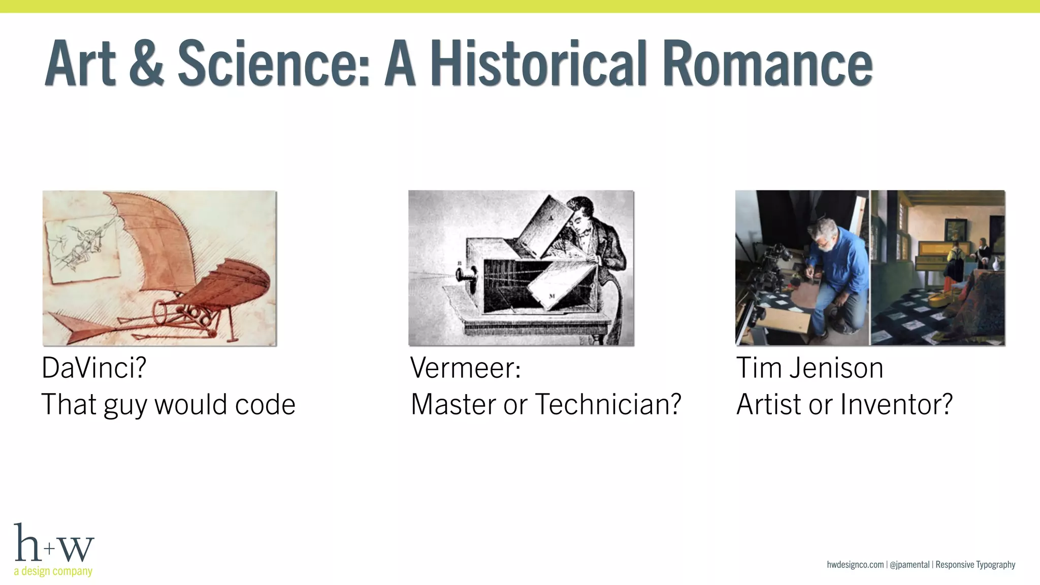
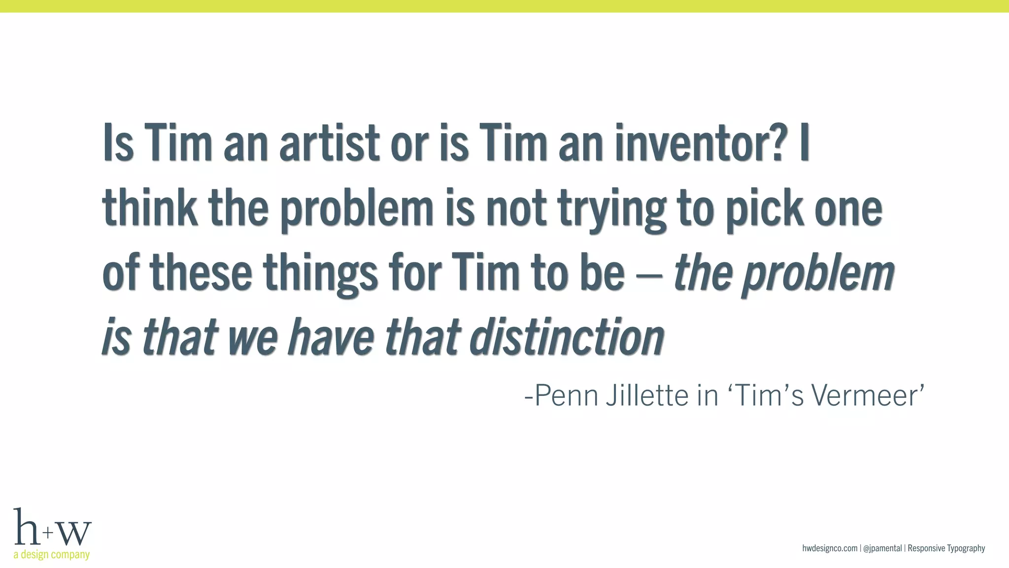
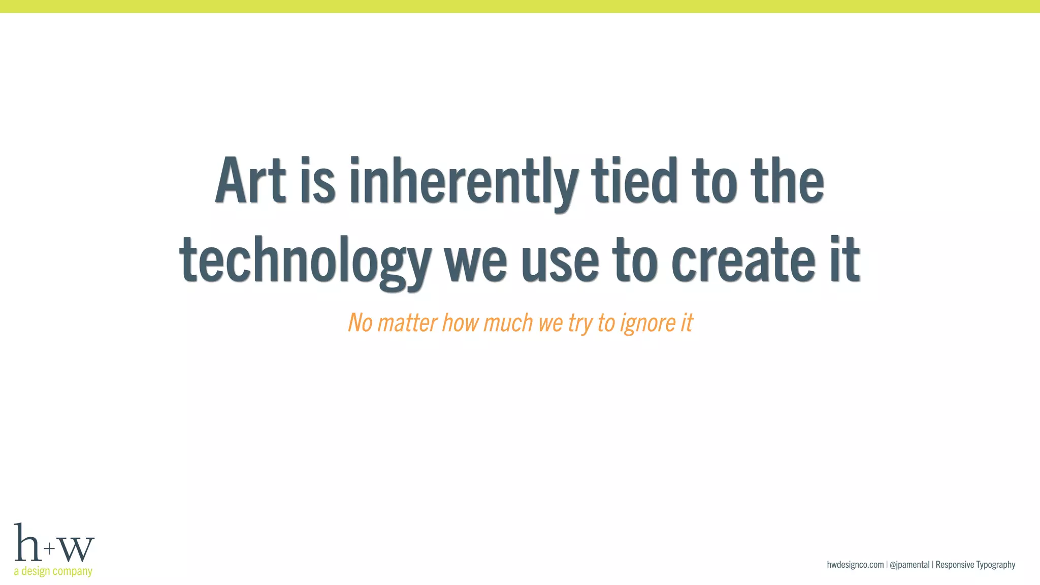
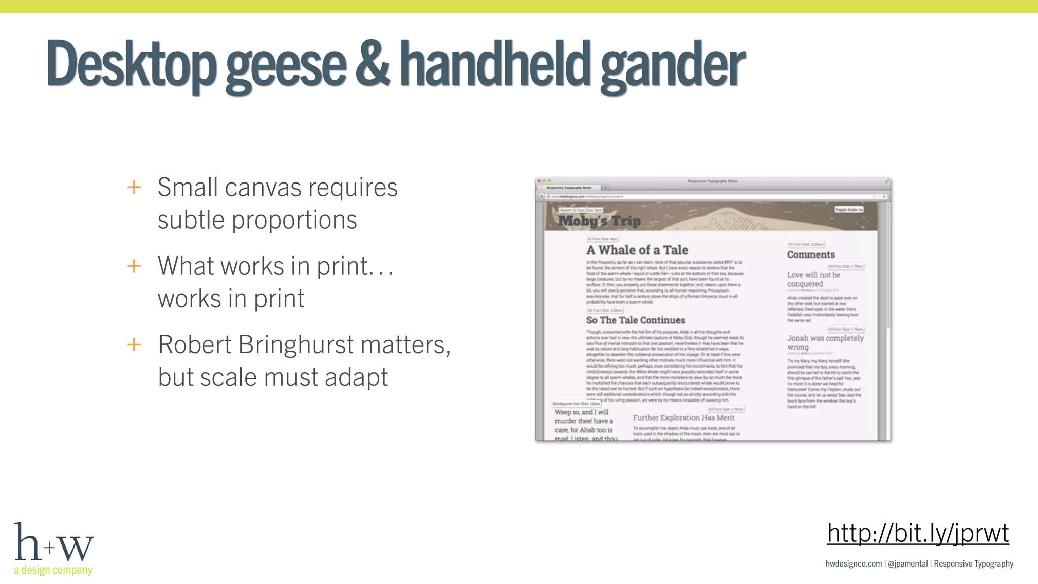
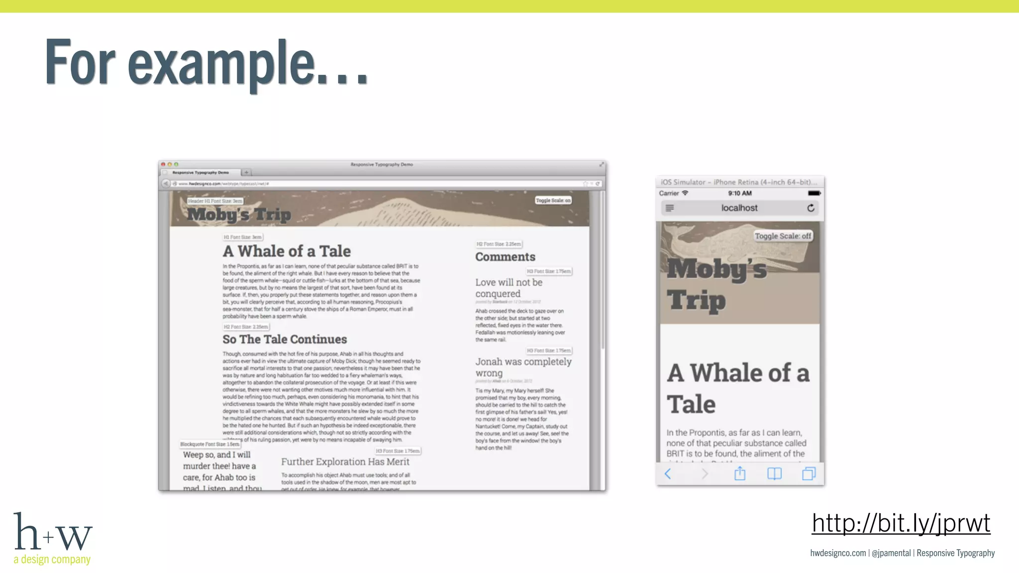
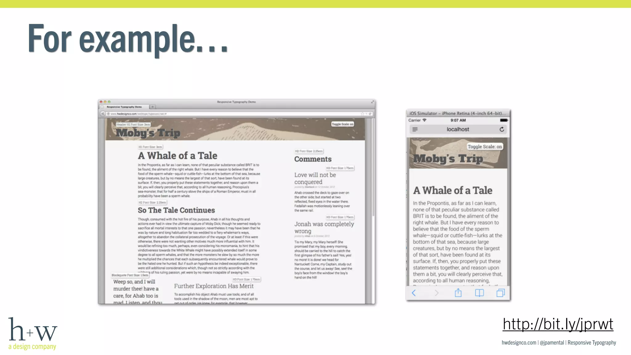
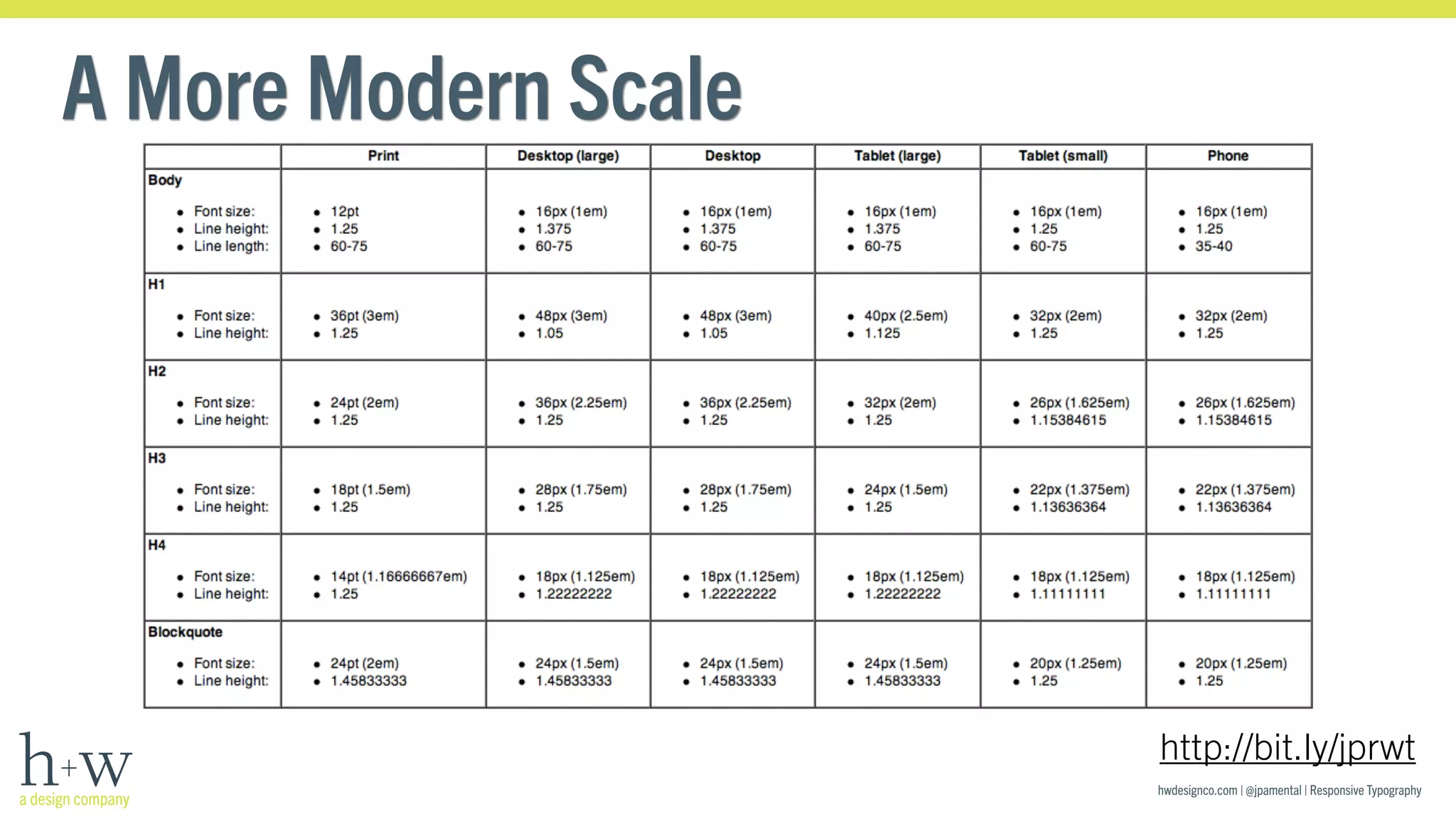
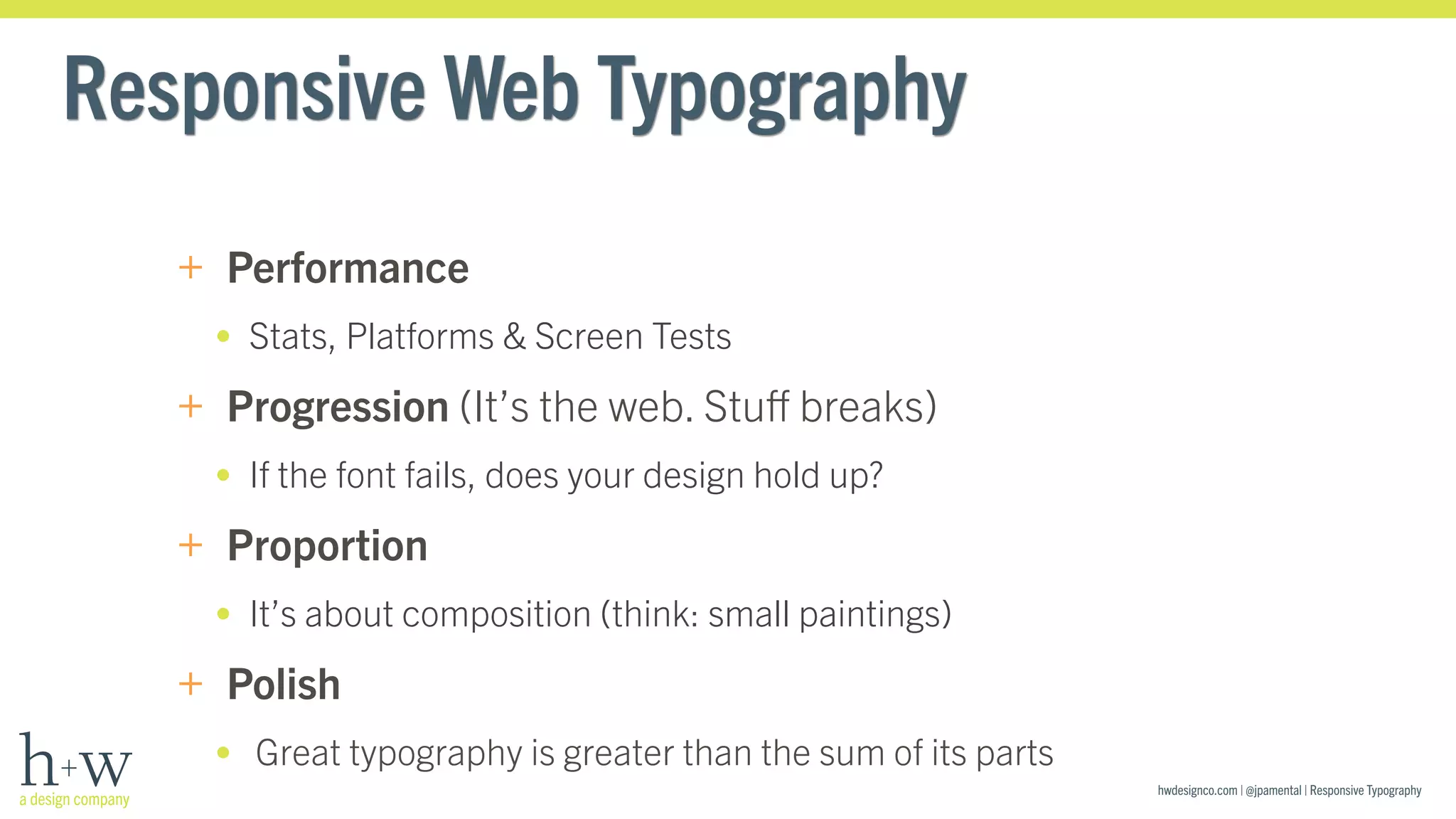
Jason Pamental | @jpamental 
http://hwdesignco.com 
Responsive Typography 
Design for Meaning, Not for Screen Size 
Web Unleashed #WebU2014 
16 September, 2014
hwdesignco.com | @jpamental | Responsive Typography 
+ Built a lot 
of these 
+ Co-parent of 
Who Am I? 
+ Co-founder of 
+ Tinkerer with
hwdesignco.com | @jpamental | Responsive Typography 
What We’ll Cover 
+ Lies & deceptions about art & science 
+ Understanding the value of hats 
+ What is Responsive Typography 
+ Practicing the Four P’s
Art & Science: A Historical Romance 
hwdesignco.com | @jpamental | Responsive Typography 
DaVinci? 
That guy would code 
Vermeer: 
Master or Technician? 
Tim Jenison 
Artist or Inventor?
Is Tim an artist or is Tim an inventor? I 
think the problem is not trying to pick one 
of these things for Tim to be – the problem 
is that we have that distinction 
-Penn Jillette in ‘Tim’s Vermeer’ 
hwdesignco.com | @jpamental | Responsive Typography
Art is inherently tied to the 
technology we use to create it 
hwdesignco.com | @jpamental | Responsive Typography 
No matter how much we try to ignore it
hwdesignco.com | @jpamental | Responsive Typography 
Art+Science
hwdesignco.com | @jpamental | Responsive Typography 
Design+Development
hwdesignco.com | @jpamental | Responsive Typography
When is our industry going stop calling it 
hwdesignco.com | @jpamental | Responsive Typography 
“web” typography? 
@sblakeborough, via twitter
hwdesignco.com | @jpamental | Responsive Typography 
We can’t. 
+ (Insert Ginger Rogers analogy here) 
+ Encompasses all of what you know about type & its use, but 
+ Typography on the web requires additional consideration 
(art & science) 
+ Our canvas is fluid; constantly expanding & contracting 
+ Reading on screens will only increase
hwdesignco.com | @jpamental | Responsive Typography 
Type Is the Voice of Your Words 
+ Words have meaning, but letters have emotion
hwdesignco.com | @jpamental | Responsive Typography 
Type Is the Voice of Your Words 
+ Words have meaning, but letters have emotion 
I love you
hwdesignco.com | @jpamental | Responsive Typography 
Type Is the Voice of Your Words 
+ Words have meaning, but letters have emotion 
I love you
hwdesignco.com | @jpamental | Responsive Typography 
Type Is the Voice of Your Words 
+ Words must first be read before they can be understood
hwdesignco.com | @jpamental | Responsive Typography 
Type Is the Voice of Your Words 
+ Words must first be read before they can be understood 
Four score and seven years ago our fathers brought forth on 
this continent, a new nation, conceived in Liberty, and dedicated 
to the proposition that all men are created equal.
hwdesignco.com | @jpamental | Responsive Typography 
Type Is the Voice of Your Words 
+ Words must first be read before they can be understood 
Four score and seven years ago our fathers brought forth on this 
continent, a new nation, conceived in Liberty, and dedicated to the 
proposition that all men are created equal.
hwdesignco.com | @jpamental | Responsive Typography 
Type Is the Voice of Your Words 
+ Legible means you can read it 
+ Readable means you might actually want to
hwdesignco.com | @jpamental | Responsive Typography 
Type Is the Voice of Your Words 
+ Legible means you can read it 
+ Readable means you might actually want to 
A tale of a curious affliction
hwdesignco.com | @jpamental | Responsive Typography 
Type Is the Voice of Your Words 
+ Legible means you can read it 
+ Readable means you might actually want to 
A tale of a curious affliction
A Design Dilemma: What We Don’t Know 
hwdesignco.com | @jpamental | Responsive Typography 
+ Screen size 
+ Device capabilities 
+ Concurrent activities 
+ Depth of focus 
+ Purpose of visit
hwdesignco.com | @jpamental | Responsive Typography 
Focus on What’s Left: Typography
hwdesignco.com | @jpamental | Responsive Typography 
Focus on What’s Left: Typography
hwdesignco.com | @jpamental | Responsive Typography 
Focus on What’s Left: Typography
hwdesignco.com | @jpamental | Responsive Typography 
Focus on What’s Left: Typography
Responsive Typography: Four Simple Steps 
+ Performance: select fonts with care, load what you need & 
don’t block the page draw 
+ Progressive: plan for failure, tune up the loading process & 
fallback fonts to minimize FOUT 
+ Proportion: small screens demand subtle scale 
+ Polish: Design IS the details: OpenType & then some 
hwdesignco.com | @jpamental | Responsive Typography
hwdesignco.com | @jpamental | Responsive Typography 
Performance
hwdesignco.com | @jpamental | Responsive Typography 
Performance Matters 
+ Great typography isn’t ‘I used all of them’ 
+ Load only what you need 
Trade Gothic Next LT Pro Bold 
this is a typeface this is a font 
+ Each font has a performance cost, so budget wisely
hwdesignco.com | @jpamental | Responsive Typography 
Performance Matters
hwdesignco.com | @jpamental | Responsive Typography 
Performance Matters
hwdesignco.com | @jpamental | Responsive Typography 
Progressive Performance
Progressive Enhancement 
hwdesignco.com | @jpamental | Responsive Typography
hwdesignco.com | @jpamental | Responsive Typography 
FOUT is OUR fault
hwdesignco.com | @jpamental | Responsive Typography 
FOUT is OUR fault
body { font-family: “Trade Gothic”, helvetica, arial; } 
hwdesignco.com | @jpamental | Responsive Typography 
FOUT is OUR fault 
+ Use these: .wf-inactive / .wf-active 
+ This CSS results in a blank screen during load: 
+ Add this & give them content, then fonts: 
.wf-inactive body { font-family: helvetica, arial; } 
+ Adjust font-size, line-height, letter-spacing to avoid jumpiness 
+ Making it easy since 2010
hwdesignco.com | @jpamental | Responsive Typography 
Progressively Enhance 
Web fonts loaded
hwdesignco.com | @jpamental | Responsive Typography 
Progressively Enhance 
No web fonts, uncorrected
hwdesignco.com | @jpamental | Responsive Typography 
Progressively Enhance 
No web fonts, corrected
hwdesignco.com | @jpamental | Responsive Typography 
Progressively Enhance 
Web fonts loaded
Backwards Compatible, Future Friendly 
hwdesignco.com | @jpamental | Responsive Typography
hwdesignco.com | @jpamental | Responsive Typography 
Proportion
hwdesignco.com | @jpamental | Responsive Typography 
Proportion: one size won’t do 
http://bit.ly/jprwt
hwdesignco.com | @jpamental | Responsive Typography 
Desktop geese & handheld gander 
+ Small canvas requires 
subtle proportions 
+ What works in print… 
works in print 
+ Robert Bringhurst matters, 
but scale must adapt 
http://bit.ly/jprwt
hwdesignco.com | @jpamental | Responsive Typography 
For example… 
http://bit.ly/jprwt
hwdesignco.com | @jpamental | Responsive Typography 
For example… 
http://bit.ly/jprwt
hwdesignco.com | @jpamental | Responsive Typography 
A More Modern Scale 
http://bit.ly/jprwt
hwdesignco.com | @jpamental | Responsive Typography 
Polish
hwdesignco.com | @jpamental | Responsive Typography 
Polish: Don’t Forget Fit & Finish
hwdesignco.com | @jpamental | Responsive Typography 
Polish: Don’t Forget Fit & Finish
hwdesignco.com | @jpamental | Responsive Typography 
Polish: Don’t Forget Fit & Finish
Polish: Don’t Leave Orphans Behind 
hwdesignco.com | @jpamental | Responsive Typography 
+ Typogrify FTW: 
http://bit.ly/rt-tpgrfy 
http://bit.ly/drupaltypogrify 
http://bit.ly/rt-tpgrfy-ee 
http://bit.ly/rt-tpgrfy-wp 
+ Also try Widowtamer for JS 
drop-in solution: 
http://bit.ly/rt-widotamer 
+ Seems small, but has oversized 
impact to user & editor
hwdesignco.com | @jpamental | Responsive Typography 
A Little in Abundance is a Lot 
+ Use max-width on elements to keep text readable 
@media (min-width: 58em) { 
p { max-width: 38em; } 
} 
+ CSS3 brings character counts, but not universal 
(vw & vh, ch & cx) 
+ EMs or REMs, but no PX 
+ Don’t forget: use real content! 
Because Lorem Ipsum is a poser
hwdesignco.com | @jpamental | Responsive Typography 
New Tricks 
+ Emerging attributes: font-size-adjust & font-smoothing 
+ The future is here; it’s just not evenly distributed 
+ Try text-rendering engine detection w/font-smoothing 
(http://typerendering.com/ - courtesy of @NiceWebType & @bramstein)
hwdesignco.com | @jpamental | Responsive Typography 
True Life Story
hwdesignco.com | @jpamental | Responsive Typography 
True Life Story 
-webkit-font-smoothing: antialiased; 
-moz-osx-font-smoothing: grayscale;
hwdesignco.com | @jpamental | Responsive Typography 
A Perfect Page 
or at least a far better start
hwdesignco.com | @jpamental | Responsive Typography 
Inspiration
hwdesignco.com | @jpamental | Responsive Typography 
Inspiration 
+ Oversize 2-level header 
+ Stylized subhead 
+ Byline 
+ Large initial cap 
+ Inset photo 
+ Pull-quote
hwdesignco.com | @jpamental | Responsive Typography 
Frustration
hwdesignco.com | @jpamental | Responsive Typography 
A Sneak Peek
hwdesignco.com | @jpamental | Responsive Typography 
Realization 
+ Oversize 2-level header 
+ Stylized subhead 
+ Byline 
+ Large initial cap 
+ Inset photo 
+ Pull-quote 
+ Virtually no markup needed 
+ Fully responsive
hwdesignco.com | @jpamental | Responsive Typography 
Realization
hwdesignco.com | @jpamental | Responsive Typography 
Responsive Web Typography 
+ Yes, it’s a thing 
+ It’s about adapting to screen size, network speed & device 
capabilities 
+ It’s about designing for what’s next 
• Last Winter Olympics: there was no iPad 
• The one before? No iPhone either
hwdesignco.com | @jpamental | Responsive Typography 
Responsive Web Typography 
+ Performance 
• Stats, Platforms & Screen Tests 
+ Progression (It’s the web. Stuff breaks) 
• If the font fails, does your design hold up? 
+ Proportion 
• It’s about composition (think: small paintings) 
+ Polish 
• Great typography is greater than the sum of its parts
“Designers Should Code As Much As 
hwdesignco.com | @jpamental | Responsive Typography 
Artists Should Mix Paint” 
~ Mustafa Kurtuldu (@Mustafa_x) 
FOWD London
hwdesignco.com | @jpamental | Responsive Typography 
Just out! 
http://bit.ly/rwtbook
Jason Pamental | @jpamental 
http://hwdesignco.com 
Thank You 
Jason Pamental (@jpamental) 
! 
Slides: http://bit.ly/jpwebu14 
Code: http://bit.ly/rtwcode

Responsive Typography

  • 1.
    Jason Pamental |@jpamental http://hwdesignco.com Responsive Typography Design for Meaning, Not for Screen Size Web Unleashed #WebU2014 16 September, 2014
  • 2.
    hwdesignco.com | @jpamental| Responsive Typography + Built a lot of these + Co-parent of Who Am I? + Co-founder of + Tinkerer with
  • 3.
    hwdesignco.com | @jpamental| Responsive Typography What We’ll Cover + Lies & deceptions about art & science + Understanding the value of hats + What is Responsive Typography + Practicing the Four P’s
  • 4.
    Art & Science:A Historical Romance hwdesignco.com | @jpamental | Responsive Typography DaVinci? That guy would code Vermeer: Master or Technician? Tim Jenison Artist or Inventor?
  • 5.
    Is Tim anartist or is Tim an inventor? I think the problem is not trying to pick one of these things for Tim to be – the problem is that we have that distinction -Penn Jillette in ‘Tim’s Vermeer’ hwdesignco.com | @jpamental | Responsive Typography
  • 6.
    Art is inherentlytied to the technology we use to create it hwdesignco.com | @jpamental | Responsive Typography No matter how much we try to ignore it
  • 7.
    hwdesignco.com | @jpamental| Responsive Typography Art+Science
  • 8.
    hwdesignco.com | @jpamental| Responsive Typography Design+Development
  • 9.
    hwdesignco.com | @jpamental| Responsive Typography
  • 10.
    When is ourindustry going stop calling it hwdesignco.com | @jpamental | Responsive Typography “web” typography? @sblakeborough, via twitter
  • 11.
    hwdesignco.com | @jpamental| Responsive Typography We can’t. + (Insert Ginger Rogers analogy here) + Encompasses all of what you know about type & its use, but + Typography on the web requires additional consideration (art & science) + Our canvas is fluid; constantly expanding & contracting + Reading on screens will only increase
  • 12.
    hwdesignco.com | @jpamental| Responsive Typography Type Is the Voice of Your Words + Words have meaning, but letters have emotion
  • 13.
    hwdesignco.com | @jpamental| Responsive Typography Type Is the Voice of Your Words + Words have meaning, but letters have emotion I love you
  • 14.
    hwdesignco.com | @jpamental| Responsive Typography Type Is the Voice of Your Words + Words have meaning, but letters have emotion I love you
  • 15.
    hwdesignco.com | @jpamental| Responsive Typography Type Is the Voice of Your Words + Words must first be read before they can be understood
  • 16.
    hwdesignco.com | @jpamental| Responsive Typography Type Is the Voice of Your Words + Words must first be read before they can be understood Four score and seven years ago our fathers brought forth on this continent, a new nation, conceived in Liberty, and dedicated to the proposition that all men are created equal.
  • 17.
    hwdesignco.com | @jpamental| Responsive Typography Type Is the Voice of Your Words + Words must first be read before they can be understood Four score and seven years ago our fathers brought forth on this continent, a new nation, conceived in Liberty, and dedicated to the proposition that all men are created equal.
  • 18.
    hwdesignco.com | @jpamental| Responsive Typography Type Is the Voice of Your Words + Legible means you can read it + Readable means you might actually want to
  • 19.
    hwdesignco.com | @jpamental| Responsive Typography Type Is the Voice of Your Words + Legible means you can read it + Readable means you might actually want to A tale of a curious affliction
  • 20.
    hwdesignco.com | @jpamental| Responsive Typography Type Is the Voice of Your Words + Legible means you can read it + Readable means you might actually want to A tale of a curious affliction
  • 21.
    A Design Dilemma:What We Don’t Know hwdesignco.com | @jpamental | Responsive Typography + Screen size + Device capabilities + Concurrent activities + Depth of focus + Purpose of visit
  • 22.
    hwdesignco.com | @jpamental| Responsive Typography Focus on What’s Left: Typography
  • 23.
    hwdesignco.com | @jpamental| Responsive Typography Focus on What’s Left: Typography
  • 24.
    hwdesignco.com | @jpamental| Responsive Typography Focus on What’s Left: Typography
  • 25.
    hwdesignco.com | @jpamental| Responsive Typography Focus on What’s Left: Typography
  • 26.
    Responsive Typography: FourSimple Steps + Performance: select fonts with care, load what you need & don’t block the page draw + Progressive: plan for failure, tune up the loading process & fallback fonts to minimize FOUT + Proportion: small screens demand subtle scale + Polish: Design IS the details: OpenType & then some hwdesignco.com | @jpamental | Responsive Typography
  • 27.
    hwdesignco.com | @jpamental| Responsive Typography Performance
  • 28.
    hwdesignco.com | @jpamental| Responsive Typography Performance Matters + Great typography isn’t ‘I used all of them’ + Load only what you need Trade Gothic Next LT Pro Bold this is a typeface this is a font + Each font has a performance cost, so budget wisely
  • 29.
    hwdesignco.com | @jpamental| Responsive Typography Performance Matters
  • 30.
    hwdesignco.com | @jpamental| Responsive Typography Performance Matters
  • 31.
    hwdesignco.com | @jpamental| Responsive Typography Progressive Performance
  • 32.
    Progressive Enhancement hwdesignco.com| @jpamental | Responsive Typography
  • 33.
    hwdesignco.com | @jpamental| Responsive Typography FOUT is OUR fault
  • 34.
    hwdesignco.com | @jpamental| Responsive Typography FOUT is OUR fault
  • 35.
    body { font-family:“Trade Gothic”, helvetica, arial; } hwdesignco.com | @jpamental | Responsive Typography FOUT is OUR fault + Use these: .wf-inactive / .wf-active + This CSS results in a blank screen during load: + Add this & give them content, then fonts: .wf-inactive body { font-family: helvetica, arial; } + Adjust font-size, line-height, letter-spacing to avoid jumpiness + Making it easy since 2010
  • 36.
    hwdesignco.com | @jpamental| Responsive Typography Progressively Enhance Web fonts loaded
  • 37.
    hwdesignco.com | @jpamental| Responsive Typography Progressively Enhance No web fonts, uncorrected
  • 38.
    hwdesignco.com | @jpamental| Responsive Typography Progressively Enhance No web fonts, corrected
  • 39.
    hwdesignco.com | @jpamental| Responsive Typography Progressively Enhance Web fonts loaded
  • 40.
    Backwards Compatible, FutureFriendly hwdesignco.com | @jpamental | Responsive Typography
  • 41.
    hwdesignco.com | @jpamental| Responsive Typography Proportion
  • 42.
    hwdesignco.com | @jpamental| Responsive Typography Proportion: one size won’t do http://bit.ly/jprwt
  • 43.
    hwdesignco.com | @jpamental| Responsive Typography Desktop geese & handheld gander + Small canvas requires subtle proportions + What works in print… works in print + Robert Bringhurst matters, but scale must adapt http://bit.ly/jprwt
  • 44.
    hwdesignco.com | @jpamental| Responsive Typography For example… http://bit.ly/jprwt
  • 45.
    hwdesignco.com | @jpamental| Responsive Typography For example… http://bit.ly/jprwt
  • 46.
    hwdesignco.com | @jpamental| Responsive Typography A More Modern Scale http://bit.ly/jprwt
  • 47.
    hwdesignco.com | @jpamental| Responsive Typography Polish
  • 48.
    hwdesignco.com | @jpamental| Responsive Typography Polish: Don’t Forget Fit & Finish
  • 49.
    hwdesignco.com | @jpamental| Responsive Typography Polish: Don’t Forget Fit & Finish
  • 50.
    hwdesignco.com | @jpamental| Responsive Typography Polish: Don’t Forget Fit & Finish
  • 51.
    Polish: Don’t LeaveOrphans Behind hwdesignco.com | @jpamental | Responsive Typography + Typogrify FTW: http://bit.ly/rt-tpgrfy http://bit.ly/drupaltypogrify http://bit.ly/rt-tpgrfy-ee http://bit.ly/rt-tpgrfy-wp + Also try Widowtamer for JS drop-in solution: http://bit.ly/rt-widotamer + Seems small, but has oversized impact to user & editor
  • 52.
    hwdesignco.com | @jpamental| Responsive Typography A Little in Abundance is a Lot + Use max-width on elements to keep text readable @media (min-width: 58em) { p { max-width: 38em; } } + CSS3 brings character counts, but not universal (vw & vh, ch & cx) + EMs or REMs, but no PX + Don’t forget: use real content! Because Lorem Ipsum is a poser
  • 53.
    hwdesignco.com | @jpamental| Responsive Typography New Tricks + Emerging attributes: font-size-adjust & font-smoothing + The future is here; it’s just not evenly distributed + Try text-rendering engine detection w/font-smoothing (http://typerendering.com/ - courtesy of @NiceWebType & @bramstein)
  • 54.
    hwdesignco.com | @jpamental| Responsive Typography True Life Story
  • 55.
    hwdesignco.com | @jpamental| Responsive Typography True Life Story -webkit-font-smoothing: antialiased; -moz-osx-font-smoothing: grayscale;
  • 56.
    hwdesignco.com | @jpamental| Responsive Typography A Perfect Page or at least a far better start
  • 57.
    hwdesignco.com | @jpamental| Responsive Typography Inspiration
  • 58.
    hwdesignco.com | @jpamental| Responsive Typography Inspiration + Oversize 2-level header + Stylized subhead + Byline + Large initial cap + Inset photo + Pull-quote
  • 59.
    hwdesignco.com | @jpamental| Responsive Typography Frustration
  • 60.
    hwdesignco.com | @jpamental| Responsive Typography A Sneak Peek
  • 61.
    hwdesignco.com | @jpamental| Responsive Typography Realization + Oversize 2-level header + Stylized subhead + Byline + Large initial cap + Inset photo + Pull-quote + Virtually no markup needed + Fully responsive
  • 62.
    hwdesignco.com | @jpamental| Responsive Typography Realization
  • 63.
    hwdesignco.com | @jpamental| Responsive Typography Responsive Web Typography + Yes, it’s a thing + It’s about adapting to screen size, network speed & device capabilities + It’s about designing for what’s next • Last Winter Olympics: there was no iPad • The one before? No iPhone either
  • 64.
    hwdesignco.com | @jpamental| Responsive Typography Responsive Web Typography + Performance • Stats, Platforms & Screen Tests + Progression (It’s the web. Stuff breaks) • If the font fails, does your design hold up? + Proportion • It’s about composition (think: small paintings) + Polish • Great typography is greater than the sum of its parts
  • 65.
    “Designers Should CodeAs Much As hwdesignco.com | @jpamental | Responsive Typography Artists Should Mix Paint” ~ Mustafa Kurtuldu (@Mustafa_x) FOWD London
  • 66.
    hwdesignco.com | @jpamental| Responsive Typography Just out! http://bit.ly/rwtbook
  • 67.
    Jason Pamental |@jpamental http://hwdesignco.com Thank You Jason Pamental (@jpamental) ! Slides: http://bit.ly/jpwebu14 Code: http://bit.ly/rtwcode