Download to read offline

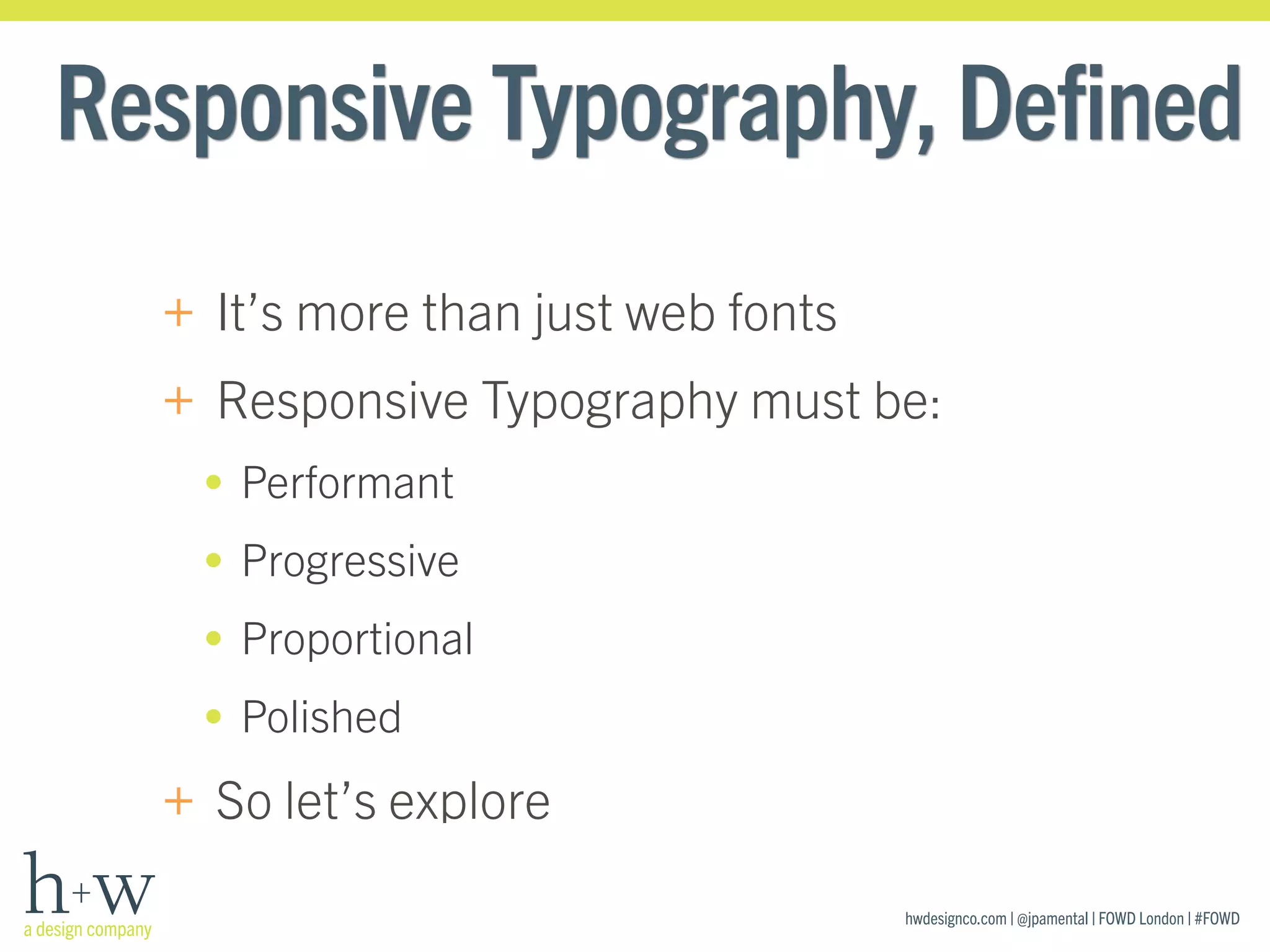
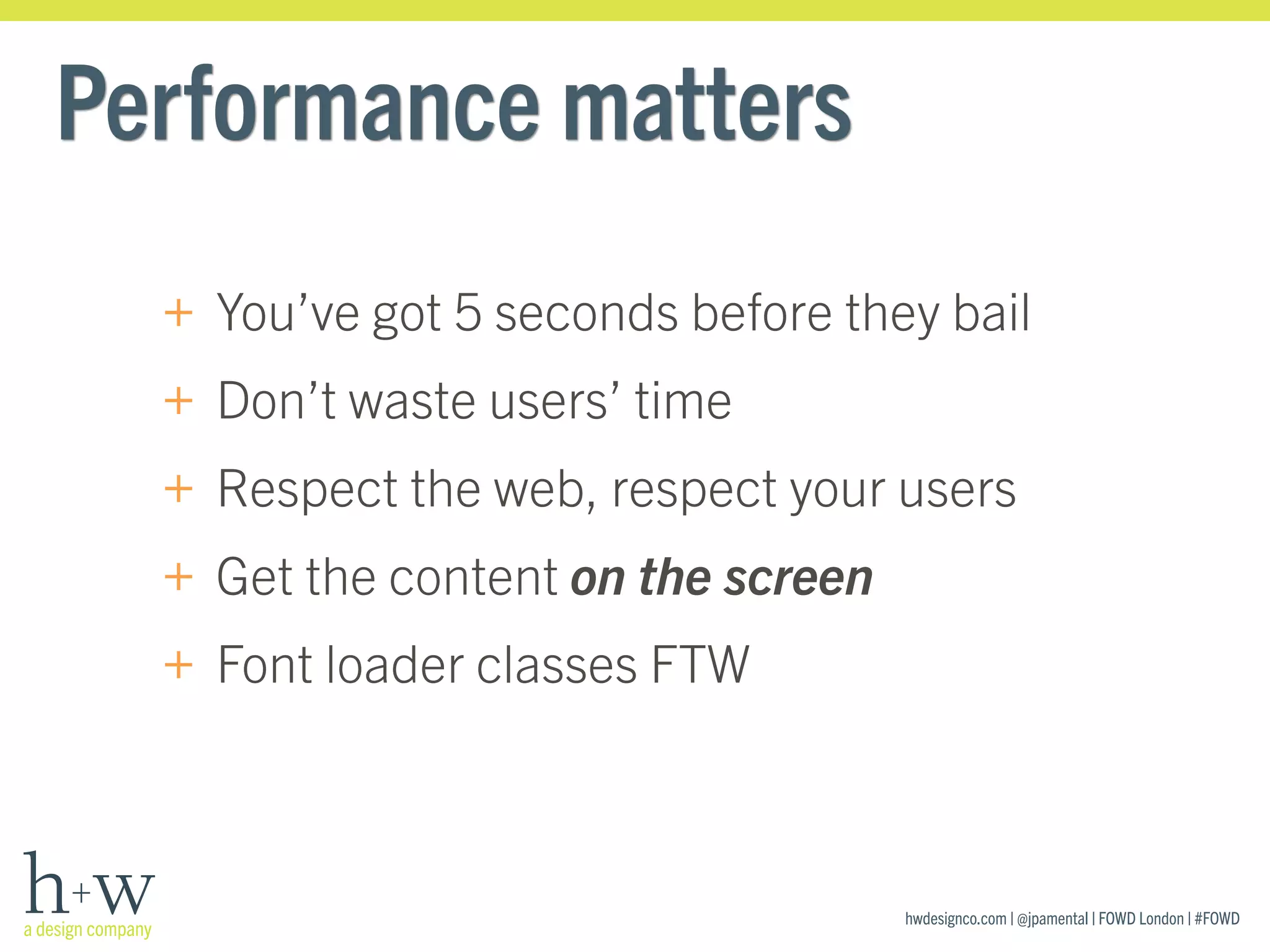
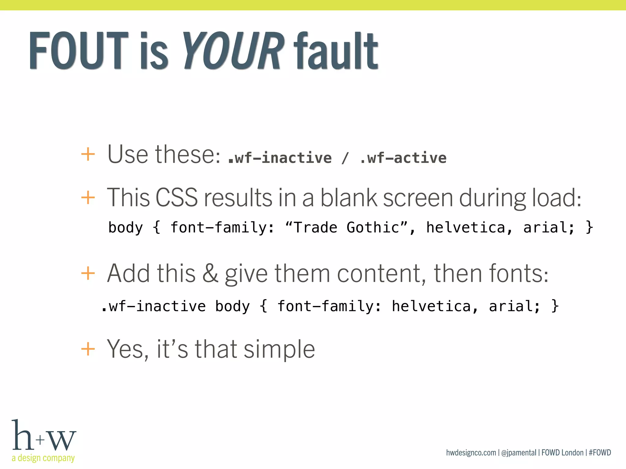
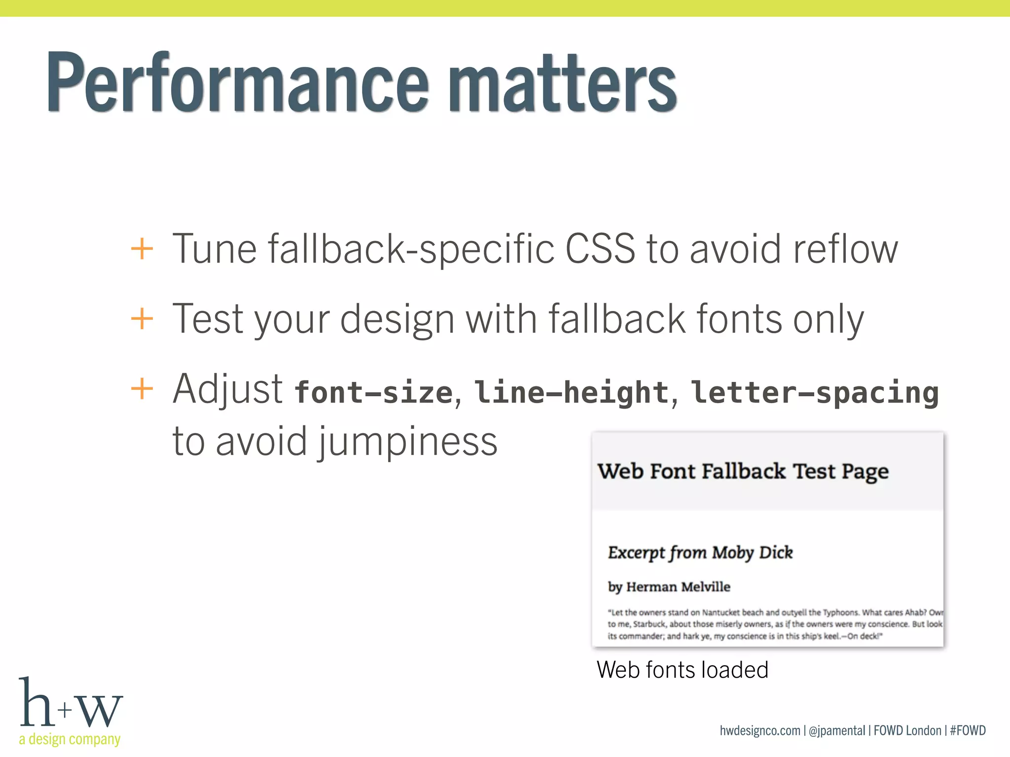

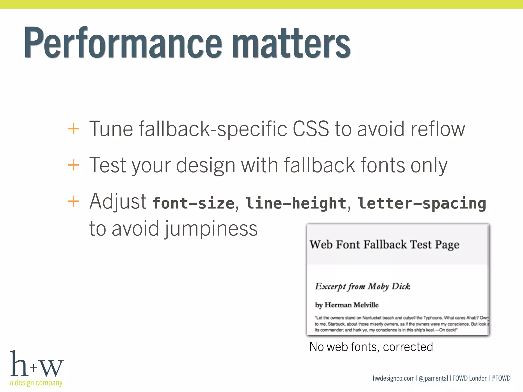
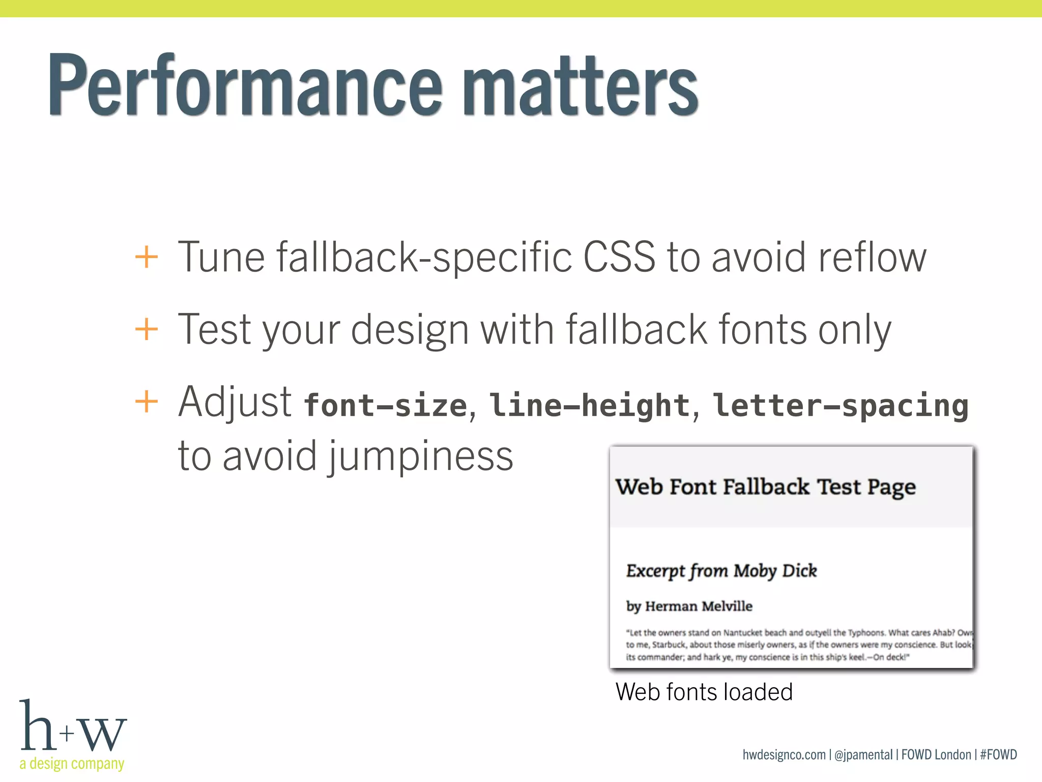
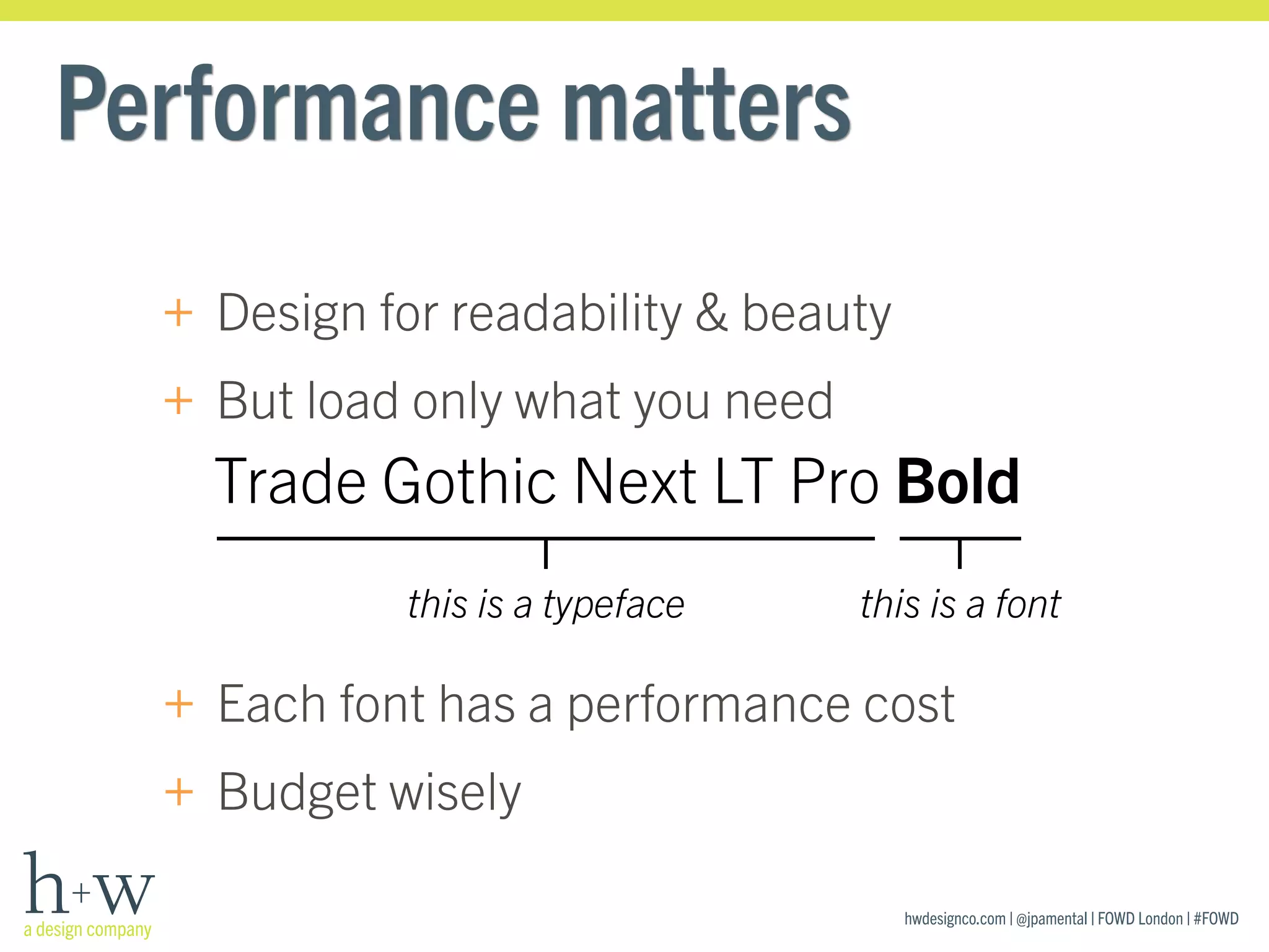
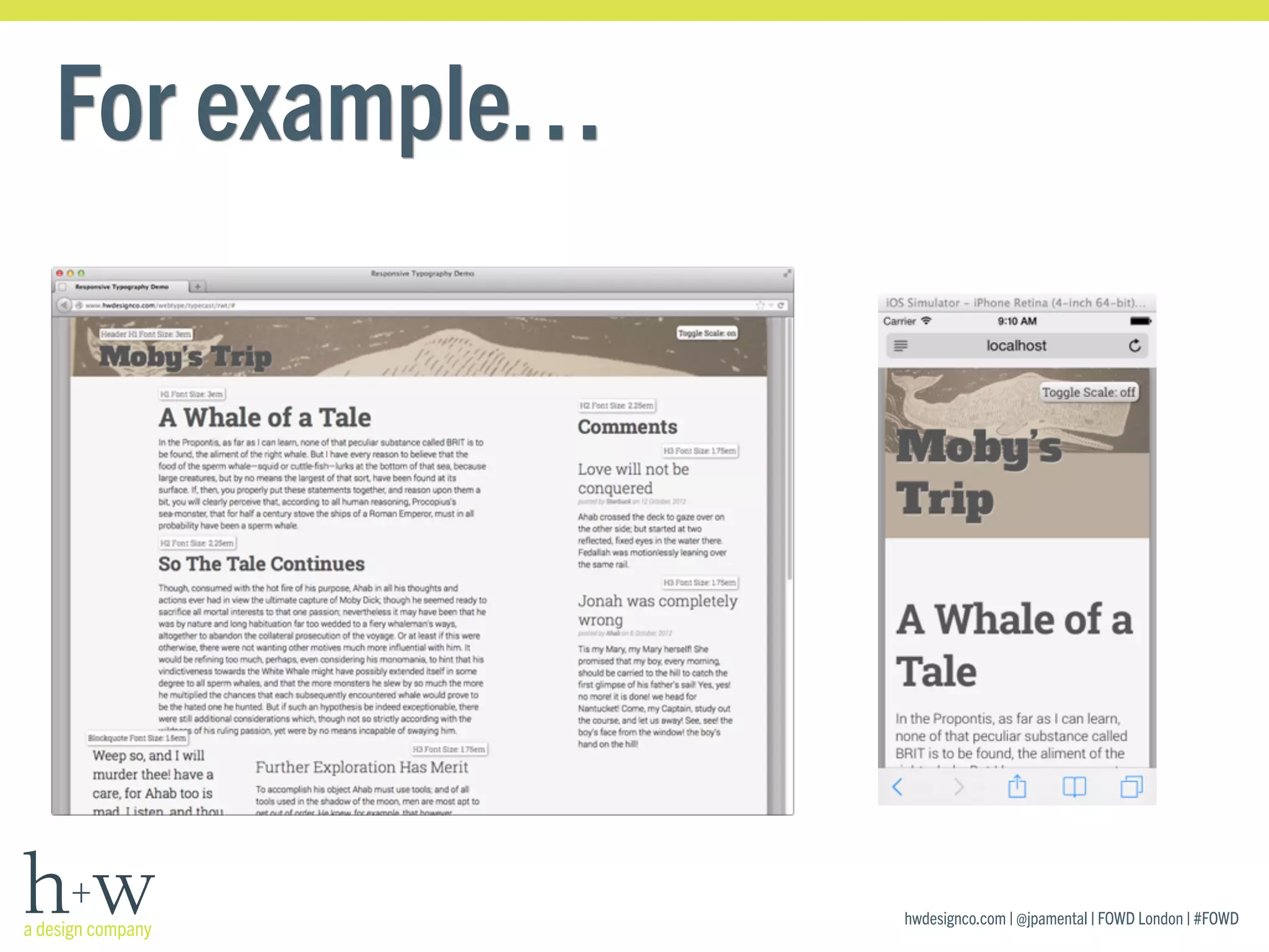
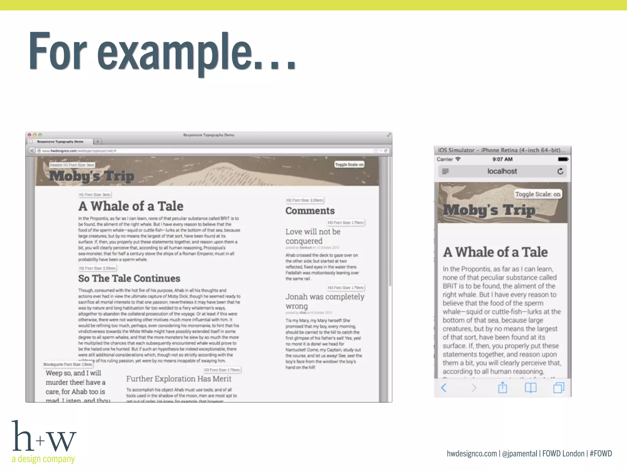
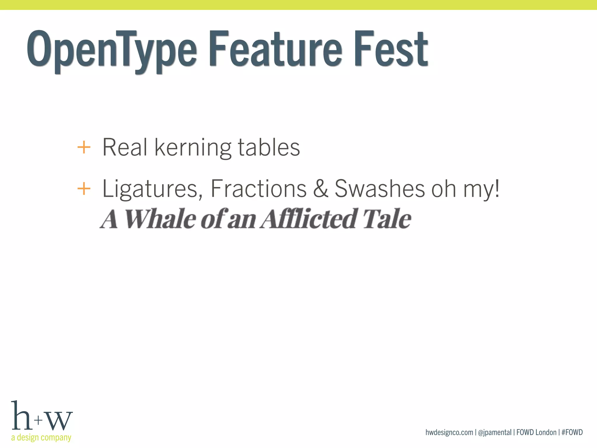

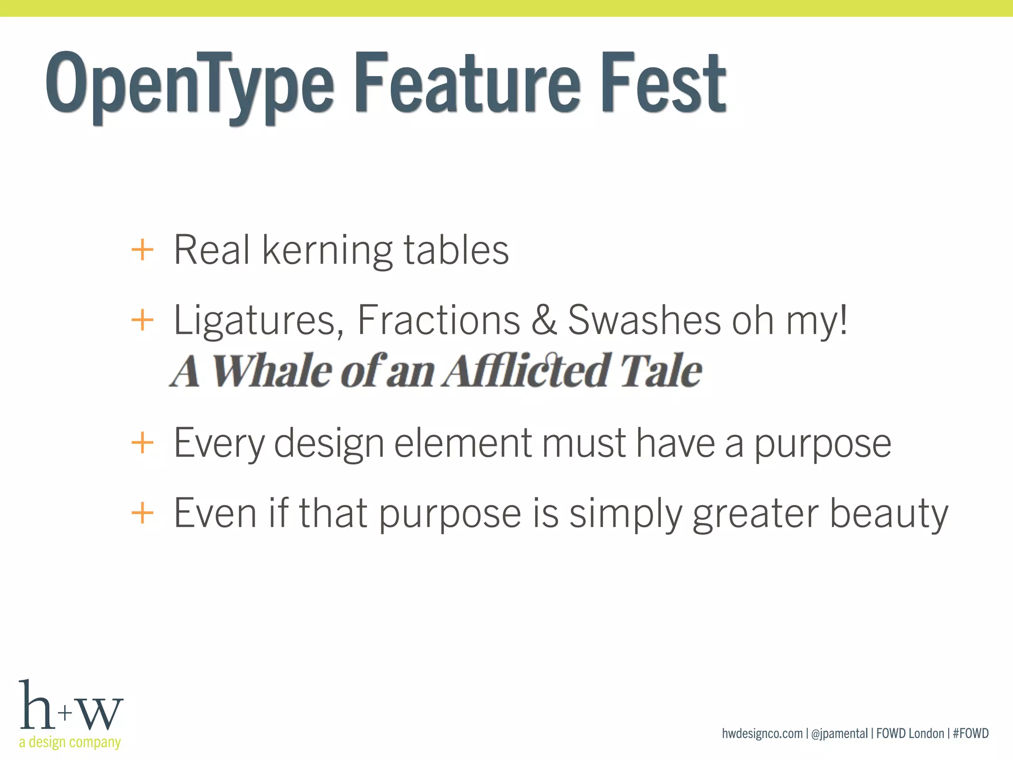

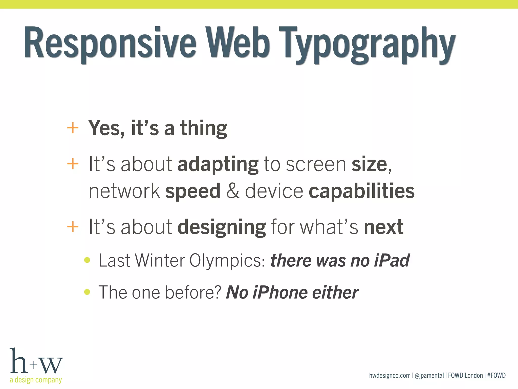
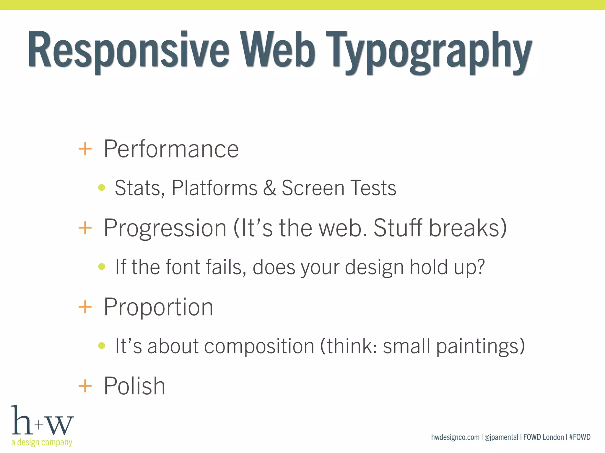

The document discusses responsive typography for web design. It defines responsive typography as designing type that is performant, progressive, proportional, and polished for different screen sizes and devices. It provides tips for improving type performance, progressively enhancing type, using proportional type scaling across devices, and polishing type details. The presentation encourages testing type across different environments and platforms, and using techniques like modular scaling, web fonts, and OpenType features to create responsive typography.


