The document analyzes the front covers of several music magazines, including NME, Kerrang, and their target audiences and histories. For the NME September 2009 cover featuring Dizzee Rascal, the analysis notes the use of his off-center image and facial expression to convey excitement. It also examines design elements like headers, color schemes, and images used across magazine covers to attract readers and convey the type of music content inside. A brief history of each magazine's founding and focus on certain genres is also provided.
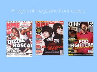
3. FRONT COVER ANALYSIS THE MASTHEAD THE HEADER ‘ ‘autumn tour special’ in bold makes it eye catching so the audience notice it. Also by mentioning other bands it will appeal to their target audience so the buyer will know what genre music NME is about THE MAIN IMAGE Off centre and almost gives the impression he is jumping out of the magazine which gives a sense of chaos and excitement. Facial expression – shows he has a happy attitude and almost welcoming to the reader and by staring directly at the audience it shows that this edition of NME is full of fun, interesting stories and makes the audience want to buy it THE MAIN COVER LINE The main cover line is slanted which again gives the impression that Dizzie Rascal is exciting, young, one to watch and also has a rebellious side as it different from other headlines. Also the word ‘dizzie’ almost jumps out at the reader so therefore it will get their attention for potential buyers. THE FOOTER By mentioning other bands it will appeal to their target audience so the buyer will know what genre music NME is about. Also it will make is seem like NME is well worth the money as it mentions a whole spectrum of different music from ‘Jay –Z’ to ‘paramore’ BACKGROUND The background shows graffiti which is very vibrant and has a lot going on gives the impression that Dizzie Rascal is the same. Also by using graffiti it gives an rebellious side of Dizzie and links in with his urban music however it still gives the impression to the audience that he is friendly. Bold, capital writing on the left hand side can be easily recognised by the buyer. NME – suggests that it is a enemy and implies that this magazine is different from the rest and gives the impression of attitude
4. Front cover analysis BARCODE /PRICE/ISSUE Barcode - important to the magazine as they can collect certain data from it for example circulation figures and who is buying their magazine Position – not many focus however the reader can still read it and see if that is the latest edition Issue and price – by using loads of headers and mention other bands it may suggest that the magazine is good value for money and the issue makes the reader know if it is the latest edition USE OF A FLASHER- grabs the readers attention and shows that they have to buy the magazine to find out more about the ‘pavement reunion’ as NME is the only place to have that story RULE OF THIRDS/THE LEFT THIRD The left third shows the key information and the left third shows the use of a pull quote. The pull quote entices the reader as they will want to find out why he is ‘spreading joy around the world’ so therefore will want to buy the magazine. Also the use of an exclamation mark shows that it is an exciting story and gives the impression that his music is going to revolutionary and only NME has the story. THE HEADER ‘autumn tour special’ in bold makes it eye catching so the audience notice it. Also by mentioning other bands it will appeal to their target audience so the buyer will know what genre music NME is about
5. Target Audience of NME According to NME’s media pack, most people who buy their magazine are young males so therefore a lot of the artists and news mentioned will have to link in their target audience. Also most people who buy their magazine are middle class so therefore they can afford £2.20 a week. Most people who buy NME are going to be very passionate about music (80% of readers say it is an important part of their lives) so therefore NME will have to respect that and fulfil their need for music albums, gossip, interviews and news.
9. Magazine Analysis NME MASTHEAD - NME is always in the left hand corner and the colours used are always red, white with bold black outline which are used issue after issue which helps develop brand identity and is easily recognised by buyers and grabs potential buyers attention. NME- new musical express suggests this magazine is different from the rest by using the word ‘new’ .also it’s short, snappy and sounds similar to the word enemy which implies that this magazine has a different attitude. Main image – Eyes – focused on the audience which grabs the reader’s attention Clothes – Black coats contrasted with the white text and the white background again makes the magazine stand out on the shelf. Also by them wearing black it is in keeping of their black, red and white colour scheme. Serious facial expressions – suggests that as they are a new band they should be taken seriously and are a force to be reckoned with. Main sell line / cover line - ‘first major interview’ suggest it is an exclusive and only NME will have their scope so therefore it will get the readers attention as they will want them to find out what their interview is about before everyone else The callout – ‘I was worries the monkeys would think id hand an affair’ – could be quite shocking and almost acts as a tease/spoiler so people would want to read the rest of the story. Also the word ‘monkeys’ suggests that their buyers should know that it’s a colloquial term for arctic monkeys and Alex Turner is the lead singer of them Capital letters and the fact it takes up most of the cover suggests its importance and how this issue of NME is not to be missed .
10. Magazine Analysis NME Bar code, date/issue and price Position – not main focus however does still keep with the rest of the colour theme Bar code – important as it shows the circulation figures and who is buying their magazine Issue – so the customer knows that they are getting the latest edition price – suggests that after seeing the front cover they will think its good value for money Header shows the genre of music that NME ‘indie/alternative’ is specialising in and may suggest that their target audience should care about ‘Franz Ferdinand’ and the ‘Courteeners’ being in the studio and working on their albums. Rules of thirds - Left third – mentions other band to attract and entice the reader. It is extras after they have read the main focus on the last of the shadow puppets. the red font stands out and the colour red suggests passion for the music. The black text is less dominate than the red however that is the way it is meant to be as it only gives some extra details on the articles Head line ’12 new bands we have found for you’ personalises the magazine to the audience and gives the impression that they have made and that article / magazine is just for you Flashers – Suggests the audience has to buy the magazine to find out more. cluttered suggests that you are getting a lot for your money
13. Magazine Analysis Kerrang Bar code, date/issue and price Position – not main focus however does still keep with the rest of the colour theme Bar code – important as it shows the circulation figures and who is buying their magazine Issue – so the customer knows that they are getting the latest edition price – suggests that after seeing the front cover they will think its good value for money Main sell line The main sell line is all in capitals which suggests that the Foo Fighters being back is very important and need to be seen Not a lot of sell lines – little information which entices the reader to buy the magazine and find out about their tour as they will only find it out in kerrang ‘uk tour exclusive’ ‘Foo’ almost jumps out to the audience to grab their attention and the fact ‘back to blow your mind’ is slanted it creates an element of excitement as if the reader NEEDS to know why they are going to blow their mind.