Beyond the EU: DORA and NIS 2 Directive's Global Impact
Brand identity and target audience analysis
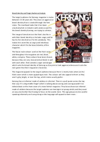
1. Brand Identity and Target Audience Analysis
The target audience for Kerrang magazine is males
between 15-30 years old. They have an aggressive
brand identity that is created through the font
styles. The masthead looks like it has been
smashed which is linked in with violence and fits
the brand identity Kerrang are trying to achieve.
The image of Jared Leto on the front also fits in
with their brand identity as he looks angry and he
has his fist clenched as if to hit somebody. This
makes him seem like an angry and rebellious
character which fits the brand identity of the
magazine.
The house style colours used on the front cover
and throughout the magazine are red, black,
white, and grey. These colours have been chosen
because they are very masculine but blend in well
with each other. Red connotes anger and danger
which suits the brand identity of Kerrang as they aim to look aggressive because it suits the
rock genre that their magazine is based on.
The magazine appeals to the target audience because there is mainly male artists on the
front cover which is more appealing to men. The colours will also appeal to them as they
aren’t girly, bright, or over the top, which males usually prefer.
Kerrang has an informal mode of address is informal. There is a pull quote across the top
that says ‘It’s a big middle finger’ which is talking about cursing and cursing wouldn’t be
talked about on the front cover of a more formal magazine. They have chosen an informal
mode of address because the target audience are teenagers to young adults and they want
an easy read rather than having to focus on the words more. This age group are also used to
speaking informally and using slang so this language will appeal to them more.
2. The clear informal mode of address is also seen on this page as the images look like they
have been stuck up with sticky tape which teenagers usually do with their posters – showing
that the magazine is aimed at 15-30 year olds because that is something they would do.
There is also more informal text on the page which sticks with the informal mode of
address. There is another pull quote, this time from Tyson Ritter (lead singer of The All
American Rejects) who says ‘I was tripping balls!’ which is clearly informal as it would be
inappropriate use of language on a more formal magazine or a magazine aimed at older
people as they wouldn’t be used to speaking like that.
The house style continues onto this page as there is a lot of black and red, however to make
the page a bit different they have replaced white with pink. This may not appeal to the
target audience as pink is associated more with girls and is a very feminine colour that isn’t
suited to the magazine genre as it connotes love and passion.
Black connotes power and black is used as one of the house style colours suggesting that
the magazine is a powerful one and the artists within it are also very powerful.
The mode of address is also informal because of the body language of the band in the
images. They are being very playful on the main image and the other ones are natural
photos and not posed which makes it more informal.
3. The house style colours are also on this
page and the main red is used on the
Metallica advert which suggests that
Metallica are an aggressive band
because red connotes anger and
danger.
The mode of address is informal
because of the words used. They use
the word ‘kill’ on an advert which
suggests that Metallica are a violent
band which suits the genre of the
magazine because violence is often
associated with the rock genre.
The image of Metallica makes the band
look very aggressive and scary. This
links to the brand identity of the
magazine as the whole magazine looks
very manly and aggressive and the
males in this picture suit that brand
identity.