
Recommended
More Related Content
What's hot
What's hot (19)
Similar to Music magazine contents analysis
Similar to Music magazine contents analysis (20)
More from asmediag12
More from asmediag12 (20)
Music magazine contents analysis
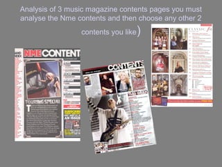
- 1. Analysis of 3 music magazine contents pages you must analyse the Nme contents and then choose any other 2 contents you like )
- 2. Analysis of magazine Contents pages Contents 1.NME Sept 2009 Dizzee Rascal Edition Band index Contents title Page numbers Images Columns Advertisements
- 3. Contents page NME (SEPT 2009) ANALYSIS NME MASTHEAD SAME COLOUR CODE AS FRONT TO SHOW THEIR BANNER PROFESSIONALISM AT TOP Main image has been purposely taken like DATE that as its showing a rockstar looking women in front of a SUB HEADING tour bus BLOCKED OUT Bands are listed in INTO BLACK red with page SUB SECTIONS number in black BRIEF HEADING +SUMMARY OF Image is edited so it CONTENT WITH looks like a photograph. This is PAGE NUMBER IN appropriate RED because it links in with the text beneath it. So this PREVIOUS/FUTURE could look like a EDITIONS OF NME ARE sort of blog, an SHOWN WITH DETAILS update of what the OF WEBSITE/PHONE popstar has been NUMBER ETC SO THEIR up to recently AUDIENCE CAN BE THE FIRST TO KNOW AND Editiors introduction to contents of magazine NOT HAVE TO WAIT
- 4. ANALYSIS OF LAYOUT/DESIGN FEATURES OF CONTENTS PAGE MASTHEAD AND WORD CONTENTS – BOLD AT TOP WITH DATE/ISSUE NUMBER BANDS LISTED WITH PAGE REFERENCES SUB- Image HEADING OF WHAT WILL BE IN THE MAGAZINE A QUICK SHORT RECAP OF WHAT AN ARTIST HAS BEEN UP TO LATELY, MAYBE ANNOUCING TOUR DATES OR TALKING ABOUT ADVERTISMENTS TO THEIR TOUR PERSUADE THE READER TO SUBSCRIBE AND GET ALL THEIR LATEST MAGAZINES
- 5. ANALYSIS OF CONTENTS PAGE 1 (Title/date of magazine analysed) The title on the content page is placed right at the top dominating the row, so that it is clear for their targeted audience to see. Its in red because its representing the color scheme as red is used thought the magazine especially on the front cover The date is just underneath the title, which you can clearly see contrasting with a black box. This is important because the audience will be expecting an update on their favorite artist
- 6. ANALYSIS OF LAYOUT CONTENTS PAGE 1 • The layout of the contents page is very clear as you straightway know what where things are placed as its displayed very professionally and isn’t messy. • At the top the title dominates that whole row which is important as it’s the name of the magazine and also to know that this is the content page. On the left is a list of artists that appeal to the genre and to the audience, the middle section is of an artist that discusses what she’s been up to lately and on the right side is what will be included in the magazine, what articles will be featured.
- 7. ANALYSIS OF CONTENTS PAGE 2 This contents page features a light red (Title/date of magazine analysed back round with a large The title of 'v' positioned directly magazine above the main image. Date The letter V is designed to stand out The word contents is broken up more than the other which enables it to take up a writing as the letter V bigger proportion of the stands for vibe which is magazine to draw the readers the name of the attention to the fact that it is a magazine contents page. The content of what will Main image in the middle but near be featured in the the bottom of the page of a male hip magazine, the font hop artist which links in with the style is different to the theme style of the “contents” this is more girly, which could suggest its aimed for both genders and not just men The contents page shows six features of the magazine and enables the audience to know Page number and what to expect in the date in the footer magazine and what page to expect it on.
- 8. Analysis of layout contents page 2 Name of magazine/ date Contents title What will be included in the magazine Main image Date and the publisher