1. Salford City College
Eccles Centre
AS Media Studies
Foundation Portfolio
Amy Fogarty
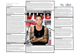
Masthead
The main head is “VIBE” that spreads across the full top of
the cover. The masthead is all in capital letters with the
colour black that then fades into the colour red. The use of
the red and black ties in with the genre of the music of the
magazine R&B and the main cover image artist genre of
music hip-hop and rap.
House Style
the colours used on the cover are red, black, and grey and white these colours are
associated with the genre of music hip-hop and rap. This shows that the colours have been
used to clearly link in with Eminem again to reinforce that he is the main focus of the issue.
The colours suggest that the magazine is aimed more towards a male audience as red is
associated more with males. The colours are quite deep which is also associated with rap
and hip-hop as it is usually dark and deep as their lyrics are usually written from their
personal experiences.
Main image
the main cover image is the main centre of attention and
also the unique selling point of the magazine. Immediately
the audience can identify the international American rapper
Eminem. He will automatically attract a wide range of
different audiences but may mainly attract male audiences
as his music is mainly aimed at male audiences. The
proxemics of Eminem suggest that he is tough with the way
he is directly addressing the camera and audience. He also
has his arms crossed also enforcing his tough rap image
along with his two arms full of tattoos. He has a tattoo of a
little girl which may suggest he has a daughter suggesting he
may be a family man, he is also wearing a necklace with a
cross on also suggesting he is a religious man too. The main
cover image is an extremely stereotypical representation of
a rapper making it easy for the audience to identify the
genre of the issue of the magazine. The main cover image
of Eminem dominates the cover of the magazine.
Typefaces
all the text used on the cover are easy to read, in bold and
capital letters. The font used is sans serif meaning it is
easier for the audience to read and may be a reason as why
people buy the issue. All the text fits well on the page and
also fills up the cover so it looks like there is a lot of content
within the magazine and surrounds the main cover image
to show that Eminem is still the main focus of the issue.
Photography Lighting
the cover uses quite high key lighting on the main cover
image which contrasts with paleness of the background
while also managing to contrast with the darker colours of
the cover lines, main cover lines and mast head. this makes
the image of Eminem stand out even more. The clean and
high lightning on the main cover image of Eminem may
suggest that this is his new image, he’s finally clean and
that his image should clearly show his achievement.
Model credit
the model credit suggests that he no longer does drugs and
anything that could result in his death. He almost appealing
to the audience, he trying to tell them he is a new man and
he feels lucky that he survived this also ties in with the cross
as he probably thanks god that he was given a second
chance to start over. The model credit is formal and shows
what type of person he is, he’s almost a “bad boy” trying to
appeal to his female audience.
Cover lines
the cover lines are surrounding the main cover image of
Eminem showing that he is the main focus of the magazine
even though in some of the cover lines other well-known
artists such as T.I. and Jay Z are mentioned.
The cover lines appeal to the audience as they mention
what else will feature in the magazine even though Eminem
mist h main focus.
Colour
the colours used are black, red, white and grey. The red
links in with the fact that Eminem almost died, red is
associated with death. Black and red can also be symbolic
of pain suggesting that Eminem went through a lot of pain
to finally get clean. The colours used a quite dark
suggesting that the rest of the magazine may be dark and it
may also be suggesting that Eminem’s feature story may be
deep and may be painful for the fans to read.
Main cover line
“Eminem Comes Clean” can be seen as a play on words as it can suggest that he is going to
tell the audience the truth and share with them the real story of what happened but it can
also be seen that he is now not on drugs he is at says “clean”. The main cover line also ties
in with the way the main cover image is presented, he’s strong and ready to face his fans
with the true story.
Design Principles Used?
The Guttenberg design principle has been used well on the
cover. In the primary optical area there is the first part of
the magazines masthead, it is in big, bold letters as this is
the area the audience see first so it needs to be eye
catching and easy to read. There is also the main cover line
with a pull quote that will make the audience instantly
interested in what Eminem has to say in the issue. The axis
of orientation is also used well and is easy for the audience
to read this makes it more appealing for the audience.