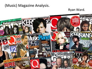
2. Masthead – The Masthead in this case is placed at the top of the magazine and is also centred. It has a ‘smashed glass’ sort of effect, which in my opinion looks very attractive, and is partially covered up by the ‘Feature Article Photograph’ (in this case the band Avenged Sevenfold.) I will perhaps use this idea in the production of my own magazine. Barcode – Placed on the bottom right of the magazine so it’s out of the way, as it has no real importance. Feature Article Photograph – Very large photo that takes up most of the front cover, with associative text that overlaps the image. I will use this idea in my own magazine. Plug - Gives extra information about what’s in the magazine, but in a sharp and snappy way, and also is more ‘In your face.’ Puff – Used to effectively attract the audience. I will use various ‘Puff’s’ in my own magazine. Main Cover Line –Attracts the reader with large text that’s ‘In your face’, which is brief info about the ‘Feature Article’. Kerrang! – Front Cover Analysis.
3. Kerrang! – Contents Page Analysis. Large Image – Takes up half of the size of the page, with little information to go beside it. It’s stressing perhaps the second main selling point of the magazine, linking in with the ‘Plug’ on the Front Cover. If I was to use this idea of having a large image that takes up half of the page I would make sure more associative text accompanied it. Editorial - The thoughts on the magazine from the ‘editor’ of the magazine. Image of the ‘editor’ above the paragraph. I will include an editorial in my magazine. The Magazine has a general ‘House Style/Theme’ which consists of the colours yellow, white, black, and red. This part of the magazine is rather busy, showing what is inside the magazine in both textual and visual ways, the text follows the same rules, with the headings in a yellow text, sub-headings in a black text, page numbers in red text, and brief sentences in grey. Half of the Contents page is ‘visual’, and the other half is ‘textual’. I think I may use this idea in my own magazine.
4. Kerrang! – Double Page Spread Analysis. Large image of the band takes up more than half of the double page spread, accompanied by three equal columns of text on the opposite side of the article. A small quote accompanies the picture. I think I will use this idea of having a very large image taking up half of the double page spread in my own magazine. Three columns of text with equal width take up the left hand page. The text is very attractive in my opinion, and fits in with the theme of the page. I will use this in my own magazine I think, as it will be aimed at more intellectual people. ’ Secondary/Supporting article’ which is additional information about the bands new album, which is related to the main focus/article. Attractively edited image – I will (try to) effectively edit all of my images. Ripped paper sort of effect – looks great. I will use effects like this in my own magazine.
5. Metal Hammer – Front Cover Analysis. Masthead - Very large, centred in the middle and at the very top of the cover. Has some sort of ‘chalk/smudged’ and ‘dripping’ effect on it with the “Metal” ‘engraved’ into the “Hammer” – looks very good. It suits the general theme of the cover, being the same colour as the rest of the text featured on it. It overlays the ‘Feature Article Photograph’, but only very slightly. This particular cover is a little bit awkward to analyse, as it is different to what you would normally expect from a “Metal Hammer”. Feature Article Photograph – Takes up the whole of the front cover, and is barely covered up by any text. The image itself is very attractive in my eyes, and the text that companies it is also very attractive. It has a very small amount of accompanying text (purposely), so it simply gets it across to the reader that there is a big article inside on “Avenged Sevenfold”, and that you need to look inside for more on it, it’s pretty much a smart tactic (like a hook with bait). Barcode – Put out of the way due to lack of importance.
6. Metal Hammer – Contents Page Analysis. Textual section of the contents - containing titles, subtitles, page numbers, and small paragraphs of information. The font used is very attractive, and the colour is consistent. Positioned effectively and attractively. Editorial - The thoughts on the magazine from the ‘editor’ of the magazine. Image placed above the paragraph. I will include an editorial in my magazine. Visual part of the contents, containing lots of images, big page numbers, large text to accompany the images (which is also accompanied by even smaller text). Almost ‘in your face’, and kind of busy, but still neat and understandable. The whole contents page is split up into two sections really – a textual section and a visual section. I think I will use this idea of splitting the magazine into different sections in my own magazine. The page follows a general theme/house style of the colours black, red, grey, and white and looks very attractive in my opinion.
7. Metal Hammer – Double Page Analysis. Large image takes up half of the double page spread, and is accompanied by a small paragraph of text. The image looks professional, and is effectively placed so that it’s the first thing the reader focuses on. I think I will use this idea of having a large image on one half of the double page spread and text on the other in my own magazine. Very large text at the top of the textual side of the article, that has a smudged ,‘sacred’ kind of effect on it – I personally think it looks very nice and attractive, I will use these sort of effects in my magazine. Three equally wide columns of text, that contain a lot of detailed writing. The starting letter is in large different coloured (Red) text, with a smudged effect on it, which I think looks pretty ‘awesome’. The whole page has a dirty, old/‘sacred’ effect on it, which adds something extra to the magazine, making it very attractive. I will use effects like this in my own magazine.
8. Total Guitar – Front Cover Analysis. Masthead – The masthead is very large and very attractive to the eye, with it’s smart looking text and bright but slightly discoloured white colour. The masthead is accompanied by the magazine’s motto, which is in the same font and colour of text, which I think is very effective. The masthead is slightly covered up by the ‘Feature Article Photograph’ as well – I wouldn’t use this idea as my magazine will be a launch issue, so I want the masthead to be as clear to see as possible. This particular front cover is rather busy to say the least, with it being plastered in plugs and puffs , big bright text, and various cover lines. This is my favourite magazine front cover out of the three I have analysed - I aim to use this magazine as my main inspiration, and will try and use a lot of the ideas of this magazine in my own. Various ‘Plugs’, to show even more selling points of the magazine without taking up much room. Feature Article – The ‘Feature Article Photograph’ takes up the entirety of the front cover, and is accompanied by the ‘Main Cover Line’ which is in large, bright text, placed so that it’s right there in your face as soon as you look at the magazine to majorly stress the main selling point of the magazine. Cover Lines in bright and attractive text, effectively and tactically placed. Barcode – Placed in the bottom corner of the magazine out of the way.
9. Total Guitar – Contents Page Analysis. Textual side of the Contents page – contains no images, just titles, sub-titles, page numbers, and small paragraphs. It has a consistent colour theme, which consists of the colours white, black, and yellow. It’s a little bit boring in my opinion, but it’s professional and neat. Very large title at the top of the page, with bright red colour in the background which I think is attractive. Visual side of the Contents page – Contains images of what the article is about, page numbers, sub-titles, and small paragraphs, and also follows the same colour theme as the ‘Textual’ side of the Contents page. The images are placed very neatly, which gives this Contents page a nice ‘balance’ between text and images, and makes it look very attractive. The larger the image is, the more ‘important’ the article that it is advertising is – I will use this idea in my own magazine.
10. Total Guitar – Double Page Spread Analysis. Large image takes up half of the double page spread, and is accompanied by a small paragraph and a ‘puff’ advertising a competition. The image looks very attractive, and is tactically placed on the right hand side of the article to make the reader have to read the text on the left hand side page before looking at the image on the right hand side. I will use this idea of having half of the article an image and the other half text, but I’m not sure which side would place each part of the article on (Text and Image). Large text at the top of the textual side of the article – The text is very attractive with the colours that it is in and the effects that have been put on it. It’s effectively and tactically placed as well to draw the reader of the magazine’s attention to the large text instantly, making them want to read the rest of the article, which is obviously what you want. I will use this idea/’tactic’ in my own magazine, to ensure my article is attractive enough to make it look like it’s worth reading.