1. Paranormal Activity Poster Evaluation. Ryan Ward.
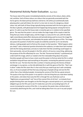
The house-style of the poster immediately/evidently consists of the colours, black, white,
red, and blue. Each of these colours are colours that are generally associated with the
horror genre; the black portrays darkness and terror, the white just aesthetically looks
pleasing when used with black, the red isn’t a nice red, its more of a dangerous, blood-
colour red, with both of these things typically being associated with the horror genre, and
the blue is ghostly, with ghosts/paranormal happenings being popular among the horror
genre. It’s safe to say that the house-style is instantly spot-on in relation to the specified
genre. The way that the poster is set out makes the large image of the couple in bed the
thing that you notice straight away, and the image is a scary one for sure, with the whole
night-vision/desaturated effect obviously and tactically being used to ensure the image fits
in with the style of the poster, and ultimately the poster within the genre of film. The image
also poses the question of what the couple are evidently scared for as it’s not directly
obvious, making people want to find out the answer to that question. “What happens when
you sleep?” asks a rhetorical question directed at the audience, to make them feel involved
with the film being advertised, and also to make them feel like something could happen to
them personally, not just the people in the film, which is of course a scary thing, addressing
the purpose of the film effectively for sure. The title “Paranormal Activity” is positioned just
underneath the image, which as I stated is the first noticeable thing about the poster,
therefore people will have to have a look round the poster to find out what the film is called
and before long will have read everything on the poster, increasing the potential success of
the film for sure. The font that the title is written in heavily portrays the themes of blood
and danger in my opinion, so the title definitely fits in with the genre of the film. “Don’t see
it alone” makes the film seem like it’s that scary that you need to go see it with somebody
else, so of course people will feel that way and groups of people will go and see the film
rather than a few individual people, increasing the success of the film by a great amount.
The quote at the top of the poster in my opinion is the last thing that you read when looking
at the poster, and states how scary the film is through the use of phrases such as
“Nightmares are guaranteed” and “one of the scariest films of all time”, so instead of just
people thinking their own thoughts on the film they get a second opinion on it, and may feel
obliged to go see the film just to see if it really lives up to the surrounding hype of it, of
course increasing the success of the film. In my opinion the poster does a brilliant job at
successfully advertising the film, and I shall be taking ideas from it to use in my own project
for sure.