1. Personal I nvestigation Owen Corbett
For my A2 Personal lnvestigation I have chosen to work to the theme of Fear. I
chose this theme to challenge myself in different ways. I wanted to move in a new
direction by being more expressive in my work, Iooking at images and ideas that
evoke strong emotion beyond the traditionally pretty.
I began my work by thinking about the different possibilities within the theme Fear.
This involved researching and asking people to find some of the most common
phobias and childhood fears, and looking at the emotion of fear itself and the way it
is expressed. I explored the presence of fear in myths and superstitions, and some
modern interpretations such as film. This helped me to find images that appear
commonly in relation to fear, so that I could further investigate what it is about them
that gives them the ability to unsettle or frighten us.
Possibly the most universal of all fears, and also the most understandable, is the fear
of death. I started with photography, capturing images of things commonly
associated with death such as skulls and cemeteries.
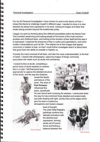
I looked further at skulls, completing a
pencil study of skulls stacked on shelves
like in a crypt. I felt that pencil was
appropriate to capture the detailed structure
of the skulls, and the way the shadows
reveal the facets
and texture of the
bone. The work of
Paul Schwaz
influenced this
piece, specifically
his own pencil work involving the skeleton. I particularly liked
the way he has combined finely detailed and anatomically
accurate drawing with light, smoky lines at the edges which
give his work a mysterious
atmosphere and reveal a deeper
level of thought.
The artist Tom French's
paintings combine fine,
delicate portraiture with
the abstract and
expressive, forming
skulls out of human
forms and finding a
balance between the
Tom French
Paul $chwarz
2. $R*,rqg
lr
ilrar iIl*m*xp *$'
AH FL[Ag&ffi?
and ask her about these pieces and
matter.
beautiful and the unsettling, I completed several
experimental pieces inspired by his work, using a
range of media including charcoal, ink and acrylic
paint. I enjoyed the
opportunity to work
in a more
expressive way
and to develop my
own approach. I
decided to involve
some colour and
was able to apply
inks and then spray
them with water to
separate them,
giving a decaying
feel to the piece.
I looked at the graveyard photographs I had
taken. One gravestone with a Victorian air to it
appealed to me. I used pastel and charcoal
for this study, to capture the marble texture
and the subtle colours of the stone. I
particularly liked the way the dark braches in
the background contrast with the pale
headstone giving a confined feel, Robyn
Bauer's pastel and charcoal studies of
cemeteries and twisted trees capture well the
atmosphere I felt when I visited the graveyard.
I was able to contact Robin Bauer via email
what her feelings were towards the subject
ffi*hin ffiau*r
3. th
h
Ib
tIh
h
th
IF
il
Ih
t
It
I
It
il
il
il
il
r
il
il
il
t
il
I
il
She replied with this:
"l was probably drawn to Toowong cemetery because of its historicat significance, its
atmosphere, and the sculptural elements of the gravestone,s, some of which are incredibly
beautiful wrth the way they have weathered and decayed. t donT think t fett fear as such but I
was acutely aware of the sad sfonbs some of the tombstones telt. Pafticutady about people
who died very young or in tragic circumstances and also the pain of loss when a tombstone
said simply "Mothef.
t liked thte fact that noone else around here has thought to draw in the cemetery. t did the
drawings or on the spot in the cemetery. lwas very aware of the norses of bird life around
me and traffic notse while there were thousands of dead people just under the ground. t
found this poignant but was not scared. (l donT believe in ghosts)."
I was interested to find that her feelings were very simihr to my own on visiting a
cemetery; perhaps this shared view is what drew me to her work in particular.
My next experimental piece was
influenced by illustrations by Fred
Banbery. He uses a palette of black,
white and blue to evoke feelings of
isolation and fear, and give the
impression of darkness and moonlight.
I used this same colour scheme in my
own mixed media piece of a moonlit
graveyard. I found it very interesting to
work with this limited colour palette, and
discovered that a simple palette can
make a bold statement and
impact.
can be utilised to create a very specific emotional
Fred Banbery
The next facet of fear that I decided to look at was some of the common phobias of
creatures. Some creatures are feared in their own right, because some of them at
least are dangerous. Others are seen as bad omen, associated with death and bad
luck. The first I chose to look at was the raven, often seen as a symbol of death. The
Alfred Hitchcock classic "The Birds" shows clearly the potentialfor intimidation that
4. Deb Kirkeeide
these creatures possess. The raven
paintings of Deb Kirkeeide capture
the mysterious and stern
personalities of these birds well, and
her use warm yellow and orange
backgrounds in contrast with the
purple-blues of the raven influenced
the backdrop of my own
painting. I used chicken
wire over the painting to emphasise the menacing
atmosphere that I was trying to create and create a
feeling of depth.
The raven also
inspired an
experimental
digital painting,
where lexplored
this bird as a
symbolic representation of fear and nightmares. I
found the digital mediurn to be very different to
traditional art forms and it took a while to adapt to,
but it can also be
extremely diverse and
allow a lot of freedom
artistically. Aditya lkranegara is
a digital artist whose work
involves subtle use of colour
and flowing forms to evoke air of
mystery and enchantment. Iwas
particularly drawn to his painting
entitled "Medusa" which inspired
the pale human form in my
experimental piece and, along
with the illustrations of Fred
Banbury, influenced the colours
I used in this digital painting,
snakes were the next creature I came to. I
chose to use pencil for this study, to capture
the intricate details of the snake's scales and
the way they catch the light, This is something
that the artist Lori Dunn does marvellously in
her scratchboard works, where she skilfully
captures the finest details of these creatures,
Aditya lkranegara
5. She also shows their eerie,
unsettling characters
through the black backdrop
and intense contrast, I found
the same use of dark
backdrop very useful to
encapsulate the fear that
these creatures can instil.
As a class we had the opportunity to
spend a day at the Seacourt Print
Workshop. In preparation we received a
Perspex plate and used an etching tool to
engrave our chosen image into the
surface. I used this opportunity to look
further into the image of the snake. I
decided on this after finding the drypoint
prints of Bill Flowers, an artist who
specialises in snakes, I liked the way he
texture of the reptilian scales.
used the intaglio technique to capture the
We spent the day at the workshop learning different techniques of applying coloui
and shading and creating a large number of different prints. I found it exciting how
one plate could make such different effects through the way the ink was applied, and
I really enjoyed the opportunity to learn new skills, use the specialist equipment and
leam from a skilled professional.
There are some fears that we almost all
images that terrified us in our early day,
and these fears can remain right into
adulthood. One such object is a doll.
Jeremiah Ellsworth captures this fear
with his creepy photographs which
highlight the unnatural feel of these
children's' toys possess, the contrast
between their human features and their
experience in childhood, certain objects and
lifeless, inanimate nature. I took some of
my own black and white photographs of
dolls, trying to capture the fear that the
Jerer"niah HIIsworth
6. dolls can instil. I used a mirror in some
of these images to invorve idea of
reflections and msvements caught in
the corner of yCIur eye which can bring
objects like dolls to life. I then worked
from one of these irnages to create a
pencil study, using again the contrast
between light and dark to enhance the
scary atmosphere that these dorts
create- I enjoyed working on this
study, with the chailenge of capturing
both the hard, smooth quarity of the
plastic doil and the details of the
woollen knitted fabrlc.
Clowns are another
concept which,
although intended to
bring amusement,
have a sinister aspect,
emotions hidden
behind painted on
smiles. I came acros$
a rather terriffing
,*jffi;rY.ntnen-_monstrous grin, and used this as the basis of an acrylicpainting' James Guentner has a series of horri*cpaintings of ctowns which capture ini, tri"t"d idea. ,n'
"o" a sertes ot nonific
paint bring out a gritty, oa* rlringinspireo by Guentny""ffainting
I used thicker
:"_:.::r1:r'ly makes these concepts scary
in the corruption of innocence and chirdhood,
and this red me to an experimentar piece.
il
I
I
r
r
f
t
r
t
I
T
t
I
l
I
lnspired by the mint tin curios compositions of"Jenuine", t creates a sort of chitd's treasure
box- The inside surface had pages from *The
Little Match Girl", a children'* *iory which to rne
represents
this conuption
of childhood' t included matches to further support
this tale' The piece is meant to demonstrate the
innocence of a child, its loss represented by the
aged and battered effect.
J*nuine
7. I then
moved on to
look at the
idea of
Horror as a
popular
genre of entertainment. I looked
at DVD covers, whose arhruork
represents the imagery and
concepts commonly used in these films. My first
piece was based on the film "Under the Bed". This
links back to
a common
childhood
fear. The
image used
is quite simple but the scenario it portrays
expresses intense fear, evoking the idea of
being dragged away into the darkness. I
retumed to look at the illustrations of Fred
Banbury, who frequenfly includes hands
reaching out of the darkness in his drawings. I
again worked with a limited palette, with white
acrylic onto black card- I developed my own tecnnique for this piece, taking a freer,
painterly approach, using a broad brush and drybrush technique and using
directional strokes to create texture. I then used a blue-green ink to stain the piece,
creating more depth of tone and eerie effect inspired by that of Banbury,s work.
A common image that comes up in many
DvD covers in the eye, retating to the idea
of the eye as the window to the soul as
well as the fears of seeing things which
aren't there, or things which shouldn,t be
seen. I used elements from several of
these images to create my own pencil
study, which shows a graveyard scene
enclosed within a human eye, and a hand
reaching out like something trying to escape. lt was
interesting to compose this piece from several different
images, combining the movie art with my own
photographs of Highgate Cernetery,
I also looked at some of the more traditional figures in
horror which have survived to permeate modern horror,
8. 5riltfirffi'In impression
f;ading into nothing
one of the most iconic of these is the vampire. r focused on the mouth todemonstrate the contrast befueen human and inhuman aspects, shown by its fangs.Around this painting r incruded the definition or
"
,rrpire combining words andimagery to capture the essence of the creature.
Wire sculptor Richard Carey
created a scurpture based on the
sci-fi horror classic film Atien, with
teeth bared and craws extended. r
liked the idea of a rnetat monster,
relating back to the chirdhood
fears of monsters under the bed. r
created my own wire sculpture of
a three clawed hand of a
nightrnarish monster. I reft the
arm unfinished, flowing out to
create a base for the sculpture
of unreality, like a nightmare
I headed in a different direction
for my final page, looking at the
emotion of fear itsetf and the
way people physically express
it. I researched Chiaroscuro,
the traditional technique of
using dramatic righting to create
dramatic or expresslve
paintings, Caravaggio used
this device to give is paintings a
dark undertone. His works often
consisted of chaotic scenes
where peopte demonstrated
anger or fear, and this lighting
style emphasised these
emotions. Rembrandt also
utilised Chiaroscuro in his
portraits, adding a new
dimension to the ancient tradition of portraiture, and ni" r5flbr"ni
flr:f often
.had
a unique kind of metanchoty air.
This research red me to investigate *r" u."
"iirrr"ic righting
further' r took photographic portraits rooking at different waysthat the face can show fear. r then chose one image, where
only part of the face is ifiuminated, and used it rorin acryric
il
il
il
il
T
r
I
I
I
I
I
T
I
l
l
9. painting. I it challenging to capture the interface between tight and dark, as there is
little intermediate tone.
I then moved on to look at how more abstract or looser
styles could be used to capture emotion. Agnes Cecile
is an artist who works in a range of media including
acrylics, watercolours and inks. Her work is defined by
its free, intensely expressive nature, combining the
human subjects with abstract, flowing forms. ln particular
I was drawn to her ink works, -ry*t'*L
the emotion the person portrays. ffi .' ; #hI completed two self portraits frH*# ;
using this style, the first an A4 #
one using watercolour and ink, /
il**k,:?ilHil*;; ffinlmThis style was interesting to use f ;!ffitj titnri . '.t
{ " t ''as you can't tell exactly what the # ;l;
f t , i}ink will do, and so the outcome is partly determined by the
nature of the medium itself, I also used the painting style
inspired by Fred Banbury again, with white acrylic on
black, stained with ink to give blue tones, ln this image
someone is covering their face with their hands in fear,
hiding away, one eye peering out through the space
between the fingers. I found that the placement of the
hands can express a surprising amount of emotion
through these studies.
It was curious to compare working in both the more
traditional, detailed painting style and the looser, freer
ones, and the very different approaches that I had to take
to do each.
ftes Ceeile
10. Something that really helped me to
develop a looser technique was a
life drawing class that I attended in
early December, taught by
professional Life Model Clare
Broome. Her classes were
recommended to me by the
Northern lrish artist and teacher Bill
Gatt, who provided an introduction
to life drawing for our class during
my AS year,
ln this full-day class I had the ,
opportunity to do a range of '
drawings of both a male and female
life model. We went through a
number of short poses taking between one and five minutes for each, including
series of one-minute sequential poses, followed by a long 45 minute pose from each
model. I found that the short poses required a more free and dynamic approach to
drawing than I had previously experienced, capturing the form in just a few strokes.
Clare also got u$
to consider the
emotion or
atmosphere that a
pose expressed,
and to use
different lines and
strokes to reflect
this.
I contacted her
later for more
information on this and she replied with the following:
"Expressive poses in tife drawing are often sfiorferpos es with the feeling of movernent or
emotion to inspire the afiist, design to canvey an emotion through the shape of ttte body
rathsr f$mm f&s facf*f #xpr*ssi*rs" frrfmruy :, ,, , .: ,::,:
gxpr#ss$y# p#s#$ s#/?tr*lm ff*garffuk flrm* of ',.-,'. ",',
t*e fuurw*m ffisr*, p*#f*e^#a{y ffue furmals fotrtr$, ' . ,' ',"
&es r?T#r?y S ssrryes trtrffftrr'? rf" i
ffi?e, fea{h*,ry p*l* firu*s c#r} &e e,rs*# f* #xpr#s,s , .. ,,,
a tig*tfr*ess *f #r??&, s$tytr;#ss, *r frumrd$fy- :;:': 1'r=':
gif;f i{*""
#.1'
*.'
ff*
F'tt':
*i
i::.
G
il
t
il
il
t
11. h
E
E
E
E
h
h
h
H
h
h
F!r
t
il
I
t
t
t
il
Heavier, firm lines can be used to denote where the weight of a pose iies, and give a sotidityor strength of emotian. Dark, scratching lines can oe usea b describe a da* mood - feararanger, while clear, swooping lines can express ioyfutness, playfulness and rhythmical
movement."
I found this experience to be both very enioyable and extremely valuabte. lt helped
me to develop a painting style based on loose, expressive brushstrokes to not onty
capture an image but also an emotion, in this case fear.
When planning my final outcome I first thought about pencilwork, linking back to
artists Paul schwarzand Lori Dunn. I liked the strong contrast and tonairange that
this medium Gan capture, as an expression of fear. t atso thought about a number ofmixed media pieces covering some of the different painting and drawing styles that I
looked at. ln the end there were some factors which were a strong influence
throughout my project, and that I
therefore wanted to include, The
illustration work of Fred Banbery
was one such influence, leading
to a more experimental painting
style and the use of the black,
white and blue palette that he
favoured, For me this painting
style represented the nature of
the fears themselves - dark and
intense, evocative of shadovqy
moonlit night and the things that
lurk in the shadows. lt also however has a suneal and nightmarish effect,
highlighting the insubstantiat nature of fears; they are not real, and only exist within
our minds.
I also wanted to incorporate some aspects using a
more traditional, realistic technique. Throughout
this proiect I have enioyed contrasting these
realistic with the abstract - playing with the
boundary behrveen real and not real. Although our
fears themselves are insubstantial and imagined,
the effect of fear is a real and very physical thing.
The final design consisted of a portrait in acrylic of
a person expre$Sing fear, using a more traditional
style influenced by Caravaggio and Rembrandt in
the use of chiaroscuro, dramatic lighting used to
evoke emotion. This represents the physical
aspects of fear, the way we express the emotion.
12. t
il
I
:r
:r
I
r
t
il
t
I
I
il
I
;I
I
I
F
t
I
f
T
I
T
I
I
I
I
I
t
I
T
T
f
This portrait then opens down the
middle to reveal a surreal landscape
comprised of the different fears that I
have looked at in my work, using the
expressive style that I developed.
This action of opening up the portrait
is like looking inside the head of the
scared person, to see the fears, the
nightmare, that is causing the
outward expression.
I found the process of creating my
final piece to be challenging but
enjoyable. The outer portrait was
particularly satisfying as I had never produced a single portrait on such a large scale
before. the high contrast in the image made it very interesting to paint, and I was
very pleased with the end result.
In my A2 core portfolio I investigated various aspects of the theme of fear. Through
this I worked in a wide range of media and experimented with new media and
techniques. By researching contextual artists and attending additionalworkshops I
extended my skills and knowledge and this influenced my work, allowing me to draw
inspiration from a wide variety of sources. I developed a better understanding of the
emotion of fear, and I produed a final.outcome which I feel demonstrates what I
have leamed both in terms of understanding of my theme and artistic techniques. I
have very much enjoyed the work I did this year and I am pleased with what I have
achieved.