The target audience of the Kerrang! magazine is young people aged 14+ due to its focus on modern music genres like rock. It uses stylistic elements like a smashed masthead, loud font, and red color scheme to signify genres like rock and metal. The Uncut magazine seems aimed at an older audience (25+) as it features older, classic rock bands that younger people may not recognize. Both magazines follow consistent house styles in their layouts, color palettes, and fonts to maintain their brand identities and associate with rock music.
The Vibe magazine targets teenagers and young adults aged 15-25 with its typography and focus on rap/hip-hop artists. It uses a central image of the artist Dead
1. Target audience and genre
The target audience is mainly young people from
age 14 plus due to the advertisement of modern
music. The genre is obviously a rock due to the
masthead as it looks like it’s been smashed and
the fact the word is “KERRANG!” meaning a
guitar noise makes the genre all the more
obvious.
House style/Colours/Typefaces
‘KERRANG!’ magazines have the same house
style layout as they use the same typography
using capitals and similar fonts to get the rocker
genre across. The red colour scheme creates
symbols of anger and rage therefore creating the
rocker genre. The black and yellow colour
scheme links to hazard symbols how the
poisonous hazard symbol is yellow and black
inferring danger and disruption indicating the
magazine genre.
The Guttenberg design principle
The primary optical area is where most people look
first as they read the masthead which is ‘KERRANG!’
The terminal area has nothing but the rest of the
main image in which makes it a week spot as there is
nothing else in that corner to make people look inside
the magazine. The strong fallow area has a graphic
feature/ badge in it to engage the audience to look
inside for. Finally in the weak fallow area has a deal
put there to make the readers look in that area this
one says if they buy the magazine they get 6 free
posters with it.
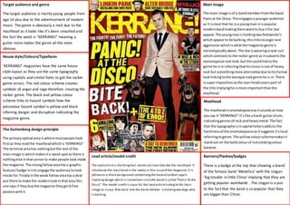
Main image
The main image is of a band member from the band
Panic at the Disco. This engages a younger audience
as it is clear that he is a young man in a popular
modern band making them want to buy it for star
appeal. The young man is holding two Rottweiler’s
which appear to be barking, this links to anger and
aggression which is what the magazine genre is
stereotypically about. The star is wearing a neat suit
which contrasts to the rocker genre as it subverts the
stereotypical rock look, but this could link to the
genre he is in inferring that his music is not of heavy
rock but something more alternative due to his formal
look linking to the baroque rock genre he is in. There
is super imposition as the stars head covers part of
the title implying he is more important than the
masthead.
Masthead
The masthead is onomatopoeia as it sounds as how
you say it “KERRANG!” it’s like a harsh guitar strum,
indicating genres of rock and heavy metal. The fact
that the typography is in capital letters adds to the
harshness of the onomatopoeia as it suggests it’s loud
referring to genre. The yellow colour scheme makes it
stand out on the bold colour of red creating colour
balance.
Lead article/model credit
The lead article is the thing that stands out most besides the masthead. It
introduces the main band in the media in this issue of the magazine. It is
yellow on a black background symbolising the hazard symbols again
implying danger which is convenient since the band is called “Panic! At the
Disco”. The model credit is a pun for the lead article linking to the main
image as it says ‘Bite back’ and the band member is holding two dogs who
is barking.
Banners/Flashes/badges
There is a badge at the top that showing a brand
of the famous band ‘Metallica’ with the slogan
‘big trouble in little China’ implying that they are
getting popular worldwide . The slogan is a pun
to the fact that the band is so popular that they
are bigger than China.
2. Target audience and genre
The target audience of this magazine seems to
be 25+ due to the advertisement of olderbands
that younger people today won’t recognise. The
genre of this magazine appears to be rock due
to the old rock band being the main image.
House style/Colours/Typefaces
The Uncut magazines follow the same house
style using the similar colour schemes mainly
red and white. The red and white colour scheme
screams danger and anger inferring the rock
genre. They also use the same font for each
magazine and have old rock icons or old rock
bands as their main images. The main images
also super impose the masthead or the other
way around.
The Guttenberg design principle
The primary optical area has barely anything in
it; it shows you the start of the title and a badge
saying ‘free CD’ which is usually put in the weak
fallow area to make the readers look there. The
terminal optical area has a lot going on telling
audiences who will be in the magazine. The
strong fallow area is not very strong as there is
nothing in that corner but the end of the
masthead and banner so now it is the weak
fallow area. The weak fallow area is actually the
strong fallow area as that area has lists of bands
that will be in the magazine.
Main image
The main image is of an old rock band called Roxy
music. This engages an older audience as they will
recognise the older bands on the front where as a
younger audience wouldn’t know who they were and
would by it and would be attracted to magazines like
KERRANG! You can tell this band is a rock band by
their outfits as they are wearing the stereotypical 80s
band rocker ‘bad boy’ gear consisting of a black
leather jack, slick hair do’s. The one on the far right
stands out as he is wearing a red leather jacket and
disco goggles implying he is the rebel in the group not
following ‘trend’ empathising genre as there is always
one rebel in a rock band.
Masthead
The masthead is in block capitals linking to the rocker
genre of the magazine. The fact that it is in old style
typography, automatically make it an older rock band
magazine for older audiences as the font just doesn’t
appeal to a younger audience. The red colour scheme
of the masthead conveys danger and rebellion
creating a rocker vibe linking to the magazines genre.
Banners/Flashes/badges
There are three flashes/ badges I can see which is
the badge that says ‘free CD’ which attracts the
audience as it means they’re getting free stuff.
The second one says 197 reviews telling the
audience what’s inside the magazine. The third is
also a banner as it introduces a one of thing in
the magazine making the audience want to get it.
Lead article/model credit
The lead article is the second thing that stands out behind the
masthead. The lead article introduces the main band in this
week’s issue. The model credit unlike kerrang magazines isn’t
a pun but tells the audience what they will be in the magazine
about the band. The model credit isn’t a pun as it is meant for
an older audience they would want to get strait to the point
than read a pun.
3. Banners/Flashes/badges
There are no banners, flashes or badges on this magazine.
Main image
The main image is of a hip-hop artist named
‘Deadmau5’. This engages people who listen to rap
and hip-hop as they would know who it was, but
people who don’t listen to that genre of music
wouldn’t know who it was and would not buy the
magazine. The rap artist dead mouse is wearing his
signature dead mouse mascot head that he uses to
brand himself so he will be recognised by the head.
He is wearing a leather jacket and a dark t-shirt which
signifies rapper as today’s leather jacket indicates
slickness and being smooth which tends to be rap or
hip hop artists.
Masthead
The masthead ‘Vibe’ links to dance music or
microphones as it could suggest the vibration of
the speakers or the vibe of the dancing or the
vibe in the music. It has multiple meanings. The
fact there is different shades of yellow bleeding
from a cover line at the top creates a ‘vibe’ as it
different colours is usually associated with ‘vibes’.
Lead article/model credit
The lead article is the second biggest typography
behind the masthead. The lead article introduces
‘Deadmau5’ pronounced dead mouse, he is a hip-hop
artist, and he is the main focus of the
magazine. The model credit is a pun to the artists
name as it says ‘making more cheese than >insert
rapper here’ implying deadmau5 earns more
money than any rapper thus creating a scandal
about this artist.
Target audience and genre
The target audience of this magazine would have
an age range from 15-25. This is because the
typography is too formal making it aim for an
older teen rather than a younger one yet the
bands and colour make it appeal to younger
teens. The genre of this magazine is rap/hip
hop, you can tell this because of one on the
subheadings says rapper in it and some of the
artists mentioned are rappers.
House style/Colours/Typefaces
All Vibe magazines share the same house style
magazine the writing is in the same places and
the masthead has different shades of colours.
The main images on vibe magazines are always
central introducing the main artist of the
magazine. The magazines also have the same
font style writing and the same layout.
The Guttenberg design principle
The primary optical area shows the start of the
top cover line and the masthead, it also shows
the start of the lead article making people look
there engaging an audience. The terminal optical
area has some cover line telling the reader who
will be in the magazine and what will be in the
magazine. The strong fallow area has one cover
line in it introducing another band who will be in
the magazine. The weak fallow are has the
barcode at the bottom and has a cover line at
the top of it making readers look there.