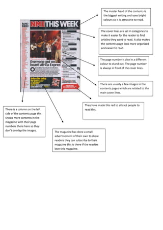
1. The master head of the contents is
the biggest writing and uses bright
colours so it is attractive to read.
The cover lines are set in categories to
make it easier for the reader to find
articles they want to read. It also makes
the contents page look more organized
and easier to read.
The page number is also in a different
colour to stand out. The page number
is always in front of the cover lines.
There are usually a few images in the
contents pages which are related to the
main cover lines.
They have made this red to attract people to
There is a column on the left read this.
side of the contents page this
shows more contents in the
magazine with their page
numbers there here so they
don’t overlap the images. The magazine has done a small
advertisement of their own to show
readers they can subscribe to their
magazine this is there if the readers
love this magazine.