What is good design
•
0 likes•674 views

The document discusses good design principles for desktop publishing, outlining three key steps: 1) ensure relevance by using headlines, photos, and captions to grab attention in under 7 seconds, 2) use confirmation techniques like subheads and pull quotes to encourage reading beyond 90 seconds, and 3) take action by breaking up long text and issuing a call to action using statistics, testimonials, or challenges. It also covers layout and balance principles like symmetrical vs. asymmetrical designs and the six rules for achieving visual balance.

Recommended
More Related Content
Similar to What is good design
Similar to What is good design (20)
More from Danielle Oser, APR
More from Danielle Oser, APR (20)
Recently uploaded
Recently uploaded (20)
What is good design
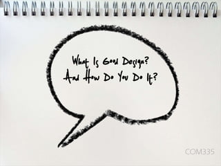
- 1. What Is Good Design? And How Do You Do It? COM335
- 3. What is "good"? • It’s a matter of opinion. • What is “good” to one person, may not be “good” to another. • It depends on your specific objective and your target audience
- 4. Step One: Relevance • Time Available: 1-7 Seconds ~ 4 words per second • What’s in it for me? • Headlines & Titles – Maximum 28 words – 9-5 is the best and should be twice the size of the subheads
- 5. Step One: Relevance • Captions • People will read captions, no matter how long, before reading body text
- 6. Step One: Relevance • Photographs – Inspire curiosity and involvement – Help readers imagine themselves there – Vary size, shape alignment, layering, isolation
- 7. Step Two: Confirmation • Time Available: Up to 90 seconds • Was I right? • Looking for a reason NOT to read.
- 8. Step Two: Confirmation • Short Body Text – Increase comprehension – Every 2-3 Paragraphs • Use Sub-heads, sidebars, pull quotes, summaries, teasers • Unfinished statements will get 30-60% more people to keep reading
- 9. Headlines
- 10. Layout
- 11. Layout
- 12. Step Two: Confirmation • Numbers & Outlines – Use bulleted lists – Call-outs – Quizes – get people involved (helps establish the need) – Table of Contents
- 13. Step Two: Confirmation • Non-photographic Art – Charts – Graphs – Tables – Clip Art – Illustrations – Watermarks
- 14. Step Two: Confirmation • Graphic Devices – Rules – Drop Caps – Dingbats – Bullets – Screens – Boxes (use sparingly to highlight items)
- 15. Step Two: Confirmation • Decreased Readability – ALL CAPS – Underline – Italics – Color
- 16. Graphic Devices • Pick two or three MAX Rules per publication and use consistently • Do not intersect Rules
- 17. Graphic Devices • Drop and Initial Caps – Draw attention to the beginning of the body text – Use large initial letters to indicate the beginning of a chapter, articles or section of text
- 18. Graphic Devices • Dingbats – Bullet Points – End-of-article markers to create a visual end-point – Highlight important copy – Can be custom
- 19. Graphic Devices • Boxes and Bullet Points – Indicate “This is the primary point” – Relate to one another – Use boxes and bullets like an outline
- 20. Step Three: Action • Time Available: As much as needed • What do I do? • Long body text – Break up for skimmers – Assume the general public has a 6th grade education – Break up with graphic devices
- 21. Step Three: Action • Proof – Connects message and reader, creates memory • Call to action – Statistics – Track record – Testimonials – Issue a challenge – Visualization – Impact Statement
- 22. Layout Design Symmetrical Asymmetrical • Copy is centered and • Unusual shapes, white art is distributed evenly space and color achieve balance
- 23. 6 Rules of Balance • Anything located in the upper left quadrant (primary optical area of the layout has more optical weight
- 24. 6 Rules of Balance • Large items are noticed more, seen for a longer time, and remembered better than small items
- 25. 6 Rules of Balance • Elements that are dark carry more optical weight than black and white
- 26. 6 Rules of Balance • Color conveys more optical weight than black and white
- 27. 6 Rules of Balance • White space serves to draw reader’s attention to whatever is in the “non-empty” space
- 28. 6 Rules of Balance • Rectangles are “expected” • Triangles, ovals, circles, cubes convey optical weight