Responsive Web Design vs. Adaptive Web Design
•
4 likes•5,389 views

Multi-channel and multi-device behavior now dictates that a business must deliver digital experiences that match every possible user context.

Recommended
Recommended
More Related Content
Viewers also liked
Viewers also liked (10)
More from Yottaa
More from Yottaa (16)
Recently uploaded
Recently uploaded (20)
Responsive Web Design vs. Adaptive Web Design
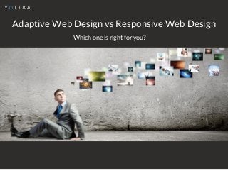
- 1. Adaptive Web Design vs Responsive Web Design Which one is right for you?
- 2. Multi-channel and multi-device behavior now dictates that a business must deliver digital experiences that match every possible user context.
- 3. It's no longer viable to focus on platform optimization with a siloed approach.
- 4. Research from Google has found that 90% of people move between devices to accomplish a goal.
- 5. An experience that begins on mobile must be able to transition onto desktop or tablet and back effortlessly.
- 6. Responsive Web Design Works on the principle of flexibility.
- 7. Responsive Web Design allows web pages to correctly format on any screen size.
- 8. Responsive Design can be effective but is difficult to do well. Responsive Web Design apps must balance the rich functionality associated with desktop usage with the ability to function less powerful mobile devices.
- 9. Adaptive Web Design Apps are able to detect information about the device requesting the page.
- 10. This intelligence is used to define the app itself, sending more, less, or different content depending on the individual context.
- 11. For example, an application with a heavy background video will exclude this asset from the lighter versions of the app that are sent to mobile devices.
- 12. Adaptive Web Design is still uncharted waters. Its sophisticated server-side configurations can make it more costly and may require more resources. When to use which? With Responsive Web Design, apps can leverage well-defined methods and frameworks and arrive at their desired app experience more affordably and quickly.
- 13. Yottaa predicts that more will choose Adaptive Web Design in the coming months and years.
- 14. But, there are multiple avenues a business can take to win in an omni- channel environment. Users expect excellent performance and an engaging experience regardless of the device they use.
- 15. "Adaptive Web Design & The Changing Mobile Environment" Looking to provide your site visitors with a unified web experience? Try our Free Whitepaper! Crafted by the Experts at Yottaa, Just for you!
- 16. Did you enjoy the presentation? Thank You for Reading! Tell us about it!