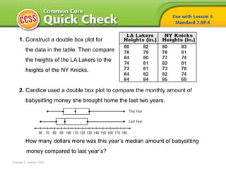
1. 1. Construct a double box plot for
the data in the table. Then compare
the heights of the LA Lakers to the
heights of the NY Knicks.
2. Candice used a double box plot to compare the monthly amount of
babysitting money she brought home the last two years.
How many dollars more was this year’s median amount of babysitting
money compared to last year’s?
Course 2, Lesson 10-5
2. Course 2, Lesson 10-5
ANSWERS
1. Sample answer: The Lakers players are taller on
average than the Knicks players.
2. $15.00
3. HOW do you know
which type of graph to use
when displaying data?
Statistics and Probability
Course 2, Lesson 10-5
5. • To determine an appropriate
display for a real-world situation
Course 2, Lesson 10-5
Statistics and Probability
6. Course 2, Lesson 10-5
Statistics and Probability
Type of Display Best Used to …
Bar Graph show the number of items in specific categories
Box Plot show measures of variation for a set of data; also
useful for very large sets of data
Circle Graph compare parts of the data to the whole
Double Bar Graph compare two sets of categorical data
Histogram show frequency of data divided into equal intervals
Line Graph show change over a period of time
Line Plot show frequency of data with a number line
7. 1
Need Another Example?
2
Step-by-Step Example
1. Select an appropriate display to show the number of boys of different age
ranges that participate in athletics.
Since the display will show an interval, a histogram like the one below would
be an appropriate display to represent this data.
8. Answer
Need Another Example?
Select an appropriate display to compare the
percents of students in seventh grade who
traveled to school this morning by bus, by car,
or by foot.
circle graph
9. 1
Need Another Example?
2
3
Step-by-Step Example
2. Select an appropriate type of display to compare the percent of ethanol
production by state. Justify your reasoning. Then construct the display.
What can you conclude from your display?
You are asked to compare parts to a whole. A circle graph would be
an appropriate display.
Indiana, Minnesota, and Illinois produce about the same amount of ethanol.
10. Answer
Need Another Example?
Select an appropriate display to
compare the percent of girls who
play in the soccer league by age
range. Round percents to the
nearest whole percent if necessary.
Justify your reasoning. Then
construct the display. What can you
conclude from your display?
Sample answer: A circle graph would
be an appropriate way to compare the
percents to the total number of girls in
the soccer league.
About 38% of the girls are age 9 to 11.
11. How did what you learned
today help you answer the
HOW do you know
which type of graph to use
when displaying data?
Course 2, Lesson 10-5
GeometryStatistics and Probability
12. How did what you learned
today help you answer the
HOW do you know
which type of graph to use
when displaying data?
Course 2, Lesson 10-5
GeometryStatistics and Probability
Sample answer:
• When you know the type of data given and how it will
be analyzed, you can determine which type of graph to
use.
13. Identify the type of statistical
display you think is most
important for showing the
change in a city’s population
over the course of 20 years.
Justify your reasoning.
Course 2, Lesson 10-5
Ratios and Proportional RelationshipsFunctionsStatistics and Probability