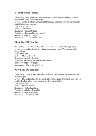
2. Is there room on the bus
• Visual Style – The book has a hand drawn style. The
book uses bright vibrant colours that stand out on the
page.
• Layout – the book integrates text onto the image page
and splis up sentences to make the text more legible
• Font – Serif font
• Author - Helen Piers
• Illustrator - Hannah Giffard
• Publishers – Frances Lincoln Limited
• Number of pages – 31pages
• Dimensions – 21.5 x 27 x 0.6 cm
3. You can see that “Is There Room On The Bus?” uses bright colours. I think this is
important because it catches the eye of the reader. Also, it makes the book stand
out more when on book shelves in shops.
The text has been placed on the same page as the images. I like how this book
has done that as it is still easy to read but I think the page looks slightly cluttered
and I think it would be more legible on a separate page. My audience will be
children who are learning to read so I think I should separate text and images so
try read without any distractions on the page.
4. Where The Wild Things Are
• Visual Style – Hand drawn style. Uses darker
shades and is not very bright.
• Layout – text and the image are placed on
separate pages. The balance is 80 image 20 text.
• Font – Serif font
• Author – Maurice Sendak
• Illustrator – Maurice Sendak
• Publishers – Random House Children’s Books.
• Number of pages – 48 pages
• Dimensions - 23.8 x 0.8 x 25.6 cm
5. In the book we’re going on a bear hunt it
changes style throughout. For example
you can see one image is in black and
white and one is in colour. I think it is
important in a childrens book to be
consistant throughout so the child does
not get confused. Additionally, the black
and white doesn’t stand out much
because the rest of the image is in black
and white.
6. We’re Going on a Bear Hunt
• Visual Style – Hand drawn style. Uses soft pastel
colours and has a minimalistic drawing style.
• Layout – The text is placed in the white place of the
page. The text is also split up and the leading is
increased to make the text more legible.
• Font – Serif font
• Author – Michael Rosen
• Illustrator – Helen Oxenbury
• Publishers – Walker Books Ltd
• Number of pages – 40 pages
• Dimensions – 27.2 x 0.5 x 24.1
7. The text in “Where The Wild
Things Are” contrasts well
against the white background.
However, this has been
placed on a separate page. A
disadvantage of doing this is
that the page can look blank
when there is much not text.
Visually interesting things
attract the audience to look at
the page. One thing the text
could do is add a background
to the text but have it on a
low opacity so it doesn’t
distract you from the text or
include some of the
characters in the background
8. This book uses softer colours and that is
the style and I think it works well.
However, I think for a younger audience
bright colours will be more engaging for
because they catch people eye easier.
9. • My Visual Style
• I have decided that I am going to place my text and a separate page.
The reason for this is because when looking at “Is There Room on
The Bus” the text stood out easily and it helps break up the story
into section as you can only see one page at a time. I also looked at
“We’re Going on a Bear Hunt”, which separated the text but kept it
on the same page. I thought this made the page cluttered.
However, because it was on a white background it still contrasted
well. When I looked at “Where The Wild Things Are” because the
text was on the same page and integrated onto the page in some
places the text did not contrast very well and it made it harder to
read. This is the main reason I am not going to put my text on the
same page because my audience will probably not be very strong
readers or just learning to read so it is important that I make it easy
for them to understand and read.