+
+
Shot type/ posture
imilarities:
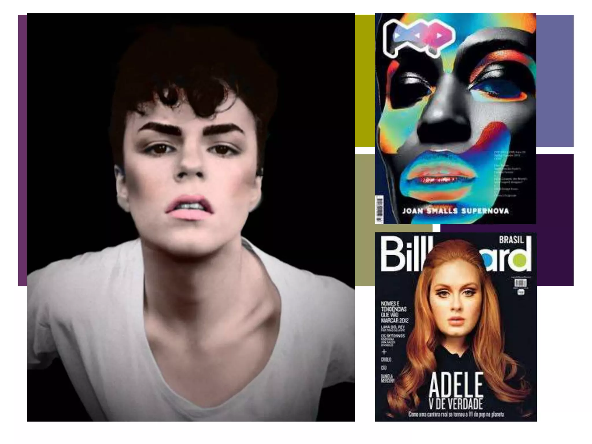
The first similarity is the shot type between my model, and Adele. I have chosen to use this shot type
because I want the focus to be on the facial expression, to show his confidence. This is shown through the
way he is leant forward and not leaning back. Originally it was a square shot, but I later made it into a long
shot to fit into the dimensions of a magazine front cover.
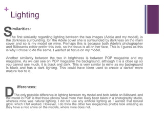
Another similarity between the two is that they are both medium shots. This may be because me, and the
photographer of Adele, both wanted the focus to be on the face, and therefore do not show full body, as that
may distract readers and make them focus more on what they’re wearing.
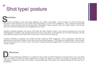
Another similarity is between my model and the model on POP magazine. This is because I feel like the
positioning of both their heads is the same, and their facial features. This helps me identify that I have chosen
the correct picture for my front cover, as there is already existing magazines of my genre that are using very
similar images.
ifferences:
The first difference between my model and the model on POP magazine is the shot type. It is very clear
that the model on POP has been captured in a close up, where as I shot my model in a medium shot, as
although I wanted the focus on the face, I still wanted part of the body as it shows attitude by the way he is
positioned.
S
D
+
Lighting
imilarities:
The first similarity regarding lighting between the two images (Adele and my model), is
the darkness surrounding. On the Adele cover she is surrounded by darkness on the main
cover and so is my model on mine. Perhaps this is because both Adele's photographer
and Billboards editor prefer this look, so the focus is all on her face. This is I guess as this
is why I chose to do the same. I wanted all focus on my model.
Another similarity between the two in brightness is between POP magazine and my
magazine. As we can see on POP magazine the background, although it is a close up so
you cannot see much, it is black and dark. This is very similar to mine as my background
is black and has a dark lighting. This could have been used to create a darker more
mature feel to it.
ifferences:
The only possible difference in lighting between my model and both Adele on Billboard, and
the model in POP is that those photos have more than likely been taken in a photography studio,
whereas mine was natural lighting. I did not use any artificial lighting as I wanted that natural
glow, which I felt worked. However, I do think the other two magazines photos look amazing as
they have a nice shine on the models, where mine does not.
S
D
+
Expression
imilarities:
The first similarity between facial expressions is between my model and Adele. This is as
both of them are not smiling and are pulling a very straight serious face. This could be to
advertise the mature side of the magazine, how it is adult pop and not child pop. This is
shown as if it was child pop they would all be happy and smiling. Also, the dark background
would not fit well at all if both models were smiling.
Another similarity regarding facial expressions is between my model and the POP model is
the mouth position. They both have it in the exact same way which could show that for this
specific genre it is the ‘normal’ expression to have. This could be as it is a more mature
music magazine the open mouth expression is linked to having a more serious music
approach and beat, rather than a happy, poppy song.
ifferences:
The only possible difference in expression could be between Adele and my model. This is as
not only my model, but the POP model too, both have there eyes almost looking down and eyes
nearly half shut, whereas Adele has hers wide open looking at the camera. This could be as she is
reflected normally as quite a happy person therefore it would be difficult to represent her as 100%.
S
D
+
Gesture/ body language
imilarities:
There is only one similarity between my cover model and the other two. This
comes between my model and POPs model. This is as they both have their heads
tilting up in attitude. Adele doesn’t have this as she is represented as a more older
artist, with no attitude and a straight posture. This helps me identify that I have
chosen the correct body language for my model to do.
ifferences:
For this section there is a lot of differences regarding postures, gestures, and body
language. The first being between Adele and my model. On billboards cover Adele is at up
very straight and looking bang at the camera. Her back posture is extremely straight and
she is in no way slumping, sadly or with attitude. This could be as she is quite a mature
artist that appeals to more of an older audience. She is professional and is not known to
make headlines for doing silly things or being immature. She is also an adult within herself
and not a teen star therefore she is presented in a more adult way. However, my model is
more of a teen than an adult, so therefore I chose to present him with a little attitude. He is
seen slumping forward in attitude which shows a more harder mature side to him, rather
than a soft, bubbly side.
S
D
+
Angle
imilarities:
The similarity between angles would be between my model and Adele. This is as
they have both used not only a medium shot but have used the same angle face on.
Both photos are cut at the same place and begin at the same place. This could not
only be as they are the same genre but it puts a lot of focus on the main model,
which was my goal, and Billboards too.
ifferences:
The major difference between the angles comes from my model and the model on
POP magazine. A not only have we used different shot types, we have also used
completely different angles. This is because POP mag have used a low angle looking up
at the model, whereas I have used a straight angle where it is equal. I like what POP has
done, as it could symbolise that they feel all the focus should be on the over model, it is
the most important person in that issue. However, I feel all my stories are important
therefore I wanted it as a straight angle as it means no one is better or has a better story
than anyone else.
S
D
+
Costume
imilarities:
The first similarity between costumes is between my model and Adele. This is they are
both wearing plain clothing. I don’t know about Billboard, but I chose to do this as I wanted
all the focus to be on the face and hair. I didn’t want people being more interested in the
outfit rather than the artist. I am guessing billboard has probably done the same, for a
similar if not the same reason. Although, I feel like they may have done it as Adele is an
older artist and the older you are, the more stereotypical you are to wear more plain
clothes. However, I know that Adele does wear some standout outfits so therefore it was
more than likely done so the focus was on her face.
ifferences:
The one major difference in costume between my model and the others is the fact that on
POP magazine you cannot even see the costume. This is because for POP magazines cover
they have chosen to do a close up shot, therefore the outfit is not visible. Whereas for my cover,
even though I did not want any focus on the outfit, I still felt it was needed which is why I used a
medium shot.
S
D

Question2 evaluation

  • 1.
  • 2.
    + Shot type/ posture imilarities: Thefirst similarity is the shot type between my model, and Adele. I have chosen to use this shot type because I want the focus to be on the facial expression, to show his confidence. This is shown through the way he is leant forward and not leaning back. Originally it was a square shot, but I later made it into a long shot to fit into the dimensions of a magazine front cover. Another similarity between the two is that they are both medium shots. This may be because me, and the photographer of Adele, both wanted the focus to be on the face, and therefore do not show full body, as that may distract readers and make them focus more on what they’re wearing. Another similarity is between my model and the model on POP magazine. This is because I feel like the positioning of both their heads is the same, and their facial features. This helps me identify that I have chosen the correct picture for my front cover, as there is already existing magazines of my genre that are using very similar images. ifferences: The first difference between my model and the model on POP magazine is the shot type. It is very clear that the model on POP has been captured in a close up, where as I shot my model in a medium shot, as although I wanted the focus on the face, I still wanted part of the body as it shows attitude by the way he is positioned. S D
  • 3.
    + Lighting imilarities: The first similarityregarding lighting between the two images (Adele and my model), is the darkness surrounding. On the Adele cover she is surrounded by darkness on the main cover and so is my model on mine. Perhaps this is because both Adele's photographer and Billboards editor prefer this look, so the focus is all on her face. This is I guess as this is why I chose to do the same. I wanted all focus on my model. Another similarity between the two in brightness is between POP magazine and my magazine. As we can see on POP magazine the background, although it is a close up so you cannot see much, it is black and dark. This is very similar to mine as my background is black and has a dark lighting. This could have been used to create a darker more mature feel to it. ifferences: The only possible difference in lighting between my model and both Adele on Billboard, and the model in POP is that those photos have more than likely been taken in a photography studio, whereas mine was natural lighting. I did not use any artificial lighting as I wanted that natural glow, which I felt worked. However, I do think the other two magazines photos look amazing as they have a nice shine on the models, where mine does not. S D
  • 4.
    + Expression imilarities: The first similaritybetween facial expressions is between my model and Adele. This is as both of them are not smiling and are pulling a very straight serious face. This could be to advertise the mature side of the magazine, how it is adult pop and not child pop. This is shown as if it was child pop they would all be happy and smiling. Also, the dark background would not fit well at all if both models were smiling. Another similarity regarding facial expressions is between my model and the POP model is the mouth position. They both have it in the exact same way which could show that for this specific genre it is the ‘normal’ expression to have. This could be as it is a more mature music magazine the open mouth expression is linked to having a more serious music approach and beat, rather than a happy, poppy song. ifferences: The only possible difference in expression could be between Adele and my model. This is as not only my model, but the POP model too, both have there eyes almost looking down and eyes nearly half shut, whereas Adele has hers wide open looking at the camera. This could be as she is reflected normally as quite a happy person therefore it would be difficult to represent her as 100%. S D
  • 5.
    + Gesture/ body language imilarities: Thereis only one similarity between my cover model and the other two. This comes between my model and POPs model. This is as they both have their heads tilting up in attitude. Adele doesn’t have this as she is represented as a more older artist, with no attitude and a straight posture. This helps me identify that I have chosen the correct body language for my model to do. ifferences: For this section there is a lot of differences regarding postures, gestures, and body language. The first being between Adele and my model. On billboards cover Adele is at up very straight and looking bang at the camera. Her back posture is extremely straight and she is in no way slumping, sadly or with attitude. This could be as she is quite a mature artist that appeals to more of an older audience. She is professional and is not known to make headlines for doing silly things or being immature. She is also an adult within herself and not a teen star therefore she is presented in a more adult way. However, my model is more of a teen than an adult, so therefore I chose to present him with a little attitude. He is seen slumping forward in attitude which shows a more harder mature side to him, rather than a soft, bubbly side. S D
  • 6.
    + Angle imilarities: The similarity betweenangles would be between my model and Adele. This is as they have both used not only a medium shot but have used the same angle face on. Both photos are cut at the same place and begin at the same place. This could not only be as they are the same genre but it puts a lot of focus on the main model, which was my goal, and Billboards too. ifferences: The major difference between the angles comes from my model and the model on POP magazine. A not only have we used different shot types, we have also used completely different angles. This is because POP mag have used a low angle looking up at the model, whereas I have used a straight angle where it is equal. I like what POP has done, as it could symbolise that they feel all the focus should be on the over model, it is the most important person in that issue. However, I feel all my stories are important therefore I wanted it as a straight angle as it means no one is better or has a better story than anyone else. S D
  • 7.
    + Costume imilarities: The first similaritybetween costumes is between my model and Adele. This is they are both wearing plain clothing. I don’t know about Billboard, but I chose to do this as I wanted all the focus to be on the face and hair. I didn’t want people being more interested in the outfit rather than the artist. I am guessing billboard has probably done the same, for a similar if not the same reason. Although, I feel like they may have done it as Adele is an older artist and the older you are, the more stereotypical you are to wear more plain clothes. However, I know that Adele does wear some standout outfits so therefore it was more than likely done so the focus was on her face. ifferences: The one major difference in costume between my model and the others is the fact that on POP magazine you cannot even see the costume. This is because for POP magazines cover they have chosen to do a close up shot, therefore the outfit is not visible. Whereas for my cover, even though I did not want any focus on the outfit, I still felt it was needed which is why I used a medium shot. S D