Rising Above_ Dubai Floods and the Fortitude of Dubai International Airport.pdf
Titling
1. SCREAM
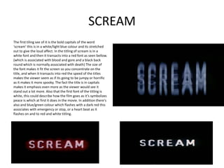
The first tiling see of it is the bold capitals of the word
‘scream’ this is in a white/light blue colour and its stretched
out to give the loud affect. In the titling of scream is in a
white font and then it transacts into a red font as seen bellow.
(which is associated with blood and gore and a black back
round which is normally associated with death) The size of
the font makes it fit the screen so you concentrate on the
title, and when it transacts into red the speed of the titles
makes the viewer seem as if its going to be jumpy or horrific
as it makes it more spooky. The fact the title is in capitals
makes it emphasis even more as the viewer would see it
stand out a lot more. Also that the first font of the titling is
white, this could describe how the film goes as it’s symbolizes
peace is which at first it does in the movie. In addition there's
also and blue/green colour which flashes with a dark red this
associates with emergency or stop, or a heart beat as it
flashes on and to red and white titling.
2. SCREAM
For this titling to the right the title stretches
out behind the normal titling to give this loud
affect. Also its ironic as the title is ‘SCREAM’
which means shouting ect. if your in trouble, is
it capitals as almost if someone's screaming or
shouting.
This is the only flash’s of the actual only scream in a
red font that doesn’t have an affect with it, I think
they do this to actually make it standout to show the
pure red, which makes the viewer take the idea from
it being flashed with white and blue to show that
red’s the main colour. This could be to associate it
with of the following; blood, emergency, hate, death,
danger and horror.
This is the final thing we see of the
titling, it zooms out bigger to cover the
whole screen so the text crawls out
towards the viewer, I believe they did
this so that it calls out and jumps to you,
which 9/10 happens in a horror.
3. F
I
N
A
L
D
E
S
In this first 2 minutes titling final destination titling in final
T
destination the first image is the Ferris wheel to the left I
which associates with the funfair, which puts the irony into
the film as that’s where the group of teenagers first cheat N
death. The background images of the titles are mostly in
black and dark colouring that resembles fog, which relates
A
to death or mysteriousness. The only bright lights are the T
fair lights of the rides, which backs it stand out because of
the contrast of the background image. Another important I
aspect of the opening titling sequences is the music, in this
sequence they use deep brass instruments and shallow O
music, which has high and suspicious elements. (Also
things happening in the background e.g screaming)
N
4. F
I
N
A
L
D
E
S
T
In some of these shots of the fairground are
I
classic fairground attractions. These clips of the N
films have different camera angles for example A
high angle shots, medium close up, extreme close
up and close ups, they use these in the different
T
affects to give the certain clip more value of I
importance. The only transactions in this 2 O
minute sequence are fading in and out and
straight cuttings.
N