Downloaded 63 times


![Developing Quality Technical
Information, 3rd Edition
“[W]e organized [this
book] to show you how to
apply quality
characteristics that make
technical information,
including information
embedded in user
interfaces, easy to use,
easy to understand, and
easy to find.”
2 April 2016 Steven Jong, InterChange 2016 29
Amazon.com](https://image.slidesharecdn.com/embeddeduithirdrailorthirdway-160403210427/85/Embedded-User-Assistance-Third-Rail-or-Third-Way-29-320.jpg)
![DQTI: “Technical information
continues to evolve”
“The nature of our work as technical
communicators continues to change, more rapidly
than ever.”
• “Some of us began our careers delivering camera-
ready copy for a shelf of physical books”
• “[W]ith the advent of the web, we used our
online help-writing skills to rework books into
online topic-based documentation”
• “Now we need to expand our focus beyond topic-
based information and onto the product user
interfaces themselves”
2 April 2016 Steven Jong, InterChange 2016 30](https://image.slidesharecdn.com/embeddeduithirdrailorthirdway-160403210427/85/Embedded-User-Assistance-Third-Rail-or-Third-Way-30-320.jpg)

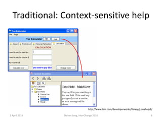
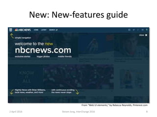
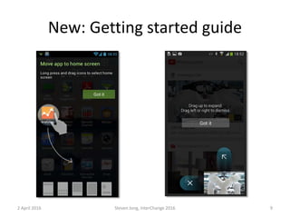
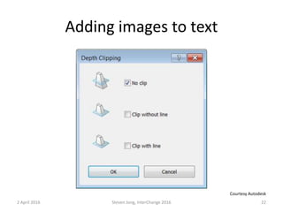
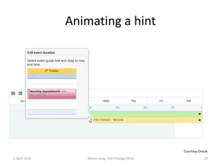
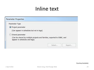
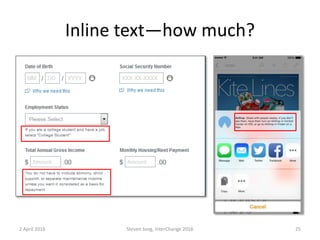
The document discusses embedded user assistance and whether it represents a "third rail" or "third way" for technical communicators. It presents examples of traditional documentation methods and embedded assistance features like tooltips, messages, and inline help. The author argues that embedded assistance is a viable approach for technical communicators, allowing them to work within agile development processes to directly improve the user experience. Technical communicators can apply established principles to embedded assistance while still performing their core functions of explaining technical information to users.


