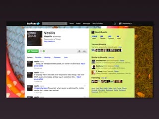
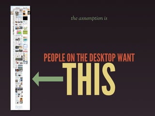
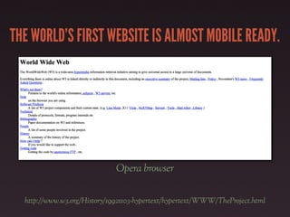
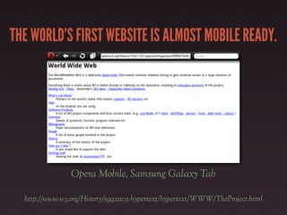
THE WORLD’S FIRSTWEBSITE IS ALMOST MOBILE READY.
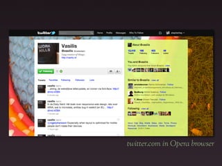
Opera browser
http://www.w3.org/History/19921103-hypertext/hypertext/WWW/TheProject.html
26.
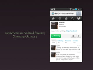
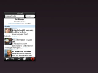
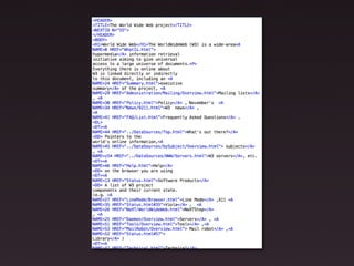
THE WORLD’S FIRSTWEBSITE IS ALMOST MOBILE READY.
Opera Mobile, Samsung Galaxy Tab
http://www.w3.org/History/19921103-hypertext/hypertext/WWW/TheProject.html
28.
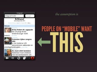
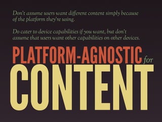
The device landscapeis constantly
changing. Capabilities are constantly
changing. Properly structured content
is portable to future platforms.
Don’t assume userswant di!erent content simply because
of the platform they’re using.
Do cater to device capabilities if you want, but don’t
assume that users want other capabilities on other devices.
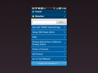
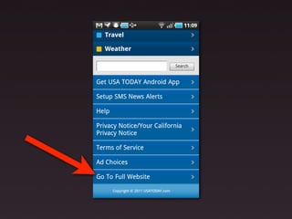
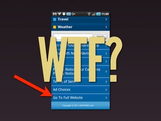
PLATFORM-AGNOSTIC for
CONTENT
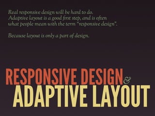
Real responsive designwill be hard to do.
Adaptive layout is a good "rst step, and is often
what people mean with the term “responsive design”.
Because layout is only a part of design.
RESPONSIVE DESIGN&
ADAPTIVE LAYOUT
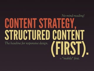
Thinking about, creatingand
designing structured content "rst
caters to the lowest common layout
denominator, whether this be a small
screen or a text browser.
In fact, this content should be able to
go anywhere.