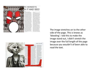
1. The image stretches on to the other
side of the page. This is knows as
‘bleeding’. I did this to make the
image stand out, I didn’t stretch the
image over the full length of the page
because you wouldn’t of been able to
read the text.
2. The text is large and bold to make it
stand out and attract the audience.
My image links with the article
because in the background is an Arctic
Monkeys poster that I have duplicated
on Photoshop. The drums link with the
article because Arctic Monkeys are a
band and drums are one of the first
things you would associate with a band.