Social media marketing/Seo expert and digital marketing
Music posters
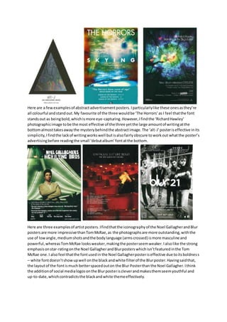
1. Here are a few examples of abstract advertisement posters. I particularly like these ones as they’re
all colourful and stand out. My favourite of the three would be ‘The Horrors’ as I feel that the font
stands out as being bold, which is more eye-capturing. However, I find the ‘Richard Hawley’
photographic image to be the most effective of the three yet the large amount of writing at the
bottom almost takes away the mystery behind the abstract image. The ‘alt-J’ poster is effective in its
simplicity, I find the lack of writing works well but is also fairly obscure to work out what the poster’s
advertising before reading the small ‘debut album’ font at the bottom.
Here are three examples of artist posters. I find that the iconography of the Noel Gallagher and Blur
posters are more impressive than Tom McRae, as the photographs are more outstanding, with the
use of low angle, medium shots and the body language (arms crossed) is more masculine and
powerful, whereas Tom McRae looks weaker, making the poster seem weaker. I also like the strong
emphasis on star-rating on the Noel Gallagher and Blur posters which isn’t featured in the Tom
McRae one. I also feel that the font used in the Noel Gallagher poster is effective due to its boldnes s
– white font doesn’t show up well on the black and white filter of the Blur poster. Having said that,
the layout of the font is much better spaced out on the Blur Poster than the Noel Gallagher. I think
the addition of social media logos on the Blur poster is clever and makes them seem youthful and
up-to-date, which contradicts the black and white theme effectively.