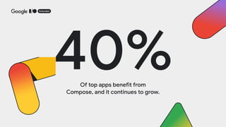
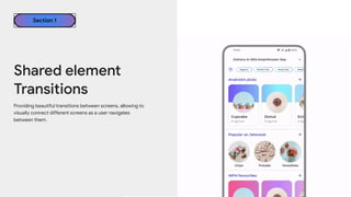
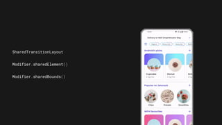
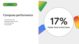
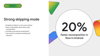
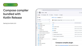
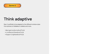
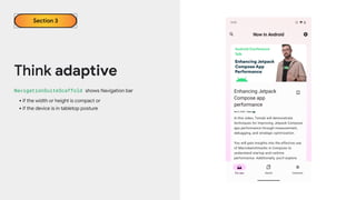
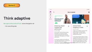
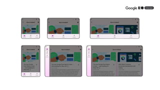
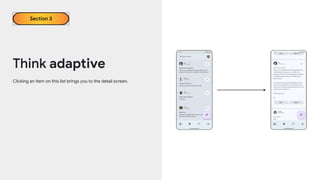
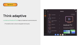
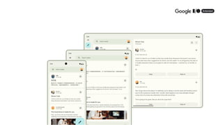
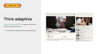
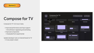
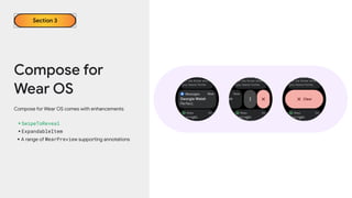
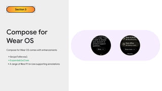
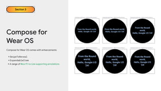
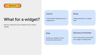
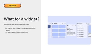
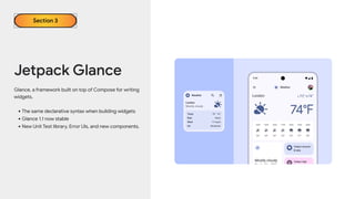
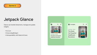
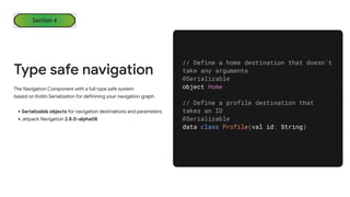
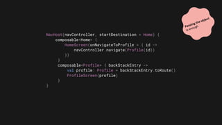
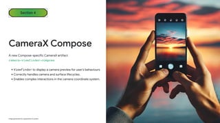
The document discusses the advancements in Jetpack Compose for Android, highlighting its benefits for rapid application development and the increasing adoption among top apps. Key updates include enhanced animations, improved transitions, and new adaptive layouts for various screen sizes, as well as new features for Compose on TV and Wear OS. It also introduces Jetpack Glance for widget creation and updates to type-safe navigation using Kotlin serialization.


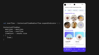
![@OptIn(ExperimentalLayoutApi::class)
@Composable
private fun SuggestedSnacks(
snacks: List<Snack>,
onSnackClick: (Snack) -> Unit,
modifier: Modifier = Modifier
) {
var maxLines by remember { mutableIntStateOf(1) }
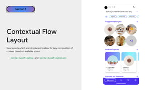
ContextualFlowRow(
maxLines = maxLines,
overflow = ContextualFlowRowOverflow.expandIndicator {
val remainingItems = totalItemCount - shownItemCount
MyOverflowIndicator(
remainingItems = remainingItems,
modifier = Modifier
.clickable {
// Expand the max lines on click
maxLines += 1
}
)
},
itemCount = snacks.size
) { index ->
val snack = snacks[index]
SnackItem(snack, onSnackClick)
}
}](https://image.slidesharecdn.com/iox2024whatsnewincompose-240709071618-9d7b656b/85/What-s-new-in-android-jetpack-compose-2024-22-320.jpg)

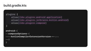
![libs.versions.toml
[versions]
kotlin = "2.0.0"
[plugins]
compose = {
id = "org.jetbrains.kotlin.plugin.compose",
version.ref = "kotlin"
}](https://image.slidesharecdn.com/iox2024whatsnewincompose-240709071618-9d7b656b/85/What-s-new-in-android-jetpack-compose-2024-30-320.jpg)


![[PBO] Pertemuan 12 - Pemrograman Android](https://cdn.slidesharecdn.com/ss_thumbnails/pbopertemuan12-pemrogramanandroid-181217234438-thumbnail.jpg?width=640&height=640&fit=bounds)