Ancillary Task: Analysis
From my previous title sequence analysis I have highlighted several key areas
for the construction of a successful Local TV News intro. Putting this research
into practice I worked with my group to create our own title sequences. Here is
the finished title sequence and analysis of the process and finished product.
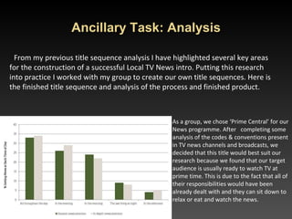
As a group, we chose ‘Prime Central’ for our
News programme. After completing some
analysis of the codes & conventions present
in TV news channels and broadcasts, we
decided that this title would best suit our
research because we found that our target
audience is usually ready to watch TV at
prime time. This is due to the fact that all of
their responsibilities would have been
already dealt with and they can sit down to
relax or eat and watch the news.
2. As a group we then created a Logo based on our name to use within the title sequence
and on our final news programme.
We used a sun flare alongside a slightly purplish
shaded area which represents the midlands in order
to announce to the audience that this is the area
we’re focusing on. A gif of a spinning globe was
implemented in the C space in order to make the
bug spin on screen.
Through the use of semiotics companies use their logos to remind their audience of their
services, products and brand.
TV news also uses this technique to remind the viewer who they are and what their media
product portrays.
This is the original picture
we used.
We then proceeded to
draft ideas, this is the one
we really liked where we
slanted the map and filled
it in with 2 solid colours.
We then added the
abbreviation of Prime
Central in order to act like
a reminder.
• 3. Through our research into audience theory we studied ‘The Hartley
Classification’ and knew that is was important to appeal to our audience
demographic through these 7 socially grouped categories:
• 1 Self – ambitions or interests of the audience
• 2 Gender
• 3 Age Group
• 4 Class – different social classes e.g. working, upper etc.
• 5 Ethnicity
• 6 Family
• 7 Nation
One of the ways we did this was through our use of still and moving images
These 3 images relate to self, ethnicity, class, gender, nation and age group as it shows the local
audience which varies in ethnicity, age, class, gender etc. Also, the pictures relate to self as the library
may be an interest of the audiences’.
4. Using this work we constructed our TV title sequence in a programme called
Video Studio Pro x8 which is a video editing programme.
We edited together our Logos and footage from our filming day. Trimming
footage, adding transitions, effects and text based on our groups storyboard.
. The transitions we used were progressive-film, box-wipe, twist-clock, split-film
and lens-f/x. The reason we chose these transitions was because it offers our
broadcast a snappy intro with the transitions matching the sharp beats of the
soundtrack therefore making it suitable for a generic title sequence. It was quite
simple and therefore wouldn’t cause distraction. It’d be short and to the point.
. The effects and transitions we used on our logos and images were: God ray and
moving image gif of a globe.
The reason we chose these was because the logo would stand out due to the god-
ray and also it shows the particular area we’re targeting which is the midlands. We
also used a moving image gif of a globe to add complexity to the globe so it looks
crisp and professional. Also, it allows for the bug to not just be a boring static image
but rather an impressive globe spinning moving bug.
. The length of our title sequence is 20 seconds, this is because it shows the key
elements of our target area as we did research to see what the perfect length
should be and it was between 15-30 secs. We also didn’t want the title sequence to
be too long as it would bore the audience.
5. We then added Music to our title sequences.
We chose this music because it’s short, snappy, almost aggressive yet
triumphant. This adds a sense of awareness for the audience as the
soundtrack would be something they’d hear all the time so they’d know
it’s the news. The soundtrack would allow for channel recognition.
Compared to the morning news, we have a more assertive soundtrack
as it’s prime time and everyone is already awake and all ready active.
The use of a soundtrack links in with John Fiske’s theory of semiotics as
we are using non-verbal communication through symbols such as the
soundtrack that announces that the news are about to roll.
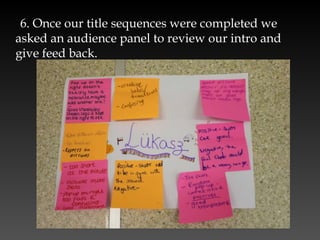
6. Once our title sequences were completed we
asked an audience panel to review our intro and
give feed back.
7. Based on this feedback we amended our title sequences.
8. I feel I have made a successful title sequence due to the fact that I’ve
done a lot of research where I disassembled a few local, national and
international news programmes in order to pick up certain key codes and
conventions that I could use in the project. I’ve looked at many different
conventions such as ticker, name super, bug, title sequence, time-lapse, vox
pops etc. I’m planning on using some further down in my broadcast but
I’ve used some in my title sequence. I made sure to include good transitions
that match my soundtrack as well as recognisable locations that people who
are local to the midlands would recognise, particularly people who live
close to/or in Birmingham.
9. In preparation for the main task I will use both our groups logo, the
music style and 2 shades of blue and a purplish shade as my house style;
On my top and bottom strips and in the actors clothing to carry through
the continuity.

Week 10 analysis pp

  • 1.
    Ancillary Task: Analysis Frommy previous title sequence analysis I have highlighted several key areas for the construction of a successful Local TV News intro. Putting this research into practice I worked with my group to create our own title sequences. Here is the finished title sequence and analysis of the process and finished product. As a group, we chose ‘Prime Central’ for our News programme. After completing some analysis of the codes & conventions present in TV news channels and broadcasts, we decided that this title would best suit our research because we found that our target audience is usually ready to watch TV at prime time. This is due to the fact that all of their responsibilities would have been already dealt with and they can sit down to relax or eat and watch the news.
  • 2.
    2. As agroup we then created a Logo based on our name to use within the title sequence and on our final news programme. We used a sun flare alongside a slightly purplish shaded area which represents the midlands in order to announce to the audience that this is the area we’re focusing on. A gif of a spinning globe was implemented in the C space in order to make the bug spin on screen. Through the use of semiotics companies use their logos to remind their audience of their services, products and brand. TV news also uses this technique to remind the viewer who they are and what their media product portrays. This is the original picture we used. We then proceeded to draft ideas, this is the one we really liked where we slanted the map and filled it in with 2 solid colours. We then added the abbreviation of Prime Central in order to act like a reminder.
  • 3.
    • 3. Throughour research into audience theory we studied ‘The Hartley Classification’ and knew that is was important to appeal to our audience demographic through these 7 socially grouped categories: • 1 Self – ambitions or interests of the audience • 2 Gender • 3 Age Group • 4 Class – different social classes e.g. working, upper etc. • 5 Ethnicity • 6 Family • 7 Nation One of the ways we did this was through our use of still and moving images These 3 images relate to self, ethnicity, class, gender, nation and age group as it shows the local audience which varies in ethnicity, age, class, gender etc. Also, the pictures relate to self as the library may be an interest of the audiences’.
  • 4.
    4. Using thiswork we constructed our TV title sequence in a programme called Video Studio Pro x8 which is a video editing programme. We edited together our Logos and footage from our filming day. Trimming footage, adding transitions, effects and text based on our groups storyboard. . The transitions we used were progressive-film, box-wipe, twist-clock, split-film and lens-f/x. The reason we chose these transitions was because it offers our broadcast a snappy intro with the transitions matching the sharp beats of the soundtrack therefore making it suitable for a generic title sequence. It was quite simple and therefore wouldn’t cause distraction. It’d be short and to the point. . The effects and transitions we used on our logos and images were: God ray and moving image gif of a globe. The reason we chose these was because the logo would stand out due to the god- ray and also it shows the particular area we’re targeting which is the midlands. We also used a moving image gif of a globe to add complexity to the globe so it looks crisp and professional. Also, it allows for the bug to not just be a boring static image but rather an impressive globe spinning moving bug. . The length of our title sequence is 20 seconds, this is because it shows the key elements of our target area as we did research to see what the perfect length should be and it was between 15-30 secs. We also didn’t want the title sequence to be too long as it would bore the audience.
  • 5.
    5. We thenadded Music to our title sequences. We chose this music because it’s short, snappy, almost aggressive yet triumphant. This adds a sense of awareness for the audience as the soundtrack would be something they’d hear all the time so they’d know it’s the news. The soundtrack would allow for channel recognition. Compared to the morning news, we have a more assertive soundtrack as it’s prime time and everyone is already awake and all ready active. The use of a soundtrack links in with John Fiske’s theory of semiotics as we are using non-verbal communication through symbols such as the soundtrack that announces that the news are about to roll.
  • 6.
    6. Once ourtitle sequences were completed we asked an audience panel to review our intro and give feed back.
  • 7.
    7. Based onthis feedback we amended our title sequences. 8. I feel I have made a successful title sequence due to the fact that I’ve done a lot of research where I disassembled a few local, national and international news programmes in order to pick up certain key codes and conventions that I could use in the project. I’ve looked at many different conventions such as ticker, name super, bug, title sequence, time-lapse, vox pops etc. I’m planning on using some further down in my broadcast but I’ve used some in my title sequence. I made sure to include good transitions that match my soundtrack as well as recognisable locations that people who are local to the midlands would recognise, particularly people who live close to/or in Birmingham. 9. In preparation for the main task I will use both our groups logo, the music style and 2 shades of blue and a purplish shade as my house style; On my top and bottom strips and in the actors clothing to carry through the continuity.