Download to read offline

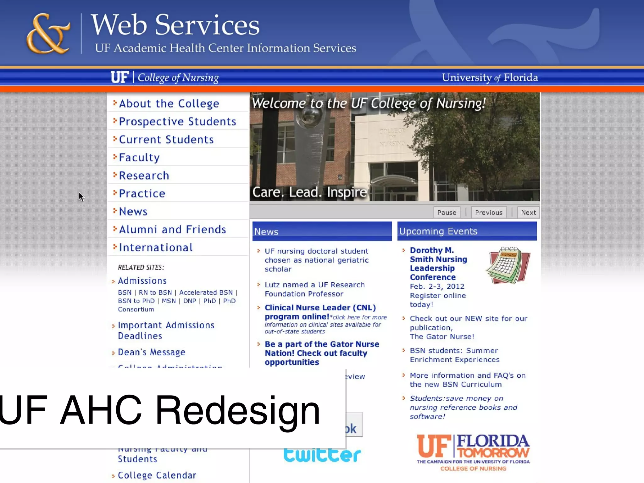
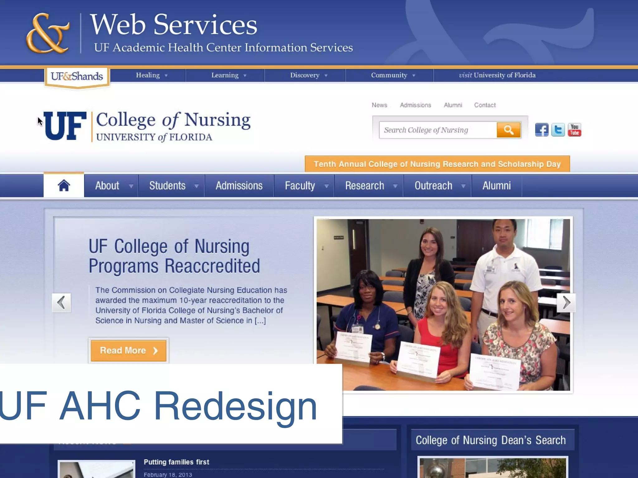
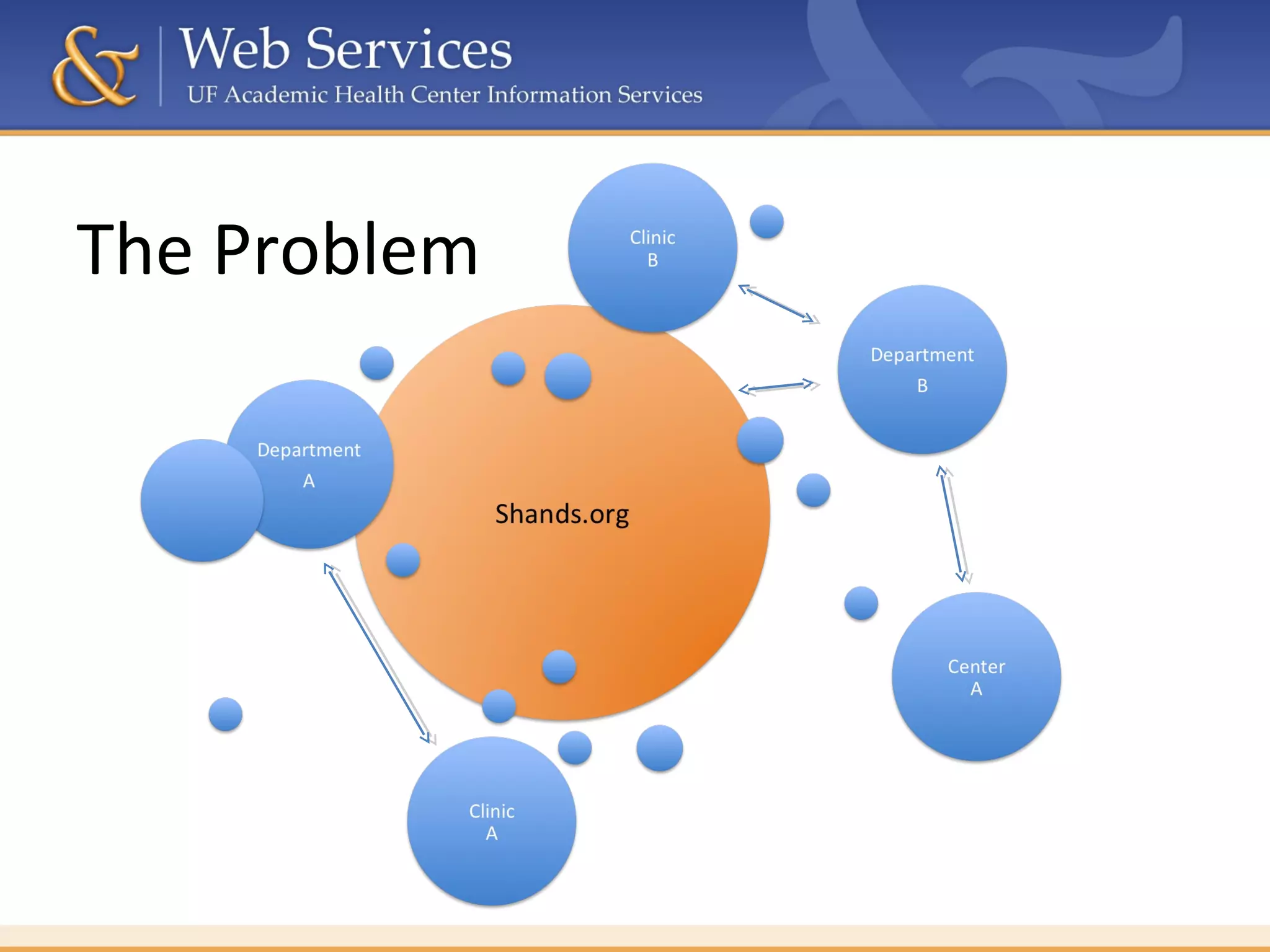
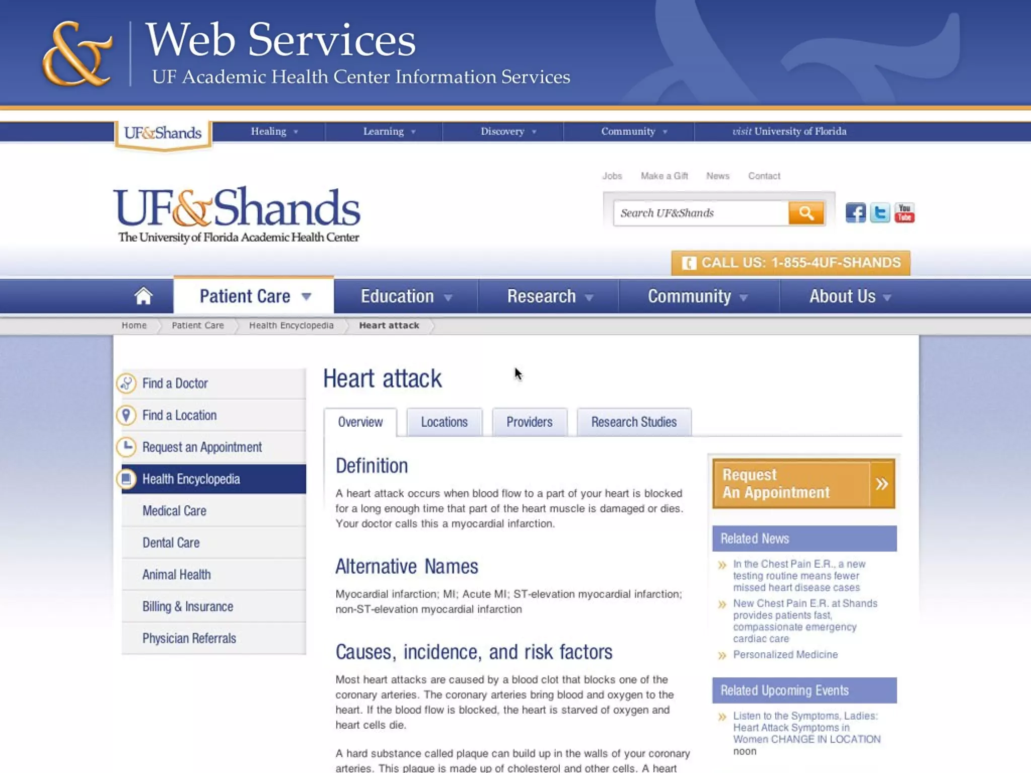
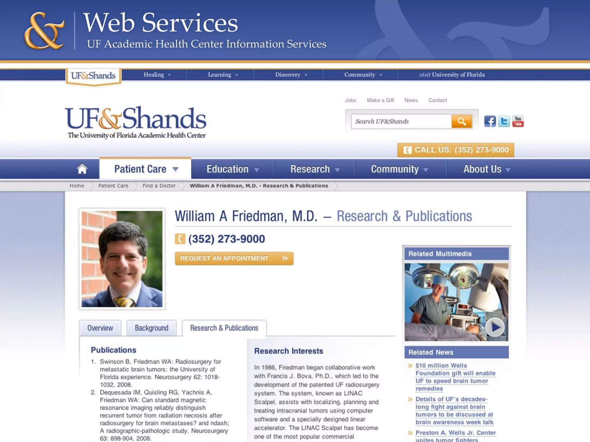
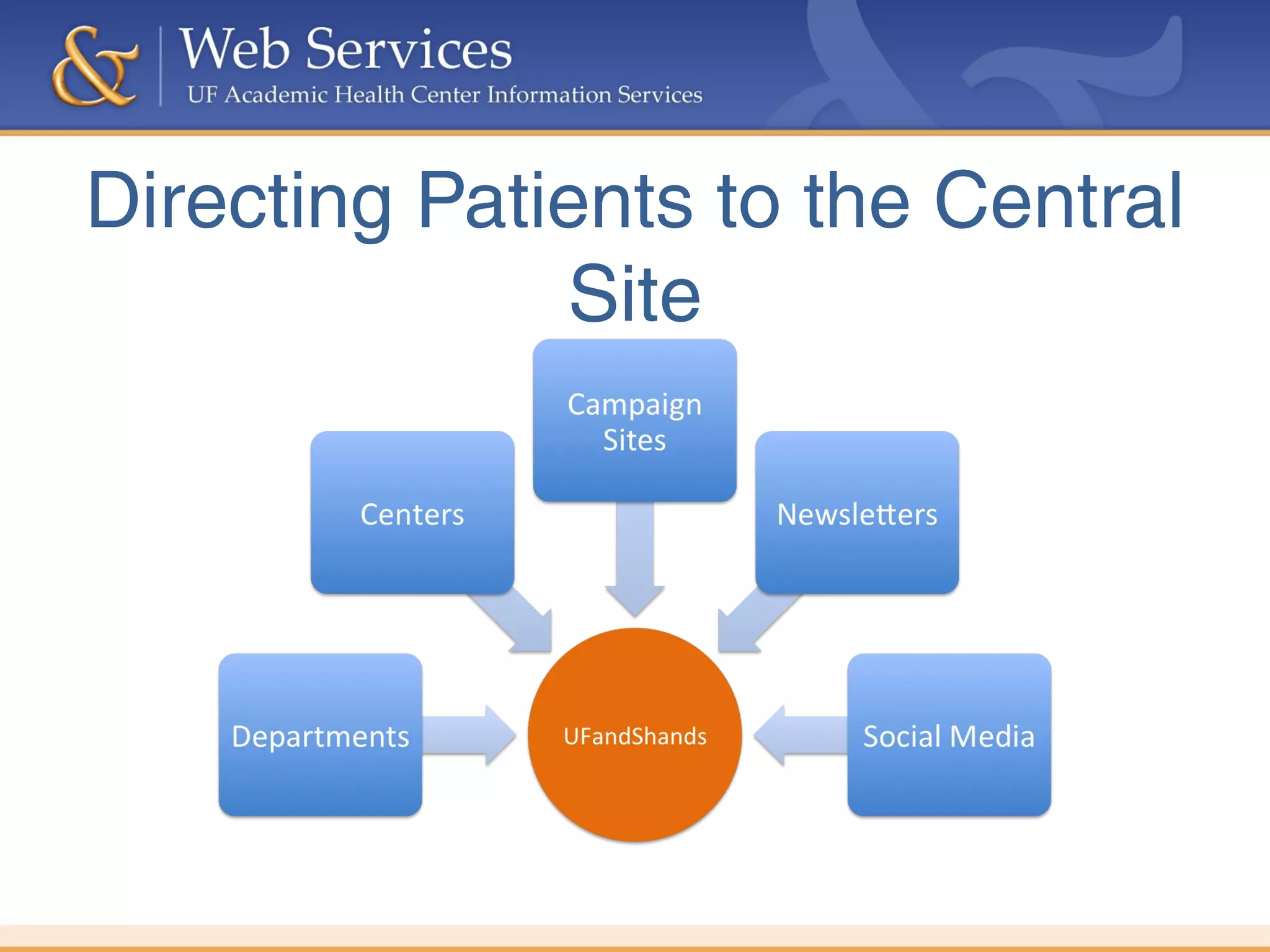
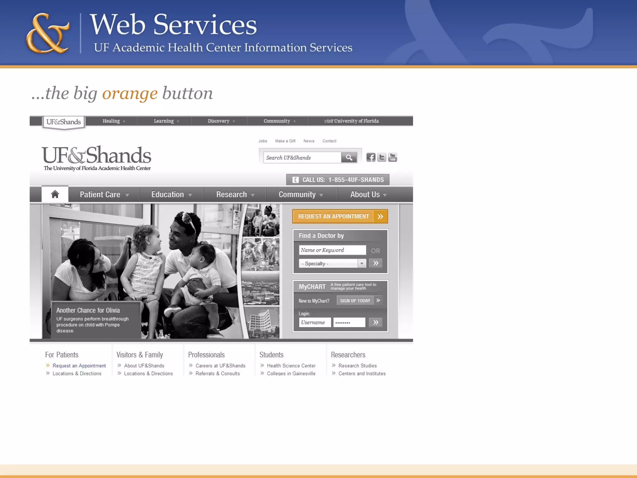
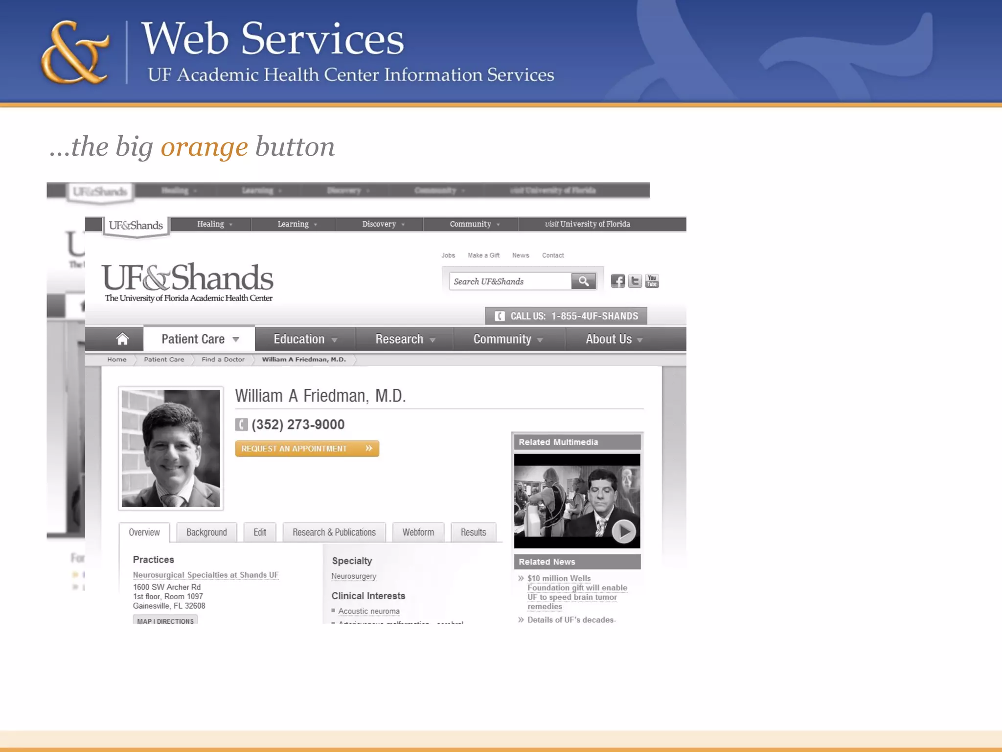
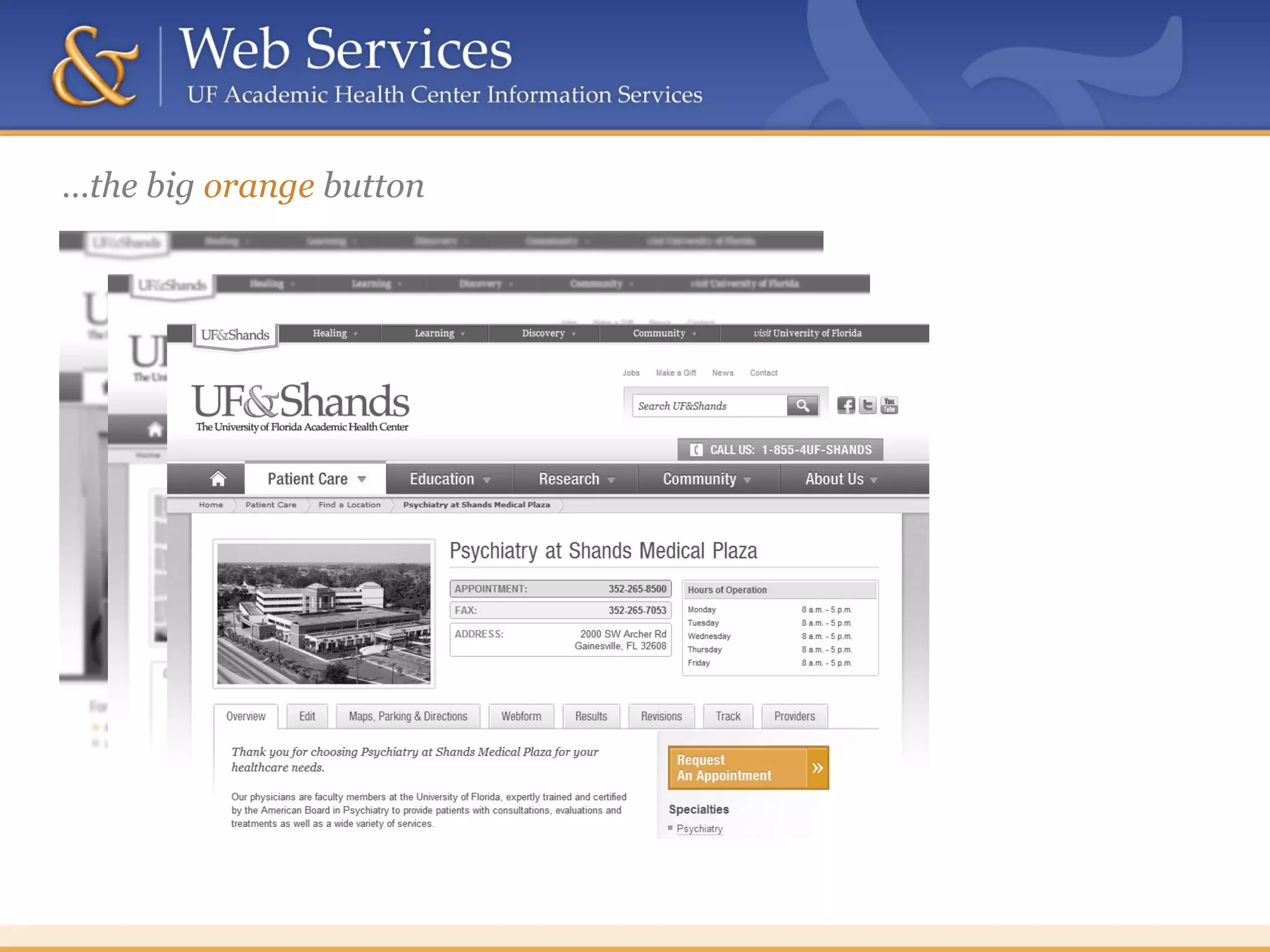
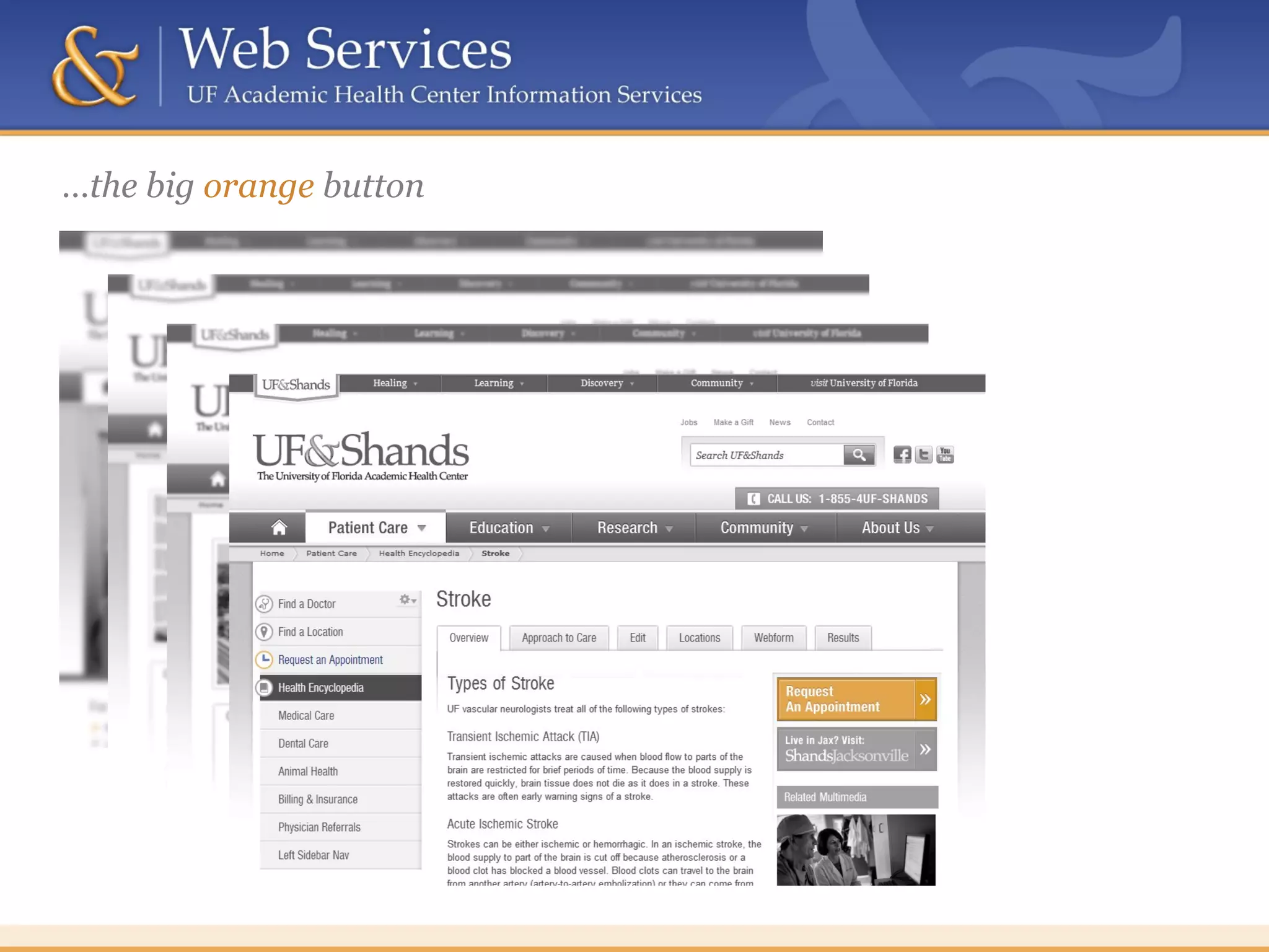
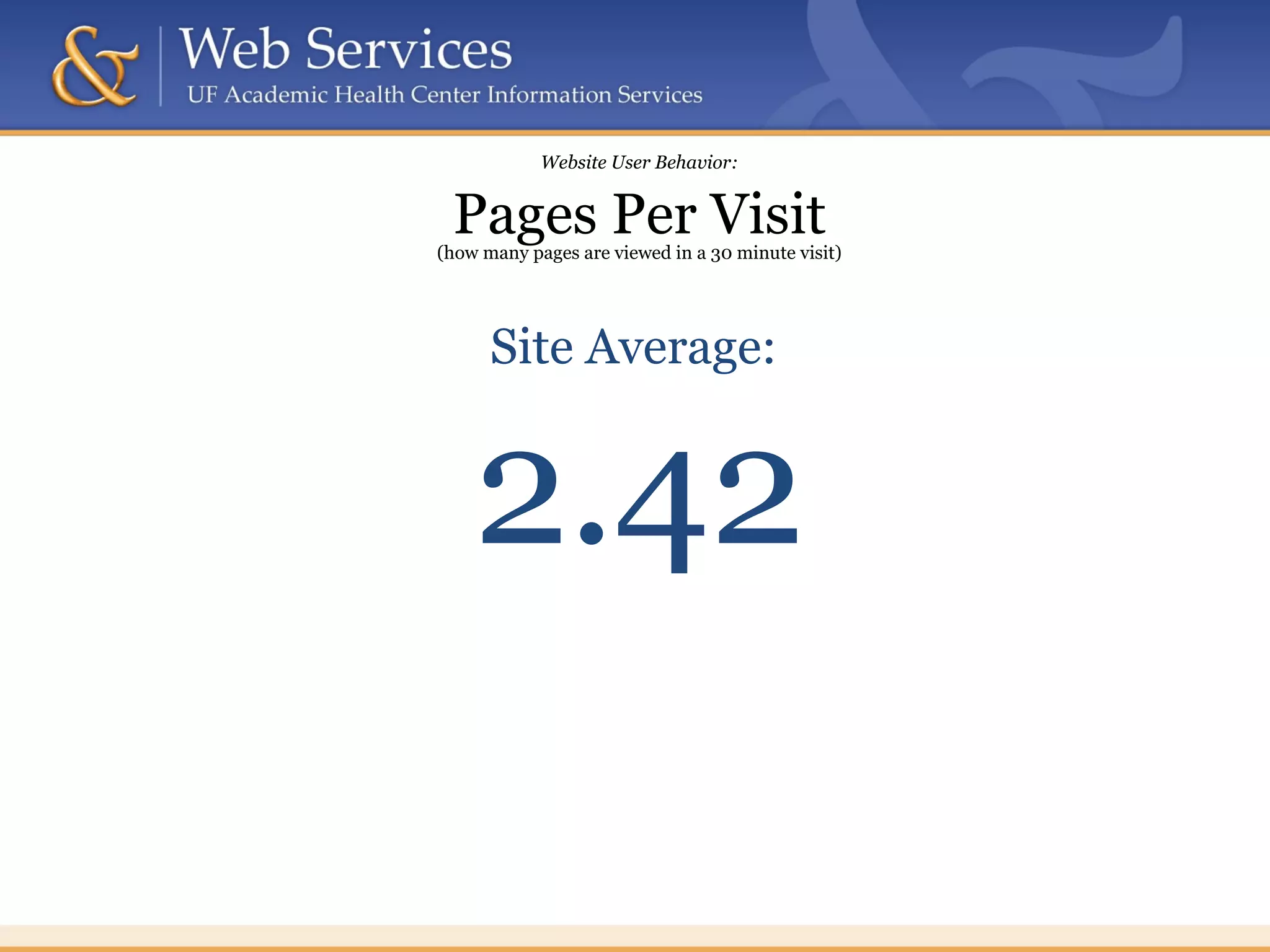
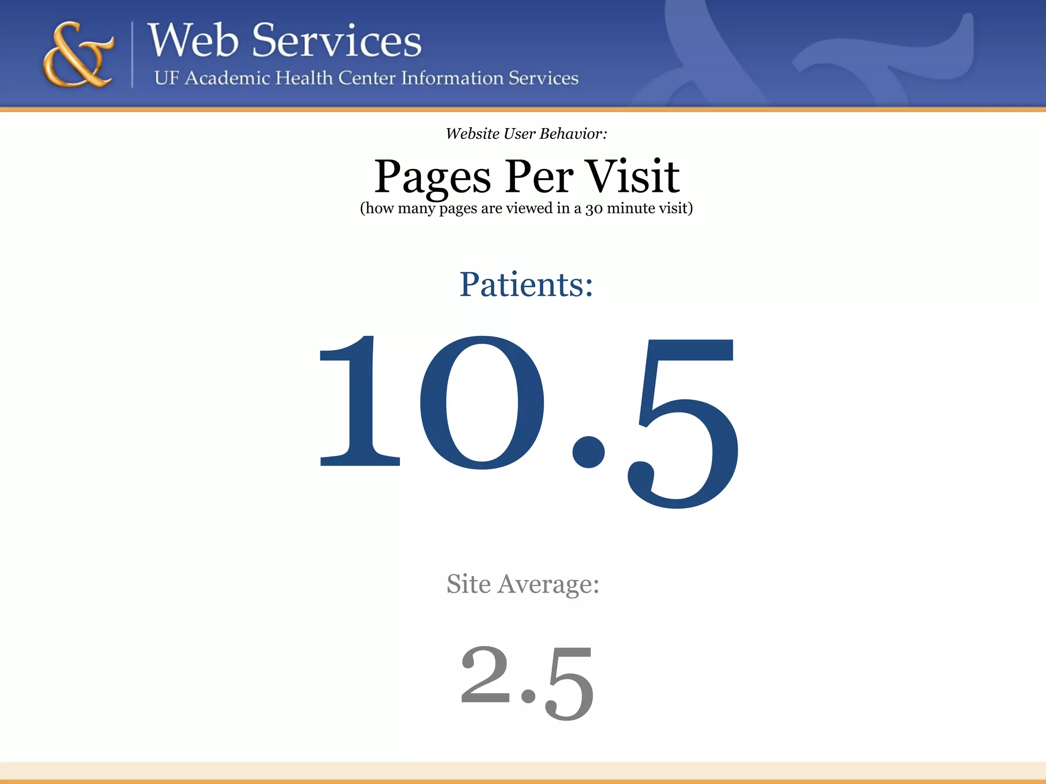
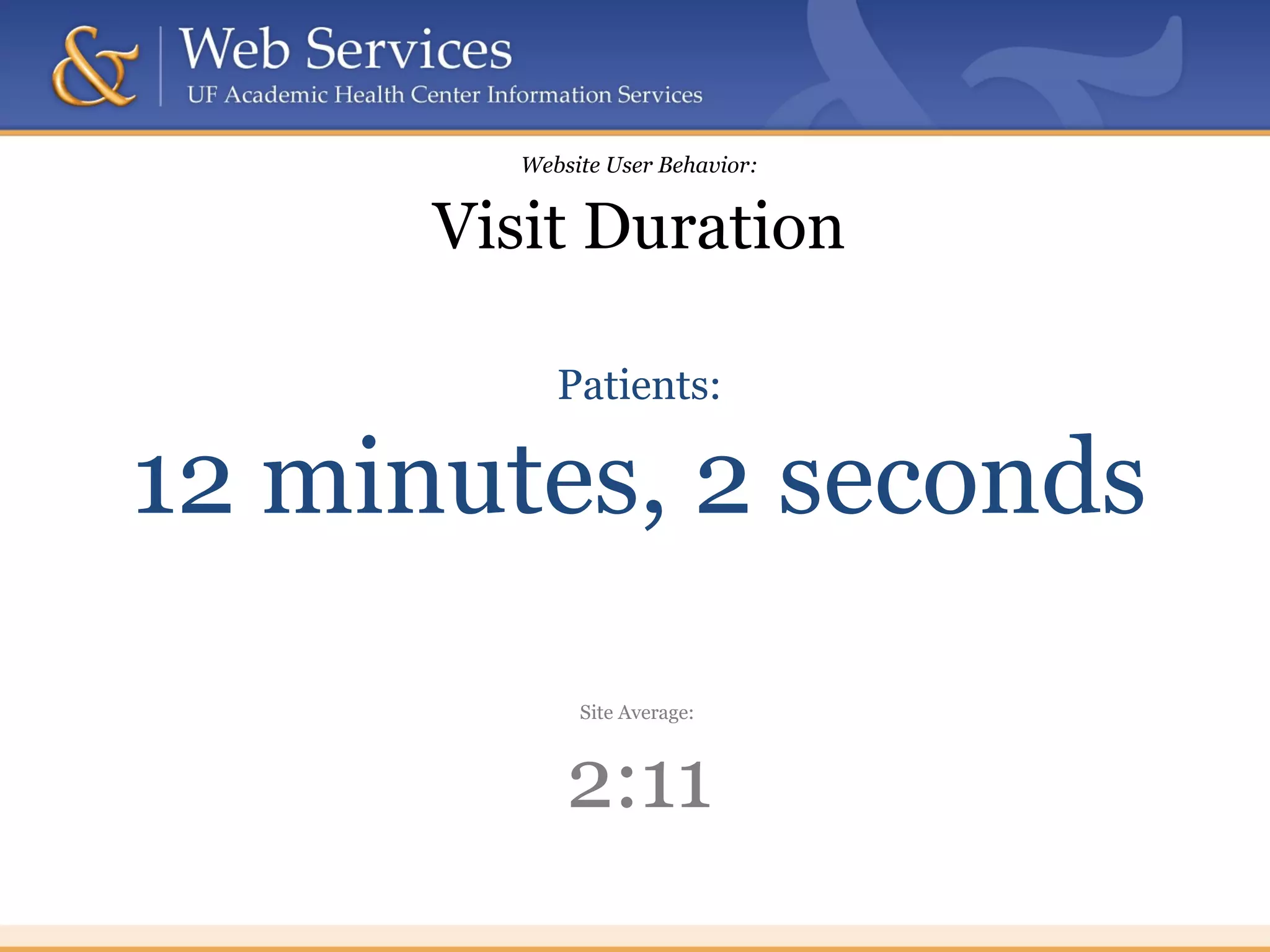
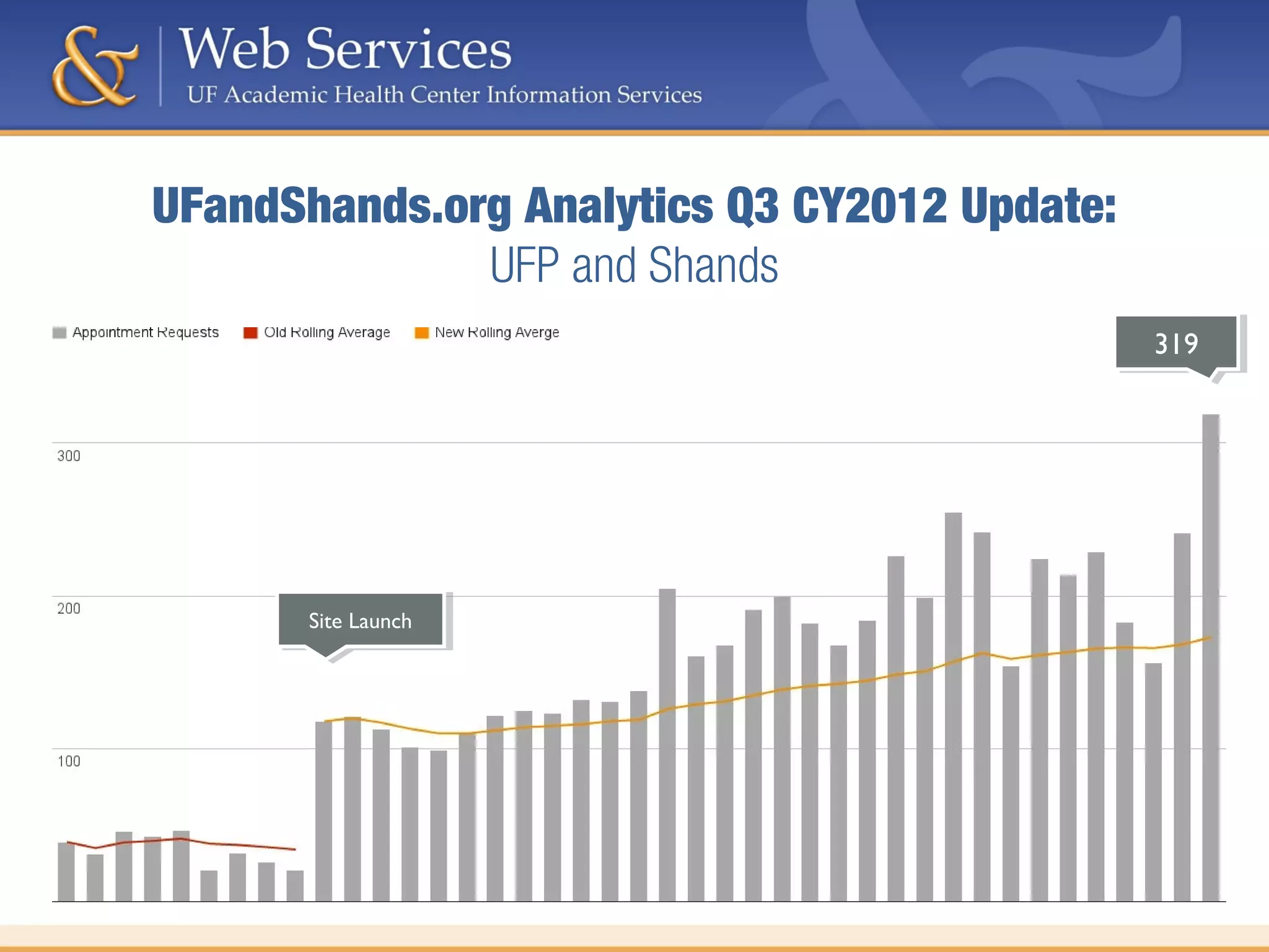
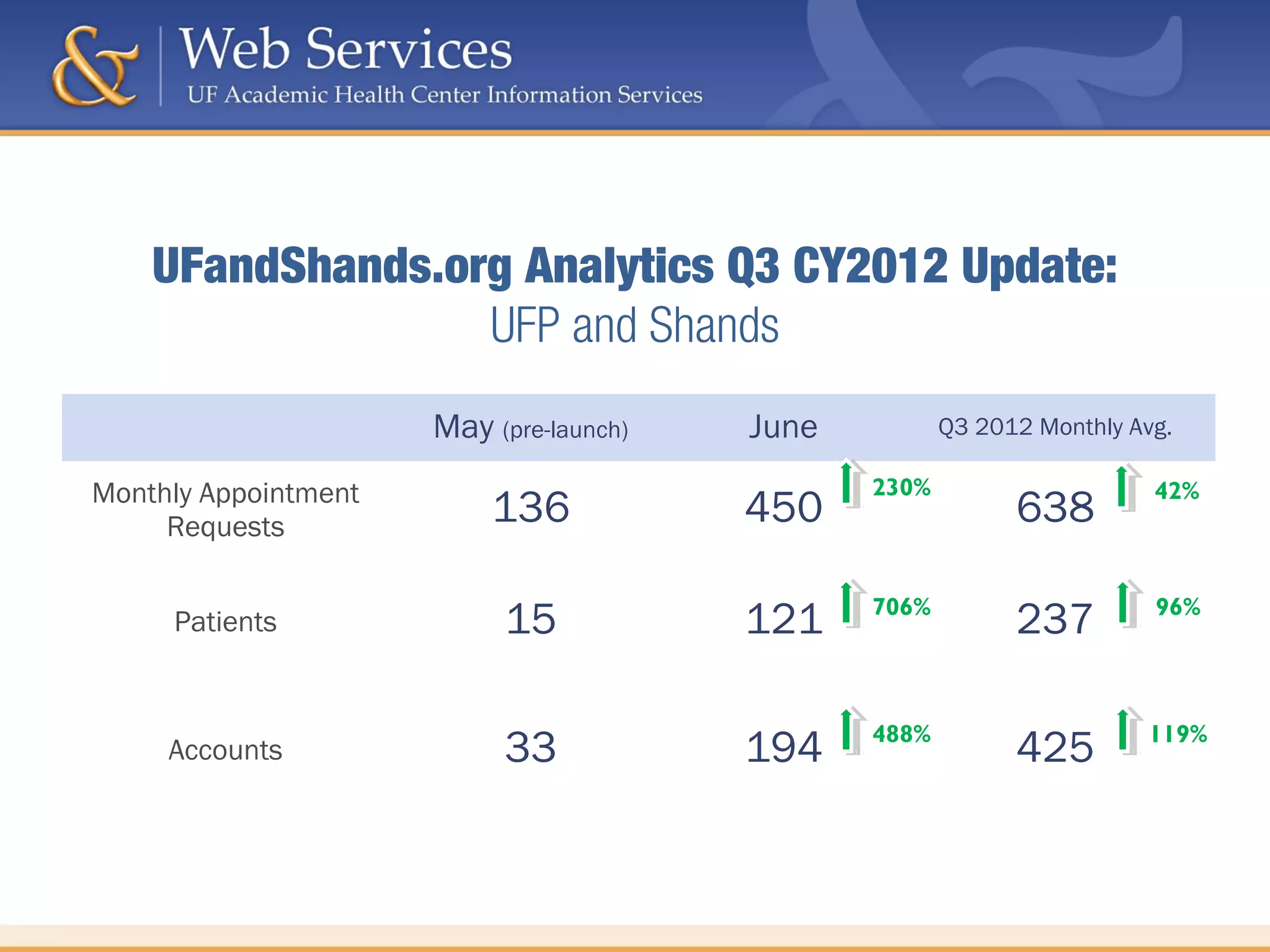
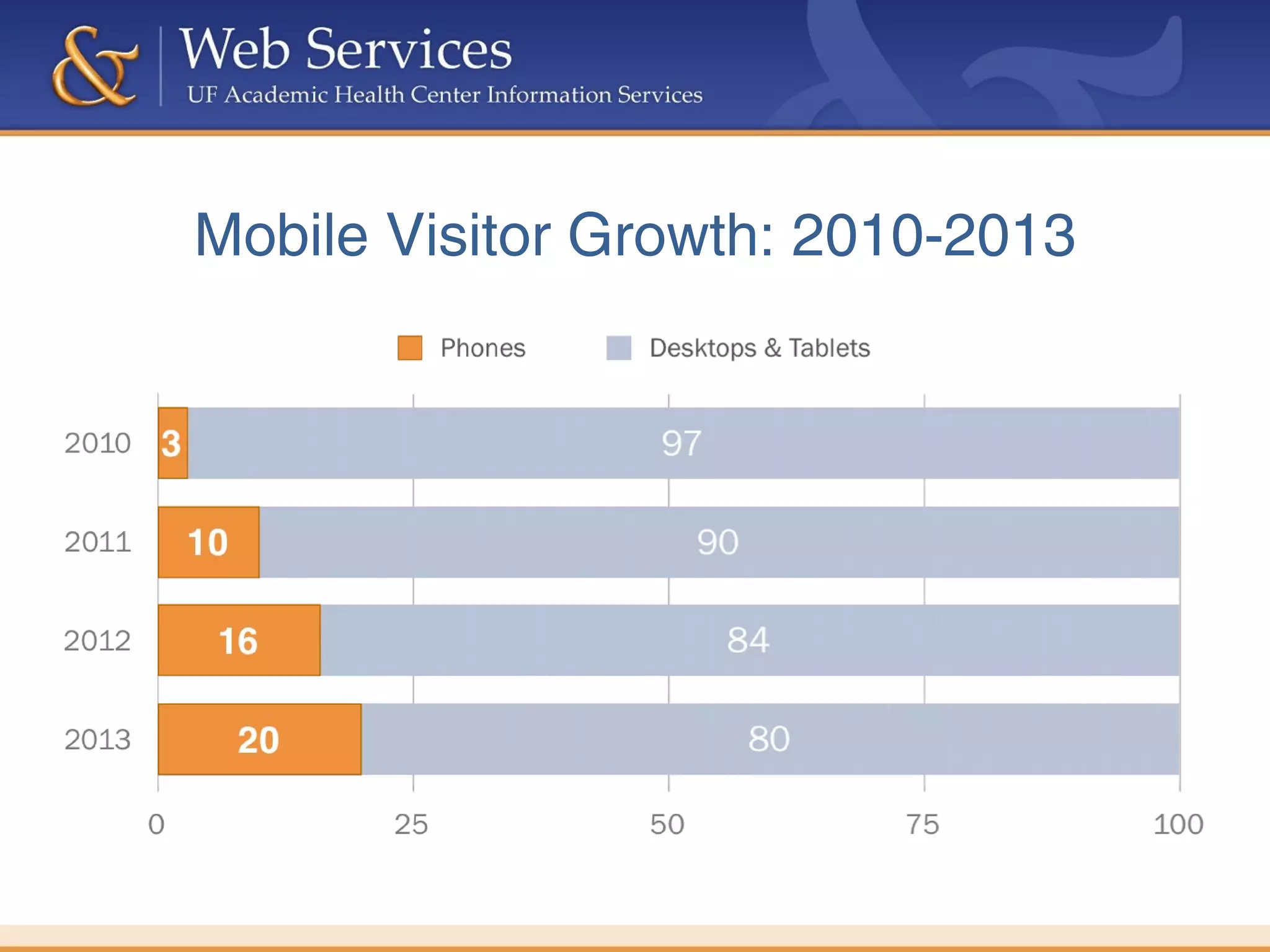
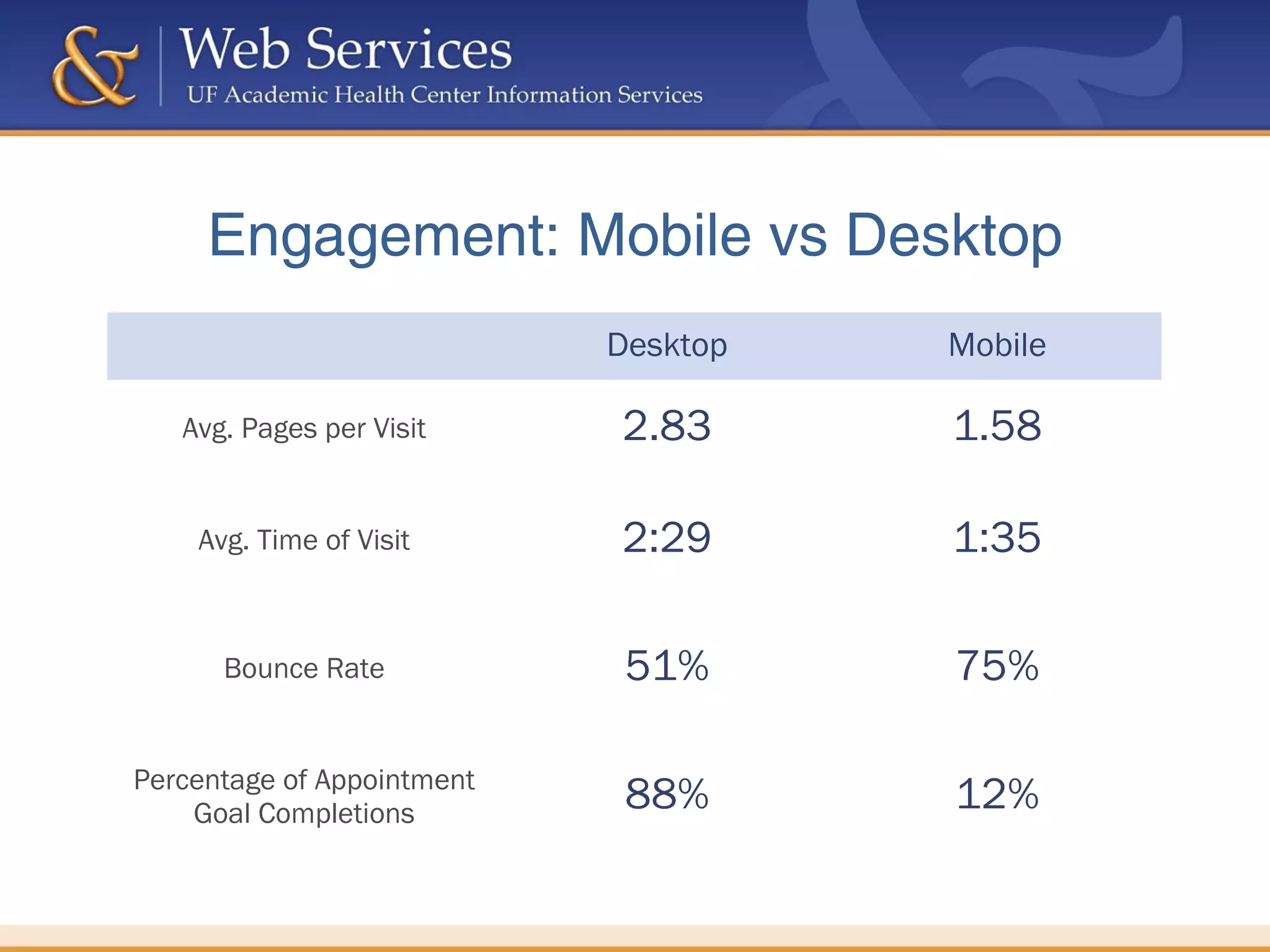
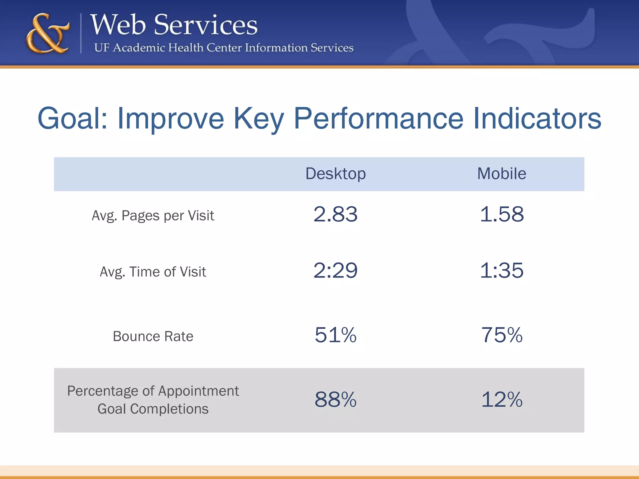
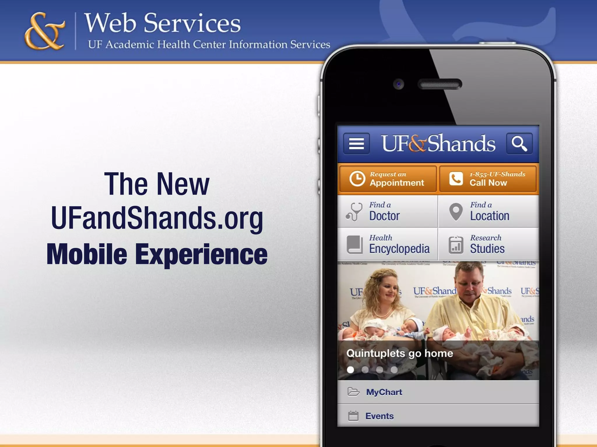

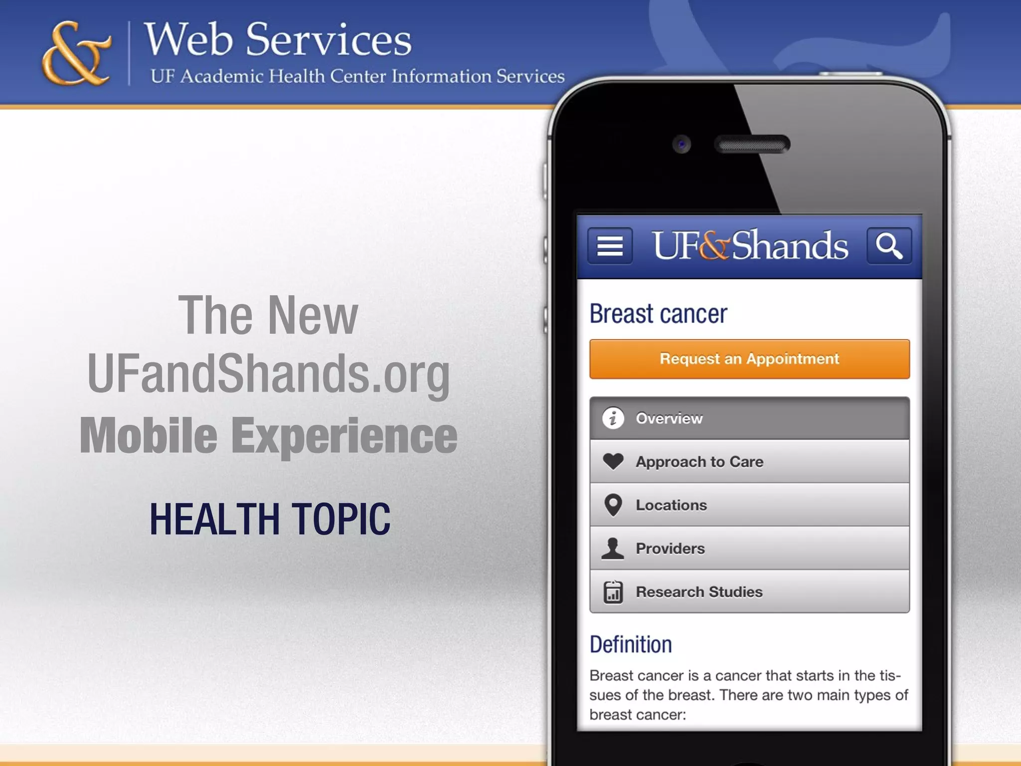

The document outlines a strategy for redesigning the UF and Shands website to enhance patient experience through improved content accessibility and usability. It presents analytics on user behavior, demonstrating metrics such as pages per visit, visit duration, and mobile versus desktop engagement. The goal is to optimize key performance indicators to facilitate better appointment completions and overall user satisfaction.


![Bearing Down: 20 tips for Creating Persuasive Web Content [NOW with MORE Bears]](https://cdn.slidesharecdn.com/ss_thumbnails/persuasive-content-slideshare-150810135807-lva1-app6892-thumbnail.jpg?width=640&height=640&fit=bounds)


