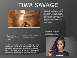
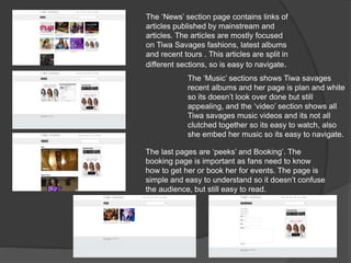
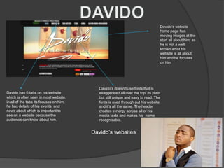
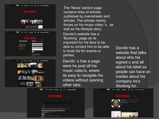
Hansa muftah
Tiwa savage has a subtitle of to
what is coming out
Tiwa savages website is beautifully
layered out, its simple and easy to
read. She has a moving image of
her which is eye catching because
its different and unique, attention is
all on her which shows that she
took time to make her website all
about her and incorporating her
style of design.
Tiwa savage had 6 tabs
which focuses on her
music, booking, newsTiwa savage has a
simple font of her
name on the page so
it doesn’t
Tiwa savages website is simple but still unique, she
uses neutral colour, which is followed through out
her website. Her website is all focused on her she
has a lot of images of her as she is not a very known
artist so she has o focus her website on herself
The ‘News’ section page contains links of
articles published by mainstream and
articles. The articles are mostly focused
on Tiwa Savages fashions, latest albums
and recent tours . This articles are split in
different sections, so is easy to navigate.
The ‘Music’ sections shows Tiwa savages
recent albums and her page is plan and white
so its doesn’t look over done but still
appealing, and the ‘video’ section shows all
Tiwa savages music videos and its not all
clutched together so its easy to watch, also
she embed her music so its easy to navigate.
The last pages are ‘peeks’ and Booking’. The
booking page is important as fans need to know
how to get her or book her for events. The page is
simple and easy to understand so it doesn’t confuse
the audience, but still easy to read.
Davido’s website
home page has
moving images at the
start all about him, as
he is not a well
known artist his
website is all about
him and he focuses
on him
Davido has 6 tabs on his website
which is often seen in most website,
in all of the tabs its focuses on him,
he has details of his events and
news about which is important to
see on a website because the
audience can know about him.
Davido’s doesn’t use fonts that is
exaggerated all over the top, its plain
but still unique and easy to read. The
fonts is used through out his website
and it’s all the same. The header
creates synergy across all of his
media texts and makes his name
recognisable.
Davido’s websites
The ‘News’ section page
contains links of articles
published by mainstream and
articles. The articles mainly
forces on his music video ‘s , as
well as his lifestyle story.
Davido’s website has a
‘Booking’ page as its
important for his fans to be
able to contact him to be able
to book his for events or
parties.
Davido ‘s has a page
were he post all his
music video’s, where
its easy to navigate his
videos without opening
other tabs.
Davido has a
website that talks
about who his
signed o and all
about his label so
people can have an
insides about his
company he's
Working for.

Website

  • 1.
  • 2.
    Tiwa savage hasa subtitle of to what is coming out Tiwa savages website is beautifully layered out, its simple and easy to read. She has a moving image of her which is eye catching because its different and unique, attention is all on her which shows that she took time to make her website all about her and incorporating her style of design. Tiwa savage had 6 tabs which focuses on her music, booking, newsTiwa savage has a simple font of her name on the page so it doesn’t Tiwa savages website is simple but still unique, she uses neutral colour, which is followed through out her website. Her website is all focused on her she has a lot of images of her as she is not a very known artist so she has o focus her website on herself
  • 3.
    The ‘News’ sectionpage contains links of articles published by mainstream and articles. The articles are mostly focused on Tiwa Savages fashions, latest albums and recent tours . This articles are split in different sections, so is easy to navigate. The ‘Music’ sections shows Tiwa savages recent albums and her page is plan and white so its doesn’t look over done but still appealing, and the ‘video’ section shows all Tiwa savages music videos and its not all clutched together so its easy to watch, also she embed her music so its easy to navigate. The last pages are ‘peeks’ and Booking’. The booking page is important as fans need to know how to get her or book her for events. The page is simple and easy to understand so it doesn’t confuse the audience, but still easy to read.
  • 4.
    Davido’s website home pagehas moving images at the start all about him, as he is not a well known artist his website is all about him and he focuses on him Davido has 6 tabs on his website which is often seen in most website, in all of the tabs its focuses on him, he has details of his events and news about which is important to see on a website because the audience can know about him. Davido’s doesn’t use fonts that is exaggerated all over the top, its plain but still unique and easy to read. The fonts is used through out his website and it’s all the same. The header creates synergy across all of his media texts and makes his name recognisable. Davido’s websites
  • 5.
    The ‘News’ sectionpage contains links of articles published by mainstream and articles. The articles mainly forces on his music video ‘s , as well as his lifestyle story. Davido’s website has a ‘Booking’ page as its important for his fans to be able to contact him to be able to book his for events or parties. Davido ‘s has a page were he post all his music video’s, where its easy to navigate his videos without opening other tabs. Davido has a website that talks about who his signed o and all about his label so people can have an insides about his company he's Working for.