Download to read offline

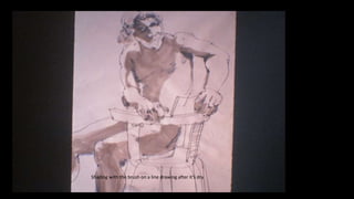
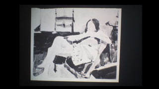
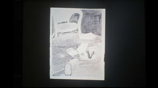
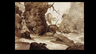
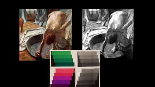
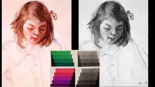
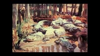


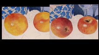
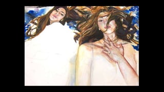
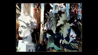
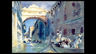

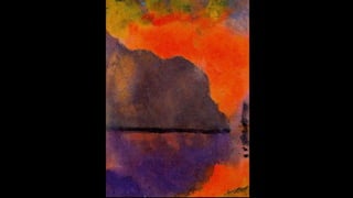
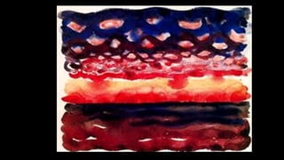
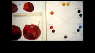
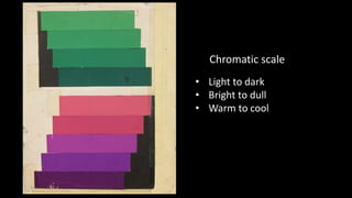
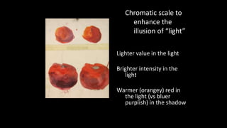

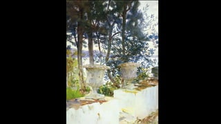
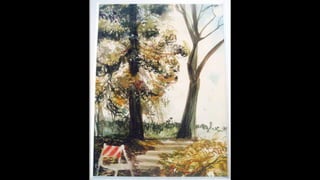
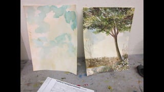
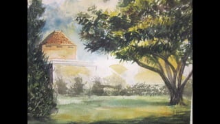
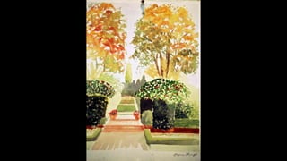

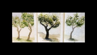
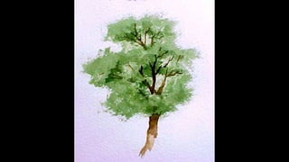
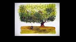

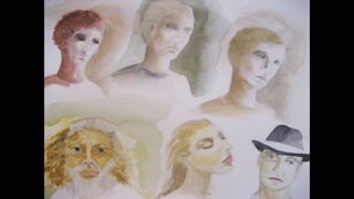
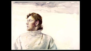


The document provides tips for using watercolor and ink techniques when drawing landscapes. It recommends starting with very light tones of diluted ink and using darker tones only at the end. Light tones should be used to depict objects farther away while darker tones are used for objects closer. Shading can be added to a line drawing with the brush after it dries. The document also discusses using value, warm and cool colors, and chromatic scales to realistically portray light in a landscape.


