Download as PDF, PPTX
![It’s ACRL-approved!
The Value of Academic Libraries: A Comprehensive
Research Review and Report (2010) emphasized the
need:
“[T]o build librarians’ capacity to document, demonstrate,
and communicate library value”](https://image.slidesharecdn.com/visualizinglibraryinstructionstatistics-130507165200-phpapp01/85/Remix-Your-Data-Visualizing-Library-Instruction-Statistics-6-320.jpg)
![It’s ACRL-approved! (x2)
The 2012 report from the Value Of Academic
Libraries Summit: Connect, Collaborate, and Comm
unicate, reiterated, calling for:
“[M]ultiple replicable approaches for documenting and
demonstrating library impact on student learning and success”](https://image.slidesharecdn.com/visualizinglibraryinstructionstatistics-130507165200-phpapp01/85/Remix-Your-Data-Visualizing-Library-Instruction-Statistics-7-320.jpg)
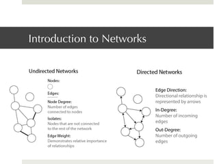
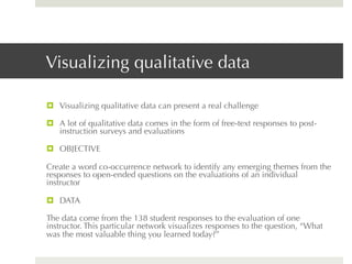
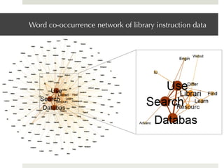
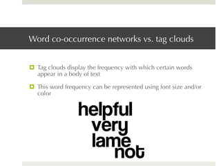
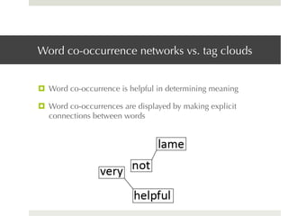
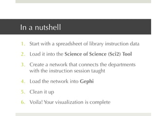
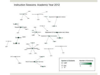
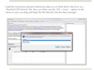
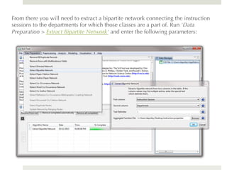
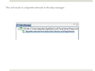
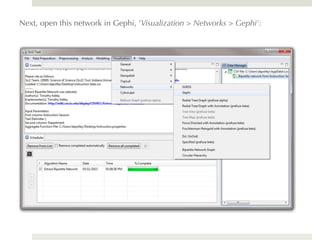
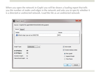
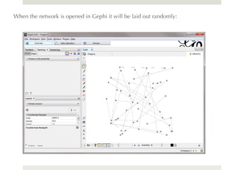
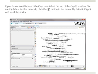
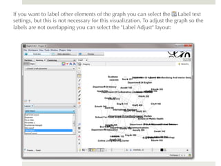
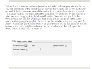
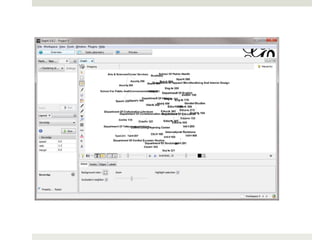
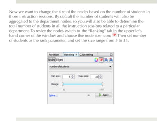
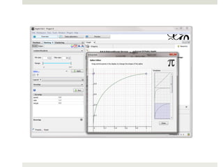
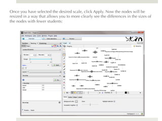
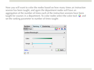
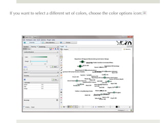
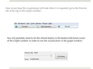
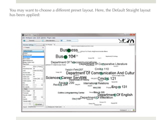
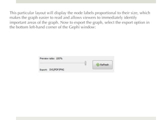
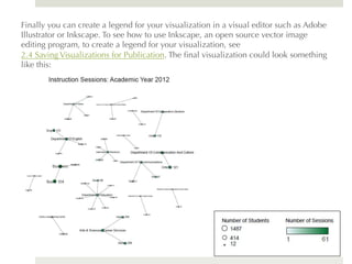

The document provides a guide on visualizing library instruction statistics using tools like Sci2 and Gephi. It emphasizes the importance of data visualization for revealing patterns and demonstrating the impact of academic libraries on student learning. The guide includes step-by-step instructions for creating both qualitative and quantitative visualizations from instruction data.


