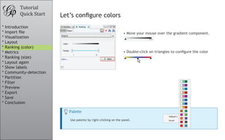
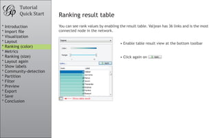
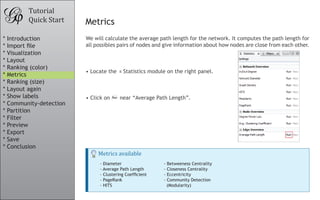
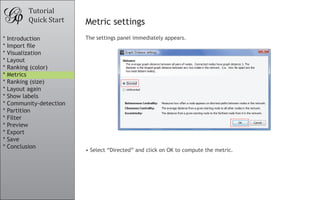
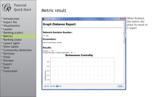
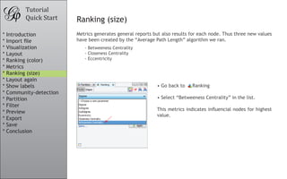
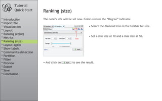
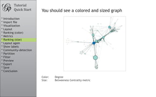
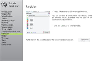
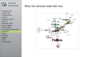
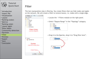
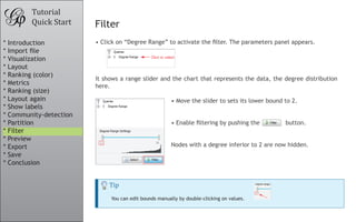
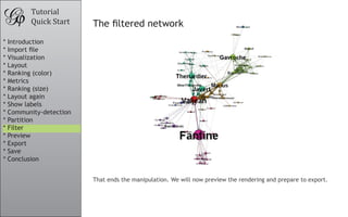
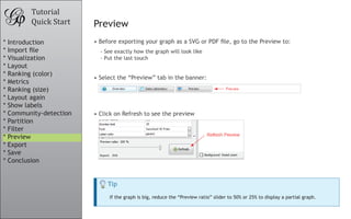
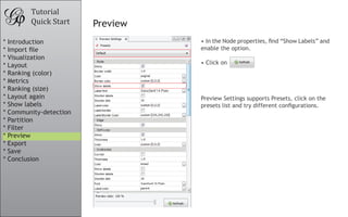
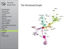
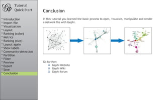
This tutorial document provides instructions for visualizing and analyzing a network dataset in Gephi. It describes the steps to import a network file, perform layout and ranking operations to visualize nodes and edges, calculate metrics about the network, detect communities, filter the network, preview the visualization, and export/save the project file. The tutorial uses a sample network dataset of characters in the novel Les Miserables and guides the user through visualizing and manipulating the network in Gephi.
The document provides 17 productivity tips for using Altium Designer, an electronic design automation software. It describes tips such as how to walk through nets to check a design, manage layer sets, use net name prefixes to set up classes, find unconnected nets, place drill drawings, close out test point errors, and more. The tips are meant to improve efficiency and help hide some less known features of the software. It concludes by providing additional resources for more Altium Designer tips and tutorials.
Programming Without Coding Technology (PWCT) - Telephone DatabaseMahmoud Samir Fayed
This document describes steps for building a telephone database application using an interactive development environment. It involves selecting components from a browser to generate steps in a steps tree. Components are added using mouse clicks or keyboard shortcuts to create an application structure with if/else statements, loops, procedures, input/output and more. Over 60 steps are created to design the full application workflow and logic.
Programming Without Coding Technology (PWCT) - Logical OperationsMahmoud Samir Fayed
This document describes how to create a steps tree in PWCT 1.9 to demonstrate logical operations. It provides instructions on adding steps using components for assignment, AND, OR, NOT, XOR, bit operations, rotation, and wait times. Screenshots show the steps tree being built out with over 15 steps adding different logical operations on variables num1 and num2 and printing results to the console.
Programming Without Coding Technology (PWCT) - Arithmetic operationsMahmoud Samir Fayed
This document describes how to create a steps tree for performing arithmetic operations using the PWCT 1.9 Art Documentation application. It outlines 37 implementation steps to add components for assigning values, summing numbers, subtracting, multiplying, dividing, taking the square root, and printing results to the console. Images are provided showing the component browser and interaction pages for setting properties at each step.
Programming Without Coding Technology (PWCT) - How to deal with StringsMahmoud Samir Fayed
This document describes steps for working with strings in an application. It includes:
1. Creating a string variable and printing it to the console.
2. Converting the string to uppercase and lowercase and printing.
3. Getting the length of the string and converting it to a string.
4. Getting substrings from the left, right, and middle of the string and printing.
5. Adding a wait before ending to see the output.
Programming Without Coding Technology (PWCT) - Convert the data type of varai...Mahmoud Samir Fayed
This document describes how to create a steps tree in PWCT 1.9 to demonstrate converting between different data types in variables. It provides detailed instructions on using the mouse or keyboard shortcuts to add components like assignment, numeric to string, print text to console, and get date/time to the steps tree. Screenshots illustrate each step of the process. The final steps tree contains 14 steps that perform operations like converting a number to a string, adding a date, and printing values to the console.
Programming Without Coding Technology (PWCT) - Adding controls to windows.Mahmoud Samir Fayed
This document describes the steps to add various controls like labels, buttons, textboxes, etc. to a window in PWCT 1.9. It explains how to add each control using either the mouse or keyboard shortcuts. Screenshots are provided of the component browser, interaction page and form designer at each step. The final steps tree shows the hierarchy of all controls added to the window.
The document discusses the benefits of exercise for mental health. Regular physical activity can help reduce anxiety and depression and improve mood and cognitive functioning. Exercise causes chemical changes in the brain that may help protect against mental illness and improve symptoms.
A new procedure for noninvasive detection of breast cancer lymph node metasta...Senology.org
A team of researchers from the University of Florida and Arizona developed a new noninvasive procedure for detecting breast cancer lymph node metastasis using targeted fluorescent molecular imaging probes that recognize two cell surface markers highly expressed in breast cancer lymph node metastases. This new procedure could spare breast cancer patients from invasive and unreliable sentinel lymph node biopsies and surgery-associated negative side effects by noninvasively detecting breast cancer lymph node metastasis.
The document discusses how JDeveloper 11g, Oracle ADF 11g, and JHeadstart can be used to rapidly develop rich Java web applications with JSF and ADF. It provides an overview of these technologies and their capabilities for declarative development and model-driven code generation. The presentation includes demonstrations of building master-detail applications with JDeveloper and ADF and generating full-fledged applications from models with JHeadstart.
The document discusses Microsoft SQL Server 2005 Reporting Services, including an overview of viewing reports on the Report Server, accessing and sharing data sources, configuring report execution and security, developing reports using SQL queries and custom code libraries, and integrating reports into web pages using the Report Server web interface. Reports can be customized with parameters passed via query strings and delivered on schedules as subscriptions to network folders or email destinations. The Report Server provides a centralized location for rendering reports accessed through a web browser.
This document provides a tutorial on how to use Gephi software to analyze and visualize network graphs. It outlines the basic steps of importing a sample graph file, applying layout algorithms to organize the nodes, calculating metrics, detecting communities, filtering the graph, and exporting/saving the results. The tutorial demonstrates features of Gephi including node ranking, partitioning, and interactive visualization of the graph.
Introduction to Network Analysis in GephiVictor Blaer
This document provides an introduction to network analysis and visualization using Gephi software. It begins with some mindset tips, such as expecting troubleshooting challenges and iterative work. The document then outlines Gephi's interface, including the Overview panel for interactive exploration, Data Laboratory for raw data, and Preview panel for final visualization export. Basic network concepts like nodes, edges, and layout algorithms are defined. The rest of the document demonstrates how to import node and edge data from CSV files, visualize the resulting network, run statistics and filtering, and tweak the layout for clearer presentation. Examples using real-world Twitter data are also briefly mentioned.
This document provides an overview of the basics of using Gephi, an open-source software for network visualization and analysis. It describes the main sections and functions of the Gephi interface, including the Overview tab for network setup and measures, the Data Laboratory tab for examining and editing node and edge data, and the Preview tab for configuring and viewing the network visualization. It also explains how to import network data from various file formats, calculate network statistics, manipulate node and edge properties, and save or export the final network project.
社會網絡分析UCINET Quick Start Guide
This guide provides a quick introduction to UCINET. It assumes that the software has been installedwith the data in the folder C:\Program Files\Analytic Technologies\Ucinet 6\DataFiles and this hasbeen left as the default directory.
Source : https://sites.google.com/site/ucinetsoftware/home
Neo4j + Tableau Visual Analytics - GraphConnect SF 2015 Neo4j
This document discusses integrating Neo4j graph databases with Tableau visualization software. It describes Tableau as a leader in business intelligence and visual analytics and explains that while Tableau typically works with tables, graphs can also be visualized. It then outlines three ways to connect Neo4j to Tableau - using a web data connector, exporting data to a Tableau data extract file, or publishing directly to Tableau Server. Finally, it provides a roadmap for beta releases integrating Neo4j and Tableau by the end of the year and envisions future capabilities to directly represent graph structures in Tableau.
This document provides instructions for visualizing metabolic networks using the MetaMapp R package and Cytoscape software. It describes how to:
1) Prepare input files for MetaMapp and address common errors, 2) Obtain network and node attribute files from MetaMapp, 3) Import these files into Cytoscape and visualize the network using various layouts, 4) Map node attributes such as color, size, and label to experimental metadata, and 5) Manipulate the network view through filtering, clustering, and exporting for publication. The goal is to create clear, focused visualizations of metabolic subnetworks from omics data.
This document provides an overview and instructions for a tutorial that demonstrates the features of the STAR*NET least squares survey adjustment software package. The tutorial includes 10 example projects of different survey network types that users can open and review to familiarize themselves with STAR*NET's interface and capabilities. The examples progress from basic 2D traverses to more advanced 3D networks, GPS data, and leveling data. Installation instructions are provided to access the demo version of STAR*NET used in the tutorial.
Prepared as part of the IT for Business Intelligence course of MBA @VGSOM, IIT Kharagpur. The tutorial describes how to create an interactive map using the open source software QGIS.
The document discusses how TactonWorks can be used to iteratively solve design problems. It describes how TactonWorks considers all constraints and options simultaneously to develop a complete solution set. This allows it to resolve the design automatically each time a change is made. TactonWorks creates a dynamic user interface that updates based on design choices. It uses attributes, constraints, and collections to link different parts of the design tree together and ensure consistency.
Crystal tr///SAP Design Studio online training by design studio Export-24/7//...venkat training
///SAP Design Studio online training by design studio Export-24/7//
venkat
Contact numbers : +91 9972971235,+91-9663233300(India)
Email Id : Madhukar.dwbi@gmail.com, https://www.youtube.com/watch?v=KK6DxwhYxAI&t=23s
Website:
http://www.sap-bo-online-training.com/
This document provides an overview of the key features and functionality of a web-based geographic information system (GIS). It describes the main components including databases, mapping capabilities, and interactive tools. The system allows users to search for and view property data, print maps, and export/import data in common formats. Detailed information and help documents are accessible through an online help button.
Building an AI and ML Model Using KNIME and Python.pptxssuser448ad3
This document provides an overview of using KNIME and Python for artificial intelligence (AI) and machine learning (ML) model building. It discusses that KNIME is a user-friendly platform for data science workflows without coding, while Python is widely used for AI/ML due to its many libraries and being platform independent. The document then provides step-by-step instructions on building basic ML models in KNIME, including data import, cleaning, visualization, linear regression training and prediction, and model evaluation. It concludes that both KNIME and Python are good options, with KNIME being more accessible and Python having more extensive library support and community.
Practice discovering biological knowledge using networks approach.Elena Sügis
This practice session gives an overview how to analyze biological data using networks approach. It covers netwokrs topology, data integration, differential expression, network visualization, functional enrichment analysis and retrieving data from external sources. Primarily Cytoscape software is used for this practice session.
Mining and analyzing social media facebook w gephi - hicss47 tutorial - dav...Dave King
The document outlines steps to analyze a network graph using NodeXL. It includes:
1) Opening a network file, changing it to undirected, and performing layouts to better visualize the graph structure.
2) Analyzing node and edge attributes and coloring nodes based on attributes like age, sex, and group membership.
3) Calculating centrality and other network statistics, applying them to node size, and exporting results for further analysis.
The steps produce a stylized network graph preview and export node data for additional exploration.
How to prioritize and select projects with TransparentChoice softwareTransparentChoice
This document provides instructions for prioritizing and selecting projects using TransparentChoice software. It outlines a 5-step process: 1) create a project, 2) add projects manually or via import, 3) define evaluation criteria, 4) evaluate projects, and 5) display prioritization results including rankings, criteria weights, sensitivity analysis, and score/cost charts. The document demonstrates how to perform each step and highlights key features such as pairwise comparisons, custom scales, consensus building, and portfolio selection based on budget.
Goodbye Nightmare : Tops and Tricks for creating LayoutsLuc Bors
Luc Bors gave a presentation on creating complex layouts with Oracle ADF Faces. He discussed various layout containers like PanelFormLayout, PanelStretchLayout, PanelSplitter, panelAccordion, and PanelTabbedLayout. He emphasized the importance of using fewer layout containers, reducing the number of components that need to stretch, and working with colors to understand layout behavior. The presentation included tips on resources and best practices like using quick start layouts, avoiding nested scrolling, and benefiting from the PanelGridLayout component.
Luc Bors presented tips and tricks for creating complex layouts with Oracle ADF Faces at ODTUG KScope 2013 in New Orleans. He discussed using various layout containers like the panelFormLayout, panelStretchLayout, panelSplitter, panelAccordion, and panelTabbedLayout. He emphasized the importance of using colors to understand layout behavior and reducing the number of layout containers. The panelGridLayout was highlighted as an effective way to create grid-based layouts without needing spacers or separators. Examples were provided for creating common application layouts like an Outlook-style interface using these techniques.
Goodbye Nightmare: Tips and Tricks for Creating Complex Layouts with Oracle A...
Gephi tutorial-quick start
1. Tutorial
Quick Start
Gephi Tutorial
Quick Start
Welcome to this introduction tutorial. It will guide you to the basic steps of network
visualization and manipulation in Gephi.
Gephi version 0.7alpha2 was used to do this tutorial.
Get Gephi
Last updated March 05th, 2010
* Introduction
* Import file
* Visualization
* Layout
* Ranking (color)
* Metrics
* Ranking (size)
* Layout again
* Show labels
* Community-detection
* Partition
* Filter
* Preview
* Export
* Save
* Conclusion
2. Tutorial
Quick Start Open Graph File
• Download the file LesMiserables.gexf
• In the menubar, go to File Menu and Open...
Graph Format
- GEXF
- GraphML
- Pajek NET
- GDF
- GML
- Tulip TLP
- CSV
- Compressed ZIP
* Introduction
* Import file
* Visualization
* Layout
* Ranking (color)
* Metrics
* Ranking (size)
* Layout again
* Show labels
* Community-detection
* Partition
* Filter
* Preview
* Export
* Save
* Conclusion
3. Tutorial
Quick Start Import Report
• When your filed is opened, the report sum up data found and issues.
- Number of nodes
- Number of edges
- Type of graph
• Click on OK to validate and see the graph
* Introduction
* Import file
* Visualization
* Layout
* Ranking (color)
* Metrics
* Ranking (size)
* Layout again
* Show labels
* Community-detection
* Partition
* Filter
* Preview
* Export
* Save
* Conclusion
4. Tutorial
Quick Start You should now see a graph
We imported “Les Miserables” dataset1
. Coappearance weighted network of
characters in the novel “Les Miserables” from Victor Hugo.
Nodes position is random at first, so you may see a slighty different representation.
1
D. E. Knuth, The Stanford GraphBase: A Platform for Combinatorial Computing, Addison-Wesley,
Reading, MA (1993).
* Introduction
* Import file
* Visualization
* Layout
* Ranking (color)
* Metrics
* Ranking (size)
* Layout again
* Show labels
* Community-detection
* Partition
* Filter
* Preview
* Export
* Save
* Conclusion
5. Tutorial
Quick Start Graph Visualization
• Use your mouse to move and scale the visualization
- Zoom: Mouse Wheel
- Pan: Right Mouse Drag
• Locate the “Edge Thickness” slider on the bottom
• If you loose your graph, reset the position
Zoom
Drag
* Introduction
* Import file
* Visualization
* Layout
* Ranking (color)
* Metrics
* Ranking (size)
* Layout again
* Show labels
* Community-detection
* Partition
* Filter
* Preview
* Export
* Save
* Conclusion
6. • Choose “Force Atlas”
You can see the layout properties below, leave default
values.
• Click on to launch the algorithm
Tutorial
Quick Start Layout the graph
Layout algorithms sets the graph shape, it is the most essential action.
• Locate the Layout module, on the left panel.
Layout algorithms
Graphs are usually layouted with “Force-based” algorithms. Their principle is easy, linked nodes
attract each other and non-linked nodes are pushed apart.
* Introduction
* Import file
* Visualization
* Layout
* Ranking (color)
* Metrics
* Ranking (size)
* Layout again
* Show labels
* Community-detection
* Partition
* Filter
* Preview
* Export
* Save
* Conclusion
7. Tutorial
Quick Start Control the layout
The purpose of Layout Properties is to let you control the algorithm in order to make a
aesthetically pleasing representation.
• And now the algorithm.
• Set the “Repulsion strengh” at 10 000 to expand
the graph.
• Type “Enter” to validate the changed value.
* Introduction
* Import file
* Visualization
* Layout
* Ranking (color)
* Metrics
* Ranking (size)
* Layout again
* Show labels
* Community-detection
* Partition
* Filter
* Preview
* Export
* Save
* Conclusion
8. Tutorial
Quick Start You should now see a layouted graph
* Introduction
* Import file
* Visualization
* Layout
* Ranking (color)
* Metrics
* Ranking (size)
* Layout again
* Show labels
* Community-detection
* Partition
* Filter
* Preview
* Export
* Save
* Conclusion
9. • Locate Ranking module, in the top left.
• Choose “Degree” as a rank parameter.
• Click on to see the result.
Tutorial
Quick Start Ranking (color)
Ranking module lets you configure node’s color and size.
You should obtain the configuration panel below:
* Introduction
* Import file
* Visualization
* Layout
* Ranking (color)
* Metrics
* Ranking (size)
* Layout again
* Show labels
* Community-detection
* Partition
* Filter
* Preview
* Export
* Save
* Conclusion
10. • Move your mouse over the gradient component.
• Double-click on triangles to configure the color
Tutorial
Quick Start Let’s configure colors
Palette
Use palette by right-clicking on the panel.
* Introduction
* Import file
* Visualization
* Layout
* Ranking (color)
* Metrics
* Ranking (size)
* Layout again
* Show labels
* Community-detection
* Partition
* Filter
* Preview
* Export
* Save
* Conclusion
11. • Enable table result view at the bottom toolbar
• Click again on
Tutorial
Quick Start Ranking result table
You can see rank values by enabling the result table. Valjean has 36 links and is the most
connected node in the network.
* Introduction
* Import file
* Visualization
* Layout
* Ranking (color)
* Metrics
* Ranking (size)
* Layout again
* Show labels
* Community-detection
* Partition
* Filter
* Preview
* Export
* Save
* Conclusion
12. We will calculate the average path length for the network. It computes the path length for
all possibles pairs of nodes and give information about how nodes are close from each other.
• Locate the Statistics module on the right panel.
• Click on near “Average Path Length”.
Tutorial
Quick Start Metrics
Metrics available
- Diameter
- Average Path Length
- Clustering Coefficient
- PageRank
- HITS
- Betweeness Centrality
- Closeness Centrality
- Eccentricity
- Community Detection
(Modularity)
* Introduction
* Import file
* Visualization
* Layout
* Ranking (color)
* Metrics
* Ranking (size)
* Layout again
* Show labels
* Community-detection
* Partition
* Filter
* Preview
* Export
* Save
* Conclusion
13. Tutorial
Quick Start Metric settings
The settings panel immediately appears.
• Select “Directed” and click on OK to compute the metric.
* Introduction
* Import file
* Visualization
* Layout
* Ranking (color)
* Metrics
* Ranking (size)
* Layout again
* Show labels
* Community-detection
* Partition
* Filter
* Preview
* Export
* Save
* Conclusion
14. Tutorial
Quick Start Metric result
When finished,
the metric dis-
plays its result in
a report
* Introduction
* Import file
* Visualization
* Layout
* Ranking (color)
* Metrics
* Ranking (size)
* Layout again
* Show labels
* Community-detection
* Partition
* Filter
* Preview
* Export
* Save
* Conclusion
15. • Go back to Ranking
• Select “Betweeness Centrality” in the list.
This metrics indicates influencial nodes for highest
value.
Tutorial
Quick Start Ranking (size)
Metrics generates general reports but also results for each node. Thus three new values
have been created by the “Average Path Length” algorithm we ran.
- Betweeness Centrality
- Closeness Centrality
- Eccentricity
* Introduction
* Import file
* Visualization
* Layout
* Ranking (color)
* Metrics
* Ranking (size)
* Layout again
* Show labels
* Community-detection
* Partition
* Filter
* Preview
* Export
* Save
* Conclusion
16. Tutorial
Quick Start Ranking (size)
The node’s size will be set now. Colors remain the “Degree” indicator.
• And click on to see the result.
• Select the diamond icon in the toolbar for size.
• Set a min size at 10 and a max size at 50.
* Introduction
* Import file
* Visualization
* Layout
* Ranking (color)
* Metrics
* Ranking (size)
* Layout again
* Show labels
* Community-detection
* Partition
* Filter
* Preview
* Export
* Save
* Conclusion
17. Tutorial
Quick Start You should see a colored and sized graph
Color: Degree
Size: Betweeness Centrality metric
* Introduction
* Import file
* Visualization
* Layout
* Ranking (color)
* Metrics
* Ranking (size)
* Layout again
* Show labels
* Community-detection
* Partition
* Filter
* Preview
* Export
* Save
* Conclusion
18. • Go Back to the Layout panel.
• Check the “Adjust by Sizes” option and run again the
algorithm for short moment.
• You can see nodes are not overlapping anymore.
Tutorial
Quick Start Layout again
The layout is not completely satisfying, as big nodes can overlap smaller.
The “Force Atlas” algorithm has an option to take node size in account when layouting.
* Introduction
* Import file
* Visualization
* Layout
* Ranking (color)
* Metrics
* Ranking (size)
* Layout again
* Show labels
* Community-detection
* Partition
* Filter
* Preview
* Export
* Save
* Conclusion
19. Let’s explore the network more in details now that colors and size indicates central
nodes.
• Display node labels
• Set label size proportional to node size
• Set label size with the scale slider
Tutorial
Quick Start Show labels
* Introduction
* Import file
* Visualization
* Layout
* Ranking (color)
* Metrics
* Ranking (size)
* Layout again
* Show labels
* Community-detection
* Partition
* Filter
* Preview
* Export
* Save
* Conclusion
20. Tutorial
Quick Start Community detection
The ability to detect and study communities is central in network analysis. We would like
to colorize clusters in our example.
Gephi implements the Louvain method1
, available from the Statistics panel.
Click on near the “Modularity” line
1
Blondel V, Guillaume J, Lambiotte R, Mech E (2008) Fast unfolding of communities in large net-
works. J Stat Mech: Theory Exp 2008:P10008. (http://findcommunities.googlepages.com)
• Select “Randomize” on the panel.
• Click on OK to launch the detection.
* Introduction
* Import file
* Visualization
* Layout
* Ranking (color)
* Metrics
* Ranking (size)
* Layout again
* Show labels
* Community-detection
* Partition
* Filter
* Preview
* Export
* Save
* Conclusion
21. • Locate the Partition module on the left panel.
• Immediately click on the “Refresh” button to pop-
ulate the partition list.
Tutorial
Quick Start Partition
The community detection algorithm created a “Modularity Class” value for each node.
The partition module can use this new data to colorize communities.
How to visualize nodes & edges columns?
See columns and values for nodes and edges by looking at the Data Table view.
Select Data Laboratory tab and click on “Nodes” to refresh the table.
* Introduction
* Import file
* Visualization
* Layout
* Ranking (color)
* Metrics
* Ranking (size)
* Layout again
* Show labels
* Community-detection
* Partition
* Filter
* Preview
* Export
* Save
* Conclusion
22. • Select “Modularity Class” in the partition list.
You can see that 9 communities were found, could
be different for you. A random color has been set for
each community identifier.
• Click on to colorize nodes.
Tutorial
Quick Start Partition
Right-click on the panel to access the Randomize colors action.
* Introduction
* Import file
* Visualization
* Layout
* Ranking (color)
* Metrics
* Ranking (size)
* Layout again
* Show labels
* Community-detection
* Partition
* Filter
* Preview
* Export
* Save
* Conclusion
23. Tutorial
Quick Start What the network looks like now
* Introduction
* Import file
* Visualization
* Layout
* Ranking (color)
* Metrics
* Ranking (size)
* Layout again
* Show labels
* Community-detection
* Partition
* Filter
* Preview
* Export
* Save
* Conclusion
24. • Locate the Filters module on the right panel.
• Select “Degree Range” in the “Topology” category.
• Drag it to the Queries, drop it to “Drag filter here”.
Tutorial
Quick Start Filter
The last manipulation step is filtering. You create filters that can hide nodes and egdes
on the network. We will create a filter to remove leaves, i.e. nodes with a single edge.
Drag
* Introduction
* Import file
* Visualization
* Layout
* Ranking (color)
* Metrics
* Ranking (size)
* Layout again
* Show labels
* Community-detection
* Partition
* Filter
* Preview
* Export
* Save
* Conclusion
25. Tutorial
Quick Start Filter
Tip
You can edit bounds manually by double-clicking on values.
• Click on “Degree Range” to activate the filter. The parameters panel appears.
It shows a range slider and the chart that represents the data, the degree distribution
here.
• Move the slider to sets its lower bound to 2.
• Enable filtering by pushing the button.
Nodes with a degree inferior to 2 are now hidden.
* Introduction
* Import file
* Visualization
* Layout
* Ranking (color)
* Metrics
* Ranking (size)
* Layout again
* Show labels
* Community-detection
* Partition
* Filter
* Preview
* Export
* Save
* Conclusion
26. Tutorial
Quick Start The filtered network
That ends the manipulation. We will now preview the rendering and prepare to export.
* Introduction
* Import file
* Visualization
* Layout
* Ranking (color)
* Metrics
* Ranking (size)
* Layout again
* Show labels
* Community-detection
* Partition
* Filter
* Preview
* Export
* Save
* Conclusion
27. Tutorial
Quick Start Preview
• Before exporting your graph as a SVG or PDF file, go to the Preview to:
• Select the “Preview” tab in the banner:
• Click on Refresh to see the preview
- See exactly how the graph will look like
- Put the last touch
Tip
If the graph is big, reduce the “Preview ratio” slider to 50% or 25% to display a partial graph.
* Introduction
* Import file
* Visualization
* Layout
* Ranking (color)
* Metrics
* Ranking (size)
* Layout again
* Show labels
* Community-detection
* Partition
* Filter
* Preview
* Export
* Save
* Conclusion
28. Tutorial
Quick Start Preview
• In the Node properties, find “Show Labels” and
enable the option.
• Click on
Preview Settings supports Presets, click on the
presets list and try different configurations.
* Introduction
* Import file
* Visualization
* Layout
* Ranking (color)
* Metrics
* Ranking (size)
* Layout again
* Show labels
* Community-detection
* Partition
* Filter
* Preview
* Export
* Save
* Conclusion
30. Tutorial
Quick Start Export as SVG
From Preview, click on SVG near Export.
SVG Files are vectorial graphics, like PDF. Images scale smoothly to different sizes and
can therefore be printed or integrated in high-res presentation.
Transform and manipulate SVG files in Inkscape or Adobe Illustrator.
High-resolution screenshots
If you prefer hi-resolution PNG screenshots only, look at the icon in the visualization properties
bar, located at the bottom of the visualization.
* Introduction
* Import file
* Visualization
* Layout
* Ranking (color)
* Metrics
* Ranking (size)
* Layout again
* Show labels
* Community-detection
* Partition
* Filter
* Preview
* Export
* Save
* Conclusion
31. Tutorial
Quick Start Save your project
Saving your project encapsulates all data and results in a single
session file.
If you missed some steps, you can download the session:
LesMiserables.gephi
* Introduction
* Import file
* Visualization
* Layout
* Ranking (color)
* Metrics
* Ranking (size)
* Layout again
* Show labels
* Community-detection
* Partition
* Filter
* Preview
* Export
* Save
* Conclusion
32. Tutorial
Quick Start Conclusion
In this tutorial you learned the basic process to open, visualize, manipulate and render
a network file with Gephi.
Go further:
• Gephi Website
• Gephi Wiki
• Gephi forum
* Introduction
* Import file
* Visualization
* Layout
* Ranking (color)
* Metrics
* Ranking (size)
* Layout again
* Show labels
* Community-detection
* Partition
* Filter
* Preview
* Export
* Save
* Conclusion