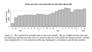
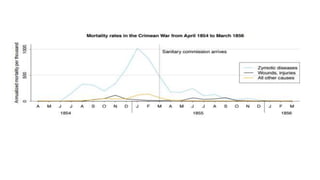
Download as PDF, PPTX


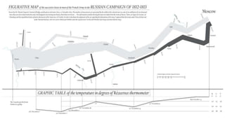

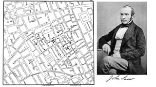


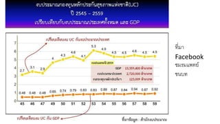
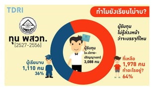


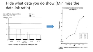

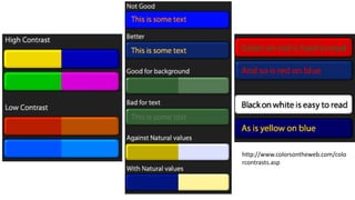
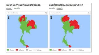
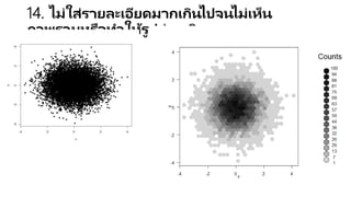
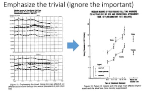


Visualizing for real impact โดยอาจารย์ ดร. อานนท์ ศักดิ์วรวิชญ์ ผู้อำนวยการศูนย์คลังปัญญาและสารสนเทศ สถาบันบัณฑิตพัฒนบริหารศาสตร์ สาขาวิชา Business Analytics and Intelligence และสาขาวิทยาการประกันภัยและการบริหารความเสี่ยง สถาบันบัณฑิตพัฒนบริหารศาสตร์ บรรยายในงาน The 4th Data Cube Conference (Data Analytic to Real Application) เมื่อวันที่ clock Saturday, July 22 at 9 AM - 5 PM https://www.facebook.com/events/193038667886326/ ขอบคุณ ดร เอกสิทธิ์ พัชรวงศ์ศักดาที่เชิญไปบรรยายครับ สไลด์ชุดนี้มีคนถามหากันมากเลย post ให้ทุกคนครับ