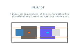
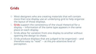
Visual Design
Principles
Part 1
Warm-Up Activity: Bad
Designs, Good Designs
Which one is a better graphic
design?
Resource: Garr Reynolds
Which one is a better graphic
design?
Resource: Garr Reynolds
Which one is better? Why?
Slide A Slide B
Part 2
PARC: Graphic Design Principles
PARC: Proximity
◎ Group related elements together
◉ Grouped elements become a visual
unit that makes it easier for your
viewer to make sense of your content
PARC: Proximity
◎ When placing elements on a slide, try
to align them with another element.
◉Centering can be harder to read
PARC: Alignment
PARC: Alignment
PARC: Repetition
◎ Repeat colors
◎ Repeat fonts
◎ Repeat visual elements
◎ Repeat elements from slide to slide
PARC: Repetition
PARC: Contrast
1.Size
2.Color choices
3.Use of space
4.Text selection
5.Position of elements
PARC: Contrast
Why Are These
Principles Important?
Visually pleasing
Coherent
Well organized
learning resources/materials
Effective information processing
Comprehension
Retention
Ability to take
action/apply
So what happens if
learning resources
(presentations, handouts,
job aids, etc.) are text-
heavy and unorganized?
such as…
What Happens Is …
Information Disbalance
results in
Cognitive Overload
Deep Dive into Visual
Design
Color
Value
Dominance
Balance
Grid
Newton color wheel
Sort your color chips into piles that correspond to the organization of the color wheel.
Warm colors
These colors advance from the picture plane and excite the nervous system. We tend
to associate them with action, confusion and energy.
Cool colors
These colors recede from the picture plane and calm the nervous system. We tend to
associate them with stillness, cleanliness and tranquility.
Monochromatic color combinations
Different gray values of the same hue are called “monochromatic.” These
combinations tend to communicate tranquility and lack of motion. Find several sets
of chips that represent analogous color combinations.
Analogous color combinations
Colors next to each other on the color wheel are “analogous.” These combinations
tend to communicate harmony and familiarity. Find several sets of chips that
represent analogous color combinations.
Complementary color combinations
Colors across from each other on the color wheel are “complementary.” These combinations tend
to communicate excitement and conflict. Find several sets of chips that represent complementary
color combinations.
Triadic color combinations
Colors separately equally from each other on the color wheel are “triadic.” These
combinations can communicate a range of impressions, depending on their
treatment. Find several sets of chips that represent triadic color combinations.
Color schemes (palettes)
◎ As a general rule, human beings love color. We prefer color images to
black and white ones.
◎ We do not all discriminate between hues at an equal level of
granularity, and a significant portion of the population does not
discriminate certain hues at all. Color cannot be used reliably for
complex coding schemes unless people have the time to memorize
and use those schemes intensively.
◎ We identify schemes or palettes (combinations) of color easily and
associate them with places, feelings and experiences. Color can be
used metaphorically to suggest certain feelings or associations.
◎ Rule of Thumbs: keep it simple (No more than 4 colors!!)
Value – light & dark
◎ Value is short for “gray value,” and refers to the lightness
or darkness of an area – the amount of black or white
that is present. Colors have gray values that are separate
from their hues (red, blue, yellow).
Value – light & dark
◎ Perceived gray value is relative … the same literal
gray value is perceived differently depending on
what is around it.
Value – light & dark
The individual who is color-blind for blue and green, will see similar gray
values as identical. Different gray values allow discrimination, even
though the colors cannot be perceived. All of us differ in the range of gray
values we can discriminate, so when in doubt – increase contrast.
Click the link here …
Value – light & dark
For people of all visual abilities, contrast in gray value is
the key to discrimination of shapes – and this affects the
visibility of text particularly since text is comprised of
many small shapes.
Highly visible text requires strong contrast
between the letter forms and the background.
Black and white provide the strongest possible
contrast in gray value.
Other combinations can also be effective.
Dominance
Darker values advance in our visual perception and lighter ones
recede. Thus, darker values dominate over lighter ones in a visual
display.
Dominance
Dominance
Balance
◎ Primates prefer visual balance. Give a baby human or a
baby chimp a crayon and a blank piece of paper and you
get overall scribbles … left alone long enough, baby or
chimp will tend to fill the page evenly.
◎ Give baby or chimp a piece of paper with a
dominant figure in one corner and the scribbles will
appear across the page, creating visual balance –
or equivalent visual dominance across the display.
Balance
◎ Balance can be symmetrical – all elements
mirrored by others of equal dominance ...
Balance
◎ Balance can be symmetrical – all elements mirrored by others
of equal dominance ... even if everything is not the same color
…
Balance
◎ … or the same shape.
Balance
◎ Balance can be asymmetrical too, and we are often drawn to
this form of balance because it is visually exciting or interesting.
◎ White Space!!
Balance
◎ When the balance between “heavy” and “light” elements
is off, you have difficulty focusing anywhere except in
the heavy part. Even though there is a lot of white space
counterbalancing the dark areas, it is not enough.
Balance
◎ A small change can make a difference … the impact of a small light
value rectangle is amplified when it appears in the middle of a dark
area. Likewise, a small rectangle of dark can add a lot of weight to the
lighter area around it.
Balance
Grids
◎ Most designers who are creating materials that will contain
more than one display use an underlying grid to help organize
the layout of those displays.
1. Grids support the consistency of the visual rhetorical for a
display – information of the same type appears in the same
place on each display.
2. Grids allow for variation from one display to another without
opening the design to chaos.
3. Grids produce displays that are judged to be organized – and
therefore easy to “read” -- at the pre-attentive level of
perception.
Animal Science
Careers
Economic
Education
Citizenship
Communication
s
Expressive Arts
Family Sciences
Foods, Nutrition
and Health
Leadership
Plants, Soils,
and Entomology
Science &
Technology
4H Online
Workbooks
and Study
Guides
Swine Project Workbook 2b: Raising market animals
page >>
All Animal
Science Workbooks
Parts of the hog
You need to know the parts of your hog. To keep
your hog healthy, you need to examine it and talk
to a veterinarian about it. When your hog is
judged at the 4-H competition or sold at market,
the judge or the buyer will look at specific parts
of the hog to decide how valuable it is.
Some of the parts have names that you will
recognize easily. Some of them have special
names that farmers use when they talk about
pigs. Print this page and study the names with
your Project Buddy. Pay special attention to the
parts with unfamiliar names.
head neck shoulder back loin rump
tail
stifle joint
ham
hock
dewclaw
belly
teats
snout
jowl
elbow
knee
cannon bone
pastern
foot (toes)
Animal Science
Careers
Economic
Education
Citizenship
Communications
Expressive Arts
Family Sciences
Foods, Nutrition
and Health
Leadership
Plants, Soils, and
Entomology
Science &
Technology
4H Online
Workbooks
and Study
Guides
Swine Project Workbook 2b: Raising market animals
page >>
4-H Home All Animal Science Workbooks
Parts of the hog
You need to know the parts of your hog. To keep
your hog healthy, you need to examine it and talk
to a veterinarian about it. When your hog is
judged at the 4-H competition or sold at market,
the judge or the buyer will look at specific parts
of the hog to decide how valuable it is.
Some of the parts have names that you will
recognize easily. Some of them have special
names that farmers use when they talk about
pigs. Print this page and study the names with
your Project Buddy. Pay special attention to the
parts with unfamiliar names.
head neck shoulder back loin rump
tail
stifle joint
ham
hock
dewclaw
belly
teats
snout
jowl
elbow
knee
cannon bone
pastern
foot (toes)

Visual Design Principles Spring 2024 semester

  • 1.
  • 2.
    Part 1 Warm-Up Activity:Bad Designs, Good Designs
  • 3.
    Which one isa better graphic design? Resource: Garr Reynolds
  • 4.
    Which one isa better graphic design? Resource: Garr Reynolds
  • 5.
    Which one isbetter? Why? Slide A Slide B
  • 6.
    Part 2 PARC: GraphicDesign Principles
  • 7.
    PARC: Proximity ◎ Grouprelated elements together ◉ Grouped elements become a visual unit that makes it easier for your viewer to make sense of your content
  • 8.
  • 9.
    ◎ When placingelements on a slide, try to align them with another element. ◉Centering can be harder to read PARC: Alignment
  • 10.
  • 11.
    PARC: Repetition ◎ Repeatcolors ◎ Repeat fonts ◎ Repeat visual elements ◎ Repeat elements from slide to slide
  • 12.
  • 13.
    PARC: Contrast 1.Size 2.Color choices 3.Useof space 4.Text selection 5.Position of elements
  • 14.
  • 15.
    Why Are These PrinciplesImportant? Visually pleasing Coherent Well organized learning resources/materials Effective information processing Comprehension Retention Ability to take action/apply
  • 16.
    So what happensif learning resources (presentations, handouts, job aids, etc.) are text- heavy and unorganized?
  • 17.
  • 18.
    What Happens Is… Information Disbalance results in Cognitive Overload
  • 19.
    Deep Dive intoVisual Design Color Value Dominance Balance Grid
  • 21.
    Newton color wheel Sortyour color chips into piles that correspond to the organization of the color wheel.
  • 22.
    Warm colors These colorsadvance from the picture plane and excite the nervous system. We tend to associate them with action, confusion and energy.
  • 23.
    Cool colors These colorsrecede from the picture plane and calm the nervous system. We tend to associate them with stillness, cleanliness and tranquility.
  • 24.
    Monochromatic color combinations Differentgray values of the same hue are called “monochromatic.” These combinations tend to communicate tranquility and lack of motion. Find several sets of chips that represent analogous color combinations.
  • 25.
    Analogous color combinations Colorsnext to each other on the color wheel are “analogous.” These combinations tend to communicate harmony and familiarity. Find several sets of chips that represent analogous color combinations.
  • 26.
    Complementary color combinations Colorsacross from each other on the color wheel are “complementary.” These combinations tend to communicate excitement and conflict. Find several sets of chips that represent complementary color combinations.
  • 27.
    Triadic color combinations Colorsseparately equally from each other on the color wheel are “triadic.” These combinations can communicate a range of impressions, depending on their treatment. Find several sets of chips that represent triadic color combinations.
  • 28.
    Color schemes (palettes) ◎As a general rule, human beings love color. We prefer color images to black and white ones. ◎ We do not all discriminate between hues at an equal level of granularity, and a significant portion of the population does not discriminate certain hues at all. Color cannot be used reliably for complex coding schemes unless people have the time to memorize and use those schemes intensively. ◎ We identify schemes or palettes (combinations) of color easily and associate them with places, feelings and experiences. Color can be used metaphorically to suggest certain feelings or associations. ◎ Rule of Thumbs: keep it simple (No more than 4 colors!!)
  • 29.
    Value – light& dark ◎ Value is short for “gray value,” and refers to the lightness or darkness of an area – the amount of black or white that is present. Colors have gray values that are separate from their hues (red, blue, yellow).
  • 30.
    Value – light& dark ◎ Perceived gray value is relative … the same literal gray value is perceived differently depending on what is around it.
  • 31.
    Value – light& dark The individual who is color-blind for blue and green, will see similar gray values as identical. Different gray values allow discrimination, even though the colors cannot be perceived. All of us differ in the range of gray values we can discriminate, so when in doubt – increase contrast. Click the link here … Click the link here … Click the link here … Click the link here …
  • 32.
    Value – light& dark For people of all visual abilities, contrast in gray value is the key to discrimination of shapes – and this affects the visibility of text particularly since text is comprised of many small shapes. Highly visible text requires strong contrast between the letter forms and the background. Black and white provide the strongest possible contrast in gray value. Other combinations can also be effective.
  • 33.
    Dominance Darker values advancein our visual perception and lighter ones recede. Thus, darker values dominate over lighter ones in a visual display.
  • 34.
  • 35.
  • 36.
    Balance ◎ Primates prefervisual balance. Give a baby human or a baby chimp a crayon and a blank piece of paper and you get overall scribbles … left alone long enough, baby or chimp will tend to fill the page evenly.
  • 37.
    ◎ Give babyor chimp a piece of paper with a dominant figure in one corner and the scribbles will appear across the page, creating visual balance – or equivalent visual dominance across the display. Balance
  • 38.
    ◎ Balance canbe symmetrical – all elements mirrored by others of equal dominance ... Balance
  • 39.
    ◎ Balance canbe symmetrical – all elements mirrored by others of equal dominance ... even if everything is not the same color … Balance
  • 40.
    ◎ … orthe same shape. Balance
  • 41.
    ◎ Balance canbe asymmetrical too, and we are often drawn to this form of balance because it is visually exciting or interesting. ◎ White Space!! Balance
  • 42.
    ◎ When thebalance between “heavy” and “light” elements is off, you have difficulty focusing anywhere except in the heavy part. Even though there is a lot of white space counterbalancing the dark areas, it is not enough. Balance
  • 43.
    ◎ A smallchange can make a difference … the impact of a small light value rectangle is amplified when it appears in the middle of a dark area. Likewise, a small rectangle of dark can add a lot of weight to the lighter area around it. Balance
  • 44.
    Grids ◎ Most designerswho are creating materials that will contain more than one display use an underlying grid to help organize the layout of those displays. 1. Grids support the consistency of the visual rhetorical for a display – information of the same type appears in the same place on each display. 2. Grids allow for variation from one display to another without opening the design to chaos. 3. Grids produce displays that are judged to be organized – and therefore easy to “read” -- at the pre-attentive level of perception.
  • 45.
    Animal Science Careers Economic Education Citizenship Communication s Expressive Arts FamilySciences Foods, Nutrition and Health Leadership Plants, Soils, and Entomology Science & Technology 4H Online Workbooks and Study Guides Swine Project Workbook 2b: Raising market animals page >> All Animal Science Workbooks Parts of the hog You need to know the parts of your hog. To keep your hog healthy, you need to examine it and talk to a veterinarian about it. When your hog is judged at the 4-H competition or sold at market, the judge or the buyer will look at specific parts of the hog to decide how valuable it is. Some of the parts have names that you will recognize easily. Some of them have special names that farmers use when they talk about pigs. Print this page and study the names with your Project Buddy. Pay special attention to the parts with unfamiliar names. head neck shoulder back loin rump tail stifle joint ham hock dewclaw belly teats snout jowl elbow knee cannon bone pastern foot (toes)
  • 46.
    Animal Science Careers Economic Education Citizenship Communications Expressive Arts FamilySciences Foods, Nutrition and Health Leadership Plants, Soils, and Entomology Science & Technology 4H Online Workbooks and Study Guides Swine Project Workbook 2b: Raising market animals page >> 4-H Home All Animal Science Workbooks Parts of the hog You need to know the parts of your hog. To keep your hog healthy, you need to examine it and talk to a veterinarian about it. When your hog is judged at the 4-H competition or sold at market, the judge or the buyer will look at specific parts of the hog to decide how valuable it is. Some of the parts have names that you will recognize easily. Some of them have special names that farmers use when they talk about pigs. Print this page and study the names with your Project Buddy. Pay special attention to the parts with unfamiliar names. head neck shoulder back loin rump tail stifle joint ham hock dewclaw belly teats snout jowl elbow knee cannon bone pastern foot (toes)