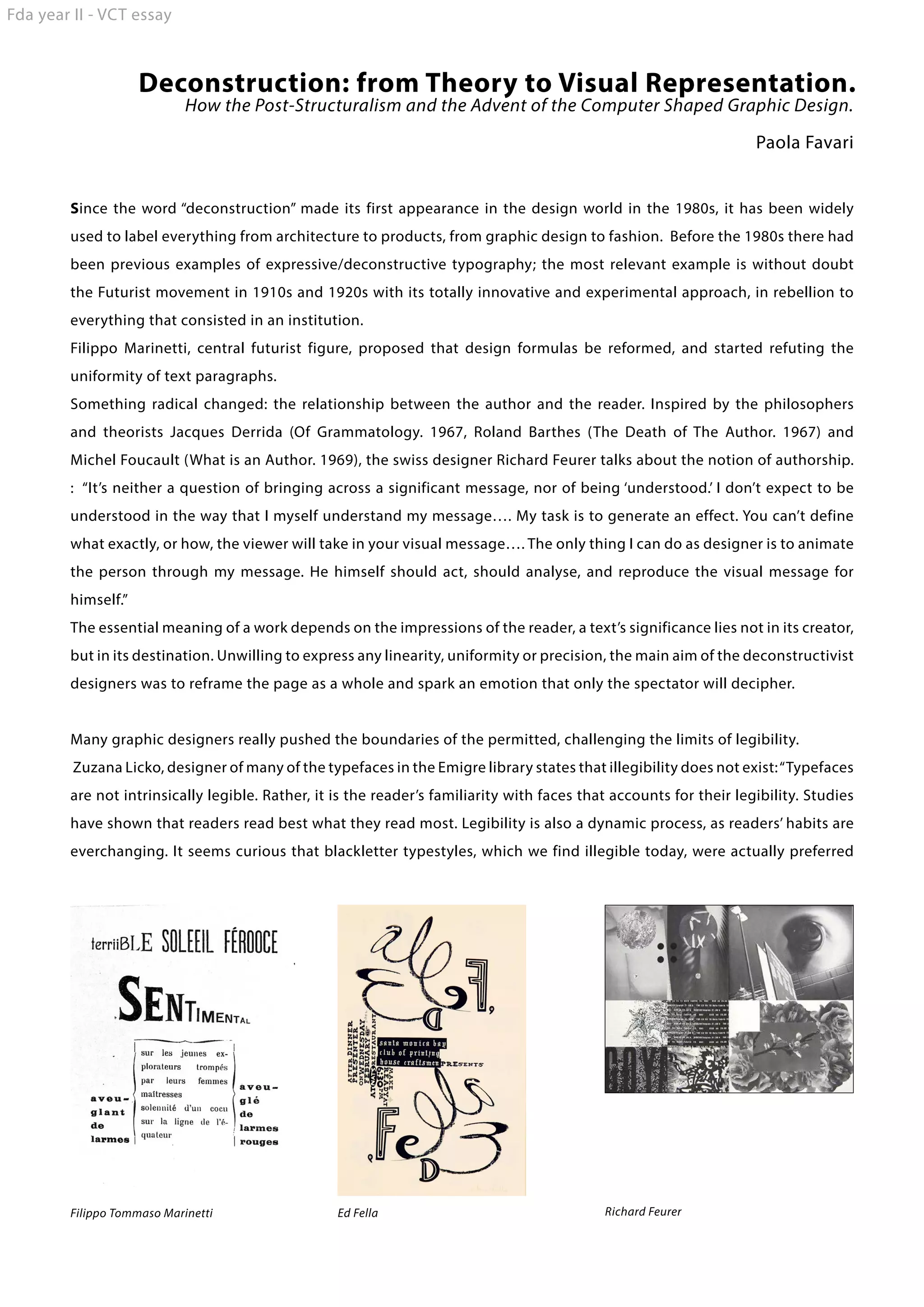
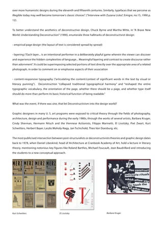
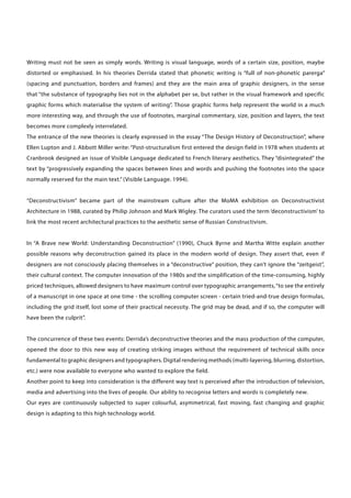
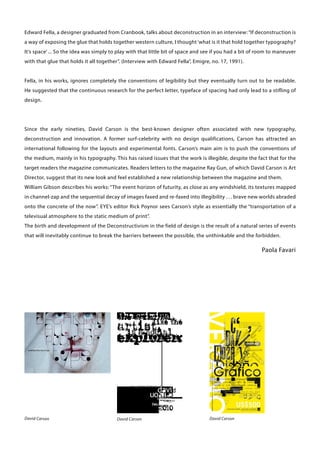
This novel was written by the famous Punjabi writer Gurdial Singh and later made into a film that led to its translation in English. The PowerPoint presentation analyses the work from a Postcolonial lens.
Visualising Boundaries between Architecture and Graphic Design - MA ThesisPlan-B Studio
I have included a copy of my MA thesis and final major project. Please note that the thesis is missing images and might have page number issues - I lost all original files(!)
The typography by Fady El-Masry
Typography (from the Greek words τύπος (typos) = form and γραφή
(graphe) = writing) is the art and technique of arranging type in order to make
language visible. The arrangement of type involves the selection of typefaces,
point size, line length, leading (line spacing), adjusting the spaces between
groups of letters (tracking) and adjusting the space between pairs of letters
(kerning). Type design is a closely related craft, which some consider distinct
and others a part of typography; most typographers do not design typefaces,
and some type designers do not consider themselves typographers. In modern
times, typography has been put into motion — in film, television and online
broadcasts — to add emotion to mass communication.
Typography is performed by typesetters, compositors, typographers, graphic
designers, art directors, comic book artists, graffiti artists, clerical workers,
and anyone else who arranges type for a product. Until the Digital Age,
typography was a specialized occupation. Digitization opened up typography
to new generations of visual designers and lay users, and it has been said that
“typography is now something everybody does.
finX1.2.3.4 - combined design exercises for meaningful concept development fo...Christiaan Weiler
METHOD
finX1 : language
step 1 : choose a text as starting point
step 2 : withing this text find 1. a noun 2. an adjective 3. a verb of crcucial meaning
step 3 : describe each word in 4 synonyms (4 nouns for noun, etc.)
step 4 : repeat to arrive at a set of 16 words
step 5 : set 4 project specific criteria
step 6 : choose from the set of 16 a word to correspond to each one of hte criteria
step 7 : with the 4 chosen words compose a phrase that is grammatically correct, not necessarily logically
step 8 : capture the phrase (haiku) in one word
finX2 : image
like finX1 but with image analysis
finX3 : volume
like finX1 but with volume analysis
finX4 : synthesis
take the results of all exercises and bring them together in one three dimensional model.
See also : http://cab54.christiaanweiler.net/?003/projects-[realised]/
Soheil najjaran what is graphic design history and originsSoheilnajaran
Soheil Najjaran Certified tips provider. Graphic design is a profession whose business is the act of designing, programming, and create visual communications, generally produced by industrial means and intended to convey specific messages to specific social groups, with a clear purpose. This is the activity that enables graphically communicate ideas, facts and values processed and synthesized in terms of form and communication, social, cultural, economic, aesthetic and technological. Also known as visual communication design, because some associate the word figure only to the printing industry, and understand that visual messages are channeled through many media, not just print.
Hello everyone! I am thrilled to present my latest portfolio on LinkedIn, marking the culmination of my architectural journey thus far. Over the span of five years, I've been fortunate to acquire a wealth of knowledge under the guidance of esteemed professors and industry mentors. From rigorous academic pursuits to practical engagements, each experience has contributed to my growth and refinement as an architecture student. This portfolio not only showcases my projects but also underscores my attention to detail and to innovative architecture as a profession.
Top 5 Indian Style Modular Kitchen DesignsFinzo Kitchens
Get the perfect modular kitchen in Gurgaon at Finzo! We offer high-quality, custom-designed kitchens at the best prices. Wardrobes and home & office furniture are also available. Free consultation! Best Quality Luxury Modular kitchen in Gurgaon available at best price. All types of Modular Kitchens are available U Shaped Modular kitchens, L Shaped Modular Kitchen, G Shaped Modular Kitchens, Inline Modular Kitchens and Italian Modular Kitchen.
Between Filth and Fortune- Urban Cattle Foraging Realities by Devi S Nair, An...Mansi Shah
This study examines cattle rearing in urban and rural settings, focusing on milk production and consumption. By exploring a case in Ahmedabad, it highlights the challenges and processes in dairy farming across different environments, emphasising the need for sustainable practices and the essential role of milk in daily consumption.
White wonder, Work developed by Eva TschoppMansi Shah
White Wonder by Eva Tschopp
A tale about our culture around the use of fertilizers and pesticides visiting small farms around Ahmedabad in Matar and Shilaj.
Transforming Brand Perception and Boosting Profitabilityaaryangarg12
In today's digital era, the dynamics of brand perception, consumer behavior, and profitability have been profoundly reshaped by the synergy of branding, social media, and website design. This research paper investigates the transformative power of these elements in influencing how individuals perceive brands and products and how this transformation can be harnessed to drive sales and profitability for businesses.
Through an exploration of brand psychology and consumer behavior, this study sheds light on the intricate ways in which effective branding strategies, strategic social media engagement, and user-centric website design contribute to altering consumers' perceptions. We delve into the principles that underlie successful brand transformations, examining how visual identity, messaging, and storytelling can captivate and resonate with target audiences.
Methodologically, this research employs a comprehensive approach, combining qualitative and quantitative analyses. Real-world case studies illustrate the impact of branding, social media campaigns, and website redesigns on consumer perception, sales figures, and profitability. We assess the various metrics, including brand awareness, customer engagement, conversion rates, and revenue growth, to measure the effectiveness of these strategies.
The results underscore the pivotal role of cohesive branding, social media influence, and website usability in shaping positive brand perceptions, influencing consumer decisions, and ultimately bolstering sales and profitability. This paper provides actionable insights and strategic recommendations for businesses seeking to leverage branding, social media, and website design as potent tools to enhance their market position and financial success.
Can AI do good? at 'offtheCanvas' India HCI preludeAlan Dix
Invited talk at 'offtheCanvas' IndiaHCI prelude, 29th June 2024.
https://www.alandix.com/academic/talks/offtheCanvas-IndiaHCI2024/
The world is being changed fundamentally by AI and we are constantly faced with newspaper headlines about its harmful effects. However, there is also the potential to both ameliorate theses harms and use the new abilities of AI to transform society for the good. Can you make the difference?
Dive into the innovative world of smart garages with our insightful presentation, "Exploring the Future of Smart Garages." This comprehensive guide covers the latest advancements in garage technology, including automated systems, smart security features, energy efficiency solutions, and seamless integration with smart home ecosystems. Learn how these technologies are transforming traditional garages into high-tech, efficient spaces that enhance convenience, safety, and sustainability.
Ideal for homeowners, tech enthusiasts, and industry professionals, this presentation provides valuable insights into the trends, benefits, and future developments in smart garage technology. Stay ahead of the curve with our expert analysis and practical tips on implementing smart garage solutions.
Deconstrution: from Theory to Visual Representation.
1. Fda year II - VCT essay
Deconstruction: from Theory to Visual Representation.
How the Post-Structuralism and the Advent of the Computer Shaped Graphic Design.
Paola Favari
Since the word “deconstruction” made its first appearance in the design world in the 1980s, it has been widely
used to label everything from architecture to products, from graphic design to fashion. Before the 1980s there had
been previous examples of expressive/deconstructive typography; the most relevant example is without doubt
the Futurist movement in 1910s and 1920s with its totally innovative and experimental approach, in rebellion to
everything that consisted in an institution.
Filippo Marinetti, central futurist figure, proposed that design formulas be reformed, and started refuting the
uniformity of text paragraphs.
Something radical changed: the relationship between the author and the reader. Inspired by the philosophers
and theorists Jacques Derrida (Of Grammatology. 1967, Roland Barthes (The Death of The Author. 1967) and
Michel Foucault (What is an Author. 1969), the swiss designer Richard Feurer talks about the notion of authorship.
: “It’s neither a question of bringing across a significant message, nor of being ‘understood.’ I don’t expect to be
understood in the way that I myself understand my message…. My task is to generate an effect. You can’t define
what exactly, or how, the viewer will take in your visual message…. The only thing I can do as designer is to animate
the person through my message. He himself should act, should analyse, and reproduce the visual message for
himself.”
The essential meaning of a work depends on the impressions of the reader, a text’s significance lies not in its creator,
but in its destination. Unwilling to express any linearity, uniformity or precision, the main aim of the deconstructivist
designers was to reframe the page as a whole and spark an emotion that only the spectator will decipher.
Many graphic designers really pushed the boundaries of the permitted, challenging the limits of legibility.
Zuzana Licko, designer of many of the typefaces in the Emigre library states that illegibility does not exist: “Typefaces
are not intrinsically legible. Rather, it is the reader’s familiarity with faces that accounts for their legibility. Studies
have shown that readers read best what they read most. Legibility is also a dynamic process, as readers’ habits are
everchanging. It seems curious that blackletter typestyles, which we find illegible today, were actually preferred
Filippo Tommaso Marinetti
Ed Fella
Richard Feurer
2. over more humanistic designs during the eleventh and fifteenth centuries. Similarly, typefaces that we perceive as
illegible today may well become tomorrow’s classic choices”. (“Interview with Zuzana Licko”, Emigre, no.15, 1990 p.
12).
To better understand the aesthetics of deconstructive design, Chuck Byrne and Martha Witte, in “A Brave New
World: Understanding Deconstruction” (1990), enumerate three hallmarks of deconstructivist design:
- empirical page design (the layout of text is considered spread by spread)
- layering (“Each layer... is an intentional performer in a deliberately playful game wherein the viewer can discover
and experience the hidden complexities of language... Meaningful layering and contrast to create discourse rather
than adornment”. It could be superimposing selected portions of text directly over the appropriate area of a related
photograph, in order to comment on or emphasise aspects of their association
- content-responsive typography (“articulating the content/context of significant words in the text by visual or
literary punning”).
Deconstruction “collapsed traditional typographical harmony” and “reshaped the entire
typographic vocabulary, the orientation of the page, whether there should be a page, and whether type itself
should do more than perform its basic historical function of being readable.”
What was the event, if there was one, that let Deconstructivism into the design world?
Graphic designers in many U. S. art programs were exposed to critical theory through the fields of photography,
architecture, design and performance during the early 1980s, through the works of several artists, Barbara Kruger,
Cindy Sherman, Hermann Nitsch and the Viennese Actionists, Filippo Marinetti, El Lissitzky, Piet Zwart, Kurt
Schwitters, Herbert Bayer, Laszlo Moholy-Nagy, Jan Tschichold, Theo Van Doesburg, etc.
The most publicised intersection between post-structuralists or deconstructivists theories and graphic design dates
back to 1978, when Daniel Libeskind, head of Architecture at Cranbook Academy of Art, hold a lecture in literary
theory, mentioning notorious key figures like Roland Barthes, Michael Foucault, Jean Baudrillard and introducing
the students to a new conceptual approach.
Kurt Schwitters
El Lissitzky
Barbara Kruger
3. Writing must not be seen as simply words. Writing is visual language, words of a certain size, position, maybe
distorted or emphasised. In his theories Derrida stated that phonetic writing is “full of non-phonetic parerga”
(spacing and punctuation, borders and frames) and they are the main area of graphic designers, in the sense
that “the substance of typography lies not in the alphabet per se, but rather in the visual framework and specific
graphic forms which materialise the system of writing”. Those graphic forms help represent the world in a much
more interesting way, and through the use of footnotes, marginal commentary, size, position and layers, the text
becomes more complexly interrelated.
The entrance of the new theories is clearly expressed in the essay “The Design History of Deconstruction”, where
Ellen Lupton and J. Abbott Miller write: “Post-structuralism first entered the design field in 1978 when students at
Cranbrook designed an issue of Visible Language dedicated to French literary aesthetics. They “disintegrated” the
text by “progressively expanding the spaces between lines and words and pushing the footnotes into the space
normally reserved for the main text.” (Visible Language. 1994).
“Deconstructivism” became part of the mainstream culture after the MoMA exhibition on Deconstructivist
Architecture in 1988, curated by Philip Johnson and Mark Wigley. The curators used the term ‘deconstructivism’ to
link the most recent architectural practices to the aesthetic sense of Russian Constructivism.
In “A Brave new World: Understanding Deconstruction” (1990), Chuck Byrne and Martha Witte explain another
possible reasons why deconstruction gained its place in the modern world of design. They assert that, even if
designers are not consciously placing themselves in a “deconstructive” position, they can’t ignore the “zeitgeist”,
their cultural context. The computer innovation of the 1980s and the simplification of the time-consuming, highly
priced techniques, allowed designers to have maximum control over typographic arrangements, “to see the entirely
of a manuscript in one space at one time - the scrolling computer screen - certain tried-and-true design formulas,
including the grid itself, lost some of their practical necessity. The grid may be dead, and if so, the computer will
have been the culprit”.
The concurrence of these two events: Derrida’s deconstructive theories and the mass production of the computer,
opened the door to this new way of creating striking images without the requirement of technical skills once
fundamental to graphic designers and typographers. Digital rendering methods (multi-layering, blurring, distortion,
etc.) were now available to everyone who wanted to explore the field.
Another point to keep into consideration is the different way text is perceived after the introduction of television,
media and advertising into the lives of people. Our ability to recognise letters and words is completely new.
Our eyes are continuously subjected to super colourful, asymmetrical, fast moving, fast changing and graphic
design is adapting to this high technology world.
4. Edward Fella, a designer graduated from Cranbook, talks about deconstruction in an interview: “If deconstruction is
a way of exposing the glue that holds together western culture, I thought ‘what is it that hold together typography?
It’s space’ ... So the idea was simply to play with that little bit of space and see if you had a bit of room to maneuver
with that glue that holds it all together”. (Interview with Edward Fella”, Emigre, no. 17, 1991).
Fella, in his works, ignores completely the conventions of legibility but they eventually turn out to be readable.
He suggested that the continuous research for the perfect letter, typeface of spacing had only lead to a stifling of
design.
Since the early nineties, David Carson is the best-known designer often associated with new typography,
deconstruction and innovation. A former surf-celebrity with no design qualifications, Carson has attracted an
international following for the layouts and experimental fonts. Carson’s main aim is to push the conventions of
the medium, mainly in his typography. This has raised issues that the work is illegible, despite the fact that for the
target readers the magazine communicates. Readers letters to the magazine Ray Gun, of which David Carson is Art
Director, suggest that its new look and feel established a new relationship between the magazine and them.
William Gibson describes his works: “The event horizon of futurity, as close as any windshield, its textures mapped
in channel-zap and the sequential decay of images faxed and re-faxed into illegibility . . . brave new worlds abraded
onto the concrete of the now”. EYE’s editor Rick Poynor sees Carson’s style as essentially the “transportation of a
televisual atmosphere to the static medium of print”.
The birth and development of the Deconstructivism in the field of design is the result of a natural series of events
that will inevitably continue to break the barriers between the possible, the unthinkable and the forbidden.
Paola Favari
David Carson
David Carson
David Carson
5. Bibliography
Norris, C. (2003) Deconstruction. 3rd ed. London: Routledge.
Benedikt, M. (1991) Deconstructing the Kimbell. NY: Lumen, Inc.
Malcolm Richards, K. (2008) Derrida Reframed. London: I.B. Tauris
Blackwell, L; Carson, D. (1995) The End of Print. London: Laurence King
Blackwell, L. (1998) David Carson: 2nd Sight. London: Laurence King
Online Resources
http://www.jaddesignsolutions.com/
http://www.emigre.com/
http://elupton.com/2009/10/deconstruction-and-graphic-design/
http://www.davidcarsondesign.com/