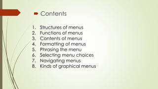
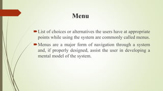
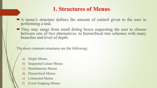
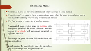
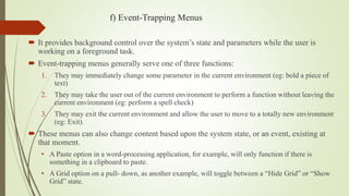
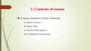
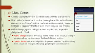
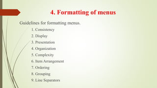
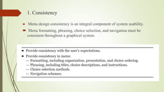
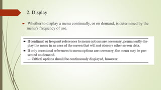
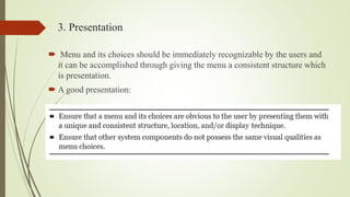
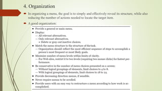
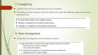
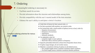
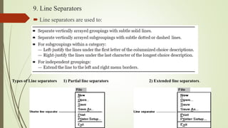
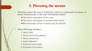
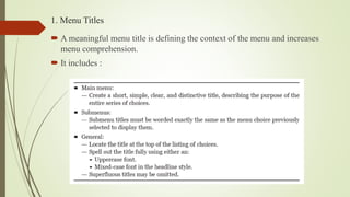
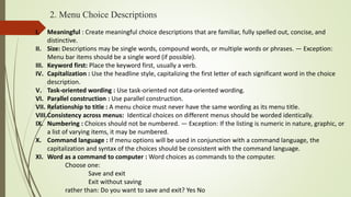
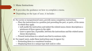
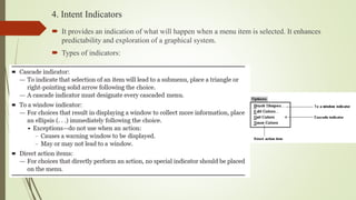
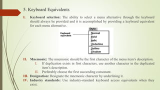
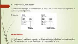
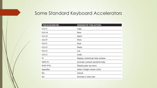
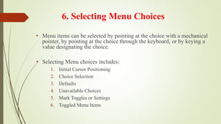
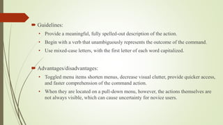
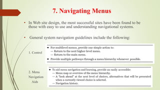
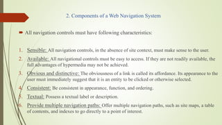
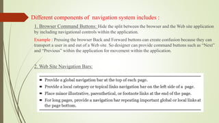
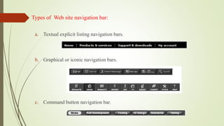
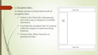
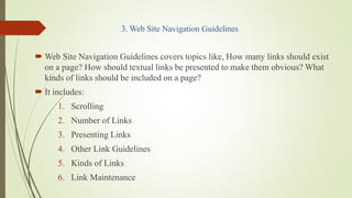
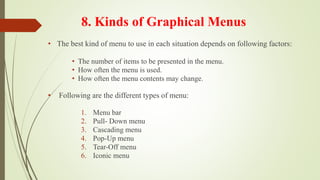
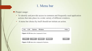
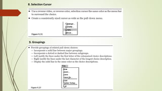
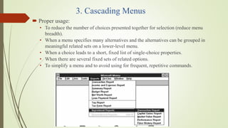
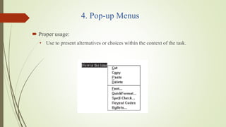
User Interface Design- Module 3 Menus
Subject Code:15CS832 USER INTERFACE DESIGN
VTU UNIVERSITY
Referred Text Book: The Essential Guide to User Interface Design (Second Edition) Author: Wilbert O. Galitz
1. Module 3
System menus and navigation schemes
Referred Text Book:
The Essential Guide to User Interface Design (Second Edition)
Author: Wilbert O. Galitz
Subject Code:15CS832
USER INTERFACE DESIGN
VTU UNIVERSITY
BNMIT, Bengaluru
2. Contents
1. Structures of menus
2. Functions of menus
3. Contents of menus
4. Formatting of menus
5. Phrasing the menu
6. Selecting menu choices
7. Navigating menus
8. Kinds of graphical menus
3. Menu
List of choices or alternatives the users have at appropriate
points while using the system are commonly called menus.
Menus are a major form of navigation through a system
and, if properly designed, assist the user in developing a
mental model of the system.
4. 1. Structures of Menus
A menu’s structure defines the amount of control given to the user in
performing a task.
They may range from small dialog boxes requesting the user to choose
between one of two alternatives, to hierarchical tree schemes with many
branches and level of depth.
The most common structures are the following:
a) Single Menus
b) Sequential Linear Menus
c) Simultaneous Menus
d) Hierarchical Menus
e) Connected Menus
f) Event-Trapping Menus
5. a) Single Menus
In this simplest form of menu, a single screen or window is presented to seek the user’s
input or request an action to be performed.
Eg: In playing a game, choices presented may be “novice,” “intermediate,” or “expert.”
The user consider the immediate consequences of the item being chosen and need not
be concerned with any other additional system menus.
6. b) Sequential Linear Menus
Sequential linear menus are presented on a series of
screens possessing only one path.
Objective is for specifying parameters or for entering data
where length of the path may be short, or long, depending
upon the nature of the information being collected.
Eg: While doing “sign-up” in any website, user has to give
sequence of information.
Sequential path menus have several shortcomings:
• A long sequence may become tedious as menu after menu is presented.
• The user may not remember an answer to a previous question.
• The user may also want to return to a previous menu to change an answer or look at an answer.
• Finally, the user may, conceptually, want to complete the menus in a different order than which
they are being presented.
7. c) Simultaneous Menus
Instead of being presented on separate screens, all menu
options are available simultaneously on single screen.
Eg: The “Filter” option in any e-commerce website, where
users can apply filters using many alternatives and choosing
the options in each alternative.
Disadvantages:
• For large collections of menu alternatives screen clutter can easily occur, and screen paging or scrolling
may still be necessary to view all the choices.
• Many menu dependencies and relationships on a screen, if poorly indicated, can lead to confusion for a
novice user.
Advantages:
• The menu may be completed in the order desired by the user, choices being skipped and
returned to later.
• All alternatives are visible for reminding of choices, comparing choices, and changing
answers.
8. d) Hierarchical Menus
When many relationships exist between menu alternatives, and some menu options are only
appropriate depending upon a previous menu selection, a hierarchical structure is the best solution.
Like: From options to sub-options, from categories to subcategories, from pages to sections to
subsections, and so on.
Eg: Menu bars with their associated pull-downs, and in Web sites with their navigation link.
9. Hierarchical structures are characterized breadth and depth, where breadth
being the number of alternatives found at each level and depth being the
number of choice levels one must traverse to reach the destination.
Disadvantage:
If users are not familiar with the hierarchical menu, or are unable to predict what
sub-options present below a particular choice, they may go down wrong paths and
find it necessary to go back up the tree to change a choice, or perhaps even return
to the top-level menu.
10. e) Connected Menus
Connected menus are networks of menus all interconnected in some manner.
From the user’s perspective there is no top-down traversal of the menu system but an almost
unhindered wandering between any two menus of interest.
Eg: One account is connected to another account.
A connected menu system may be cyclical, with
movement permitted in either direction between
menus, or acyclical, with movement permitted in
only one direction.
Advantage: It gives the user full control over the
navigation flow
Disadvantage: Its complexity, and its navigation
may be daunting for an inexperienced user.
11. f) Event-Trapping Menus
It provides background control over the system’s state and parameters while the user is
working on a foreground task.
Event-trapping menus generally serve one of three functions:
1. They may immediately change some parameter in the current environment (eg: bold a piece of
text)
2. They may take the user out of the current environment to perform a function without leaving the
current environment (eg: perform a spell check)
3. They may exit the current environment and allow the user to move to a totally new environment
(eg: Exit).
These menus can also change content based upon the system state, or an event, existing at
that moment.
• A Paste option in a word-processing application, for example, will only function if there is
something in a clipboard to paste.
• A Grid option on a pull- down, as another example, will toggle between a “Hide Grid” or “Show
Grid” state.
12. From the user’s perspective, a menu can be used to perform following
functions
a) Navigation to a New Menu
b) Execute an Action or Procedure
c) Displaying Information
d) Data or Parameter Input
2. Functions of menus
13. a) Navigation to a New Menu
Each user selection causes another menu in a hierarchical menu to be displayed.
The purpose of each selection is to drive the user towards an objective or goal.
Selection errors may lead the user down wrong paths, and cost time and, perhaps, aggravation,
but these errors are nondestructive and usually undoable.
b) Execute an Action or Procedure
A user selection directs the computer to implement an action or perform a procedure.
The action may be something like opening or closing a file, copying text, or sending a message.
In some cases execution may only occur after a hierarchical menu tree is navigated. In other
cases actions may be performed as successive hierarchical menus are encountered and
traversed.
Selection errors may or may not have serious consequences, depending upon the nature of the
action. Accidental selection of critical irreversible actions must be prevented in interface
design.
14. c) Displaying Information
The main purpose of selecting a menu choice may simply be to display information.
Like: The user may be searching for specific information in a database or browsing the Web.
In many cases, information retrieval may occur only after a hierarchical menu tree is navigated.
Users may spend considerable time and effort understanding and processing uncovered
information in order to evaluate subsequently displayed menu choices.
Wrong turns in the process will again cost time but these errors are nondestructive and usually
undoable.
d) Data or Parameter Input
Each selection specifies a piece of input data for the system.
Data or values may be input on a single menu or spread over a hierarchy of menus. The user’s
focus is primarily on the information being provided.
Selection errors can easily be corrected if detected by the system.
15. A menu consists of four elements
a) Menu Context
b) Menu Title
c) Choice Descriptions
d) Completion Instructions
3. Contents of menus
16. a) Menu Context
A menu’s context provides information to keep the user oriented.
This kind of information is critical in complex or hierarchical menu
systems, where loss of position or disorientation can easily occur so
feedback is necessary that tells users where they are in a process.
Verbal linkage, spatial linkage, or both may be used to provide
navigation feedback.
Verbal linkage involves providing, on the current menu screen, a listing of
choices made on previous menus that have led to this position.
Spatial linkage can be accomplished by graphic methods. Each succeeding
menu screen can be displayed overlap- ping the previous menu screen
17. b) Menu Title
A menu’s title provides the context for the current set of choices.
The title must reflect the choice selected on the previously displayed menu.
c) Choice Descriptions
Choice descriptions are the alternatives available to the user. These descriptions can range from
a mnemonic, numeric, or alphabetized listing of choices to single words or phrases to full
sentences or more.
The style chosen will reflect:
• the experience of the user (novice or expert)
• the nature of the choices (well-learned alternatives or not)
• the nature of the selection mechanism (keyboard or mouse)
• the nature of the system (business system application or Web page).
18. d) Completion Instructions
Completion instructions tell users how to indicate their choices.
They may include the reason for why the user is being asked to make this
choice and the impact the choice will have on subsequent processes.
Explicit instructions may be needed for first time or casual users of a system.
The needs of all system users, and the nature of the system, must again be
considered in creating this kind of on-screen guidance.
19. Guidelines for formatting menus.
1. Consistency
2. Display
3. Presentation
4. Organization
5. Complexity
6. Item Arrangement
7. Ordering
8. Grouping
9. Line Separators
4. Formatting of menus
20. 1. Consistency
Menu design consistency is an integral component of system usability.
Menu formatting, phrasing, choice selection, and navigation must be
consistent throughout a graphical system.
21. 2. Display
Whether to display a menu continually, or on demand, is determined by the
menu’s frequency of use.
22. 3. Presentation
Menu and its choices should be immediately recognizable by the users and
it can be accomplished through giving the menu a consistent structure which
is presentation.
A good presentation:
23. 4. Organization
In organizing a menu, the goal is to simply and effectively reveal its structure, while also
reducing the number of actions needed to locate the target item.
A good organization:
24. 5. Complexity
A factor involved in a complicated process or situation.
Providing two sets of menus will more effectively satisfy the differing needs of the novice
and expert user.
6. Item Arrangement
It describes the alignment and orientation of menus.
25. 7. Ordering
A meaningful ordering is necessary to:
• Facilitate search for an item.
• Provide information about the structure and relationships among items.
• Provide compatibility with the user’s mental model of the item structure.
• Enhance the user’s ability to anticipate a choice’s location.
Common ordering schemes for menus
are:
26. 8. Grouping
Grouping is the action of putting things in a group or groups.
It includes:
27. 9. Line Separators
Line separators are used to:
Types of Line separators 1) Partial line separators 2) Extended line separators.
28. • Phrasing means the way in which the context is expressed via menus. A
menu communicate to the user information about:
The nature and purpose of the menu .
The nature and purpose of each presented choice.
How the proper choice or choices may be selected.
• Menu Phrasing includes:
1. Menu Titles
2. Menu Choice Descriptions
3. Menu Instructions
4. Intent Indicators
5. Keyboard Equivalents
6. Keyboard Accelerators
5. Phrasing the menus
29. 1. Menu Titles
A meaningful menu title is defining the context of the menu and increases
menu comprehension.
It includes :
30. 2. Menu Choice Descriptions
I. Meaningful : Create meaningful choice descriptions that are familiar, fully spelled out, concise, and
distinctive.
II. Size: Descriptions may be single words, compound words, or multiple words or phrases. — Exception:
Menu bar items should be a single word (if possible).
III. Keyword first: Place the keyword first, usually a verb.
IV. Capitalization : Use the headline style, capitalizing the first letter of each significant word in the choice
description.
V. Task-oriented wording : Use task-oriented not data-oriented wording.
VI. Parallel construction : Use parallel construction.
VII. Relationship to title : A menu choice must never have the same wording as its menu title.
VIII.Consistency across menus: Identical choices on different menus should be worded identically.
IX. Numbering : Choices should not be numbered. — Exception: If the listing is numeric in nature, graphic, or
a list of varying items, it may be numbered.
X. Command language : If menu options will be used in conjunction with a command language, the
capitalization and syntax of the choices should be consistent with the command language.
XI. Word as a command to computer : Word choices as commands to the computer.
Choose one:
Save and exit
Exit without saving
rather than: Do you want to save and exit? Yes No
31. 3. Menu Instructions
It provides the guidance on how to complete a menu.
Depending on the type of user, it includes :
32. 4. Intent Indicators
It provides an indication of what will happen when a menu item is selected. It enhances
predictability and exploration of a graphical system.
Types of indicators:
33. 5. Keyboard Equivalents
I. Keyboard selection: The ability to select a menu alternative through the keyboard
should always be provided and it is accomplished by providing a keyboard equivalent
for each menu alternative.
II. Mnemonic: The mnemonic should be the first character of the menu item’s description.
I. If duplication exists in first characters, use another character in the duplicated
item’s description.
II. Preferably choose the first succeeding consonant.
III. Designation: Designate the mnemonic character by underlining it.
IV. Industry standards: Use industry-standard keyboard access equivalents when they
exist.
34. 6. Keyboard Accelerators
Accelerators are keys, or combinations of keys, that invoke an action regardless of
cursor or pointer position.
Example:
Characteristics:
1. For frequently used items, provide a keyboard accelerator to facilitate keyboard selection.
2. The accelerator may be one function key or a combination of keys
35. 3. Pressing no more than two keys simultaneously is preferred.
4. Use a plus (+) sign to indicate that two or more keys must be pressed at the same
time.
5. Accelerators should have some associative value to the item.
6. Identify the keys by their actual key top engraving.
7. If keyboard terminology differences exist, use:
• The most common keyboard terminology.
• Terminology contained on the newest PCs
8. Separate the accelerator from the item description by three spaces.
9. Right-align the key descriptions.
10. Do not use accelerators for:
• Menu items that have cascaded menus.
• Pop-up menus.
11. Use industry-standard keyboard accelerators when they exist.
37. • Menu items can be selected by pointing at the choice with a mechanical
pointer, by pointing at the choice through the keyboard, or by keying a
value designating the choice.
• Selecting Menu choices includes:
1. Initial Cursor Positioning
2. Choice Selection
3. Defaults
4. Unavailable Choices
5. Mark Toggles or Settings
6. Toggled Menu Items
6. Selecting Menu Choices
40. 3. Defaults
Defaults includes system learning and it enhance system efficiency.
Indicate a default by displaying it in a bold text.
4. Unavailable Choices
Unavailable choices should be dimmed or “grayed out.”
Do not add or remove items from a menu unless the user takes explicit action
to add or remove them through the application.
41. 5. Mark Toggles or Settings
Purpose: — Use to designate that an item or feature is active or inactive over a
relatively long period of time.
When it is active: An indicator is displayed adjacent to the item description. For
nonexclusive choices, a check mark is displayed; for mutually exclusive choices, another
distinctive symbol, such as a diamond or circle, is displayed.
When the item is not active: no mark or symbol will appear.
42. Guidelines:
• Position the indicator directly to the left of the option.
• For situations where several nonexclusive choices may be selected, consider
including one alternative that deselects all the items and reverts the state to the
“normal” condition.
Advantages/disadvantages:
• Mark toggles provide a visual indication of the state of an item. Best suited to items
or features that remain active or inactive over relatively long periods of time.
• They are accessed quickly but may not always be visible.
43. 6. Toggled Menu Items
A toggled menu item is a one menu item command that toggles back and forth
between the current state and its alternative state.
Purpose:
• Use to designate two opposite commands that are accessed frequently.
• Use when the menu item displayed will clearly indicate that the opposite condition
currently exists.
For example: If a background grid is currently being displayed, the menu item reads Hide Grid. When Hide Grid
is selected, the grid is removed from the window, and the menu item dynamically changes to reflect the
opposite action. It will now read Show Grid.
44. Guidelines:
• Provide a meaningful, fully spelled-out description of the action.
• Begin with a verb that unambiguously represents the outcome of the command.
• Use mixed-case letters, with the first letter of each word capitalized.
Advantages/disadvantages:
• Toggled menu items shorten menus, decrease visual clutter, provide quicker access,
and faster comprehension of the command action.
• When they are located on a pull-down menu, however, the actions themselves are
not always visible, which can cause uncertainty for novice users.
45. • In Web site design, the most successful sites have been found to be
those with easy to use and understanding navigational systems.
• General system navigation guidelines include the following:
1. Control
2. Menu
Navigation
Aids
7. Navigating Menus
46. Topics to be covered in Navigating Menus
1. Web Site Navigation
2. Components of a Web Navigation System
3. Web Site Navigation Guidelines
4. Maintaining a Sense of Place
47. 1. Web Site Navigation
The design goal of proper Web Site Navigation can be listed as below:
1. Logical fragments, units, or chunks : Divide content into logical fragments, units, or
chunks.
2. Establish hierarchy of generality or importance : Having identified the information
units, in- formation is now organized in according to importance or generality, from
general to specific.
3. Structure the relationships: Structure the relationships among content fragments, units,
or chunks.
• Establish global or site-wide navigation requirements.
4. Hierarchical tree : Create a well-balanced hierarchical tree.
• Restrict to two levels requiring no more than two clicks to reach deepest content,
whenever possible.
48. 2. Components of a Web Navigation System
All navigation controls must have following characteristics:
1. Sensible: All navigation controls, in the absence of site context, must make sense to the user.
2. Available: All navigational controls must be easy to access. If they are not readily available, the
full advantages of hypermedia may not be achieved.
3. Obvious and distinctive: The obviousness of a link is called its affordance. Its appearance to the
user must immediately suggest that it is an entity to be clicked or otherwise selected.
4. Consistent: Be consistent in appearance, function, and ordering.
5. Textual: Possess a textual label or description.
6. Provide multiple navigation paths: Offer multiple navigation paths, such as site maps, a table
of contents, and indexes to go directly to a point of interest.
49. Different components of navigation system includes :
1. Browser Command Buttons: Hide the split between the browser and the Web site application
by including navigational controls within the application.
Example : Pressing the browser Back and Forward buttons can create confusion because they can
transport a user in and out of a Web site. So designer can provide command buttons such as “Next”
and “Previous” within the application for movement within the application.
2. Web Site Navigation Bars:
50. Types of Web site navigation bar:
a. Textual explicit listing navigation bars.
b. Graphical or iconic navigation bars.
c. Command button navigation bar.
51. 3. Navigation links :
A website can have at least three levels of
navigation links:
▪ Global or Site-Wide links: Indicating the
site’s total scope or categories of available
information.
▪ Local Specific navigation links: It is present
within the category or topical area being
displayed.
▪ Footnote links: Minor illustrative or
parenthetical links.
52. 4. Other Web Site Navigation Elements:
a. Executive summaries: An executive summary that provides a preview of the site and
contains links to all major concepts.
b. Site maps: A site map illustrating the site’s hierarchical structure and the relationships
of components. It includes both global and local maps.
c. Indexes: An alphabetized site index
d. Tables of contents: Allow accessibility from any point in the Web site
e. Historical trails: It is located at the top of the page below the navigation links. It
provides:
• History Lists.
• History Trees.
• Footprints.
• Bookmarks.
f. Search engines: Provide a search facility.
53. 3. Web Site Navigation Guidelines
Web Site Navigation Guidelines covers topics like, How many links should exist
on a page? How should textual links be presented to make them obvious? What
kinds of links should be included on a page?
It includes:
1. Scrolling
2. Number of Links
3. Presenting Links
4. Other Link Guidelines
5. Kinds of Links
6. Link Maintenance
54. 1. Scrolling
• Do not require scrolling of navigation-only pages.
• Minimize the need for scrolling to view all links on pages containing content.
• Never require horizontal scrolling.
2. Number of Links
• One link: Every page should contain at least one link.
• Conservative number: Be conservative in the total number of links presented on a screen.
• Without logical groupings of elements, limit links to 4 to 8.
• With logical groupings of elements, limit links to 18 to 2
• Embedded links: Restrict embedded links to those most important, pertinent, and
interesting.
55. 3. Presenting Links
o Links must be easy to find.
They must not be confused
with other screen graphics
or textual content.
o It includes:
• Link text
• Kinds of links
• Graphical links
• Links in toolbars
58. 6. Link Maintenance
1. Maintain correct internal links: Carefully check sequential pages if Next
and Previous links are used within the site.
2. Frequently check and correct external links: Due to the volatile nature of
the Web, a linked site’s content may change, its location may change, or a site
may cease to exist. So frequent checks and corrections needs to be made.
59. 4. Maintaining a Sense of Place
A sense of place is “Where one currently is in the Web”. It is often difficult to maintain as
navigation links can transport a user from anywhere to anywhere in web.
Design Characteristics that Aid in Maintaining a Sense of Place
➢ Within a Website: To assist maintaining a sense of place within a Web site
• Provide a simple hierarchical tree structure.
• Provide ease of movement to important site features.
➢ Across multiple Web sites: To assist maintaining a sense of place across multiple Web sites,
provide consistency in all Web site design elements, including:
• Graphical identity schemes.
• Component presentation.
• Component organization and location
60. Design Elements that Aid in Maintaining a Sense of Place
• Home base: A site’s home page is a stable, concrete, and safe anchor point to
escape to in times of difficulty.
• Recurring navigation tools: Use recurring navigation tools on all pages.
• Recurring page elements: Use recurring elements on all pages.
• Page numbers: Provide page numbers for sequential pages.
• Ongoing feedback showing location in Web site: Provide ongoing feedback that
shows where users are in a site.
• On-demand aids illustrating location: Provide on-demand aids that illustrate the
user’s location within a site. Like: Site maps, Table of contents, etc.
• Clearly written links: Provide clearly written link labels.
61. • The best kind of menu to use in each situation depends on following factors:
• The number of items to be presented in the menu.
• How often the menu is used.
• How often the menu contents may change.
• Following are the different types of menu:
1. Menu bar
2. Pull- Down menu
3. Cascading menu
4. Pop-Up menu
5. Tear-Off menu
6. Iconic menu
8. Kinds of Graphical Menus
62. 1. Menu bar
Proper usage:
• To identify and provide access to common and frequently used application
actions that take place in a wide variety of different windows.
• A menu bar choice by itself should not initiate an action.
63. Advantages of menu bars:
• Are always visible, reminding the user of their existence.
• Are easy to browse through and easy to locate consistently on the screen.
• Usually do not obscure the screen working area and with windows and dialog boxes.
• Allow for use of keyboard equivalents.
Disadvantages of menu bars:
• They consume a full row of screen space.
• They require looking away from the main working area to find.
• They require moving pointer from the main working area to select.
• The menu options are smaller than full-size buttons, slowing selection time.
• Their horizontal orientation limits number of choices that can be displayed.
67. 2. Pull-Down Menu
Proper usage:
• To initiate frequently used application actions that take place on a wide variety
of different windows.
• A small number of items.
• Items best represented textually.
• Items whose content rarely changes.
68. Advantages of pull-down menus:
• They may be located relatively consistently on the screen.
• No window space is consumed when they are not used.
• They are easy to browse through. Their vertical orientation is most efficient for
scanning and grouping.
• Their vertical orientation permits more choices to be displayed.
• They allow for display of both keyboard equivalents and accelerators.
Disadvantages of pull-down menus:
• They require searching and selecting from another menu before seeing options.
• They require looking away from main working area to read and moving the pointer
out of working area to select (unless using keyboard equivalents).
• They items are smaller than full-size buttons, slowing selection time.
• They may obscure the screen working area.
74. 3. Cascading Menus
Proper usage:
• To reduce the number of choices presented together for selection (reduce menu
breadth).
• When a menu specifies many alternatives and the alternatives can be grouped in
meaningful related sets on a lower-level menu.
• When a choice leads to a short, fixed list of single-choice properties.
• When there are several fixed sets of related options.
• To simplify a menu and to avoid using for frequent, repetitive commands.
75. Advantages of cascading menus:
• The top-level menus are simplified because some choices are hidden.
• More first-letter mnemonics are available because menus possess fewer alternatives.
• High-level command browsing is easier because subtopics are hidden.
Disadvantages of cascading menus:
• Access to submenu items requires more steps.
• Access to submenu items requires a change in pointer movement direction.
• Exhaustive browsing is more difficult; some alternatives remain hidden as pull-
downs become visible.
78. 4. Pop-up Menus
Proper usage:
• Use to present alternatives or choices within the context of the task.
79. Advantages of pop-up menus :
• They appear in the working area and they do not use window space when not
displayed.
• No pointer movement is needed if selected by button.
• Their vertical orientation is most efficient scanning and grouping.
• Their vertical orientation allows more choices to be displayed.
• They may be able to remain showing (“pinned”) when used frequently.
• They allow for display of both keyboard equivalents and accelerators.
Disadvantages of pop-up menus :
• Their existence and the means for selecting them must be learned and remembered.
• They require a special action to see the menu (mouse click).
• Items are smaller than full-size buttons, slowing selection time.
• They may obscure the screen working area.
• Their display locations may not be consistent.
82. 5. Tear-off Menus
Proper usage:
• A tear-off menu is a pull-down menu that can be positioned anywhere on
the screen for constant referral.
Advantages/disadvantages:
• No space is consumed on the screen when the menu is not needed.
• When needed, it can remain continuously displayed.
• It does require extra steps to retrieve, but it may obscure the screen
working area.
83. 6. Iconic Menus
Proper usage:
• Use to remind users of the functions, commands, attributes, or application
choices available.
• Create icons that:
• Help enhance recognition and hasten option selection.
• Are concrete and meaningful.
• Clearly represent choices.
84. Advantages/disadvantages:
• Pictures (Icons) help facilitate memory of applications, and their larger size
increases speed of selection.
• Pictures do, however, consume considerably more screen space than text,
and they are difficult to organize for scanning efficiency.
• To create meaningful icons requires special skills and an extended amount
of time.