Download to read offline
![Slide 14
P tfo
la rm P tfo
la rm
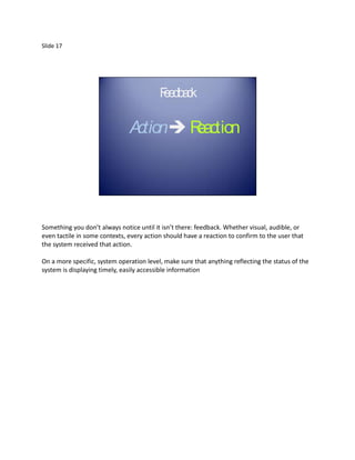
…*CLICK+
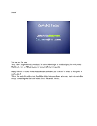
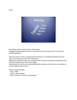
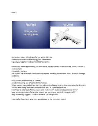
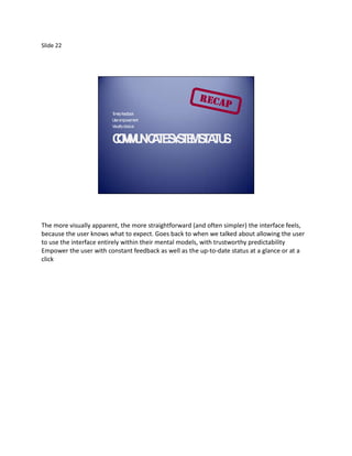
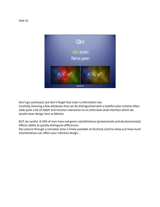
Minutia including OK/Apply/Cancel/Close/Save buttons – stick to platform!
[CLICK]
Sometimes web standards emerge to be better than native: OK is obvious button while Cancel is
less-salient link
While these conventions are written for a reason—to unify look and feel across a common user
experience—doesn’t mean set in stone (thus the name “Guidelines”)
Recommend starting with the standard recommendation for a particular situation, when that
isn’t working with the user’s mental model or could be vastly improved by tweaking the
implementation, test it versus a competing version
Diverting from these guidelines needs to be significantly better than the alternative in order to
outweigh the cost of disrupting a user’s expectations](https://image.slidesharecdn.com/usability101slidesandnotes-111216155745-phpapp01/85/Usability-101-14-320.jpg)
![Slide 19
A kno dgeInput
c wle A kno dgeInput
c wle
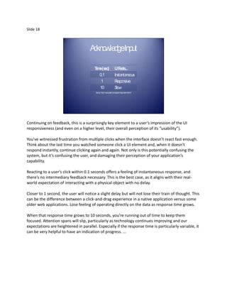
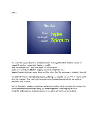
T e(s )
im ec U eels
IF ... T e(s )
im ec U eels
IF ...
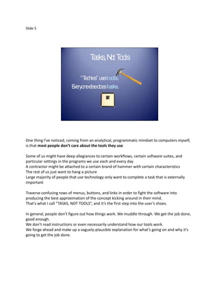
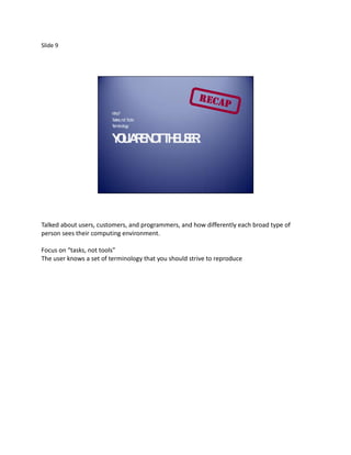
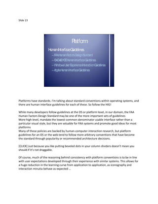
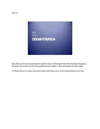
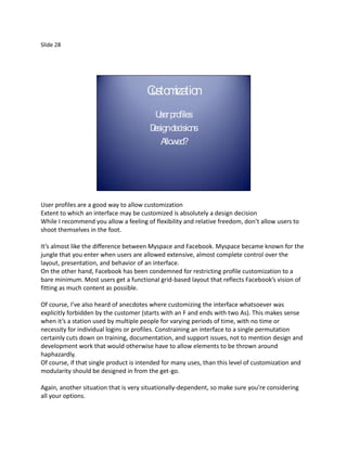
0.1 Insta neous
nta 0.1 Insta neous
nta
1 R esponsive 1 R esponsive
10 S low 10 S low
Source: http://www.useit.com/papers/responsetime.html Source: http://www.useit.com/papers/responsetime.html
…*CLICK+ A full-fledged modal progress bar may be overkill in this situation, but a busy cursor
and maybe a [CLICK] less-salient bar or incrementing percent-done number in the bottom
corner would fit in relatively unobtrusively.
If a task takes longer than 10 seconds, you’ve lost their attention for the time being, so you
need some feedback indicating (first,) when a task is expected to be done (probably with a %-
done indicator), and (second,) when the task actually is completed. Of course, you’ll also want a
way to interrupt that lengthy operation.
Don’t lie with a progress bar that reaches “100%” over and over
Again, we write software for some pretty specific edge cases that seem to be well-suited
towards making my hard-and-fast rules not always apply, so I’d be interested if anyone’s
thinking of any particular situation where these guidelines don’t work for you.](https://image.slidesharecdn.com/usability101slidesandnotes-111216155745-phpapp01/85/Usability-101-19-320.jpg)
![Slide 27
Clo
or Clo
or
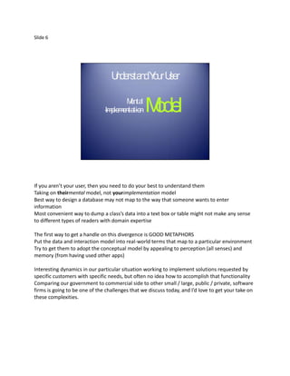
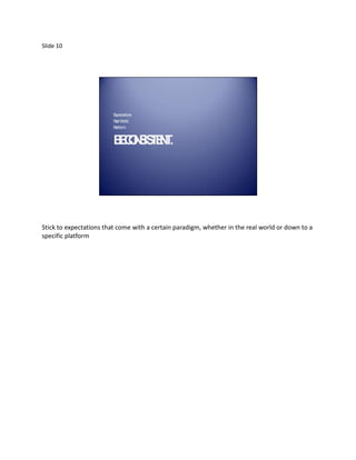
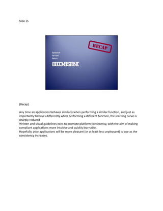
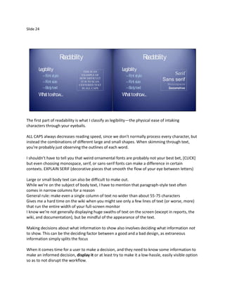
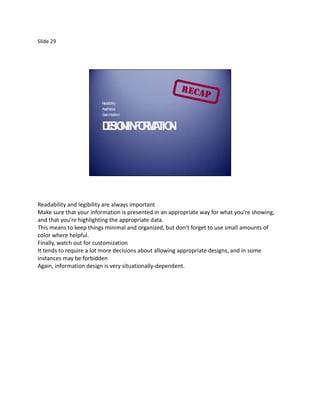
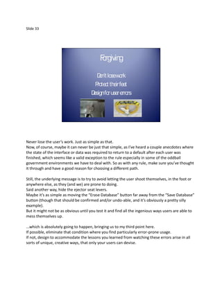
C olorisinfo C olorisinfo
R vs. green
ed R vs. green
ed
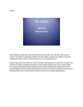
Vischeck.com Vischeck.com
…Ran picture through a simulator (one is freely available at Vischeck.com) to show just how
much colorblindness can [CLICK] affect your interface design
Here, the required fields aren’t obvious
This is a better idea
Allows user to visually group similar elements through an additional dimension, just be careful](https://image.slidesharecdn.com/usability101slidesandnotes-111216155745-phpapp01/85/Usability-101-27-320.jpg)

This document provides a summary of a presentation on usability principles. It discusses 5 key ideas: 1) Design with the user in mind, not as a programmer. Understand how users think and what tasks they need to accomplish. 2) Ensure interactions are consistent with expectations based on real-world analogues and platform conventions. 3) Provide timely feedback for all user interactions to maintain a sense of control. 4) Keep navigation visible and intuitive to avoid disorienting the user. 5) Test usability principles against edge cases to ensure guidelines actually improve the user experience.


![Getting Started with Apache Spark: Big Data Made Simple [Free Meetup]](https://cdn.slidesharecdn.com/ss_thumbnails/apachesparkgettingstarted-260203175547-8361bcc3-thumbnail.jpg?width=640&height=640&fit=bounds)


