Download to read offline


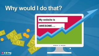


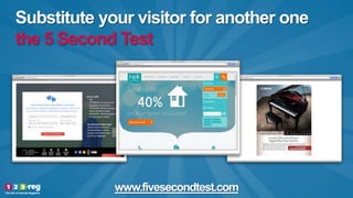


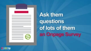
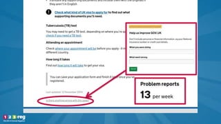
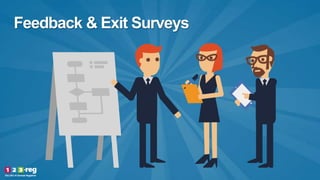
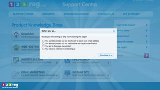

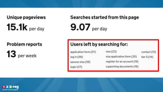


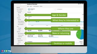


The document provides insights on how to better understand website visitors to enhance user experience and design. It emphasizes the importance of customer feedback through various methods such as live chat, observation tests, and analytics tools. It also discusses strategies for testing and optimizing website performance to improve sales and engagement.


![[Elite Camp 2016] Karl Gilis - How to Make Sure Your New Website Won’t Be a F...](https://cdn.slidesharecdn.com/ss_thumbnails/02elitecamp-karlgilis-howtomakesureyournewwebsitewontbeafailure-160708113629-thumbnail.jpg?width=640&height=640&fit=bounds)


![[CXL Live 16] You Can’t Make This Stuff Up by Alex Harris](https://cdn.slidesharecdn.com/ss_thumbnails/r4uxo85stoa2ezcmn5xo-signature-42db88fde2139044dd6963018b134da7e709739587431e34ce8d4285185c8547-poli-160403200010-thumbnail.jpg?width=640&height=640&fit=bounds)


![[Elite Camp 2016] Thomas Barker - From Zero to In-House Optimisation Superstars](https://cdn.slidesharecdn.com/ss_thumbnails/17elitecamp-thomasbarkerrbs-fromzerotoin-houseoptimisationsuperstars-160708120952-thumbnail.jpg?width=640&height=640&fit=bounds)


![[CXL Live 16] Opening Keynote by Peep Laja](https://cdn.slidesharecdn.com/ss_thumbnails/01peeplaja-openingkeynote-160401004912-thumbnail.jpg?width=640&height=640&fit=bounds)


![[CXL Live 16] Using Urgency to Boost E-commerce Conversions by Viljo Vabrit](https://cdn.slidesharecdn.com/ss_thumbnails/idrzpyvjsocrxbmdxh20-signature-42db88fde2139044dd6963018b134da7e709739587431e34ce8d4285185c8547-poli-160403200011-thumbnail.jpg?width=640&height=640&fit=bounds)


