Download to read offline


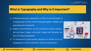
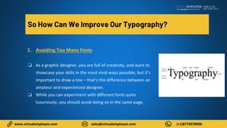
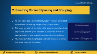
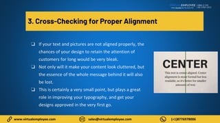


The document discusses the importance of typography in graphic design, emphasizing that it enhances readability and visual appeal. It provides tips for improving typography, including avoiding excessive font use, ensuring proper spacing and alignment, choosing suitable font types and sizes, and focusing on color themes. Additionally, it suggests hiring professional graphic designers to meet design needs effectively.


![Introduction to Graphic Design PDF [slideshare]](https://cdn.slidesharecdn.com/ss_thumbnails/prologuegraphicdesignslideshare-190815200118-thumbnail.jpg?width=640&height=640&fit=bounds)


