
Recommended
More Related Content
What's hot
What's hot (20)
Similar to Didot Typographer Poster and Process
Similar to Didot Typographer Poster and Process (20)
Recently uploaded
Recently uploaded (20)
Didot Typographer Poster and Process
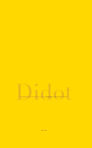
- 1. Jada Cash DidotTypographer poster and process package Typography 1 Francheska Guerrero
- 2. ntent F I R M I N D I D O T 1783 2 3 4 4 5 5 6 6 7 7 8 8 9 9 10 10 11 12 13 14 Final visible grid Written paper: Complete Paper Paper paragraphs: Flush Left 8 pt. cap height, 9 pt. leading Paper paragraphs: Flush Left 8 pt. cap height, 11 pt. leading Paper paragraphs: Flush Left 8 pt. cap height, 13 pt. leading Paper paragraphs: Flush Left, 8 pt. cap height, 15 pt. leading Paper paragraphs: Flush Left, 8 pt. cap height, 17 pt. leading Paper paragraphs: Flush Left, 8 pt. cap height, 19 pt. leading Paper paragraphs: Flush Left, 9 pt. cap height, 11 pt. leading Paper paragraphs: Flush Left, 9 pt. cap height, 13 pt. leading Paper paragraphs: Flush Left, 9 pt. cap height, 15 pt. leading Paper paragraphs: Flush Left, 9 pt. cap height, 17 pt. leading Paper paragraphs: Flush Left, 9 pt. cap height, 19 pt. leading Paper paragraphs: Flush Left, 9 pt. cap height, 21 pt. leading Paper paragraphs: Flush Left, 9 pt. cap height, 23 pt. leading Paper paragraphs: Flush Left, 9 pt. cap height, 25 pt. leading Poster design 1 Poster design 2 Poster design 3 Final Poster design Co
- 3. Final visible grid 2
- 4. Essay: Firman Didot Typographic characters are carefully designed shapes incorporating type design tradition (Coueignoux 240).Typo- graphic characters are depended on the rules related to visual appearance, and are also subjected to the design ideas of a skilled character designer (Southhall 168).The first Didot type- faces appeared in 1781, as was at the end of a long typographic continuum, which to the modern eyes at least, seems relatively unvaried. Between Nicolas Jenson’s seminal humanist typeface of 1470 and the old styles of the early eighteenth century, there is a 250-year period marked less by innovation than by a steady improvement in the design of letters. As the center of Euro- pean printing moved north, fifteenth century Venetian types gave way to sixteenth century French models, which were in turn assimilated into the Dutch and English old styles of the centuries to follow.Taken together, these types describe a slow progression away from the alphabet’s calligraphic origins stress angles shifting from generally diagonal to horizontal, bracketed serifs beginning to suggest the graver more than the pen, and by the end of the seventeenth century, printing types began to evidence a distinct and autonomous visual vocabulary. Gone are the irrelevancies of calligraphy, replaced instead by the spurs, beaks, serifs and terminals of modern typography, a coherent system of parts which hinted at the critical rationalism of the Age of Reason (“Didot”). Didot is classified as a Serif, also known for being one of the most dramatic serif typeface and is often used for magazines; often explored in fashion magazines. Didot typefaces is named after the famous French printing and type producing family. High and abrupt contrast between thick and thin strokes, abrupt hairline serifs (thin), vertical axis, horizontal stress, and small aperture are known characteristics that make the typeface Didot so unique. Firmin Didot was born in a Parisian dynasty that dominated French type founding for two centuries. His family owned their own printing firm, which was called the House of Didot. Firmin Didot created the first modern Roman typeface in 1784, and he is remembered today as the namesake of a series of Neoclassical typefaces that exquisitely captured the Modern style. He also created the typeface Ambroise, which is a contemporary interpretation of various typefaces belonging to Didot’s late style, conceived circa 1830, including the original forms of g, y, &; and to a lesser extent, k. (“A History of Graph- ic Design”).The types that Didot used are characterized by extreme contrast in thick strokes and thin strokes, by the use of hairline serifs and by the vertical stress of the letters. Many fonts today are available based on Firmin Didot’s typefaces.These in- clude Linotype Didot and HTF Didot. In the second half of the 19th century, it was normal to find fat Didots in several widths in the catalogues of French type foundries, mostly alphabets of capitals only.The narrow versions were widely used for heavy titlings in theatre posters.These same typefaces continued to be offered by French foundries such as Deberny and Peignot until the demise of the last type foundries in France at the end of the 1960s. (“A History of Graphic Design”). Around 1800, the Didot family owned the most important print shop and font foundry in France. Pierre Didot, the printer, published a document with the typefaces of his brother, Firmin Didot, the typeface designer. The printing company still exists under the name Firmin Didot, Societe Nouvelle. (Font Designer). In 1797, it was granted a pat- ent for his developments in the field of stereotype printing. His typefaces were used in his brother, Pierre Didot’s “Editions du Louvre”, series. In 1812, he was made director of the Imprimerie Impériale type foundry. Later, in 1823, one of his tragedies is performed at the Théâtre de l’Odeon. (“Font Designer”) Didot’s good qualities include the vertical axis coupled with strong horizontal stress which furnishes them with the stiffness of toy soldiers on parade.They are elegant, and like all things elegant, 3 look unhurried, calm, and in control.They are generally not suited to setting extended text, as the verticality of the letter forms interferes with the text’s horizontal rhythm. The letters don’t lead our eyes across the page, but rather up and down. (“Didot”).When opening just about any fashion magazine a person will spot a Didone. If it’s a premi- um brand, then it may well be brought to them on the back of Bodoni or Didot (“Didot”). Brodovitch had used Didot while working in Paris on Cahiers d’Art in the 1920s. In his reign as art director of Harper’s Bazaar, Didot was the black blade that cut the white space of his layouts.The font became the signa- ture of Harper’s Bazaar as well as Brodovitch’s own signature: he used the font for the identity of his influential Design Labo- ratory at the New School. In the 1950s Bodoni (and its clown- ishly bloated progeny Bodoni Poster) was used in many other ‘design’ contexts.The cover of a 1950 Museum of Modern Art book, designed by Jack Dunbar, prominently displays its title, “What Is Modern Design?” in Bodoni, as if the question it asks is answered by the typeface, rendered in stark white letters on a black background. (Miller et al.) Flash ahead to 1992 and the Didone aesthetic is powerfully resuscitated in Fabien Baron’s re-design of Harper’s Bazaar. Baron commissioned Jonathan Hoefler to create a new digital Didot, a kind of super-Didot, drawn in extremely large sizes that allowed the type to be set in enormous display sizes while still retaining its razor-thin lines. He applied the same spirit to his advertising and brand work with Valentino and Calvin Klein, and, more recently, his art direction for a book on Balenciaga. (Miller et al.). Linotype Didot was designed by Adrian Frutiger for digital technology in 1992, Linotype Didot retains all of the features that make Didot types superior for book work and other text use; like Bodoni, its delicate lines are enhanced in display it uses. Work Cited “A History of Graphic Design: Chapter 54:A History of Typeface.” A History of Graphic Design: Chapter 54:A History of Typeface. http://guity-novin.blogspot.com/2012/03/history- of-type-face.html. 14 Oct. 2015. “Hoefler & Co.” Didot Fonts. http://www.typography.com/. 14 Oct. 2015. R. Southall,“Metafont in the Rockies: the Colorado Typemaking Project,” Electronic Publish- ing,Artistic Imaging, and Digital Typography, R.D. Hersch, J.André, and H. Brown, eds., LNCS 1375, Springer-Verlag, 1998, pp. 167-180 Ph. Coueignoux,“Character Generation by Computer”, Computer Graphics and Image Processing, vol. 16, 1981, pp. 240-269 Hoefler & Co.” Didot Fonts: History. http://www.typography.comfonts/didot/overview/. 14 Oct. 2015. “Eye Magazine.” Eye Magazine. http://www.eyemagazine.com/feature/article/through-thick- and-think-fashion-and-type 14 Oct. 2015. “Font Designer – Firmin Didot.” Firmin Didot. http://www.linotype.com/370/firmindidot. html. 14 Oct. 2015. “Didot.” - Desktop Font: MyFonts. https://www.myfonts.com/fonts/adobe/linotype-didot/. 14 Oct. 2015.
- 5. Paper paragraphs The first Didot typefaces appeared in 1781, as was at the end of a long typographic continuum, which to the modern eyes at least, seems relatively unvaried. Between Nicolas Jenson’s seminal humanist typeface of 1470 and the old styles of the early eighteenth century, there is a 250-year period marked less by innovation than by a steady improvement in the design of letters. As the center of European printing moved north, fifteenth century Venetian types gave way to sixteenth century French models, which were in turn assimilated into the Dutch and English old styles of the centuries to follow.Taken together, these types describe a slow progression away from the alphabet’s calligraphic origins stress angles shifting from generally diagonal to horizontal, bracketed serifs beginning to suggest the graver more than the pen, and by the end of the seventeenth century, printing types began to evidence a distinct and autonomous visual vocabulary. Gone are the irrelevancies of calligraphy, replaced instead by the spurs, beaks, serifs and terminals of modern typography, a coherent system of parts which hinted at the critical rationalism of the Age of Reason (“Didot”). Didot is classified as a Serif, also known for being one of the most dramatic serif typeface and is often used for magazines; often explored in fashion magazines. Didot typefaces is named after the famous French printing and type producing family. High and abrupt contrast between thick and thin strokes, abrupt hairline serifs (thin), vertical axis, horizontal stress, and small aperture are known characteristics that make the typeface Didot so unique. The letters don’t lead our eyes across the page, but rather up and down. (“Didot”). When opening just about any fashion maga- zine a person will spot a Didone. If it’s a premium brand, then it may well be brought to them on the back of Bodoni or Didot (“Didot”). Brodovitch had used Didot while working in Paris on Cahiers d’Art in the 1920s. In his reign as art director of Harper’s Bazaar, Didot was the black blade that cut the white space of his layouts. The font became the signature of Harper’s Bazaar as well as Brodovitch’s own signature: he used the font for the identity of his influential Design Laboratory at the New School. In the 1950s Bodoni (and its clownishly bloated progeny Bodoni Poster) was used in many other ‘design’ contexts. The cover of a 1950 Mu- seum of Modern Art book, designed by Jack Dunbar, prominently displays its title, “What Is Modern Design?” in Bodoni, as if the question it asks is answered by the typeface, rendered in stark white letters on a black background. (Miller et al.) The first Didot typefaces appeared in 1781, as was at the end of a long typographic continuum, which to the modern eyes at least, seems relatively unvaried. Between Nicolas Jenson’s seminal humanist typeface of 1470 and the old styles of the early eighteenth century, there is a 250-year period marked less by innovation than by a steady improvement in the design of letters. As the center of European printing moved north, fifteenth century Venetian types gave way to sixteenth century French models, which were in turn assimilated into the Dutch and English old styles of the centuries to follow.Taken together, these types describe a slow progression away from the alphabet’s calligraphic origins stress angles shifting from generally diagonal to horizontal, bracketed serifs beginning to suggest the graver more than the pen, and by the end of the seventeenth century, printing types began to evidence a distinct and autonomous visual vocabulary. Gone are the irrelevancies of calligraphy, replaced instead by the spurs, beaks, serifs and terminals of modern typography, a coherent system of parts which hinted at the critical rationalism of the Age of Reason (“Didot”). Didot is classified as a Serif, also known for being one of the most dramatic serif typeface and is often used for magazines; often explored in fashion magazines. Didot typefaces is named after the famous French printing and type producing family. High and abrupt contrast between thick and thin strokes, abrupt hairline serifs (thin), vertical axis, horizontal stress, and small aperture are known characteristics that make the typeface Didot so unique. The letters don’t lead our eyes across the page, but rather up and down. (“Didot”). When opening just about any fashion maga- zine a person will spot a Didone. If it’s a premium brand, then it may well be brought to them on the back of Bodoni or Didot (“Didot”). Brodovitch had used Didot while working in Paris on Cahiers d’Art in the 1920s. In his reign as art director of Harper’s Bazaar, Didot was the black blade that cut the white space of his layouts. The font became the signature of Harper’s Bazaar as well as Brodovitch’s own signature: he used the font for the identity of his influential Design Laboratory at the New School. In the 1950s Bodoni (and its clownishly bloated progeny Bodoni Poster) was used in many other ‘design’ contexts. The cover of a 1950 Mu- seum of Modern Art book, designed by Jack Dunbar, prominently displays its title, “What Is Modern Design?” in Bodoni, as if the question it asks is answered by the typeface, rendered in stark white letters on a black background. (Miller et al.) Flush Left 8 pt. cap height, 9 pt. leading Flush Left 8 pt. cap height, 11 pt. leading 4
- 6. The first Didot typefaces appeared in 1781, as was at the end of a long typographic continuum, which to the modern eyes at least, seems relatively unvaried. Between Nicolas Jenson’s seminal humanist typeface of 1470 and the old styles of the early eighteenth century, there is a 250-year period marked less by innovation than by a steady improvement in the design of letters. As the center of European printing moved north, fifteenth century Venetian types gave way to sixteenth century French models, which were in turn assimilated into the Dutch and English old styles of the centuries to follow.Taken together, these types describe a slow progression away from the alphabet’s calligraphic origins stress angles shifting from generally diagonal to horizontal, bracketed serifs beginning to suggest the graver more than the pen, and by the end of the seventeenth century, printing types began to evidence a distinct and autonomous visual vocabulary. Gone are the irrelevancies of calligraphy, replaced instead by the spurs, beaks, serifs and terminals of modern typography, a coherent system of parts which hinted at the critical rationalism of the Age of Reason (“Didot”). Didot is classified as a Serif, also known for being one of the most dramatic serif typeface and is often used for magazines; often explored in fashion magazines. Didot typefaces is named after the famous French printing and type producing family. High and abrupt contrast between thick and thin strokes, abrupt hairline serifs (thin), vertical axis, horizontal stress, and small aperture are known characteristics that make the typeface Didot so unique. The letters don’t lead our eyes across the page, but rather up and down. (“Didot”). When opening just about any fashion maga- zine a person will spot a Didone. If it’s a premium brand, then it may well be brought to them on the back of Bodoni or Didot (“Didot”). Brodovitch had used Didot while working in Paris on Cahiers d’Art in the 1920s. In his reign as art director of Harper’s Bazaar, Didot was the black blade that cut the white space of his layouts. The font became the signature of Harper’s Bazaar as well as Brodovitch’s own signature: he used the font for the identity of his influential Design Laboratory at the New School. In the 1950s Bodoni (and its clownishly bloated progeny Bodoni Poster) was used in many other ‘design’ contexts. The cover of a 1950 Mu- seum of Modern Art book, designed by Jack Dunbar, prominently displays its title, “What Is Modern Design?” in Bodoni, as if the question it asks is answered by the typeface, rendered in stark white letters on a black background. (Miller et al.) The first Didot typefaces appeared in 1781, as was at the end of a long typographic continuum, which to the modern eyes at least, seems relatively unvaried. Between Nicolas Jenson’s seminal humanist typeface of 1470 and the old styles of the early eighteenth century, there is a 250-year period marked less by innovation than by a steady improvement in the design of letters. As the center of European printing moved north, fifteenth century Venetian types gave way to sixteenth century French models, which were in turn assimilated into the Dutch and English old styles of the centuries to follow.Taken together, these types describe a slow progression away from the alphabet’s calligraphic origins stress angles shifting from generally diagonal to horizontal, bracketed serifs beginning to suggest the graver more than the pen, and by the end of the seventeenth century, printing types began to evidence a distinct and autonomous visual vocabulary. Gone are the irrelevancies of calligraphy, replaced instead by the spurs, beaks, serifs and terminals of modern typography, a coherent system of parts which hinted at the critical rationalism of the Age of Reason (“Didot”). Didot is classified as a Serif, also known for being one of the most dramatic serif typeface and is often used for magazines; often explored in fashion magazines. Didot typefaces is named after the famous French printing and type producing family. High and abrupt contrast between thick and thin strokes, abrupt hairline serifs (thin), vertical axis, horizontal stress, and small aperture are known characteristics that make the typeface Didot so unique. The letters don’t lead our eyes across the page, but rather up and down. (“Didot”). When opening just about any fashion maga- zine a person will spot a Didone. If it’s a premium brand, then it may well be brought to them on the back of Bodoni or Didot (“Didot”). Brodovitch had used Didot while working in Paris on Cahiers d’Art in the 1920s. In his reign as art director of Harper’s Bazaar, Didot was the black blade that cut the white space of his layouts. The font became the signature of Harper’s Bazaar as well as Brodovitch’s own signature: he used the font for the identity of his influential Design Laboratory at the New School. In the 1950s Bodoni (and its clownishly bloated progeny Bodoni Poster) was used in many other ‘design’ contexts. The cover of a 1950 Mu- seum of Modern Art book, designed by Jack Dunbar, prominently displays its title, “What Is Modern Design?” in Bodoni, as if the question it asks is answered by the typeface, rendered in stark white letters on a black background. (Miller et al.) Flush Left 8 pt. cap height, 13 pt. leading Flush Left 8 pt. cap height, 15 pt. leading Paper paragraphs 5
- 7. The first Didot typefaces appeared in 1781, as was at the end of a long typographic continuum, which to the modern eyes at least, seems relatively unvaried. Between Nicolas Jenson’s seminal humanist typeface of 1470 and the old styles of the early eighteenth century, there is a 250-year period marked less by innovation than by a steady improvement in the design of letters. As the center of European printing moved north, fifteenth century Venetian types gave way to sixteenth century French models, which were in turn assimilated into the Dutch and English old styles of the centuries to follow.Taken together, these types describe a slow progression away from the alphabet’s calligraphic origins stress angles shifting from generally diagonal to horizontal, bracketed serifs beginning to suggest the graver more than the pen, and by the end of the seventeenth century, printing types began to evidence a distinct and autonomous visual vocabulary. Gone are the irrelevancies of calligraphy, replaced instead by the spurs, beaks, serifs and terminals of modern typography, a coherent system of parts which hinted at the critical rationalism of the Age of Reason (“Didot”). Didot is classified as a Serif, also known for being one of the most dramatic serif typeface and is often used for magazines; often explored in fashion magazines. Didot typefaces is named after the famous French printing and type producing family. High and abrupt contrast between thick and thin strokes, abrupt hairline serifs (thin), vertical axis, horizontal stress, and small aperture are known characteristics that make the typeface Didot so unique. The letters don’t lead our eyes across the page, but rather up and down. (“Didot”). When opening just about any fashion maga- zine a person will spot a Didone. If it’s a premium brand, then it may well be brought to them on the back of Bodoni or Didot (“Didot”). Brodovitch had used Didot while working in Paris on Cahiers d’Art in the 1920s. In his reign as art director of Harper’s Bazaar, Didot was the black blade that cut the white space of his layouts. The font became the signature of Harper’s Bazaar as well as Brodovitch’s own signature: he used the font for the identity of his influential Design Laboratory at the New School. In the 1950s Bodoni (and its clownishly bloated progeny Bodoni Poster) was used in many other ‘design’ contexts. The cover of a 1950 Mu- seum of Modern Art book, designed by Jack Dunbar, prominently displays its title, “What Is Modern Design?” in Bodoni, as if the question it asks is answered by the typeface, rendered in stark white letters on a black background. (Miller et al.) The first Didot typefaces appeared in 1781, as was at the end of a long typographic continuum, which to the modern eyes at least, seems relatively unvaried. Between Nicolas Jenson’s seminal humanist typeface of 1470 and the old styles of the early eighteenth century, there is a 250-year period marked less by innovation than by a steady improvement in the design of letters. As the center of European printing moved north, fifteenth century Venetian types gave way to sixteenth century French models, which were in turn assimilated into the Dutch and English old styles of the centuries to follow.Taken together, these types describe a slow progression away from the alphabet’s calligraphic origins stress angles shifting from generally diagonal to horizontal, bracketed serifs beginning to suggest the graver more than the pen, and by the end of the seventeenth century, printing types began to evidence a distinct and autonomous visual vocabulary. Gone are the irrelevancies of calligraphy, replaced instead by the spurs, beaks, serifs and terminals of modern typography, a coherent system of parts which hinted at the critical rationalism of the Age of Reason (“Didot”). Didot is classified as a Serif, also known for being one of the most dramatic serif typeface and is often used for magazines; often explored in fashion magazines. Didot typefaces is named after the famous French printing and type producing family. High and abrupt contrast between thick and thin strokes, abrupt hairline serifs (thin), vertical axis, horizontal stress, and small aperture are known characteristics that make the typeface Didot so unique. The letters don’t lead our eyes across the page, but rather up and down. (“Didot”). When opening just about any fashion maga- zine a person will spot a Didone. If it’s a premium brand, then it may well be brought to them on the back of Bodoni or Didot (“Didot”). Brodovitch had used Didot while working in Paris on Cahiers d’Art in the 1920s. In his reign as art director of Harper’s Bazaar, Didot was the black blade that cut the white space of his layouts. The font became the signature of Harper’s Bazaar as well as Brodovitch’s own signature: he used the font for the identity of his influential Design Laboratory at the New School. In the 1950s Bodoni (and its clownishly bloated progeny Bodoni Poster) was used in many other ‘design’ contexts. The cover of a 1950 Mu- seum of Modern Art book, designed by Jack Dunbar, prominently displays its title, “What Is Modern Design?” in Bodoni, as if the question it asks is answered by the typeface, rendered in stark white letters on a black background. (Miller et al.) Flush Left 8 pt. cap height, 17 pt. leading Flush Left 8 pt. cap height, 19 pt. leading Paper paragraphs 6
- 8. The first Didot typefaces appeared in 1781, as was at the end of a long typographic continuum, which to the modern eyes at least, seems relatively unvaried. Between Nicolas Jenson’s seminal humanist typeface of 1470 and the old styles of the early eighteenth century, there is a 250-year period marked less by innovation than by a steady improvement in the design of letters. As the center of European printing moved north, fifteenth century Vene- tian types gave way to sixteenth century French models, which were in turn assimilated into the Dutch and English old styles of the centuries to follow.Taken together, these types describe a slow progression away from the alphabet’s calligraphic origins stress angles shifting from general- ly diagonal to horizontal, bracketed serifs beginning to suggest the graver more than the pen, and by the end of the seventeenth century, printing types began to evidence a distinct and autonomous visual vocabulary. Gone are the irrelevancies of calligraphy, replaced instead by the spurs, beaks, serifs and terminals of modern typography, a coher- ent system of parts which hinted at the critical rationalism of the Age of Reason (“Didot”).Didot is classified as a Serif, also known for being one of the most dramatic serif typeface and is often used for magazines; often explored in fashion magazines. Didot typefaces is named after the famous French printing and type producing family. High and abrupt contrast between thick and thin strokes, abrupt hairline serifs (thin), vertical axis, horizontal stress, and small aperture are known characteristics that make the typeface Didot so unique. The letters don’t lead our eyes across the page, but rather up and down. (“Didot”). When opening just about any fashion magazine a person will spot a Didone. If it’s a premium brand, then it may well be brought to them on the back of Bodoni or Didot (“Didot”). Brodovitch had used Didot while working in Paris on Cahiers d’Art in the 1920s. In his reign as art director of Harper’s Bazaar, Didot was the black blade that cut the white space of his layouts. The font became the signature of Harper’s Bazaar as well as Brodovitch’s own signature: he used the font for the identity of his influential Design Laboratory at the New School. In the 1950s Bodoni (and its clownishly bloated progeny Bodoni Poster) was used in many other ‘design’ contexts. The cover of a 1950 Museum of Modern Art book, designed by Jack Dunbar, prominently displays its title, “What Is Modern Design?” in Bodoni, as if the question it asks is answered by the typeface, rendered in stark white letters on a black background. (Miller et al.) The first Didot typefaces appeared in 1781, as was at the end of a long typographic continuum, which to the modern eyes at least, seems relatively unvaried. Between Nicolas Jenson’s seminal humanist typeface of 1470 and the old styles of the early eighteenth century, there is a 250-year period marked less by innovation than by a steady improvement in the design of letters. As the center of European printing moved north, fifteenth century Vene- tian types gave way to sixteenth century French models, which were in turn assimilated into the Dutch and English old styles of the centuries to follow.Taken together, these types describe a slow progression away from the alphabet’s calligraphic origins stress angles shifting from general- ly diagonal to horizontal, bracketed serifs beginning to suggest the graver more than the pen, and by the end of the seventeenth century, printing types began to evidence a distinct and autonomous visual vocabulary. Gone are the irrelevancies of calligraphy, replaced instead by the spurs, beaks, serifs and terminals of modern typography, a coher- ent system of parts which hinted at the critical rationalism of the Age of Reason (“Didot”).Didot is classified as a Serif, also known for being one of the most dramatic serif typeface and is often used for magazines; often explored in fashion magazines. Didot typefaces is named after the famous French printing and type producing family. High and abrupt contrast between thick and thin strokes, abrupt hairline serifs (thin), vertical axis, horizontal stress, and small aperture are known characteristics that make the typeface Didot so unique. The letters don’t lead our eyes across the page, but rather up and down. (“Didot”). When opening just about any fashion magazine a person will spot a Didone. If it’s a premium brand, then it may well be brought to them on the back of Bodoni or Didot (“Didot”). Brodovitch had used Didot while working in Paris on Cahiers d’Art in the 1920s. In his reign as art director of Harper’s Bazaar, Didot was the black blade that cut the white space of his layouts. The font became the signature of Harper’s Bazaar as well as Brodovitch’s own signature: he used the font for the identity of his influential Design Laboratory at the New School. In the 1950s Bodoni (and its clownishly bloated progeny Bodoni Poster) was used in many other ‘design’ contexts. The cover of a 1950 Museum of Modern Art book, designed by Jack Dunbar, prominently displays its title, “What Is Modern Design?” in Bodoni, as if the question it asks is answered by the typeface, rendered in stark white letters on a black background. (Miller et al.) Flush Left 9 pt. cap height, 11 pt. leading Flush Left 9 pt. cap height, 13 pt. leading Paper paragraphs 7
- 9. The first Didot typefaces appeared in 1781, as was at the end of a long typographic continuum, which to the modern eyes at least, seems relatively unvaried. Between Nicolas Jenson’s seminal humanist typeface of 1470 and the old styles of the early eighteenth century, there is a 250-year period marked less by innovation than by a steady improvement in the design of letters. As the center of European printing moved north, fifteenth century Vene- tian types gave way to sixteenth century French models, which were in turn assimilated into the Dutch and English old styles of the centuries to follow.Taken together, these types describe a slow progression away from the alphabet’s calligraphic origins stress angles shifting from general- ly diagonal to horizontal, bracketed serifs beginning to suggest the graver more than the pen, and by the end of the seventeenth century, printing types began to evidence a distinct and autonomous visual vocabulary. Gone are the irrelevancies of calligraphy, replaced instead by the spurs, beaks, serifs and terminals of modern typography, a coher- ent system of parts which hinted at the critical rationalism of the Age of Reason (“Didot”).Didot is classified as a Serif, also known for being one of the most dramatic serif typeface and is often used for magazines; often explored in fashion magazines. Didot typefaces is named after the famous French printing and type producing family. High and abrupt contrast between thick and thin strokes, abrupt hairline serifs (thin), vertical axis, horizontal stress, and small aperture are known characteristics that make the typeface Didot so unique. The letters don’t lead our eyes across the page, but rather up and down. (“Didot”). When opening just about any fashion magazine a person will spot a Didone. If it’s a premium brand, then it may well be brought to them on the back of Bodoni or Didot (“Didot”). Brodovitch had used Didot while working in Paris on Cahiers d’Art in the 1920s. In his reign as art director of Harper’s Bazaar, Didot was the black blade that cut the white space of his layouts. The font became the signature of Harper’s Bazaar as well as Brodovitch’s own signature: he used the font for the identity of his influential Design Laboratory at the New School. In the 1950s Bodoni (and its clownishly bloated progeny Bodoni Poster) was used in many other ‘design’ contexts. The cover of a 1950 Museum of Modern Art book, designed by Jack Dunbar, prominently displays its title, “What Is Modern Design?” in Bodoni, as if the question it asks is answered by the typeface, rendered in stark white letters on a black background. (Miller et al.) The first Didot typefaces appeared in 1781, as was at the end of a long typographic continuum, which to the modern eyes at least, seems relatively unvaried. Between Nicolas Jenson’s seminal humanist typeface of 1470 and the old styles of the early eighteenth century, there is a 250-year period marked less by innovation than by a steady improvement in the design of letters. As the center of European printing moved north, fifteenth century Vene- tian types gave way to sixteenth century French models, which were in turn assimilated into the Dutch and English old styles of the centuries to follow.Taken together, these types describe a slow progression away from the alphabet’s calligraphic origins stress angles shifting from general- ly diagonal to horizontal, bracketed serifs beginning to suggest the graver more than the pen, and by the end of the seventeenth century, printing types began to evidence a distinct and autonomous visual vocabulary. Gone are the irrelevancies of calligraphy, replaced instead by the spurs, beaks, serifs and terminals of modern typography, a coher- ent system of parts which hinted at the critical rationalism of the Age of Reason (“Didot”).Didot is classified as a Serif, also known for being one of the most dramatic serif typeface and is often used for magazines; often explored in fashion magazines. Didot typefaces is named after the famous French printing and type producing family. High and abrupt contrast between thick and thin strokes, abrupt hairline serifs (thin), vertical axis, horizontal stress, and small aperture are known characteristics that make the typeface Didot so unique. The letters don’t lead our eyes across the page, but rather up and down. (“Didot”). When opening just about any fashion magazine a person will spot a Didone. If it’s a premium brand, then it may well be brought to them on the back of Bodoni or Didot (“Didot”). Brodovitch had used Didot while working in Paris on Cahiers d’Art in the 1920s. In his reign as art director of Harper’s Bazaar, Didot was the black blade that cut the white space of his layouts. The font became the signature of Harper’s Bazaar as well as Brodovitch’s own signature: he used the font for the identity of his influential Design Laboratory at the New School. In the 1950s Bodoni (and its clownishly bloated progeny Bodoni Poster) was used in many other ‘design’ contexts. The cover of a 1950 Museum of Modern Art book, designed by Jack Dunbar, prominently displays its title, “What Is Modern Design?” in Bodoni, as if the question it asks is answered by the typeface, rendered in stark white letters on a black background. (Miller et al.) Flush Left 9 pt. cap height, 15 pt. leading Flush Left 9 pt. cap height, 17 pt. leading Paper paragraphs 8
- 10. The first Didot typefaces appeared in 1781, as was at the end of a long typographic continuum, which to the modern eyes at least, seems relatively unvaried. Between Nicolas Jenson’s seminal humanist typeface of 1470 and the old styles of the early eighteenth century, there is a 250-year period marked less by innovation than by a steady improvement in the design of letters. As the center of European printing moved north, fifteenth century Vene- tian types gave way to sixteenth century French models, which were in turn assimilated into the Dutch and English old styles of the centuries to follow.Taken together, these types describe a slow progression away from the alphabet’s calligraphic origins stress angles shifting from general- ly diagonal to horizontal, bracketed serifs beginning to suggest the graver more than the pen, and by the end of the seventeenth century, printing types began to evidence a distinct and autonomous visual vocabulary. Gone are the irrelevancies of calligraphy, replaced instead by the spurs, beaks, serifs and terminals of modern typography, a coher- ent system of parts which hinted at the critical rationalism of the Age of Reason (“Didot”).Didot is classified as a Serif, also known for being one of the most dramatic serif typeface and is often used for magazines; often explored in fashion magazines. Didot typefaces is named after the famous French printing and type producing family. High and abrupt contrast between thick and thin strokes, abrupt hairline serifs (thin), vertical axis, horizontal stress, and small aperture are known characteristics that make the typeface Didot so unique. The letters don’t lead our eyes across the page, but rather up and down. (“Didot”). When opening just about any fashion magazine a person will spot a Didone. If it’s a premium brand, then it may well be brought to them on the back of Bodoni or Didot (“Didot”). Brodovitch had used Didot while working in Paris on Cahiers d’Art in the 1920s. In his reign as art director of Harper’s Bazaar, Didot was the black blade that cut the white space of his layouts. The font became the signature of Harper’s Bazaar as well as Brodovitch’s own signature: he used the font for the identity of his influential Design Laboratory at the New School. In the 1950s Bodoni (and its clownishly bloated progeny Bodoni Poster) was used in many other ‘design’ contexts. The cover of a 1950 Museum of Modern Art book, designed by Jack Dunbar, prominently displays its title, “What Is Modern Design?” in Bodoni, as if the question it asks is answered by the typeface, rendered in stark white letters on a black background. (Miller et al.) The first Didot typefaces appeared in 1781, as was at the end of a long typographic continuum, which to the modern eyes at least, seems relatively unvaried. Between Nicolas Jenson’s seminal humanist typeface of 1470 and the old styles of the early eighteenth century, there is a 250-year period marked less by innovation than by a steady improvement in the design of letters. As the center of European printing moved north, fifteenth century Vene- tian types gave way to sixteenth century French models, which were in turn assimilated into the Dutch and English old styles of the centuries to follow.Taken together, these types describe a slow progression away from the alphabet’s calligraphic origins stress angles shifting from general- ly diagonal to horizontal, bracketed serifs beginning to suggest the graver more than the pen, and by the end of the seventeenth century, printing types began to evidence a distinct and autonomous visual vocabulary. Gone are the irrelevancies of calligraphy, replaced instead by the spurs, beaks, serifs and terminals of modern typography, a coher- ent system of parts which hinted at the critical rationalism of the Age of Reason (“Didot”).Didot is classified as a Serif, also known for being one of the most dramatic serif typeface and is often used for magazines; often explored in fashion magazines. Didot typefaces is named after the famous French printing and type producing family. High and abrupt contrast between thick and thin strokes, abrupt hairline serifs (thin), vertical axis, horizontal stress, and small aperture are known characteristics that make the typeface Didot so unique. The letters don’t lead our eyes across the page, but rather up and down. (“Didot”). When opening just about any fashion magazine a person will spot a Didone. If it’s a premium brand, then it may well be brought to them on the back of Bodoni or Didot (“Didot”). Brodovitch had used Didot while working in Paris on Cahiers d’Art in the 1920s. In his reign as art director of Harper’s Bazaar, Didot was the black blade that cut the white space of his layouts. The font became the signature of Harper’s Bazaar as well as Brodovitch’s own signature: he used the font for the identity of his influential Design Laboratory at the New School. In the 1950s Bodoni (and its clownishly bloated progeny Bodoni Poster) was used in many other ‘design’ contexts. The cover of a 1950 Museum of Modern Art book, designed by Jack Dunbar, prominently displays its title, “What Is Modern Design?” in Bodoni, as if the question it asks is answered by the typeface, rendered in stark white letters on a black background. (Miller et al.) Flush Left 9 pt. cap height, 19 pt. leading Flush Left 9 pt. cap height, 21 pt. leading Paper paragraphs 9
- 11. The first Didot typefaces appeared in 1781, as was at the end of a long typographic continuum, which to the modern eyes at least, seems relatively unvaried. Between Nicolas Jenson’s seminal humanist typeface of 1470 and the old styles of the early eighteenth century, there is a 250-year period marked less by innovation than by a steady improvement in the design of letters. As the center of European printing moved north, fifteenth century Vene- tian types gave way to sixteenth century French models, which were in turn assimilated into the Dutch and English old styles of the centuries to follow.Taken together, these types describe a slow progression away from the alphabet’s calligraphic origins stress angles shifting from general- ly diagonal to horizontal, bracketed serifs beginning to suggest the graver more than the pen, and by the end of the seventeenth century, printing types began to evidence a distinct and autonomous visual vocabulary. Didot type- faces is named after the famous French printing and type producing family. High and abrupt contrast between thick and thin strokes, abrupt hairline serifs (thin), vertical axis, horizontal stress, and small aperture are known character- istics that make the typeface Didot so unique. The letters don’t lead our eyes across the page, but rather up and down. (“Didot”). When opening just about any fashion magazine a person will spot a Didone. If it’s a premium brand, then it may well be brought to them on the back of Bodoni or Didot (“Didot”). Brodovitch had used Didot while working in Paris on Cahiers d’Art in the 1920s. In his reign as art director of Harper’s Bazaar, Didot was the black blade that cut the white space of his layouts. The font became the signature of Harper’s Bazaar as well as Brodovitch’s own signature: he used the font for the identity of his influential Design Laboratory at the New School. In the 1950s Bodoni (and its clownishly bloated progeny Bodoni Poster) was used in many other ‘design’ contexts. The cover of a 1950 Museum of Modern Art book, designed by Jack Dunbar, prominently displays its title, “What Is Modern Design?” in Bodoni, as if the question it asks is answered by the typeface, rendered in stark white letters on a black background. (Miller et al.) The first Didot typefaces appeared in 1781, as was at the end of a long typographic continuum, which to the modern eyes at least, seems relatively unvaried. Between Nicolas Jenson’s seminal humanist typeface of 1470 and the old styles of the early eighteenth century, there is a 250-year period marked less by innovation than by a steady improvement in the design of letters. As the center of European printing moved north, fifteenth century Vene- tian types gave way to sixteenth century French models, which were in turn assimilated into the Dutch and English old styles of the centuries to follow.Taken together, these types describe a slow progression away from the alphabet’s calligraphic origins stress angles shifting from general- ly diagonal to horizontal, bracketed serifs beginning to suggest the graver more than the pen, and by the end of the seventeenth century, printing types began to evidence a distinct and autonomous visual vocabulary. Didot type- faces is named after the famous French printing and type producing family. High and abrupt contrast between thick and thin strokes, abrupt hairline serifs (thin), vertical axis, horizontal stress, and small aperture are known character- istics that make the typeface Didot so unique. The letters don’t lead our eyes across the page, but rather up and down. (“Didot”). When opening just about any fashion magazine a person will spot a Didone. If it’s a premium brand, then it may well be brought to them on the back of Bodoni or Didot (“Didot”). Brodovitch had used Didot while working in Paris on Cahiers d’Art in the 1920s. In his reign as art director of Harper’s Bazaar, Didot was the black blade that cut the white space of his layouts. The font became the signature of Harper’s Bazaar as well as Brodovitch’s own signature: he used the font for the identity of his influential Design Laboratory at the New School. In the 1950s Bodoni (and its clownishly bloated progeny Bodoni Poster) was used in many other ‘design’ contexts. The cover of a 1950 Museum of Modern Art book, designed by Jack Dunbar, prominently displays its title, “What Is Modern Design?” in Bodoni, as if the question it asks is answered by the typeface, rendered in stark white letters on a black background. (Miller et al.) Flush Left 9 pt. cap height, 25 pt. leadingFlush Left 9 pt. cap height, 23 pt. leading Paper paragraphs 10
- 12. F I R M I N Didot F A S H I O N The first Didot typefaces appeared in 1781, as was at the end of a long typographic continuum, which to the modern eyes at least, seems relatively unvar- ied. Between Nicolas Jenson’s seminal humanist typeface of 1470 and the old styles of the early eigh- teenth century, there is a 250-year period marked less by innovation than by a steady improvement in the design of letters. As the center of European printing moved north, fifteenth century Venetian types gave way to sixteenth century French models, which were in turn assimilated into the Dutch and English old styles of the centuries to follow. Taken together, these types describe a slow progression away from the alphabet’s calligraphic origins stress angles shifting from generally diagonal to horizon- tal, bracketed serifs beginning to suggest the graver more than the pen, and by the end of the seven- teenth century, printing types began to evidence a distinct and autonomous visual vocabulary. Gone are the irrelevancies of calligraphy, replaced instead by the spurs, beaks, serifs and terminals of modern typography, a coherent system of parts which hinted at the critical rationalism of the Age of Reason (“Di- dot”).Didot is classified as a Serif, also known for being one of the most dramatic serif typeface and is often used for magazines; often explored in fash- ion magazines. Didot typefaces is named after the famous French printing and type producing family. High and abrupt contrast between thick and thin strokes, abrupt hairline serifs (thin), vertical axis, horizontal stress,and small aperture are known char- acteristics that make the typeface Didot so unique. The letters don’t lead our eyes across the page, but rather up and down. (“Didot”). When opening just about any fashion magazine a person will spot a Didone. If it’s a premium brand, then it may well be brought to them on the back of Bodoni or Di- dot (“Didot”). Brodovitch had used Didot while working in Paris on Cahiers d’Art in the 1920s. In his reign as art director of Harper’s Bazaar, Didot was the black blade that cut the white space of his layouts. The font became the signature of Harper’s Bazaar as well as Brodovitch’s own signature: he used the font for the identity of his influential De- sign Laboratory at the New School. In the 1950s Bodoni (and its clownishly bloated progeny Bodo- ni Poster) was used in many other ‘design’ contexts. The cover of a 1950 Museum of Modern Art book, designed by Jack Dunbar, prominently displays its title, “What Is Modern Design?” in Bodoni, as if the question it asks is answered by the typeface, rendered in stark white letters on a black back- ground. (Miller et al.) Flash ahead to 1992 and the Didone aesthetic is powerfully resuscitated in Fa- bien Baron’s re-design of Harper’s Bazaar. Baron commissioned Jonathan Hoefler to create a new digital Didot, a kind of super-Didot, drawn in ex- tremely large sizes that allowed the type to be set in enormous display sizes while still retaining its razor-thin lines. He applied the same spirit to his advertising and brand work with Valentino and Calvin Klein, and, more recently, his art direction for a book on Balenciaga. (Miller et al.). Linotype Didot was designed by Adrian Frutiger for dig- ital technology in 1992, Linotype Didot retains all of the features that make Didot types superi- or for book work and other text use; like Bodoni, its delicate lines are enhanced in display it uses. A B C D E F G H I J K L M N O P Q R S T U V W X Y Z a b c d e f g h i j k l n o p q r s t u v q x y z Defined the characteritics of the modern type style ” “ ! @ # $ % ^ & * ) ? ; + E L E G A N T C L A S S I C M O D E R N 1 2 3 4 5 6 7 8 9 0 1783
- 13. nF i rm i D idt o F A S H I O N The first Didot typefaces appeared in 1781, as was at the end of a long typographic continuum, which to the modern eyes at least, seems relatively unvar- ied. Between Nicolas Jenson’s seminal humanist typeface of 1470 and the old styles of the early eigh- teenth century, there is a 250-year period marked less by innovation than by a steady improvement in the design of letters. As the center of European printing moved north, fifteenth century Venetian types gave way to sixteenth century French models, which were in turn assimilated into the Dutch and English old styles of the centuries to follow. Tak- en together, these types describe a slow progres- sion away from the alphabet’s calligraphic origins stress angles shifting from generally diagonal to horizontal, bracketed serifs beginning to suggest the graver more than the pen, and by the end of F I R M I N D I D O T E L E G A N T 1783 A B D E F G H J K L M N O P Q R S T U V W X Y Z a b c d e f g h i j k l n o p q r s t u v q x y z ! @ # $ % ^ & * ) ? ; + 1 2 3 4 5 6 7 8 9 0 M O D E R N C L A S S I C Defined the characteritics of the modern type style ” “ the seventeenth century, printing types began to evidence a distinct and autonomous visual vocab- ulary. Gone are the irrelevancies of calligraphy, replaced instead by the spurs, beaks, serifs and terminals of modern typography, a coherent sys- tem of parts which hinted at the critical rational- ism of the Age of Reason (“Didot”).Didot is clas- sified as a Serif, also known for being one of the most dramatic serif typeface and is often used for magazines; often explored in fashion magazines. Didot typefaces is named after the famous French printing and type producing family. High and abrupt contrast between thick and thin strokes, abrupt hairline serifs (thin), vertical axis, horizon- tal stress, and small aperture are known charac- teristics that make the typeface Didot so unique.
- 14. t A B D E F G H J K L M N O P Q R S T U VWXYZ abcdefg h i j k l n o p qrstu v q x y z 1 2 3 4 5 6 7 8 9 0 Dd dThe first Didot typefaces appeared in 1781, as was at the end of a long typographic continuum, which to the modern eyes at least, seems relatively unvar- ied. Between Nicolas Jenson’s seminal humanist typeface of 1470 and the old styles of the early eigh- teenth century, there is a 250-year period marked less by innovation than by a steady improvement in the design of letters. As the center of European printing moved north, fifteenth century Venetian types gave way to sixteenth century French models, which were in turn assimilated into the Dutch and English old styles of the centuries to follow. Taken together, these types describe a slow progression away from the alphabet’s calligraphic origins stress angles shifting from generally diagonal to horizon- tal, bracketed serifs beginning to suggest the graver more than the pen, and by the end of the seven- teenth century, printing types began to evidence a distinct and autonomous visual vocabulary. Gone are the irrelevancies of calligraphy, replaced instead by the spurs, beaks, serifs and terminals of modern typography, a coherent system of parts which hinted at the critical rationalism of the Age of Reason (“Di- dot”).Didot is classified as a Serif, also known for being one of the most dramatic serif typeface and is often used for magazines; often explored in fash- ion magazines. Didot typefaces is named after the famous French printing and type producing family. High and abrupt contrast between thick and thin strokes, abrupt hairline serifs (thin), vertical axis, horizontal stress,and small aperture are known char- acteristics that make the typeface Didot so unique. Ii oThe letters don’t lead our eyes across the page, but rather up and down. (“Didot”). When opening just about any fashion magazine a person will spot a Didone. If it’s a premium brand, then it may well be brought to them on the back of Bodoni or Di- dot (“Didot”). Brodovitch had used Didot while working in Paris on Cahiers d’Art in the 1920s. In his reign as art director of Harper’s Bazaar, Didot was the black blade that cut the white space of his layouts. The font became the signature of Harper’s Bazaar as well as Brodovitch’s own signature: he used the font for the identity of his influential De- sign Laboratory at the New School. In the 1950s Bodoni (and its clownishly bloated progeny Bodo- ni Poster) was used in many other ‘design’ contexts. The cover of a 1950 Museum of Modern Art book, designed by Jack Dunbar, prominently displays its title, “What Is Modern Design?” in Bodoni, as if the question it asks is answered by the typeface, rendered in stark white letters on a black back- ground. (Miller et al.) Flash ahead to 1992 and the Didone aesthetic is powerfully resuscitated in Fa- bien Baron’s re-design of Harper’s Bazaar. Baron commissioned Jonathan Hoefler to create a new digital Didot, a kind of super-Didot, drawn in ex- tremely large sizes that allowed the type to be set in enormous display sizes while still retaining its razor-thin lines. He applied the same spirit to his advertising and brand work with Valentino and Calvin Klein, and, more recently, his art direction for a book on Balenciaga. (Miller et al.). Linotype Didot was designed by Adrian Frutiger for dig- ital technology in 1992, Linotype Didot retains all of the features that make Didot types superi- or for book work and other text use; like Bodoni, its delicate lines are enhanced in display it uses. o 1783 F i r m i n D i d o t F A S H I O N M O D E R N ! @ # $ % ^ & * ) ? ; + C L A S S I C Defined the characteritics of the modern type style ” “ E L E G A N T