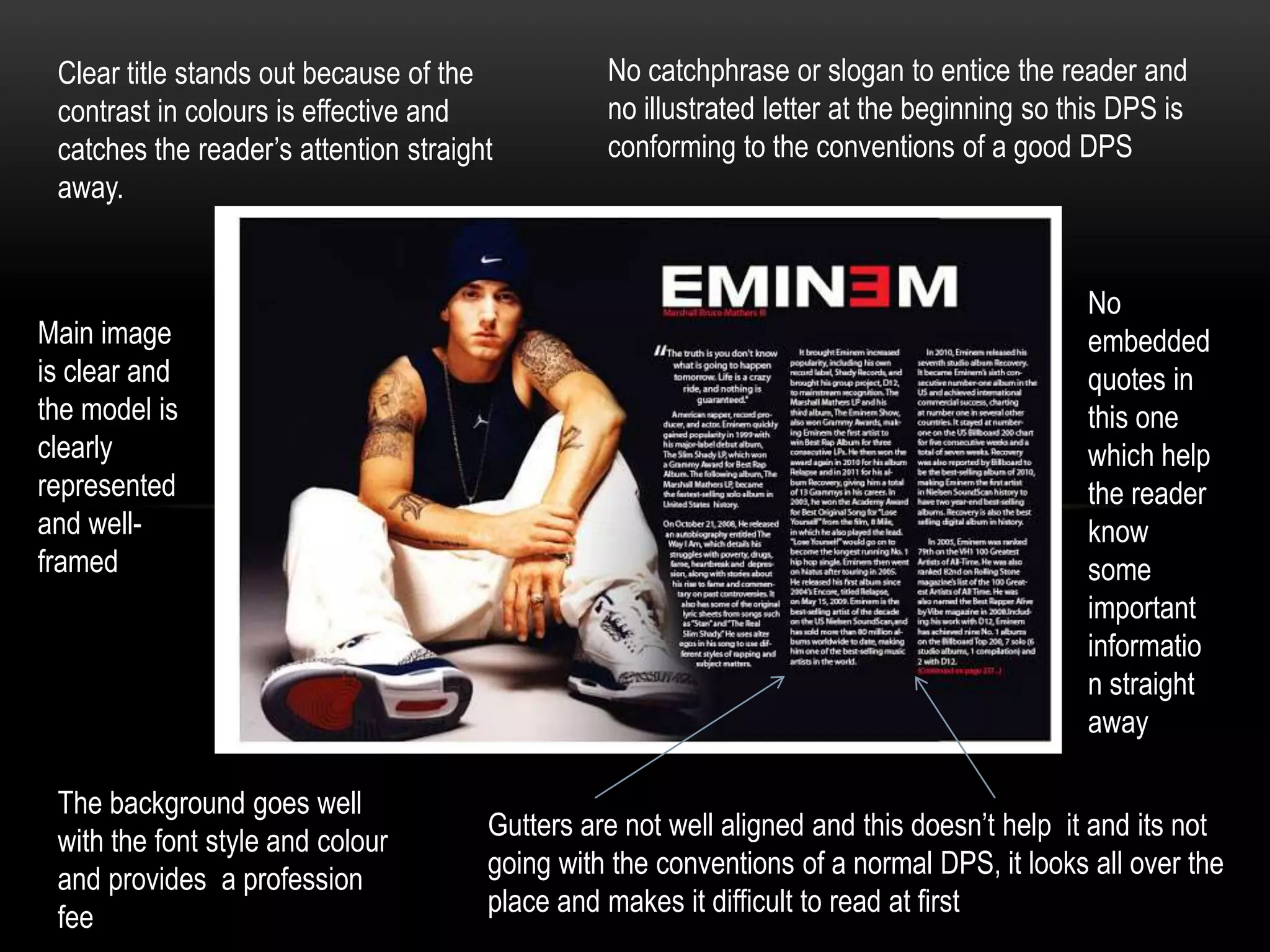
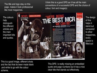
Clear title stands out because of the
contrast in colours is effective and
catches the reader’s attention straight
away.

Main image
is clear and
the model is
clearly
represented
and wellframed

The background goes well
with the font style and colour
and provides a profession
fee

No catchphrase or slogan to entice the reader and
no illustrated letter at the beginning so this DPS is
conforming to the conventions of a good DPS

No
embedded
quotes in
this one
which help
the reader
know
some
important
informatio
n straight
away
Gutters are not well aligned and this doesn’t help it and its not
going with the conventions of a normal DPS, it looks all over the
place and makes it difficult to read at first
The title and logo stay on this
page, makes it look professional
like most magazines.

I think this is a good DPS as it has all the main
conventions of a successful DPS and the choice of
colour, font and image(s)

The colours
help
distinguish
the different
articles and
the main
important bits
and quotes.

This is a good image, different shots
and the fact that its been made black
.and white to go with the colour
scheme,

The design
of this
helps it
stand out
compared
to other
magazines,
every
space is
filled out

This DPS is really missing an embedded
quote and page numbers but it has a nice
clear title that stands out effectively.

Two media dps analysis

  • 1.
    Clear title standsout because of the contrast in colours is effective and catches the reader’s attention straight away. Main image is clear and the model is clearly represented and wellframed The background goes well with the font style and colour and provides a profession fee No catchphrase or slogan to entice the reader and no illustrated letter at the beginning so this DPS is conforming to the conventions of a good DPS No embedded quotes in this one which help the reader know some important informatio n straight away Gutters are not well aligned and this doesn’t help it and its not going with the conventions of a normal DPS, it looks all over the place and makes it difficult to read at first
  • 2.
    The title andlogo stay on this page, makes it look professional like most magazines. I think this is a good DPS as it has all the main conventions of a successful DPS and the choice of colour, font and image(s) The colours help distinguish the different articles and the main important bits and quotes. This is a good image, different shots and the fact that its been made black .and white to go with the colour scheme, The design of this helps it stand out compared to other magazines, every space is filled out This DPS is really missing an embedded quote and page numbers but it has a nice clear title that stands out effectively.