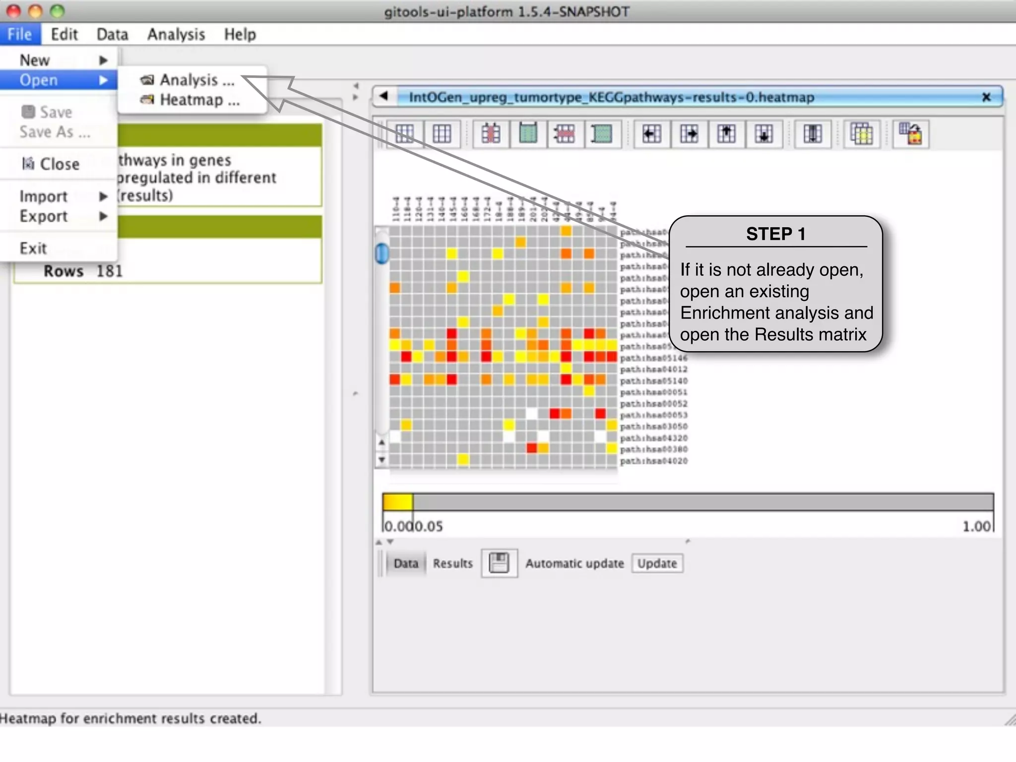
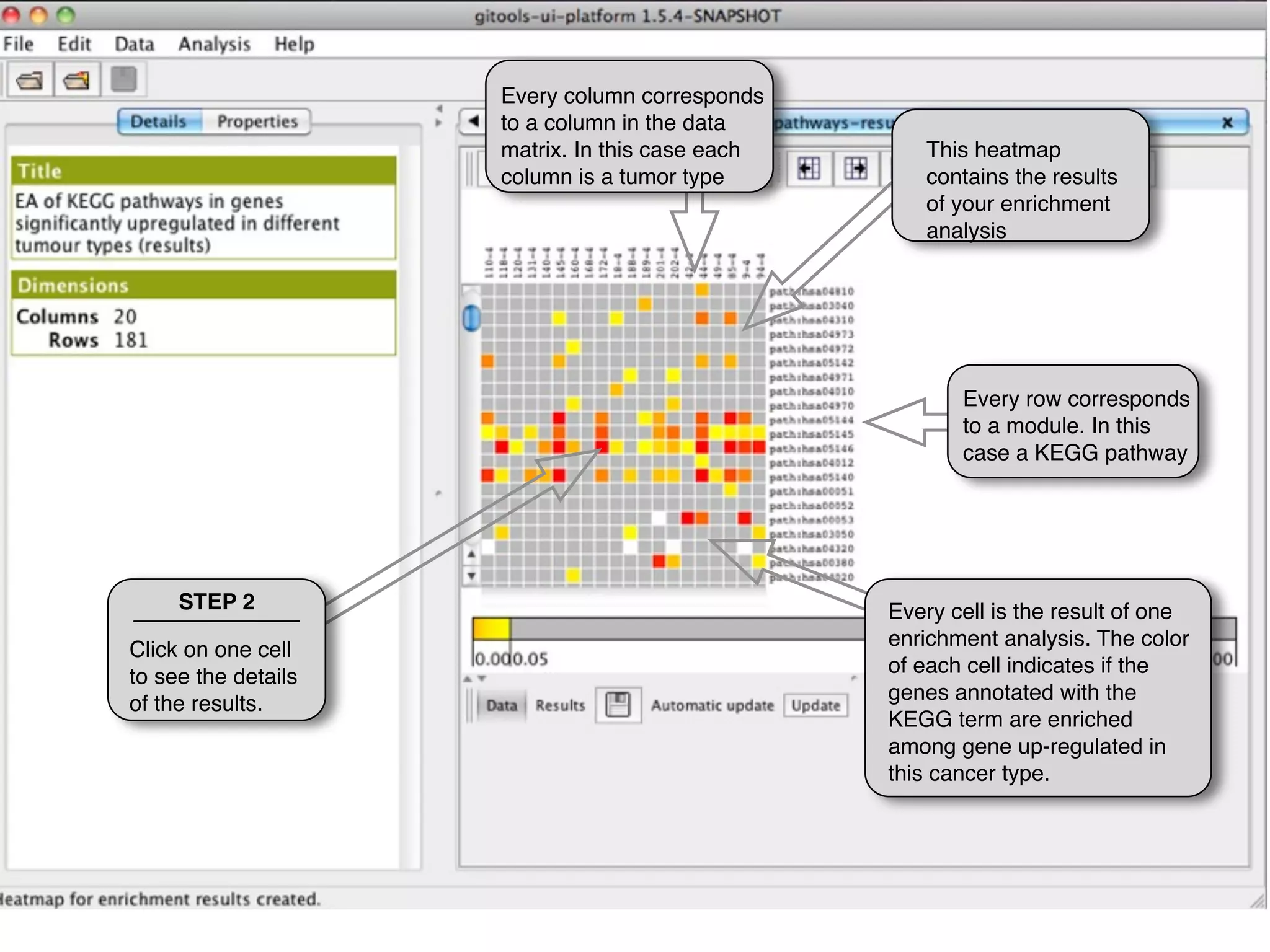
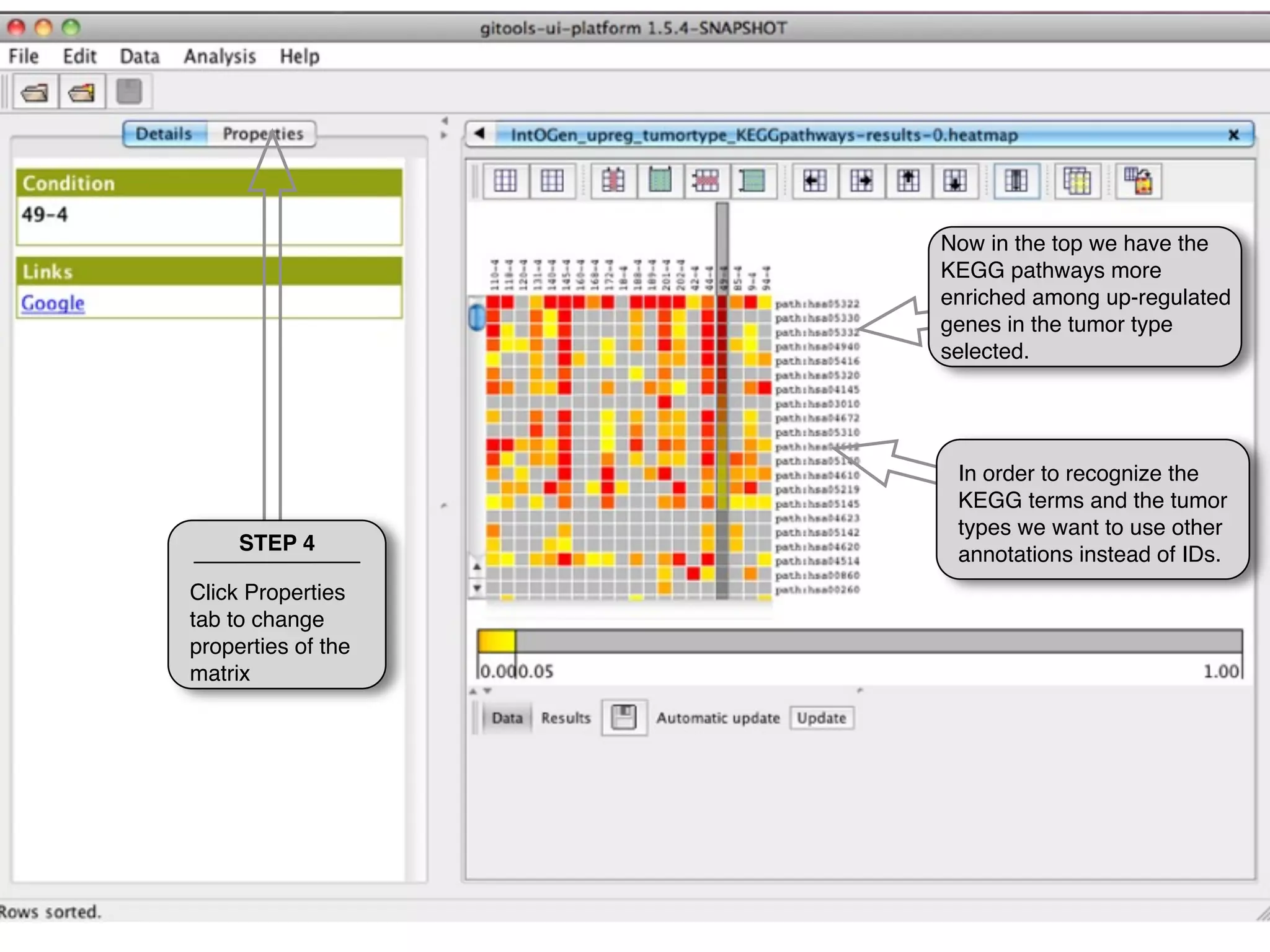
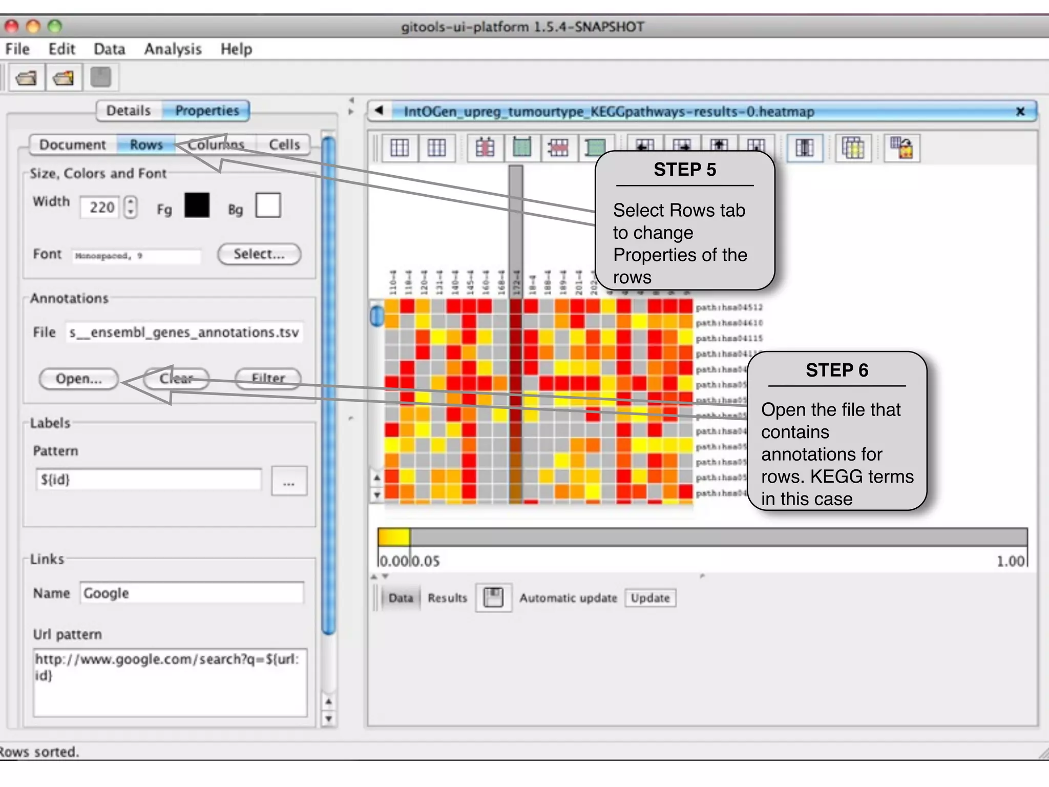
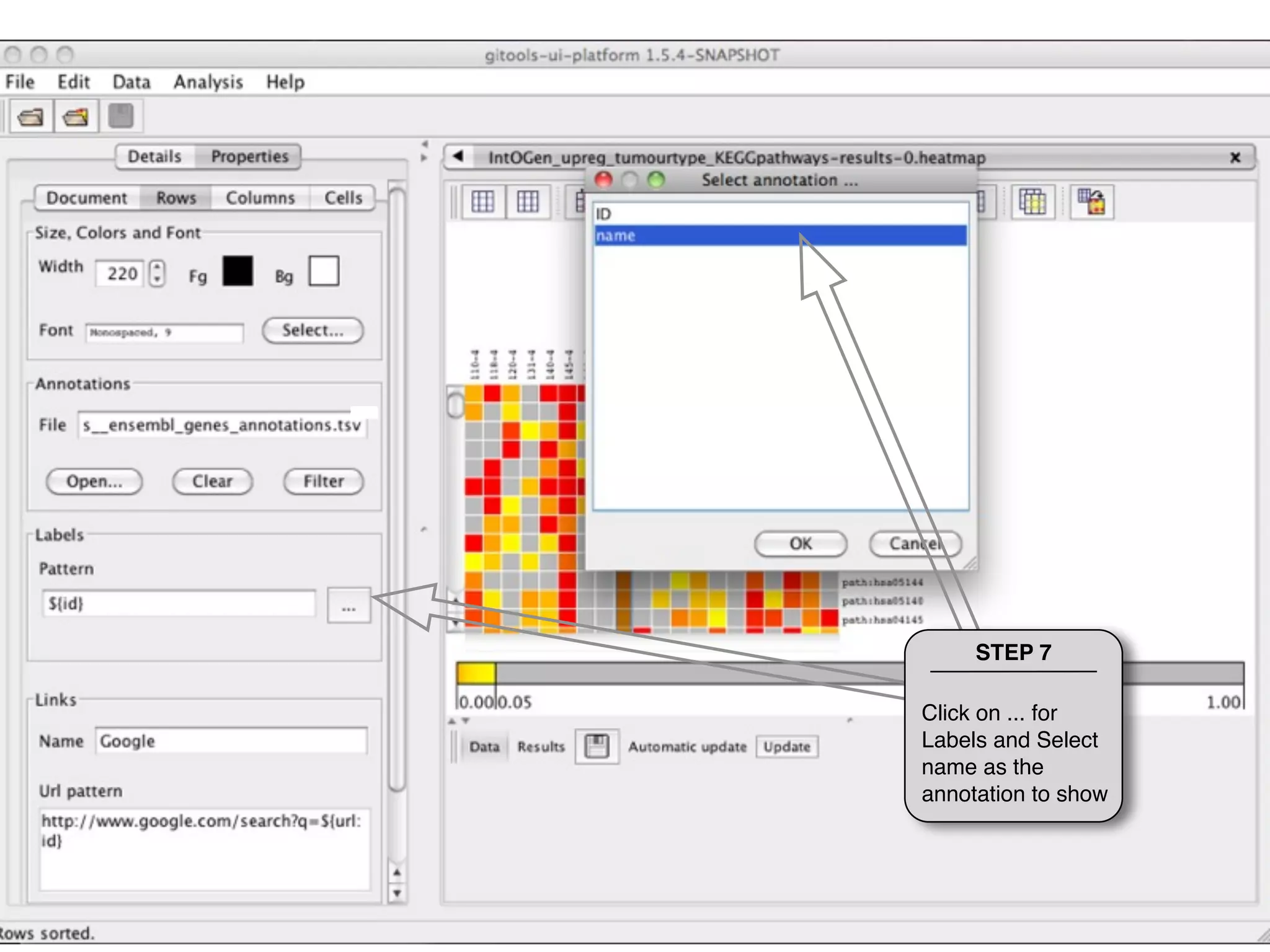
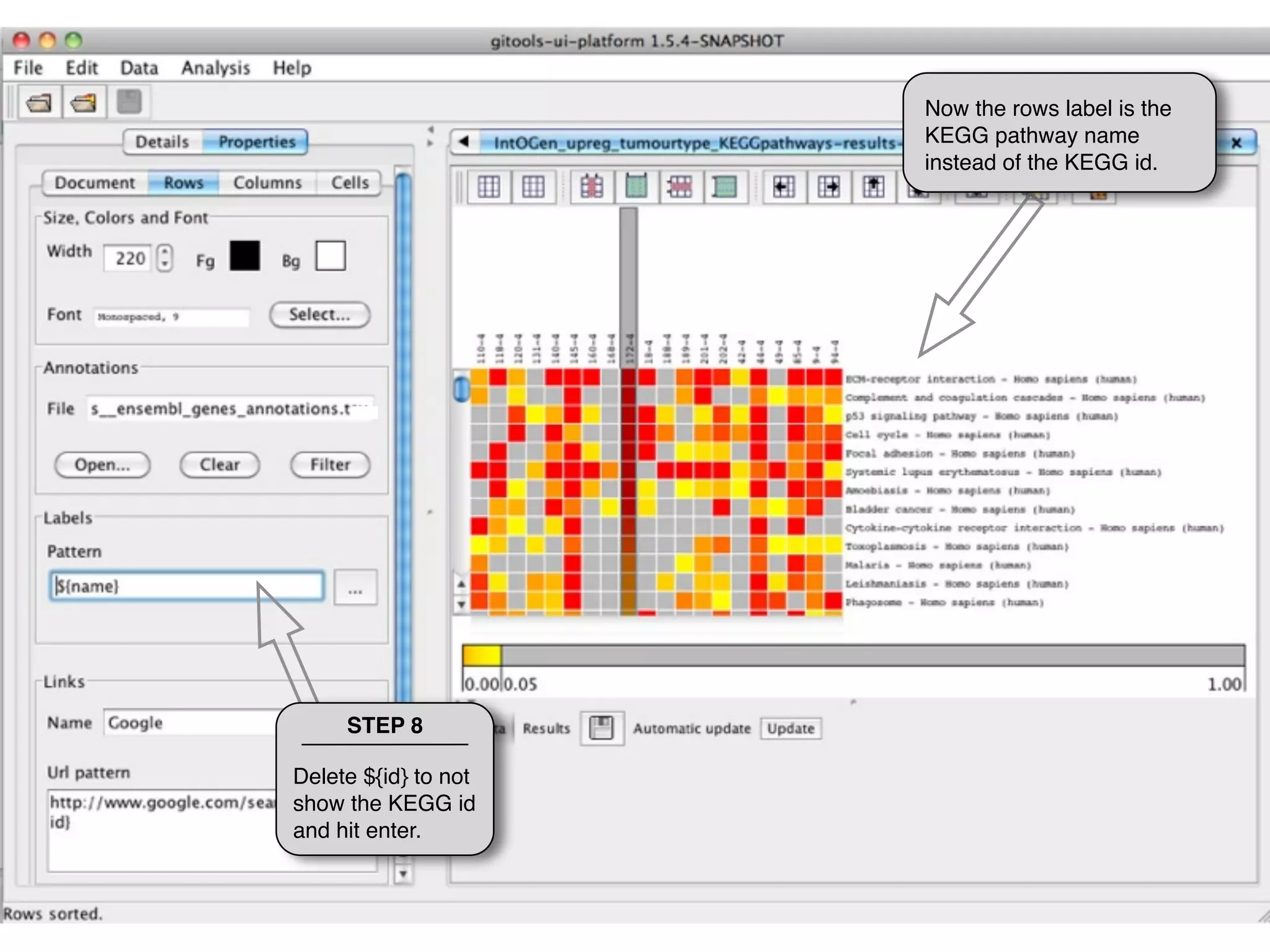
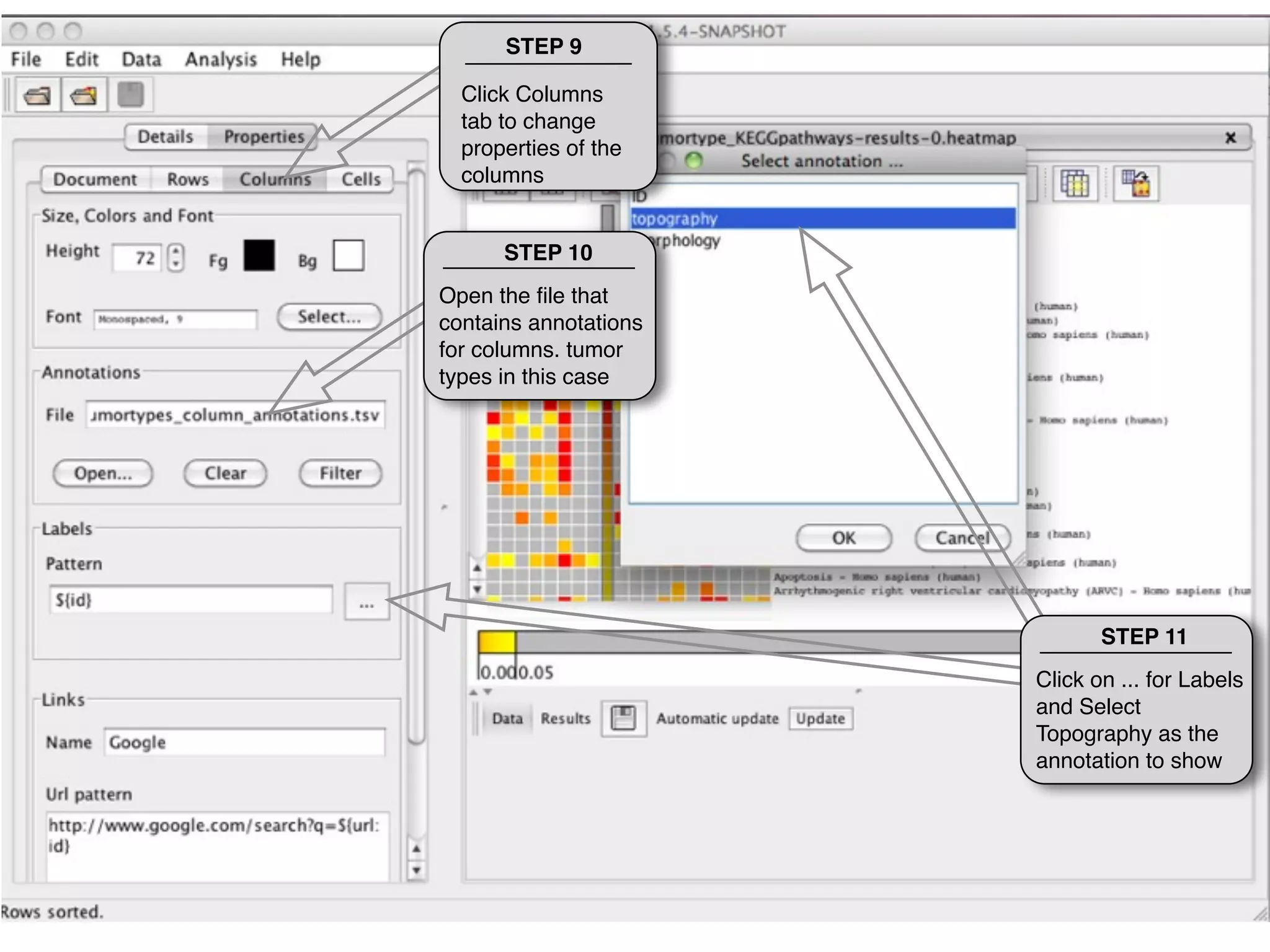
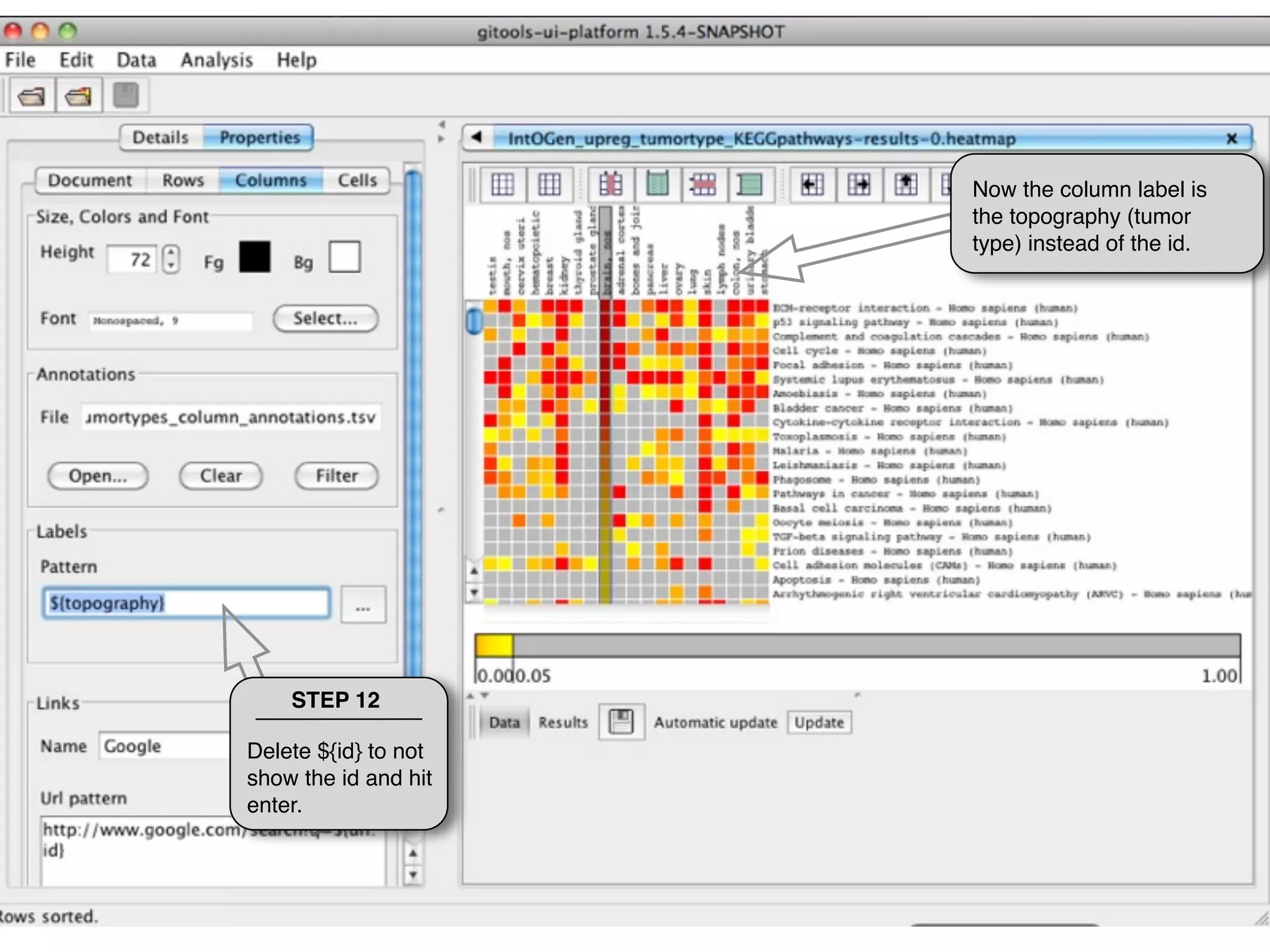
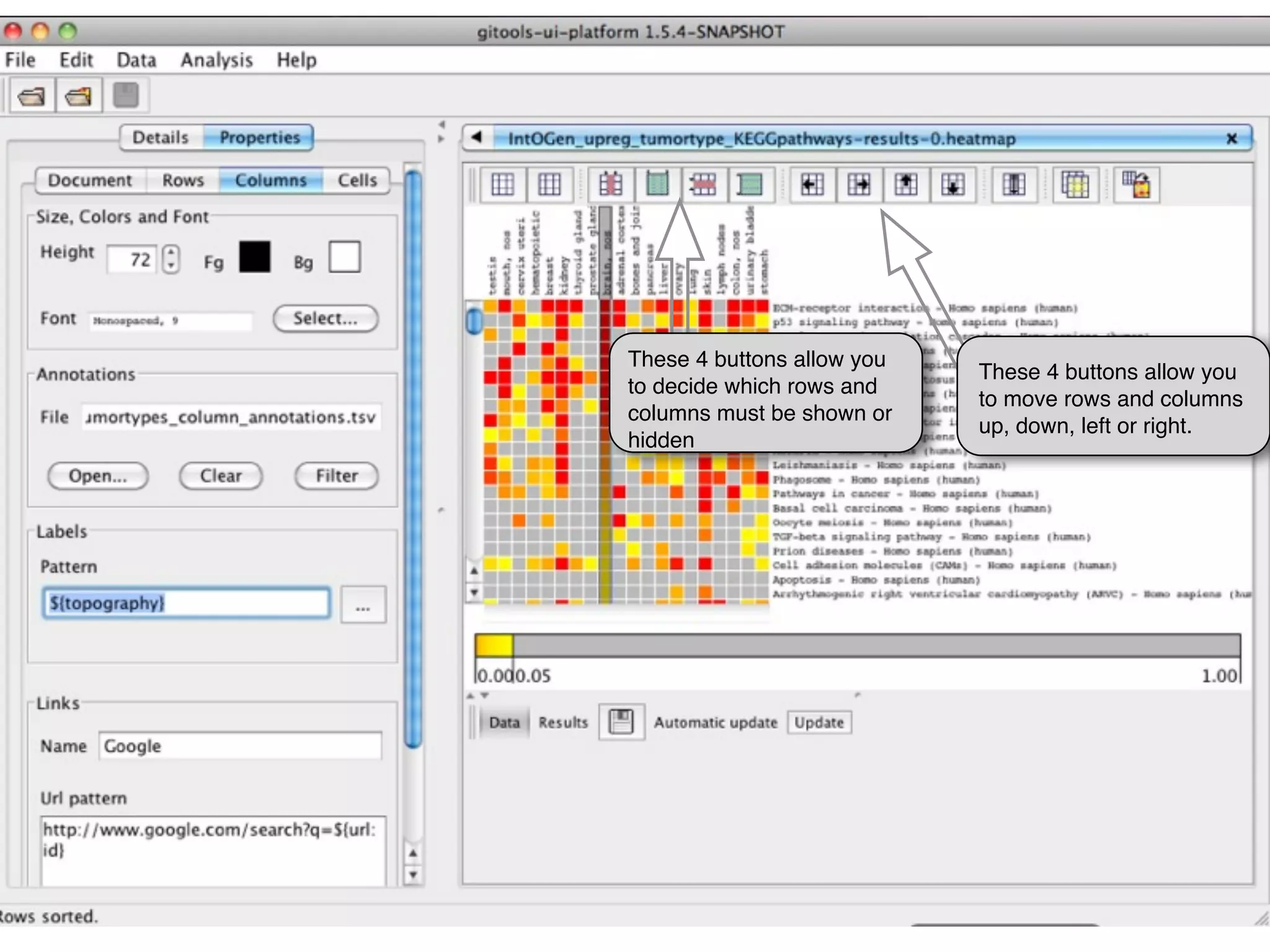
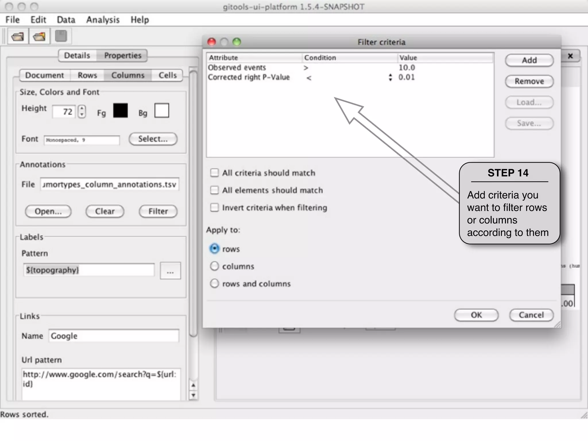
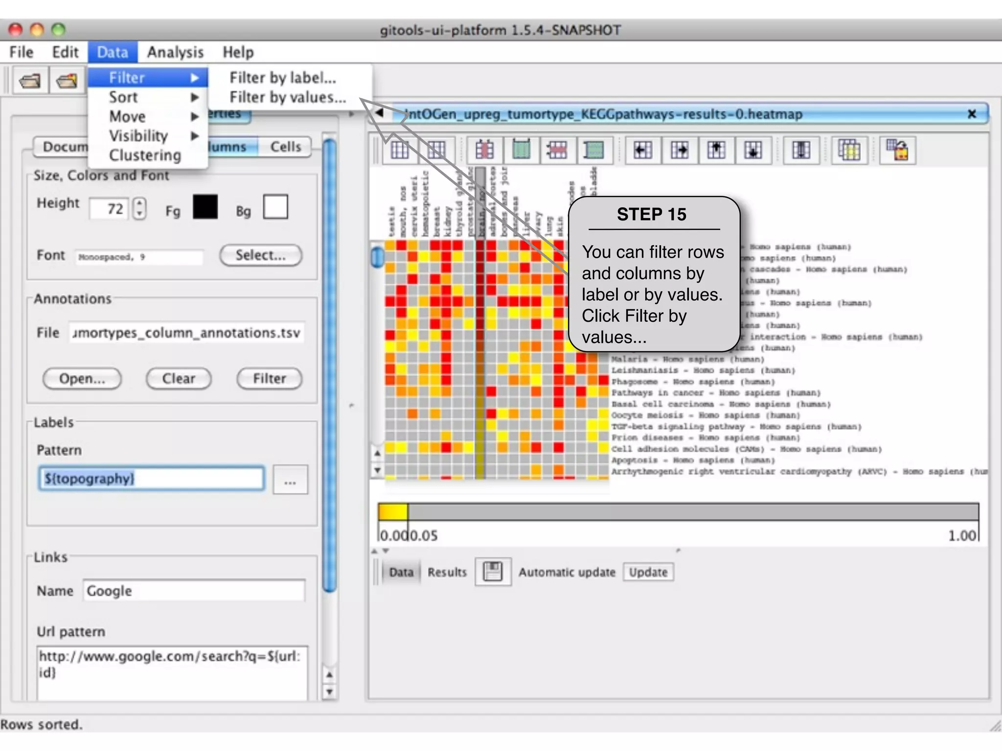
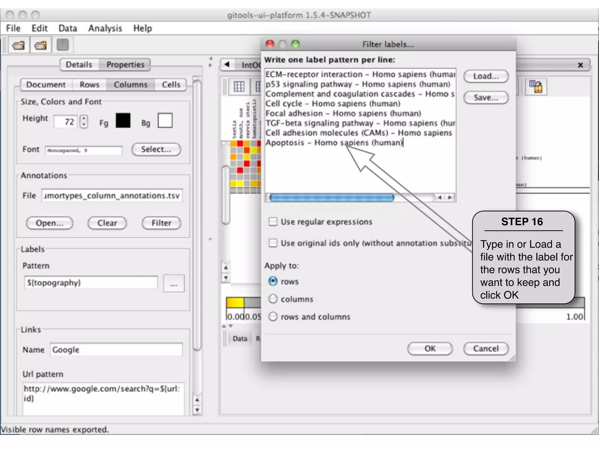
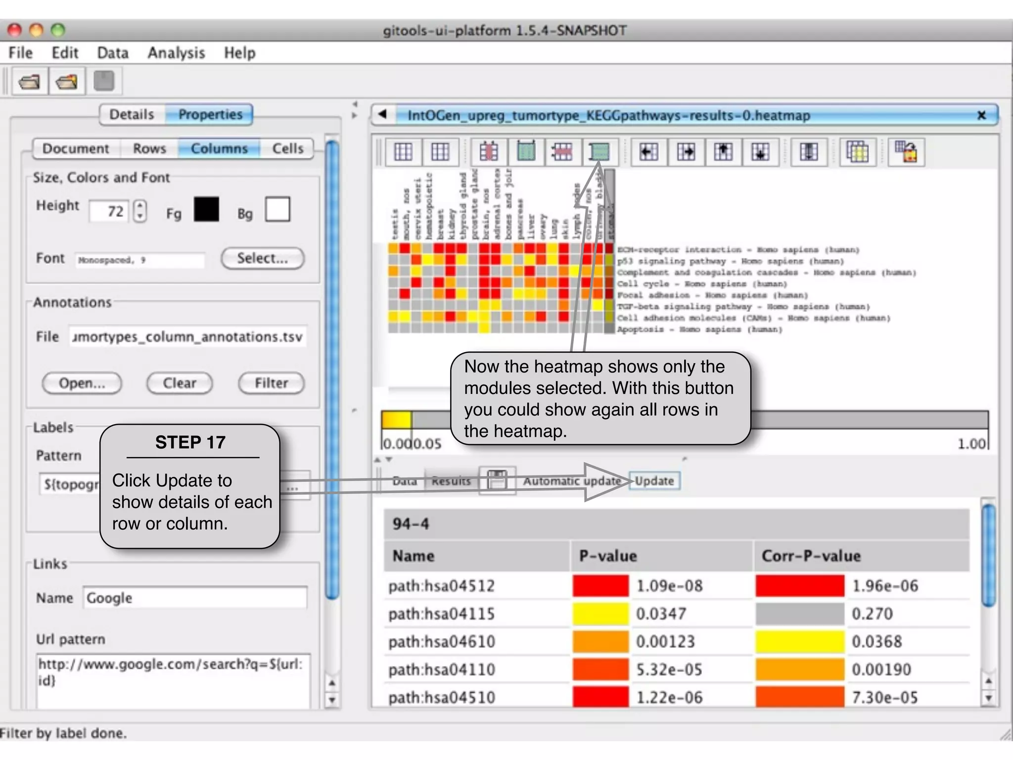
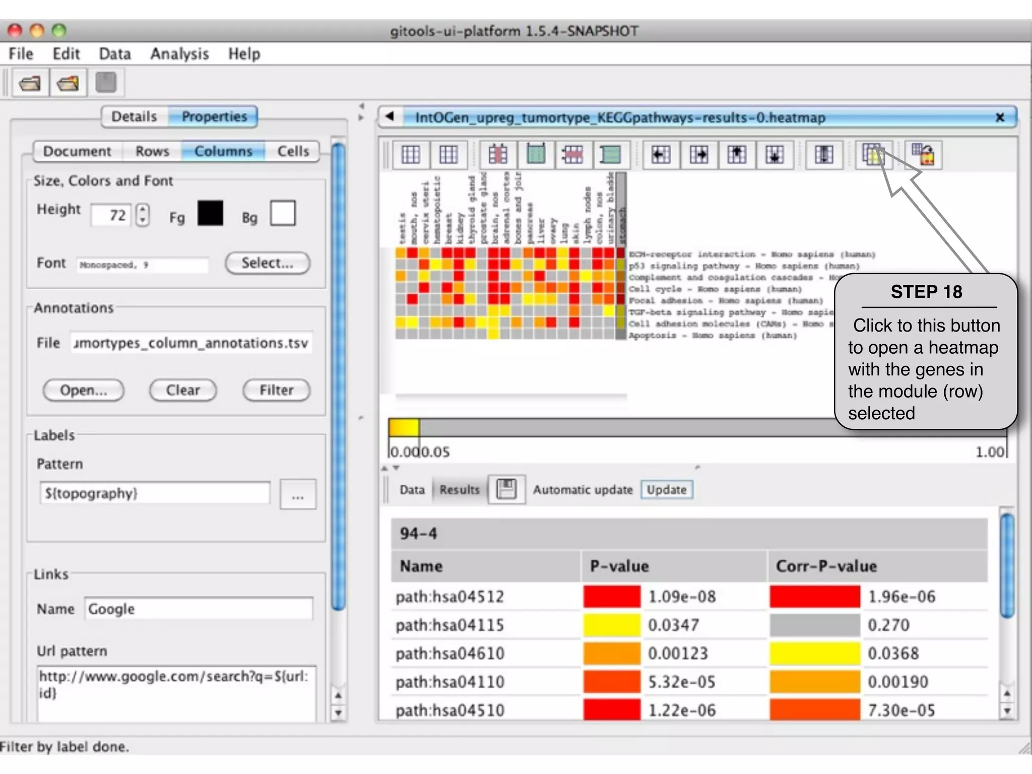
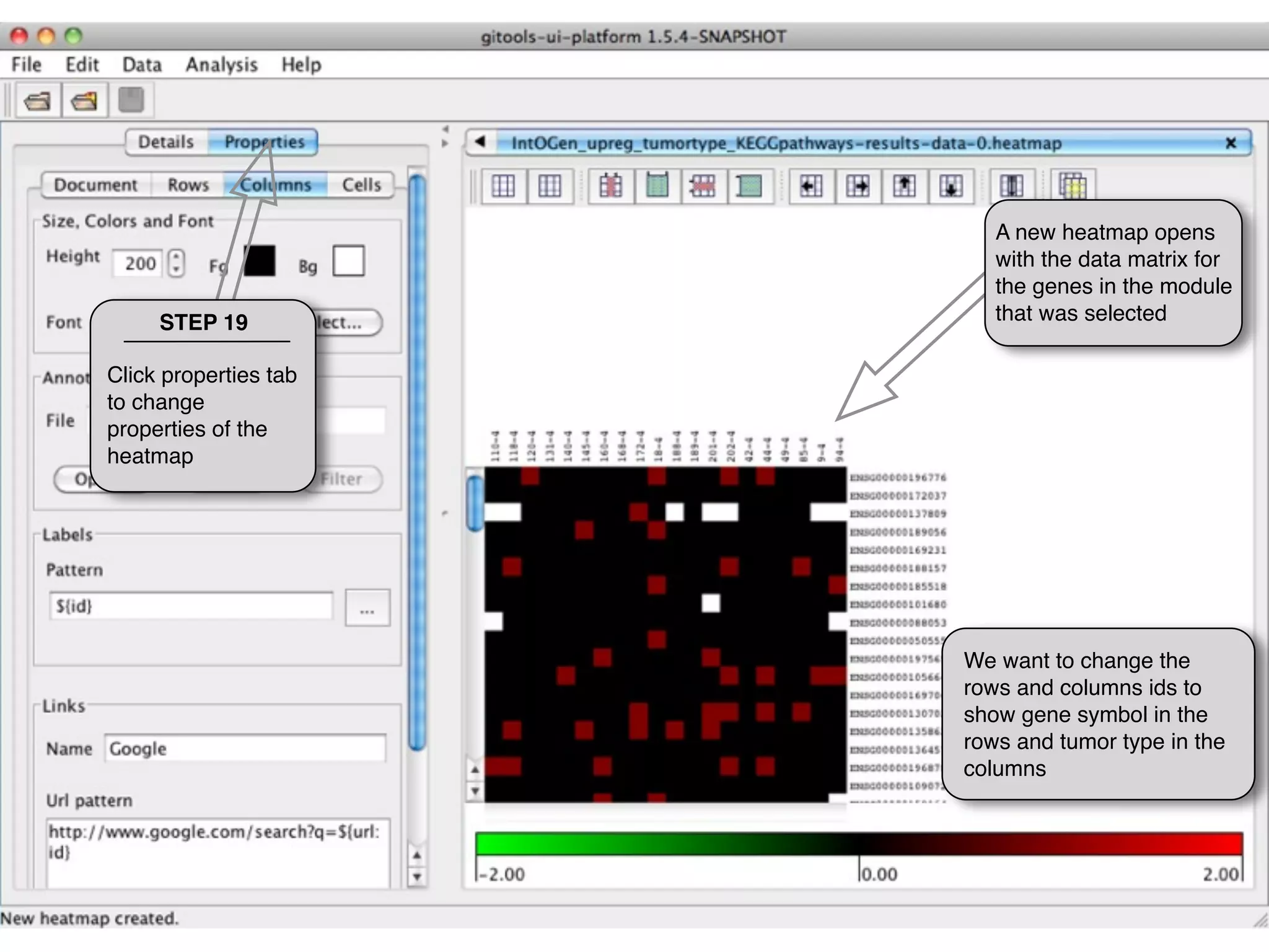
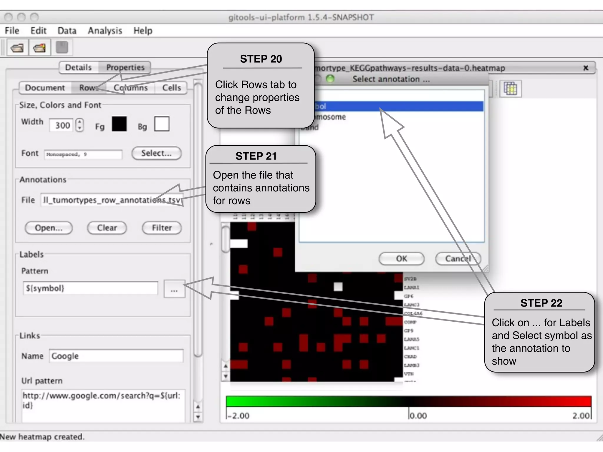
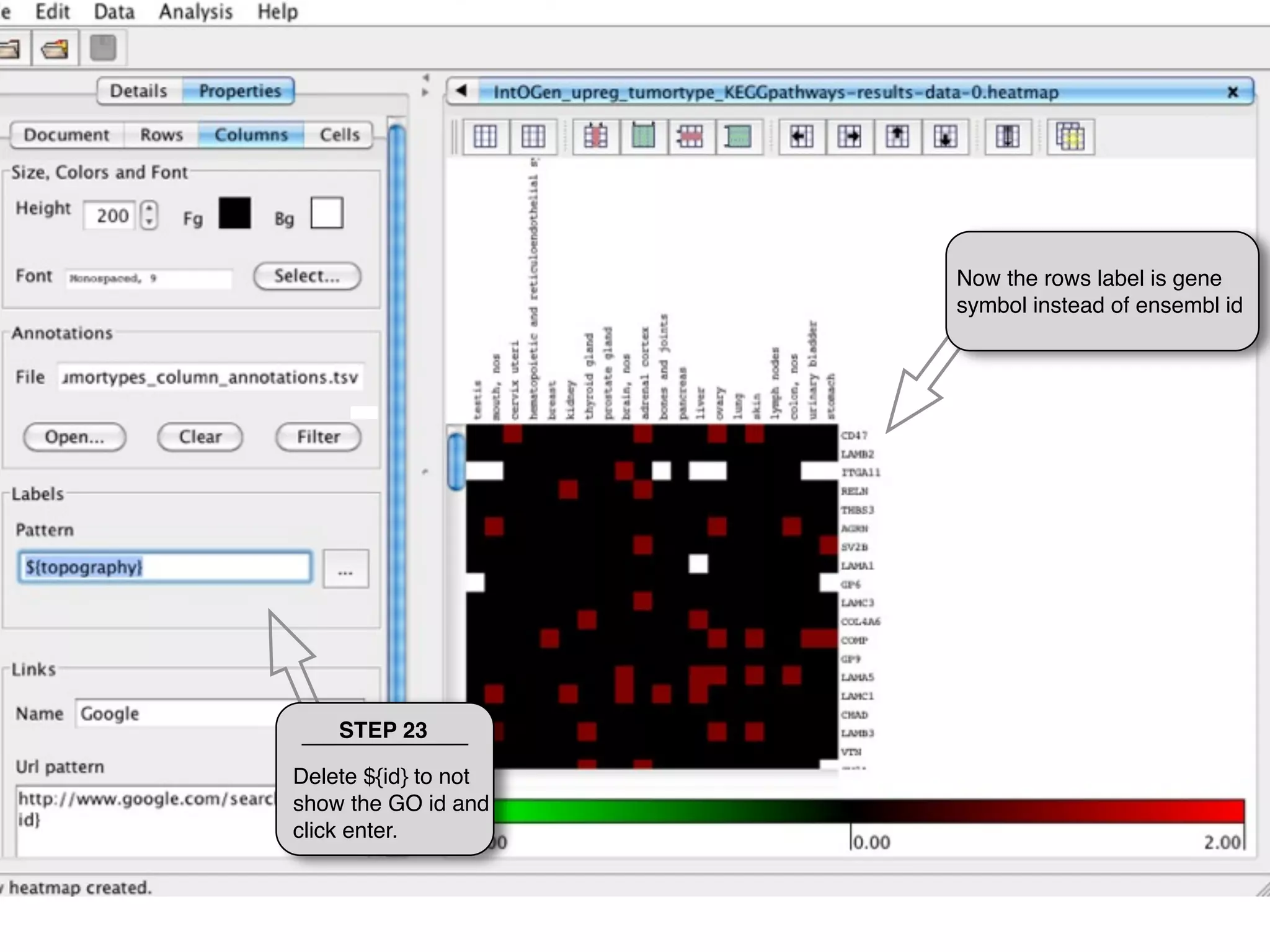
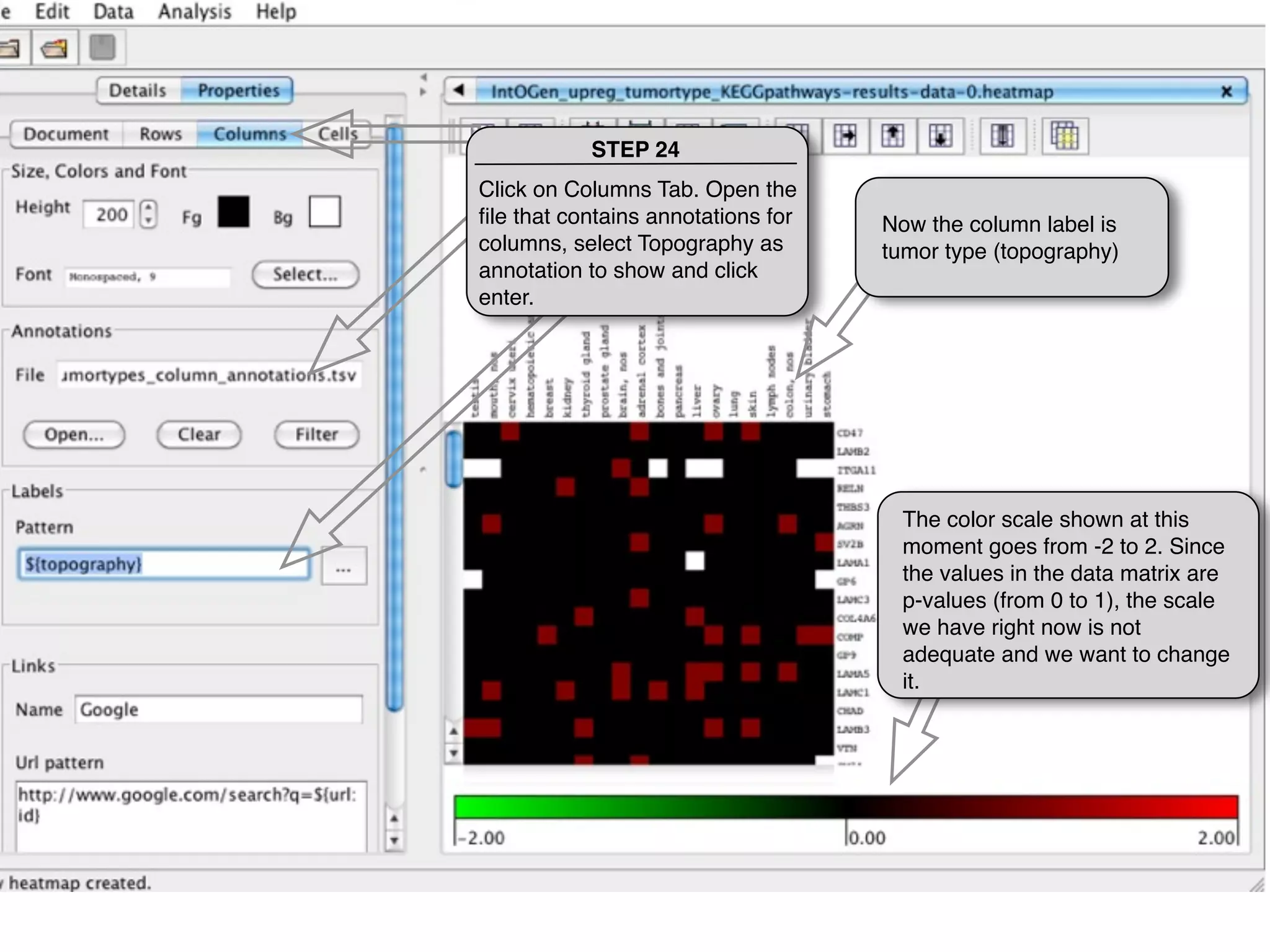
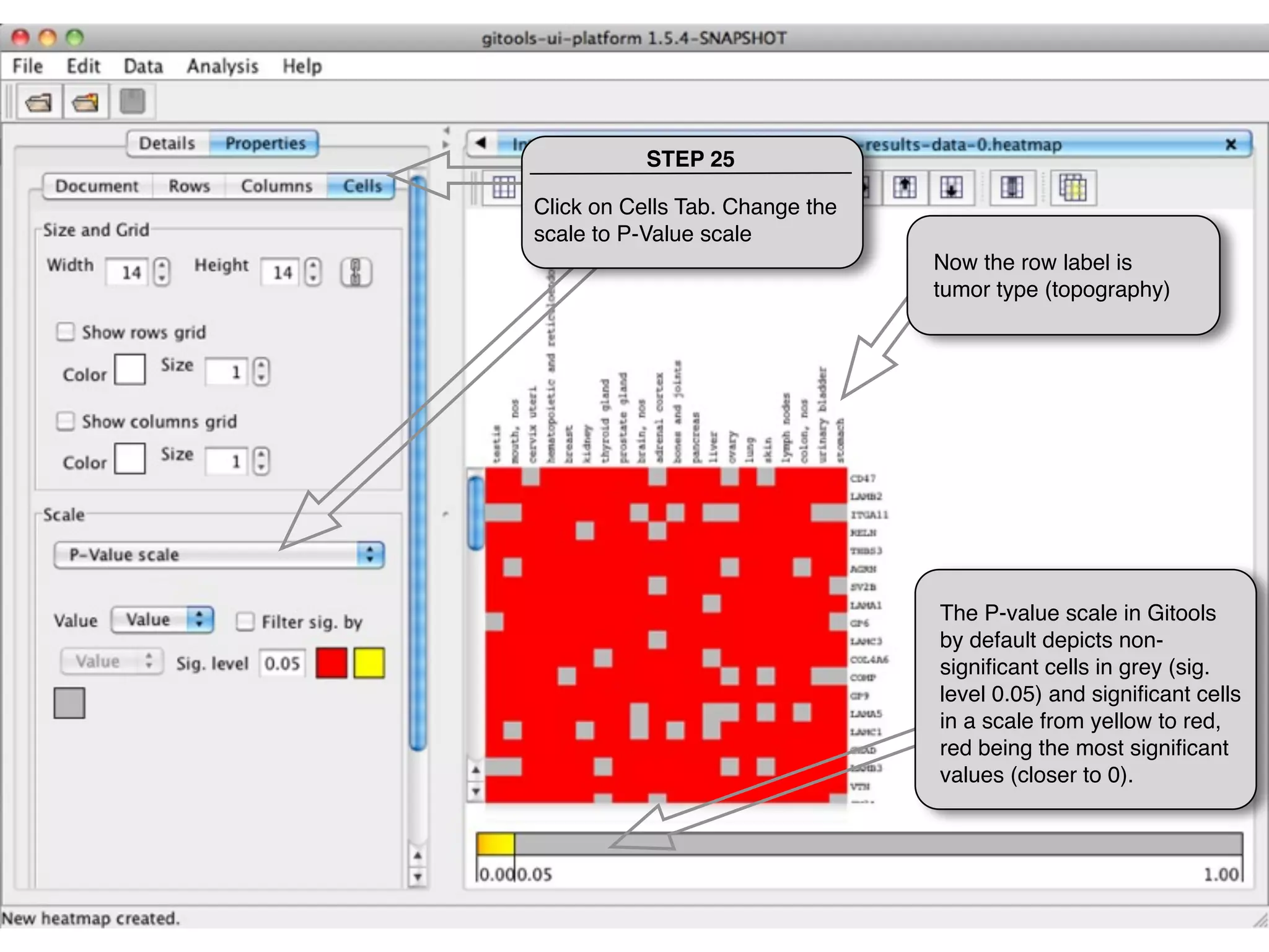
This document provides steps to explore and customize the results of an enrichment analysis in a heatmap visualization tool. It describes how to sort and filter rows and columns, change the labels to use more descriptive names instead of IDs, and modify the color scale to better represent p-value results. The goal is to interactively investigate and understand the relationships between enriched gene sets and conditions from the analysis.