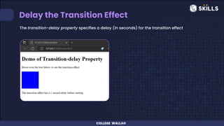
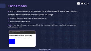
Transition
and tooltips
List of Content
1. Transitions
2. Tooltips
TRANSITIONS
Transitions
● CSS transitions allow you to change property values smoothly, over a given duration.
To create a transition effect, you must specify two things:
● the CSS property you want to add an effect to
● the duration of the effect
Note: If the duration part is not specified, the transition will have no effect, because the
default value is 0.
Change Several Property Values
Specifying the Speed Curve of Transition
The transition-timing-function property specifies the speed curve of the transition effect.
The transition-timing-function property can have the following values:
● ease - specifies a transition effect with a slow start, then fast, then end slowly (this is
default)
● linear - specifies a transition effect with the same speed from start to end
● ease-in - specifies a transition effect with a slow start
● ease-out - specifies a transition effect with a slow end
● ease-in-out - specifies a transition effect with a slow start and end
● cubic-bezier(n,n,n,n) - lets you define your own values in a cubic-bezier function
Delay the Transition Effect
The transition-delay property specifies a delay (in seconds) for the transition effect
Transition + Transformation
Using the shorthand property transition
Tooltip
Tooltip
● A tooltip is used to specify extra information about something when the user moves
the mouse pointer over an element.
● Basic Tooltip Example : a tooltip that appears when the user moves the mouse over
an element
Positioning Tooltips
The tooltip can be placed at any of the following locations:
● left
● right
● top
● bottom
Tooltip Arrows
● To create an arrow that should appear from a specific side of the tooltip, add "empty"
content after tooltip, with the pseudo-element class ::after together with the content
property.
● The arrow itself is created using borders. This will make the tooltip look like a speech
bubble.
● Arrows can appear at bottom, top, left or right
Faded Tooltips
● If you want to fade in the tooltip text when it is about to be visible, you can use the CSS
transition property together with the opacity property, and go from being completely
invisible to 100% visible, in a number of specified seconds
THANK YOU

Transition and tooltips.pdf

  • 1.
  • 2.
    List of Content 1.Transitions 2. Tooltips
  • 3.
  • 4.
    Transitions ● CSS transitionsallow you to change property values smoothly, over a given duration. To create a transition effect, you must specify two things: ● the CSS property you want to add an effect to ● the duration of the effect Note: If the duration part is not specified, the transition will have no effect, because the default value is 0.
  • 5.
  • 6.
    Specifying the SpeedCurve of Transition The transition-timing-function property specifies the speed curve of the transition effect. The transition-timing-function property can have the following values: ● ease - specifies a transition effect with a slow start, then fast, then end slowly (this is default) ● linear - specifies a transition effect with the same speed from start to end ● ease-in - specifies a transition effect with a slow start ● ease-out - specifies a transition effect with a slow end ● ease-in-out - specifies a transition effect with a slow start and end ● cubic-bezier(n,n,n,n) - lets you define your own values in a cubic-bezier function
  • 8.
    Delay the TransitionEffect The transition-delay property specifies a delay (in seconds) for the transition effect
  • 9.
  • 10.
    Using the shorthandproperty transition
  • 11.
  • 12.
    Tooltip ● A tooltipis used to specify extra information about something when the user moves the mouse pointer over an element. ● Basic Tooltip Example : a tooltip that appears when the user moves the mouse over an element
  • 13.
    Positioning Tooltips The tooltipcan be placed at any of the following locations: ● left ● right ● top ● bottom
  • 14.
    Tooltip Arrows ● Tocreate an arrow that should appear from a specific side of the tooltip, add "empty" content after tooltip, with the pseudo-element class ::after together with the content property. ● The arrow itself is created using borders. This will make the tooltip look like a speech bubble. ● Arrows can appear at bottom, top, left or right
  • 15.
    Faded Tooltips ● Ifyou want to fade in the tooltip text when it is about to be visible, you can use the CSS transition property together with the opacity property, and go from being completely invisible to 100% visible, in a number of specified seconds
  • 16.