Top 10 Slide Tips
Stephanie Mumpton
Article by: Garr Reynolds
source: http://www.garrreynolds.com/preso-tips/design/
Image: WoodleyWonderworks
http://www.flickr.com/photos/73645804@N
00/3019961773
Keep It
Simple
Image: ‘55Laney69’
http://www.flickr.com/photos/42875184@N08/9057166554
Limit Text
Image: ‘A Guy Taking Pictures’
http://www.flickr.com/photos/80901381@N04/8009377832
Limit Animation
Image:Neal Fowler
http://www.flickr.com/photos/31878512@N06/4323264950
High
Quality
Image: Paul Bica
http://www.flickr.com/photos/99771506
@N00/3017515135
Visual Theme
Image: aussiegall
http://www.flickr.com/photos/14516334@N00/9058768724
Use Appropriate
Charts
Image: Doug Belshaw
http://www.flickr.com/photos/94991702@N00/4105405987
Image: Kevin Dooley
http://www.flickr.com/photos/12836528@N00/3132476481
Use Color Well
Choose Serif
Image:Ian Muttoo
http://www.flickr.com/photos/20741443@N
2631466945
Video
Effects
Image: hunnnterrr
Organize
Image: Juhan Sonin
http://www.flickr.com/photos/38869431@N00/473482999
9

Editor's Notes

  • #2 The top 10 slide tips come from the article by Garr Reynolds. He is a best selling author and speaker.
  • #3 The less clutter on a slide, the more likely the audience will be paying attention to what the presenter is saying. If there is too much on the slide it can be quite a distraction.
  • #4 If there is less text on a slide then the audience won’t be reading while the presenter is talking. Also, the presenter will be less inclined to read from the slide and actually know the information.
  • #5 A simple transition and/or animation is beneficial to exemplify that the time and effort was put into creating the slideshow. But anything that takes too long or is too flashy will take away from the overall presentation.
  • #6 High quality professional or personal photography is greatly appreciated in the business world. Clipart is now looked at as simple and unprofessional.
  • #7 It is a great benefit to have powerpoint templates but no one wants to watch a ‘cookie cutter presentation’ with the same background that has been overused. Also, there are now websites to easily create your own template.
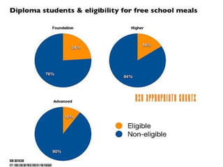
  • #8 Whether the chart is a pie chart, bar, column or graph, the information must be presented correctly. There are a simple list of rules and qualifications to deciding which type to use and choosing the correct one with limited information is always appreciated.
  • #9 Every color has an emotion, mood or point to persuade or effect the audience. Choosing the correct one is simple and knowing the lighting in the room that you will be presenting is beneficial to making the decision.
  • #10 Simple fonts are always better. A large font is necessary for a medium to large sized room and choosing serif or sans serif is always the best route.
  • #11 Using videos to attract and persuade the audience is an excellent tool. Making sure it is not too long, boring or ‘cheesy’ is necessary when choosing the correct video to get a point across.
  • #12 Although the slide template is out of date, the slide sorter is not. Audiences love organization and neatness when it comes to a presentation. It is professional and shows that the presenter played close attention to detail.