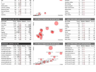
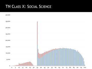
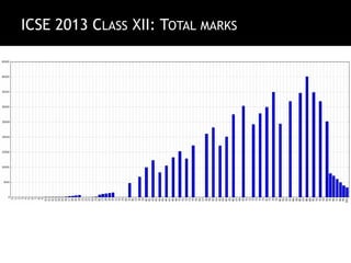
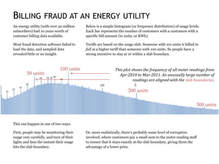
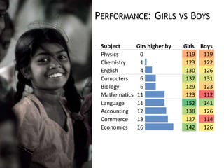
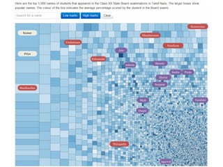
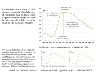
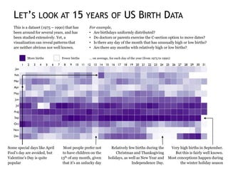
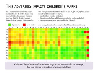
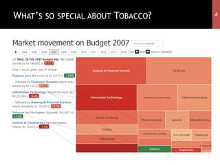
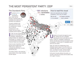
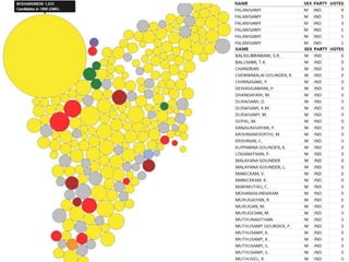
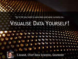
THE ART OF DATA VISUALISATION
S Anand, Chief Data Scientist, Gramener
THIS TALK HAS TWO PARTS
WHAT I DO IN MY
CURRENT JOB
HOW I GOT MY
CURRENT JOB
Heinlein, in connection with my
story “Dreaming Is a Private Thing”,
accused me, good-naturedly, of
coining money out of my neuroses.
Well, whose neuroses should I make
money off of?
LET’S TAKE TESCO’S GROCERIES
categor
y title kJ rate
dairy Activia Pouring Natural Yogurt 1X950g 216 0.21
dairy Activia Pouring Strawberry Yogurt 1X950g 250 0.21
dairy Activia Pouring Vanilla Yogurt 1X950g 263 0.21
icecream Almondy Daim 400G 1804 0.75
icecream Almondy Toblerone 400G 1850 0.5
cereals Alpen 10 Pack Lite Summer Fruits Cereal Bars 210G 1222 1.57
cereals Alpen 10Pk Fruit Nut And Chocolate Cereal Bars 290G 1812 1.14
cereals Alpen Coconut And Chocolate Cereal Bars 5Pk 145G 1863 1.24
cereals Alpen Fruit And Nut With Chocolate Cereal Bar 5X29g 1812 1.24
cereals Alpen High Fruit 650G 1439 0.4
cereals Alpen Light Bars Chocolate And Orange 5X21g 1246 1.71
cereals Alpen Light Chocolate And Fudge Bar 5X21g 1264 1.71
cereals Alpen Light Sultana & Apple Bars 5Pk 105G 1197 1.71
cereals Alpen Light Summer Fruits Bars 5Pk 105G 1222 1.71
cereals Alpen No Added Sugar 1.3Kg 1488 0.31
cereals Alpen No Added Sugar 560G 1488 0.46
cereals Alpen Original 1.5Kg 1509 0.27
cereals Alpen Original Muesli 750G 1509 0.35
cereals Alpen Raspberry And Yoghurt Cereal Bars5x29g 1748 1.24
cereals Alpen Strawberry With Yoghurt Cereal Bar 5X29g 1756 1.24
dairy Alpro Natural Yofu 500G 0.28
dairy Alpro Raspberry Vanilla Yofu 4X125g 0.35
dairy Alpro Strawberry And Fof Soya Yofu 4X125g 0.35
dairy Alpro Vanilla Yofu 500G 0.28
The Shawshank
Redepmption
The Godfather
The Dark Knight
Titanic
The Phantom
Menace
Twilight
New Moon
Wild Wild West
Transformers
The Good, The Bad,
The Ugly
12 Angry Men
7 Samurai
Taare Zameen
Par
Rang De Basanti
Yojinbo
MORE VOTES
BETTER RATED
Many unwatched movies
Few unwatched movies
Mix of watched & unwatched
Few watched movies
Many watched movies
Movies on the IMDb
3 Idiots
We handle terabyte-size data via non-traditional analytics and visualise it in real-time.
Gramener visualises
your data
Gramener transforms your data into concise dashboards
that make your business problem & solution visually obvious.
We help you find insights quickly, based on cognitive research,
and our visualisations guide you towards actionable decisions.
A data analytics and visualisation company
MOST OF WHAT I DO TODAY IS
VISUALISING DATA ANOMALIES
India’s religions
Australia’s religions
As a Data Scientist, I’m quite intrigued by anomalies, and
ANOMALIES ARE EVERYWHERE…
S Anand, Chief Data Scientist, Gramener
100YEARSOFINDIA’SWEATHER
1901
1911
1921
1931
1941
1951
1961
1971
1981
1991
2001
Jan Feb Mar Apr May Jun Jul Aug Sep Oct Nov Dec
You don’t need sophisticated analyses for this
IT CAN BE EASY TO SPOT THEM
S Anand, Chief Data Scientist, Gramener
EDUCATION
PREDICTING MARKS
What determines a child’s marks?
Do girls score better than boys?
Does the choice of subject matter?
Does the medium of instruction matter?
Does community or religion matter?
Does their birthday matter?
Does the first letter of their name matter?
0
5,000
10,000
15,000
20,000
25,000
30,000
35,000
40,000
0 5 10 15 20 25 30 35 40 45 50 55 60 65 70 75 80 85 90 95 100
TN CLASS X: ENGLISH
TN CLASS X: SOCIAL SCIENCE
0
5,000
10,000
15,000
20,000
25,000
30,000
35,000
40,000
0 5 10 15 20 25 30 35 40 45 50 55 60 65 70 75 80 85 90 95 100
TN CLASS X: MATHEMATICS
0
5,000
10,000
15,000
20,000
25,000
30,000
35,000
40,000
0 5 10 15 20 25 30 35 40 45 50 55 60 65 70 75 80 85 90 95 100
ICSE 2013 CLASS XII: TOTAL MARKS
DETECTING FRAUD
“
We know meter readings are
incorrect, for various reasons.
We don’t, however, have the
concrete proof we need to start the
process of meter reading
automation.
Part of our problem is the volume
of data that needs to be analysed.
The other is the inexperience in
tools or analyses to identify such
patterns.
ENERGY UTILITY
BILLING FRAUD AT AN ENERGY UTILITY
This plot shows the frequency of all meter readings from
Apr-2010 to Mar-2011. An unusually large number of
readings are aligned with the slab boundaries.
Below is a simple histogram (or frequency distribution) of usage levels.
Each bar represents the number of customers with a customers with a
specific bill amount (in units, or KWh).
Tariffs are based on the usage slab. Someone with 101 units is billed in
full at a higher tariff than someone with 100 units. So people have a
strong incentive to stay at or within a slab boundary.
An energy utility (with over 50 million
subscribers) had 10 years worth of
customer billing data available.
Most fraud detection software failed to
load the data, and sampled data
revealed little or no insight.
This can happen in one of two ways.
First, people may be monitoring their
usage very carefully, and turn of their
lights and fans the instant their usage
hits the slab boundary.
Or, more realistically, there’s probably some level of corruption
involved, where customers pay a small sum to the meter reading staff
to ensure that it stays exactly at the slab boundary, giving them the
advantage of a lower price.
Subject Girs higher by Girls Boys
Physics 0 119 119
Chemistry 1 123 122
English 4 130 126
Computers 6 137 131
Biology 6 129 123
Mathematics 11 123 112
Language 11 152 141
Accounting 12 138 126
Commerce 13 127 114
Economics 16 142 126
PERFORMANCE: GIRLS VS BOYS
Jain
Harini
Shweta
Sneha Pooja
Ashwin
Shah
Deepti
Sanjana
Varshini
Ezhumalai
Venkatesan
Silambarasan
Pandiyan
Kumaresan
Manikandan
Thirupathi
Agarwal
Kumar
Priya
Based on the results of the 20 lakh
students taking the Class XII exams
at Tamil Nadu over the last 3 years,
it appears that the month you were
born in can make a difference of as
much as 120 marks out of 1,200.
June borns
score the lowest
The marks shoot
up for Aug borns
… and peaks for
Sep-borns
120 marks out of
1200 explainable
by month of birth
An identical pattern was observed in 2009 and 2010…
… and across districts, gender, subjects, and class X & XII.
“It’s simply that in Canada the eligibility
cutoff for age-class hockey is January 1. A
boy who turns ten on January 2, then,
could be playing alongside someone who
doesn’t turn ten until the end of the year—
and at that age, in preadolescence, a
twelve-month gap in age represents an
enormous difference in physical maturity.”
-- Malcolm Gladwell, Outliers
LET’S LOOK AT 15 YEARS OF US BIRTH DATA
This is a dataset (1975 – 1990) that has
been around for several years, and has
been studied extensively. Yet, a
visualization can reveal patterns that
are neither obvious nor well known.
For example,
• Are birthdays uniformly distributed?
• Do doctors or parents exercise the C-section option to move dates?
• Is there any day of the month that has unusually high or low births?
• Are there any months with relatively high or low births?
Very high births in September.
But this is fairly well known.
Most conceptions happen during
the winter holiday season
Relatively few births during the
Christmas and Thanksgiving
holidays, as well as New Year and
Independence Day.
Most people prefer not
to have children on the
13th of any month, given
that it’s an unlucky day
Some special days like April
Fool’s day are avoided, but
Valentine’s Day is quite
popular
More births Fewer births … on average, for each day of the year (from 1975 to 1990)
THE PATTERN IN INDIA IS QUITE DIFFERENT
This is a birth date dataset that’s
obtained from school admission data
for over 10 million children. When we
compare this with births in the US, we
see none of the same patterns.
For example,
• Is there an aversion to the 13th or is there a local cultural nuance?
• Are holidays avoided for births?
• Which months have a higher propensity for births, and why?
• Are there any patterns not found in the US data?
Very few children are born in the
month of August, and thereafter.
Most births are concentrated in
the first half of the year
We see a large number of
children born on the 5th, 10th,
15th, 20th and 25th of each month
– that is, round numbered dates
Such round numbered patterns a
typical indication of fraud. Here,
birthdates are brought forward
to aid early school admission
More births Fewer births … on average, for each day of the year (from 2007 to 2013)
THIS ADVERSELY IMPACTS CHILDREN’S MARKS
It’s a well established fact that older
children tend to do better at school in
most activities. Since many children
have had their birth dates brought
forward, these younger children suffer.
The average marks of children “born” on the 1st, 5th, 10th, 15th etc. of the
month tend to score lower marks.
• Are holidays avoided for births?
• Which months have a higher propensity for births, and why?
• Are there any patterns not found in the US data?
Higher marks Lower marks … on average, for children born on a given day of the year (from 2007 to 2013)
Children “born” on round numbered days score lower marks on average,
due to a higher proportion of younger children
WHAT’S UNUSUAL ABOUT LOANS AFTER THE 20TH?
Every loan disbursed after the 20th of the month, i.e. from the 21st to
the end of the month, shows consistently lower non-performing assets
(i.e. better quality) than any loan disbursed prior to the 20th.
The bank mapped this back to their incentive scheme. The sales team’s
commission is based only on loans disbursed until the 20th. Hence new
loans are squeezed into this period without regard for their quality.
The personal finance division of a
bank, focusing on retail loans, drove
its sales through a branch sales team.
A study of the non-performing assets
of loans generated over the course of
one year shows a strange pattern.
Analytics can detect something that you’re specifically looking for.
It takes a visual to detect what we don’t know to look for
This representation, known as a
calendar map, can show some
interesting patterns, particularly
weekday-based patterns, as the next
example will show.
5
RESTAURANT FOUND AN UNUSUAL DIP IN SALES
A restaurant chain had data for every
single transaction made over a few
years. Plotting this as a time series
showed them nothing unusual.
However, the same data on a calendar
map reveals a very different story.
Specifically, at the bottom left point-of-sale terminal, sales dips on
every Wednesday. At the bottom right point-of-sale terminal, sales
rises on every Wednesday (almost as if to compensate for the loss.)
It turns out that the manager closes the bottom-left counter every
Wednesday afternoon due to shortage of staff, assuming that it results
in no loss of sales. There is, however, a net loss every Wednesday.
5
But that’s to say that simple techniques can spot everything
YOU CAN GO BEYOND “EASY”
S Anand, Chief Data Scientist, Gramener
WHAT’S SO SPECIAL ABOUT TOBACCO? 4
WHAT’S WRONG WITH THE MINERAL WATER? 3
Try it! All you need is some data and some curiosity to…
VISUALISE DATA YOURSELF!
S Anand, Chief Data Scientist, Gramener

The Art of Data Visualization

  • 1.
    THE ART OFDATA VISUALISATION S Anand, Chief Data Scientist, Gramener
  • 2.
    THIS TALK HASTWO PARTS WHAT I DO IN MY CURRENT JOB HOW I GOT MY CURRENT JOB
  • 3.
    Heinlein, in connectionwith my story “Dreaming Is a Private Thing”, accused me, good-naturedly, of coining money out of my neuroses. Well, whose neuroses should I make money off of?
  • 10.
    LET’S TAKE TESCO’SGROCERIES categor y title kJ rate dairy Activia Pouring Natural Yogurt 1X950g 216 0.21 dairy Activia Pouring Strawberry Yogurt 1X950g 250 0.21 dairy Activia Pouring Vanilla Yogurt 1X950g 263 0.21 icecream Almondy Daim 400G 1804 0.75 icecream Almondy Toblerone 400G 1850 0.5 cereals Alpen 10 Pack Lite Summer Fruits Cereal Bars 210G 1222 1.57 cereals Alpen 10Pk Fruit Nut And Chocolate Cereal Bars 290G 1812 1.14 cereals Alpen Coconut And Chocolate Cereal Bars 5Pk 145G 1863 1.24 cereals Alpen Fruit And Nut With Chocolate Cereal Bar 5X29g 1812 1.24 cereals Alpen High Fruit 650G 1439 0.4 cereals Alpen Light Bars Chocolate And Orange 5X21g 1246 1.71 cereals Alpen Light Chocolate And Fudge Bar 5X21g 1264 1.71 cereals Alpen Light Sultana & Apple Bars 5Pk 105G 1197 1.71 cereals Alpen Light Summer Fruits Bars 5Pk 105G 1222 1.71 cereals Alpen No Added Sugar 1.3Kg 1488 0.31 cereals Alpen No Added Sugar 560G 1488 0.46 cereals Alpen Original 1.5Kg 1509 0.27 cereals Alpen Original Muesli 750G 1509 0.35 cereals Alpen Raspberry And Yoghurt Cereal Bars5x29g 1748 1.24 cereals Alpen Strawberry With Yoghurt Cereal Bar 5X29g 1756 1.24 dairy Alpro Natural Yofu 500G 0.28 dairy Alpro Raspberry Vanilla Yofu 4X125g 0.35 dairy Alpro Strawberry And Fof Soya Yofu 4X125g 0.35 dairy Alpro Vanilla Yofu 500G 0.28
  • 14.
    The Shawshank Redepmption The Godfather TheDark Knight Titanic The Phantom Menace Twilight New Moon Wild Wild West Transformers The Good, The Bad, The Ugly 12 Angry Men 7 Samurai Taare Zameen Par Rang De Basanti Yojinbo MORE VOTES BETTER RATED Many unwatched movies Few unwatched movies Mix of watched & unwatched Few watched movies Many watched movies Movies on the IMDb 3 Idiots
  • 17.
    We handle terabyte-sizedata via non-traditional analytics and visualise it in real-time. Gramener visualises your data Gramener transforms your data into concise dashboards that make your business problem & solution visually obvious. We help you find insights quickly, based on cognitive research, and our visualisations guide you towards actionable decisions. A data analytics and visualisation company
  • 18.
    MOST OF WHATI DO TODAY IS VISUALISING DATA ANOMALIES
  • 19.
  • 20.
  • 22.
    As a DataScientist, I’m quite intrigued by anomalies, and ANOMALIES ARE EVERYWHERE… S Anand, Chief Data Scientist, Gramener
  • 23.
  • 24.
    You don’t needsophisticated analyses for this IT CAN BE EASY TO SPOT THEM S Anand, Chief Data Scientist, Gramener
  • 25.
    EDUCATION PREDICTING MARKS What determinesa child’s marks? Do girls score better than boys? Does the choice of subject matter? Does the medium of instruction matter? Does community or religion matter? Does their birthday matter? Does the first letter of their name matter?
  • 26.
    0 5,000 10,000 15,000 20,000 25,000 30,000 35,000 40,000 0 5 1015 20 25 30 35 40 45 50 55 60 65 70 75 80 85 90 95 100 TN CLASS X: ENGLISH
  • 27.
    TN CLASS X:SOCIAL SCIENCE 0 5,000 10,000 15,000 20,000 25,000 30,000 35,000 40,000 0 5 10 15 20 25 30 35 40 45 50 55 60 65 70 75 80 85 90 95 100
  • 28.
    TN CLASS X:MATHEMATICS 0 5,000 10,000 15,000 20,000 25,000 30,000 35,000 40,000 0 5 10 15 20 25 30 35 40 45 50 55 60 65 70 75 80 85 90 95 100
  • 29.
    ICSE 2013 CLASSXII: TOTAL MARKS
  • 30.
    DETECTING FRAUD “ We knowmeter readings are incorrect, for various reasons. We don’t, however, have the concrete proof we need to start the process of meter reading automation. Part of our problem is the volume of data that needs to be analysed. The other is the inexperience in tools or analyses to identify such patterns. ENERGY UTILITY
  • 31.
    BILLING FRAUD ATAN ENERGY UTILITY This plot shows the frequency of all meter readings from Apr-2010 to Mar-2011. An unusually large number of readings are aligned with the slab boundaries. Below is a simple histogram (or frequency distribution) of usage levels. Each bar represents the number of customers with a customers with a specific bill amount (in units, or KWh). Tariffs are based on the usage slab. Someone with 101 units is billed in full at a higher tariff than someone with 100 units. So people have a strong incentive to stay at or within a slab boundary. An energy utility (with over 50 million subscribers) had 10 years worth of customer billing data available. Most fraud detection software failed to load the data, and sampled data revealed little or no insight. This can happen in one of two ways. First, people may be monitoring their usage very carefully, and turn of their lights and fans the instant their usage hits the slab boundary. Or, more realistically, there’s probably some level of corruption involved, where customers pay a small sum to the meter reading staff to ensure that it stays exactly at the slab boundary, giving them the advantage of a lower price.
  • 32.
    Subject Girs higherby Girls Boys Physics 0 119 119 Chemistry 1 123 122 English 4 130 126 Computers 6 137 131 Biology 6 129 123 Mathematics 11 123 112 Language 11 152 141 Accounting 12 138 126 Commerce 13 127 114 Economics 16 142 126 PERFORMANCE: GIRLS VS BOYS
  • 33.
  • 34.
    Based on theresults of the 20 lakh students taking the Class XII exams at Tamil Nadu over the last 3 years, it appears that the month you were born in can make a difference of as much as 120 marks out of 1,200. June borns score the lowest The marks shoot up for Aug borns … and peaks for Sep-borns 120 marks out of 1200 explainable by month of birth An identical pattern was observed in 2009 and 2010… … and across districts, gender, subjects, and class X & XII. “It’s simply that in Canada the eligibility cutoff for age-class hockey is January 1. A boy who turns ten on January 2, then, could be playing alongside someone who doesn’t turn ten until the end of the year— and at that age, in preadolescence, a twelve-month gap in age represents an enormous difference in physical maturity.” -- Malcolm Gladwell, Outliers
  • 35.
    LET’S LOOK AT15 YEARS OF US BIRTH DATA This is a dataset (1975 – 1990) that has been around for several years, and has been studied extensively. Yet, a visualization can reveal patterns that are neither obvious nor well known. For example, • Are birthdays uniformly distributed? • Do doctors or parents exercise the C-section option to move dates? • Is there any day of the month that has unusually high or low births? • Are there any months with relatively high or low births? Very high births in September. But this is fairly well known. Most conceptions happen during the winter holiday season Relatively few births during the Christmas and Thanksgiving holidays, as well as New Year and Independence Day. Most people prefer not to have children on the 13th of any month, given that it’s an unlucky day Some special days like April Fool’s day are avoided, but Valentine’s Day is quite popular More births Fewer births … on average, for each day of the year (from 1975 to 1990)
  • 36.
    THE PATTERN ININDIA IS QUITE DIFFERENT This is a birth date dataset that’s obtained from school admission data for over 10 million children. When we compare this with births in the US, we see none of the same patterns. For example, • Is there an aversion to the 13th or is there a local cultural nuance? • Are holidays avoided for births? • Which months have a higher propensity for births, and why? • Are there any patterns not found in the US data? Very few children are born in the month of August, and thereafter. Most births are concentrated in the first half of the year We see a large number of children born on the 5th, 10th, 15th, 20th and 25th of each month – that is, round numbered dates Such round numbered patterns a typical indication of fraud. Here, birthdates are brought forward to aid early school admission More births Fewer births … on average, for each day of the year (from 2007 to 2013)
  • 37.
    THIS ADVERSELY IMPACTSCHILDREN’S MARKS It’s a well established fact that older children tend to do better at school in most activities. Since many children have had their birth dates brought forward, these younger children suffer. The average marks of children “born” on the 1st, 5th, 10th, 15th etc. of the month tend to score lower marks. • Are holidays avoided for births? • Which months have a higher propensity for births, and why? • Are there any patterns not found in the US data? Higher marks Lower marks … on average, for children born on a given day of the year (from 2007 to 2013) Children “born” on round numbered days score lower marks on average, due to a higher proportion of younger children
  • 38.
    WHAT’S UNUSUAL ABOUTLOANS AFTER THE 20TH? Every loan disbursed after the 20th of the month, i.e. from the 21st to the end of the month, shows consistently lower non-performing assets (i.e. better quality) than any loan disbursed prior to the 20th. The bank mapped this back to their incentive scheme. The sales team’s commission is based only on loans disbursed until the 20th. Hence new loans are squeezed into this period without regard for their quality. The personal finance division of a bank, focusing on retail loans, drove its sales through a branch sales team. A study of the non-performing assets of loans generated over the course of one year shows a strange pattern. Analytics can detect something that you’re specifically looking for. It takes a visual to detect what we don’t know to look for This representation, known as a calendar map, can show some interesting patterns, particularly weekday-based patterns, as the next example will show. 5
  • 39.
    RESTAURANT FOUND ANUNUSUAL DIP IN SALES A restaurant chain had data for every single transaction made over a few years. Plotting this as a time series showed them nothing unusual. However, the same data on a calendar map reveals a very different story. Specifically, at the bottom left point-of-sale terminal, sales dips on every Wednesday. At the bottom right point-of-sale terminal, sales rises on every Wednesday (almost as if to compensate for the loss.) It turns out that the manager closes the bottom-left counter every Wednesday afternoon due to shortage of staff, assuming that it results in no loss of sales. There is, however, a net loss every Wednesday. 5
  • 40.
    But that’s tosay that simple techniques can spot everything YOU CAN GO BEYOND “EASY” S Anand, Chief Data Scientist, Gramener
  • 41.
    WHAT’S SO SPECIALABOUT TOBACCO? 4
  • 42.
    WHAT’S WRONG WITHTHE MINERAL WATER? 3
  • 48.
    Try it! Allyou need is some data and some curiosity to… VISUALISE DATA YOURSELF! S Anand, Chief Data Scientist, Gramener

Editor's Notes

  • #18 Gramener is a data analtyics and visualisation company. We have the ability to process data at a small and a large scale. We analyse the data to find non-intuitive insights that lie hidden behind it and present it as a visual story that makes those insights obvious in real time.
  • #42 We were working with a restaurant who had 7 months’ worth of sales data, and asked what we could do with this data. It was a fairly open-ended problem. Among other things, we looked at the various product categories they sold, such as starters, breads, desserts, etc. and the pairwise correlations between each of these. The number in each cell shows the pairwise correlation between any two products. The 17 on the top left, for example, indicates a 17% correlation between side dishes and meals. The scatter plots diagonally opposite show the correlations between these visually as well. These are colour coded based on the correlation. The redder it is, the more negative the correlation. The greener it is, the more positive the correlation. There are a few patterns that emerge. For example: desserts are positively correlated with every product. The row and column are green right through, indicating that it doesn’t matter what people eat – they usually have desserts at the end. Starters are an interesting category. They were introduced 4 years ago as a loss-leader, with the aim of increasing the restaurant’s menu variety and to bring in footfall. As a result, they were priced at cost. You can see from this that starters sell well with breads (rotis, naans, etc). They sell well with desserts, but then, everything sells well with desserts. But they reduce the sales of every other product! What’s been happening is that since starters were so attractive, people were coming in, ordering starters and desserts, and leaving. As a result, this initiative had been a net loss for the profit margin, though it had not been spotted for nearly four years.
  • #43 When you look at the correlations at an individual item level, it turns out that there’s one product that is negatively correlated with almost every other product: the 1 litre mineral water bottle. This is a curious phenomenon, and our client explained this once they realised what was happening. Theirs is a low-end chain of restaurants and it’s mostly individuals (not families) that visit this restaurant. Their customers are rather price-conscious. When they buy 1 litre of water, they want to make sure that they do not waste it. And when an entire litre is consumed, there’s not much space in the stomach for other things. An obvious solution was to replace the 1 litre packaging with a smaller 200ml bottle. This ends up turning the entire row and column of reds into neutral yellows, resulting in an overall increase in sale of all products.