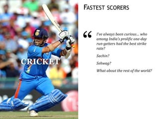
ANALYSIS PATTERNS
FASTEST SCORERS
CRICKET
“
I’ve always been curious… who
among India’s prolific one-day
run-getters had the best strike
rate?
Sachin?
Sehwag?
What about the rest of the world?
LET’S TAKE ONE DAY CRICKET DATA
Country Player Runs ScoreRate MatchDate Ground Versus
Australia Michael J Clarke 99* 93.39 30-06-2010The Oval England
Australia Dean M Jones 99* 128.57 28-01-1985Adelaide Oval Sri Lanka
Australia Bradley J Hodge 99* 115.11 04-02-2007Melbourne Cricket Ground New Zealand
India Virender Sehwag 99* 99 16-08-2010Rangiri Dambulla International Stad. Sri Lanka
New Zealand Bruce A Edgar 99* 72.79 14-02-1981Eden Park India
Pakistan Mohammad Yousuf 99* 95.19 15-11-2007Captain Roop Singh Stadium India
West Indies Richard B Richardson 99* 70.21 15-11-1985Sharjah CA Stadium Pakistan
West Indies Ramnaresh R Sarwan 99* 95.19 15-11-2002Sardar Patel Stadium India
Zimbabwe Andrew Flower 99* 89.18 24-10-1999Harare Sports Club Australia
Zimbabwe Alistair D R Campbell 99* 79.83 01-10-2000Queens Sports Club New Zealand
Zimbabwe Malcolm N Waller 99* 133.78 25-10-2011Queens Sports Club New Zealand
Australia David C Boon 98* 82.35 08-12-1994Bellerive Oval Zimbabwe
Australia Graeme M Wood 98* 63.22 11-01-1981Melbourne Cricket Ground India
England Ian J L Trott 98* 84.48 20-10-2011Punjab Cricket Association Stadium India
India Yuvraj Singh 98* 89.09 01-08-2001Sinhalese Sports Club Ground Sri Lanka
Ireland Kevin J O'Brien 98* 94.23 10-07-2010VRA Ground Scotland
Kenya Collins O Obuya 98* 75.96 13-03-2011M.Chinnaswamy Stadium Australia
Netherlands Ryan N ten Doeschate 98* 73.68 01-09-2009VRA Ground Afghanistan
New Zealand James E C Franklin 98* 142.02 07-12-2010M.Chinnaswamy Stadium India
Pakistan Ijaz Ahmed 98* 112.64 28-10-1994Iqbal Stadium South Africa
South Africa Jacques H Kallis 98* 74.24 06-02-2000St George's Park Zimbabwe
Against which countries are
higher averages scored?
Which countries’ players
score more per match?
Which player scores the
most per ball?
The player with the highest strike
rate is an obscure South African
whose name most of us have never
heard of.
In fact, this list is filled with players
we have never heard of.
ODI STRIKE RATES OF THE WORLD
We want to see the
prioritised performance.
That is, what is the strike
rate of the established
players?
Most analysis answers the question
“Which is are the top 10 X”?
Which are my top products?
Which are my top branches?
Who are my best sales people?
Which vendors have the highest cost per unit?
Which divisions are spending the most money?
In which hours does the under 12 segment watch TV most?
Which customer segment has the highest revenue per user?
THIS QUESTION CAN BE ANSWERED SYSTEMATICALLY
Country Player Runs ScoreRate MatchDate Ground Versus
Australia Michael J Clarke 99* 93.39 30-06-2010The Oval England
Australia Dean M Jones 99* 128.57 28-01-1985Adelaide Oval Sri Lanka
Australia Bradley J Hodge 99* 115.11 04-02-2007Melbourne Cricket Ground New Zealand
India Virender Sehwag 99* 99 16-08-2010Rangiri Dambulla International Stad. Sri Lanka
New Zealand Bruce A Edgar 99* 72.79 14-02-1981Eden Park India
Pakistan Mohammad Yousuf 99* 95.19 15-11-2007Captain Roop Singh Stadium India
West Indies Richard B Richardson 99* 70.21 15-11-1985Sharjah CA Stadium Pakistan
West Indies Ramnaresh R Sarwan 99* 95.19 15-11-2002Sardar Patel Stadium India
Zimbabwe Andrew Flower 99* 89.18 24-10-1999Harare Sports Club Australia
Zimbabwe Alistair D R Campbell 99* 79.83 01-10-2000Queens Sports Club New Zealand
Zimbabwe Malcolm N Waller 99* 133.78 25-10-2011Queens Sports Club New Zealand
Australia David C Boon 98* 82.35 08-12-1994Bellerive Oval Zimbabwe
Australia Graeme M Wood 98* 63.22 11-01-1981Melbourne Cricket Ground India
England Ian J L Trott 98* 84.48 20-10-2011Punjab Cricket Association Stadium India
India Yuvraj Singh 98* 89.09 01-08-2001Sinhalese Sports Club Ground Sri Lanka
Ireland Kevin J O'Brien 98* 94.23 10-07-2010VRA Ground Scotland
Kenya Collins O Obuya 98* 75.96 13-03-2011M.Chinnaswamy Stadium Australia
Netherlands Ryan N ten Doeschate 98* 73.68 01-09-2009VRA Ground Afghanistan
New Zealand James E C Franklin 98* 142.02 07-12-2010M.Chinnaswamy Stadium India
Pakistan Ijaz Ahmed 98* 112.64 28-10-1994Iqbal Stadium South Africa
South Africa Jacques H Kallis 98* 74.24 06-02-2000St George's Park Zimbabwe
Take every column in the data
Find the top value by that column
Country South Africa has the highest strike rate of 76%
Player Johann Louw has the highest strike rate of 329%
Runs 164 runs has the highest strike rate of 156%
MatchDate 12-03-2006 has the highest strike rate of 136%
Ground AC-VDCA Stadium has the highest strike rate of 98%
Versus United States has the highest strike rate of 104%
AUTOLYSIS
A PRODUCT THAT ENCAPSULATES BUSINESS ANALYSIS PATTERNS
SPATIAL FREQUENCY ANALYSIS
100YEARSOFINDIA’SWEATHER
1901
1911
1921
1931
1941
1951
1961
1971
1981
1991
2001
Jan Feb Mar Apr May Jun Jul Aug Sep Oct Nov Dec
12
TEMPORAL FREQUENCY ANALYSIS
IMPACT OF THE BUDGET ON STOCK PRICES
14
RESTAURANT FOUND AN UNUSUAL DIP IN SALES
15
A restaurant chain had data for every
single transaction made over a few
years. Plotting this as a time series
showed them nothing unusual.
However, the same data on a calendar
map reveals a very different story.
Specifically, at the bottom left point-of-sale terminal, sales dips on every
Wednesday. At the bottom right point-of-sale terminal, sales rises on
every Wednesday (almost as if to compensate for the loss.)
It turns out that the manager closes the bottom-left counter every
Wednesday afternoon due to shortage of staff, assuming that it results in
no loss of sales. There is, however, a net loss every Wednesday.
HOW BIRTHDAYS AFFECT MARKS
BANK FOUND ALL LOANS BEFORE 20TH POOR
17
Every loan disbursed after the 20th of the month, i.e. from the 21st to
the end of the month, shows consistently lower non-performing assets
(i.e. better quality) than any loan disbursed prior to the 20th.
The bank mapped this back to their incentive scheme. The sales team’s
commission is based only on loans disbursed until the 20th. Hence new
loans are squeezed into this period without regard for their quality.
The personal finance division of a
bank, focusing on retail loans, drove
its sales through a branch sales team.
A study of the non-performing assets
of loans generated over the course of
one year shows a strange pattern.
This representation, known as a
calendar map, can show some
interesting patterns, particularly
weekday-based patterns, as the next
example will show.
A similar visual helped a telecom company identify specific days on which their
competitors’ market share rose significantly, enabling them to negate the strategy.
Communicating data visually is the most effective way to a shared understanding
A brief aside on this
distribution...
Based on the results of the 20 lakh
students taking the Class XII
exams at Tamil Nadu over the last
3 years, it appears that the month
you were born in can make a
difference of as much as 120
marks out of 1,200.
June borns
score the lowest
The marks shoot
up for Aug borns
… and peaks for
Sep-borns
120 marks out of
1200 explainable
by month of birth
An identical pattern was observed in 2009 and 2010…
… and across districts, gender, subjects, and class X & XII.
“It’s simply that in Canada the eligibility cut-
off for age-class hockey is January 1. A boy
who turns ten on January 2, then, could be
playing alongside someone who doesn’t turn
ten until the end of the year—and at that age,
in preadolescence, a twelve-month gap in age
represents an enormous difference in physical
maturity.”
-- Malcolm Gladwell, Outliers
PATTERN OF “BIRTHS” IN INDIA IS SKEWED
This is a birth date dataset that’s
obtained from school admission data
for over 10 million children. When we
compare this with births in the US, we
see none of the same patterns.
For example,
• Is there an aversion to the 13th or is there a local cultural nuance?
• Are holidays avoided for births?
• Which months have a higher propensity for births, and why?
• Are there any patterns not found in the US data?
Very few children are born in the
month of August, and thereafter.
Most births are concentrated in
the first half of the year
We see a large number of
children born on the 5th, 10th,
15th, 20th and 25th of each month
– that is, round numbered dates
Such round numbered patterns a
typical indication of fraud. Here,
birthdates are brought forward
to aid early school admission
More births Fewer births … on average, for each day of the year (from 2007 to 2013)
THIS ADVERSELY IMPACTS CHILDREN’S MARKS
It’s a well established fact that older
children tend to do better at school in
most activities. Since many children
have had their birth dates brought
forward, these younger children suffer.
The average marks of children “born” on the 1st, 5th, 10th, 15th etc. of the
month tend to score lower marks.
• Are holidays avoided for births?
• Which months have a higher propensity for births, and why?
• Are there any patterns not found in the US data?
Higher marks Lower marks … on average, for children born on a given day of the year (from 2007 to 2013)
Children “born” on round numbered days score lower marks on average,
due to a higher proportion of younger children
RANK SCALE DISTRIBUTIONS
AN ENERGY UTILITY DETECTED BILLING FRAUD
This plot shows the frequency of all meter readings from Apr-
2010 to Mar-2011. An unusually large number of readings are
aligned with the slab boundaries.
Below is a simple histogram (or frequency distribution) of usage levels.
Each bar represents the number of customers with a customers with a
specific bill amount (in units, or KWh).
Tariffs are based on the usage slab. Someone with 101 units is billed in
full at a higher tariff than someone with 100 units. So people have a
strong incentive to stay at or within a slab boundary.
An energy utility (with over 50 million
subscribers) had 10 years worth of
customer billing data available.
Most fraud detection software failed to
load the data, and sampled data
revealed little or no insight.
This can happen in one of two ways.
First, people may be monitoring their
usage very carefully, and turn of their
lights and fans the instant their usage
hits the slab boundary.
Or, more realistically, there’s probably some level of corruption
involved, where customers pay a small sum to the meter reading staff
to ensure that it stays exactly at the slab boundary, giving them the
advantage of a lower price.
23
TN CLASS X: ENGLISH
0
5,000
10,000
15,000
20,000
25,000
30,000
35,000
40,000
0 5 10 15 20 25 30 35 40 45 50 55 60 65 70 75 80 85 90 95 100
24
TN CLASS X: SOCIAL SCIENCE
0
5,000
10,000
15,000
20,000
25,000
30,000
35,000
40,000
0 5 10 15 20 25 30 35 40 45 50 55 60 65 70 75 80 85 90 95 100
25
TN CLASS X: MATHEMATICS
0
5,000
10,000
15,000
20,000
25,000
30,000
35,000
40,000
0 5 10 15 20 25 30 35 40 45 50 55 60 65 70 75 80 85 90 95 100
26
CBSE 2013 CLASS XII: ENGLISH MARKS
27
CLUSTERED CORRELATIONS
68% correlation
between AUD & EUR
Plot of 6 month daily
AUD - EUR values
Block of correlated
currencies
… clustered
hierarchically
RESTAURANT: PRODUCT SALES CORRELATION
31
MAXIMAL TEXTUAL SEGMENTATION
WHAT TOPICS DID THE YOUNG & OLD FOCUS ON?
33
P.W.D.
Health
and
family
welfare
Reven
ue
Rural
Developm
ent and
Panchayat
Raj
Social
Welfar
e
Urban
Develo
pment
Water
Resou
rces
Minor
Irrigat
ion
Fuel
Hou
sing
Agricul
ture
Primary
Educati
on
Primary
and
Secondary
Education
Woman &
Child
Developm
ent
Higher
Educat
ion
Hom
eCoope
rative
Fore
st
Adminisr
ative
Reforms
Lab
our
Food &
Civil
Supplies
Tour
ism
Fina
nce
Animal
Husband
ry
Transpo
rtation
Horticu
lture
Muzr
ai
Haz &
Wakf
Trans
portMedical
Educati
on
Medium
and
Large
Industrie
s
Exci
se
Major &
Medium
Industrie
s
Kannada
&
Culture
Tex
tile
Fishe
ries
Parlia
mentar
y
Affairs
and
Human
Rights
Adult
Educat
ion
Rural
Water
Supply
and
Sanitat
ion
Mines
&
Geolog
y
Small
Indust
ries
Youth
and
Sports
Suga
r
Planni
ng
and
Statist
ics
Agricu
ltural
Marke
ting
Rural
Water
Suppl
y
Fishe
ries
&
Inlan
d
wate
r
trans
port
Smal
l
Scale
Indus
tries
Yout
h
Servi
ce &
Spor
ts
Seri
cult
ure
Law
&
Hum
an
Righ
ts
Pris
on
Plan
ning
Info
rma
tion
&
Tec
hno
logy
Pub
lic
Libr
ary
Young Old
Based on assembly session questions, Karnataka, 2008-2012
THE LANGUAGE OF TWEETS
Based on 1 week of geo-coded tweets from India, this visual shows words sized by frequency. Words on
the left (in red) are used by people with few followers, while those on the right (in green) is the reverse.
High-followers use significantly
more hash-tags and are perhaps
more polite with ‘good morning’s
and ‘thank you’s
People with low followers tend
to talk more about ‘know’,
‘traffic’, ‘high’ etc
34
PARLIAMENT DECISIONS
promotion scheme
project
approved
development
agreement amendment
central
act
section
limited
bill
laning
plan
government
new
ltd
phaseapproval
sector
state
setting
investment
pradesh
policy
four
programme
amendments
indian
extension
institute
commission
nhdp
technology
proposal
iii
implementation
fund
establishment
equity
assistance
ooperation
transfer
infrastructure
corporation
international
mou
cabinet
company
public
year
revised
construction
services
continuation
approves
stateseducation
additional
financial
revision
sponsored
port
mission
centrally
basis
signing
protection
management
capital
bank
two
projects
research
upgradation
rural
special
land
delhi
employees
existing
committee
relief
convention
six
crore
payment
power
health
cost
package
institutions
acquisition
control
restructuring
air
grant
field
university
scheduled
PRE-2009 2009 AND AFTER
Decisions related to
intervention, assistance and
relief were almost entirely
concentrated in pre-2009
The number of international
agreements has declined
dramatically between pre-2009
and post-2009
A significant rise in the number of
decisions related to the States is seen
post 2009 – in contrast with the focus on
“Central” pre-2009
Decisions to increase the number of lanes on
highways grew significantly post-2009,
especially as part of the CCI (Cabinet
Committee on Infrastructure) decisions
35
WHAT DO FINANCIAL ANALYSTS ASK IBM VS MSFT?
36
BIPARTITE NETWORK CLUSTERING
How does Mahabharata, one of the largest epics with 1.8
million words lend itself to text analytics?
Can this ‘unstructured data’ be processed to extract
analytical insights?
What does sentiment analysis of this tome convey?
Is there a better way to explore relations between
characters?
How can closeness of characters be analysed &
visualized?
VISUALISING THE MAHABHARATA
38
Tata Teleservices
Tata Consultancy Services
Tata Business Support Services
Tata Global Beverages
Tata Infotech (merged)
Tata Toyo Radiator
Honeywell Automation India
Tata Communications
A G C Networks
Tata Technologies
Tata Projects
Tata Power
Tata Finance
Idea Cellular
Tata Motors
Tata Sons
Tata Steel
Tayo Rolls
Tata Securities
Tata Coffee
Tata Investment Corp
A J Engineer
H H Malgham
H K Sethna
Keshub Mahindra
Ravi Kant
Russi Mody
Sujit Gupta
A S Bam
Amal Ganguli
D B Engineer
D N Ghosh
M N Bhagwat
N N Kampani
U M Rao
B Muthuraman
Ishaat Hussain
J J Irani
N A Palkhivala
N A Soonawala
R Gopalakrishnan
Ratan Tata
S Ramadorai
S Ramakrishnan
DIRECTORSHIPS AT THE TATAS
Every person who was a Director at the Tata
Group is shown here as an orange circle. The size of
the circle is based on the number of directorship
positions held over their lifetime.
Every company in the Tata Group is
shown here as a blue circle. The size of the
circle is based on the number of directors the
company has had over time.
Every directorship relation is shown
by a line. If a person has held a
directorship position at a company, the two
are connected by a line.
The group appears to be divided into
two clusters based on the network of
directorship roles.
Prominent leaders
bridge the groups
Second group of companies
First group of companies
Some directors are
mainly associated with
the first group of
companies
Some directors are
mainly associated with
the second group of
companies
Manual exploration Automated insights
More
problems
Tougher
problems
EXCEL
TABLEAU
QLIK
R
SAS
SPSS
TENSORFLOW
THEANO
SPOTFIRE
MICROSTRATEGY
COGNOS
CAFFE
Deep insights
TORCH
This fills a gap in the
pattern-based analysis space
AUTOLYSIS
GRAMENER.COM
s.anand@gramener.com

Analysis Patterns

  • 1.
  • 2.
    FASTEST SCORERS CRICKET “ I’ve alwaysbeen curious… who among India’s prolific one-day run-getters had the best strike rate? Sachin? Sehwag? What about the rest of the world?
  • 3.
    LET’S TAKE ONEDAY CRICKET DATA Country Player Runs ScoreRate MatchDate Ground Versus Australia Michael J Clarke 99* 93.39 30-06-2010The Oval England Australia Dean M Jones 99* 128.57 28-01-1985Adelaide Oval Sri Lanka Australia Bradley J Hodge 99* 115.11 04-02-2007Melbourne Cricket Ground New Zealand India Virender Sehwag 99* 99 16-08-2010Rangiri Dambulla International Stad. Sri Lanka New Zealand Bruce A Edgar 99* 72.79 14-02-1981Eden Park India Pakistan Mohammad Yousuf 99* 95.19 15-11-2007Captain Roop Singh Stadium India West Indies Richard B Richardson 99* 70.21 15-11-1985Sharjah CA Stadium Pakistan West Indies Ramnaresh R Sarwan 99* 95.19 15-11-2002Sardar Patel Stadium India Zimbabwe Andrew Flower 99* 89.18 24-10-1999Harare Sports Club Australia Zimbabwe Alistair D R Campbell 99* 79.83 01-10-2000Queens Sports Club New Zealand Zimbabwe Malcolm N Waller 99* 133.78 25-10-2011Queens Sports Club New Zealand Australia David C Boon 98* 82.35 08-12-1994Bellerive Oval Zimbabwe Australia Graeme M Wood 98* 63.22 11-01-1981Melbourne Cricket Ground India England Ian J L Trott 98* 84.48 20-10-2011Punjab Cricket Association Stadium India India Yuvraj Singh 98* 89.09 01-08-2001Sinhalese Sports Club Ground Sri Lanka Ireland Kevin J O'Brien 98* 94.23 10-07-2010VRA Ground Scotland Kenya Collins O Obuya 98* 75.96 13-03-2011M.Chinnaswamy Stadium Australia Netherlands Ryan N ten Doeschate 98* 73.68 01-09-2009VRA Ground Afghanistan New Zealand James E C Franklin 98* 142.02 07-12-2010M.Chinnaswamy Stadium India Pakistan Ijaz Ahmed 98* 112.64 28-10-1994Iqbal Stadium South Africa South Africa Jacques H Kallis 98* 74.24 06-02-2000St George's Park Zimbabwe
  • 4.
    Against which countriesare higher averages scored? Which countries’ players score more per match?
  • 5.
    Which player scoresthe most per ball? The player with the highest strike rate is an obscure South African whose name most of us have never heard of. In fact, this list is filled with players we have never heard of.
  • 6.
    ODI STRIKE RATESOF THE WORLD We want to see the prioritised performance. That is, what is the strike rate of the established players?
  • 7.
    Most analysis answersthe question “Which is are the top 10 X”? Which are my top products? Which are my top branches? Who are my best sales people? Which vendors have the highest cost per unit? Which divisions are spending the most money? In which hours does the under 12 segment watch TV most? Which customer segment has the highest revenue per user?
  • 8.
    THIS QUESTION CANBE ANSWERED SYSTEMATICALLY Country Player Runs ScoreRate MatchDate Ground Versus Australia Michael J Clarke 99* 93.39 30-06-2010The Oval England Australia Dean M Jones 99* 128.57 28-01-1985Adelaide Oval Sri Lanka Australia Bradley J Hodge 99* 115.11 04-02-2007Melbourne Cricket Ground New Zealand India Virender Sehwag 99* 99 16-08-2010Rangiri Dambulla International Stad. Sri Lanka New Zealand Bruce A Edgar 99* 72.79 14-02-1981Eden Park India Pakistan Mohammad Yousuf 99* 95.19 15-11-2007Captain Roop Singh Stadium India West Indies Richard B Richardson 99* 70.21 15-11-1985Sharjah CA Stadium Pakistan West Indies Ramnaresh R Sarwan 99* 95.19 15-11-2002Sardar Patel Stadium India Zimbabwe Andrew Flower 99* 89.18 24-10-1999Harare Sports Club Australia Zimbabwe Alistair D R Campbell 99* 79.83 01-10-2000Queens Sports Club New Zealand Zimbabwe Malcolm N Waller 99* 133.78 25-10-2011Queens Sports Club New Zealand Australia David C Boon 98* 82.35 08-12-1994Bellerive Oval Zimbabwe Australia Graeme M Wood 98* 63.22 11-01-1981Melbourne Cricket Ground India England Ian J L Trott 98* 84.48 20-10-2011Punjab Cricket Association Stadium India India Yuvraj Singh 98* 89.09 01-08-2001Sinhalese Sports Club Ground Sri Lanka Ireland Kevin J O'Brien 98* 94.23 10-07-2010VRA Ground Scotland Kenya Collins O Obuya 98* 75.96 13-03-2011M.Chinnaswamy Stadium Australia Netherlands Ryan N ten Doeschate 98* 73.68 01-09-2009VRA Ground Afghanistan New Zealand James E C Franklin 98* 142.02 07-12-2010M.Chinnaswamy Stadium India Pakistan Ijaz Ahmed 98* 112.64 28-10-1994Iqbal Stadium South Africa South Africa Jacques H Kallis 98* 74.24 06-02-2000St George's Park Zimbabwe Take every column in the data Find the top value by that column Country South Africa has the highest strike rate of 76% Player Johann Louw has the highest strike rate of 329% Runs 164 runs has the highest strike rate of 156% MatchDate 12-03-2006 has the highest strike rate of 136% Ground AC-VDCA Stadium has the highest strike rate of 98% Versus United States has the highest strike rate of 104%
  • 9.
    AUTOLYSIS A PRODUCT THATENCAPSULATES BUSINESS ANALYSIS PATTERNS
  • 10.
  • 12.
  • 13.
  • 14.
    IMPACT OF THEBUDGET ON STOCK PRICES 14
  • 15.
    RESTAURANT FOUND ANUNUSUAL DIP IN SALES 15 A restaurant chain had data for every single transaction made over a few years. Plotting this as a time series showed them nothing unusual. However, the same data on a calendar map reveals a very different story. Specifically, at the bottom left point-of-sale terminal, sales dips on every Wednesday. At the bottom right point-of-sale terminal, sales rises on every Wednesday (almost as if to compensate for the loss.) It turns out that the manager closes the bottom-left counter every Wednesday afternoon due to shortage of staff, assuming that it results in no loss of sales. There is, however, a net loss every Wednesday.
  • 16.
  • 17.
    BANK FOUND ALLLOANS BEFORE 20TH POOR 17 Every loan disbursed after the 20th of the month, i.e. from the 21st to the end of the month, shows consistently lower non-performing assets (i.e. better quality) than any loan disbursed prior to the 20th. The bank mapped this back to their incentive scheme. The sales team’s commission is based only on loans disbursed until the 20th. Hence new loans are squeezed into this period without regard for their quality. The personal finance division of a bank, focusing on retail loans, drove its sales through a branch sales team. A study of the non-performing assets of loans generated over the course of one year shows a strange pattern. This representation, known as a calendar map, can show some interesting patterns, particularly weekday-based patterns, as the next example will show. A similar visual helped a telecom company identify specific days on which their competitors’ market share rose significantly, enabling them to negate the strategy. Communicating data visually is the most effective way to a shared understanding
  • 18.
    A brief asideon this distribution...
  • 19.
    Based on theresults of the 20 lakh students taking the Class XII exams at Tamil Nadu over the last 3 years, it appears that the month you were born in can make a difference of as much as 120 marks out of 1,200. June borns score the lowest The marks shoot up for Aug borns … and peaks for Sep-borns 120 marks out of 1200 explainable by month of birth An identical pattern was observed in 2009 and 2010… … and across districts, gender, subjects, and class X & XII. “It’s simply that in Canada the eligibility cut- off for age-class hockey is January 1. A boy who turns ten on January 2, then, could be playing alongside someone who doesn’t turn ten until the end of the year—and at that age, in preadolescence, a twelve-month gap in age represents an enormous difference in physical maturity.” -- Malcolm Gladwell, Outliers
  • 20.
    PATTERN OF “BIRTHS”IN INDIA IS SKEWED This is a birth date dataset that’s obtained from school admission data for over 10 million children. When we compare this with births in the US, we see none of the same patterns. For example, • Is there an aversion to the 13th or is there a local cultural nuance? • Are holidays avoided for births? • Which months have a higher propensity for births, and why? • Are there any patterns not found in the US data? Very few children are born in the month of August, and thereafter. Most births are concentrated in the first half of the year We see a large number of children born on the 5th, 10th, 15th, 20th and 25th of each month – that is, round numbered dates Such round numbered patterns a typical indication of fraud. Here, birthdates are brought forward to aid early school admission More births Fewer births … on average, for each day of the year (from 2007 to 2013)
  • 21.
    THIS ADVERSELY IMPACTSCHILDREN’S MARKS It’s a well established fact that older children tend to do better at school in most activities. Since many children have had their birth dates brought forward, these younger children suffer. The average marks of children “born” on the 1st, 5th, 10th, 15th etc. of the month tend to score lower marks. • Are holidays avoided for births? • Which months have a higher propensity for births, and why? • Are there any patterns not found in the US data? Higher marks Lower marks … on average, for children born on a given day of the year (from 2007 to 2013) Children “born” on round numbered days score lower marks on average, due to a higher proportion of younger children
  • 22.
  • 23.
    AN ENERGY UTILITYDETECTED BILLING FRAUD This plot shows the frequency of all meter readings from Apr- 2010 to Mar-2011. An unusually large number of readings are aligned with the slab boundaries. Below is a simple histogram (or frequency distribution) of usage levels. Each bar represents the number of customers with a customers with a specific bill amount (in units, or KWh). Tariffs are based on the usage slab. Someone with 101 units is billed in full at a higher tariff than someone with 100 units. So people have a strong incentive to stay at or within a slab boundary. An energy utility (with over 50 million subscribers) had 10 years worth of customer billing data available. Most fraud detection software failed to load the data, and sampled data revealed little or no insight. This can happen in one of two ways. First, people may be monitoring their usage very carefully, and turn of their lights and fans the instant their usage hits the slab boundary. Or, more realistically, there’s probably some level of corruption involved, where customers pay a small sum to the meter reading staff to ensure that it stays exactly at the slab boundary, giving them the advantage of a lower price. 23
  • 24.
    TN CLASS X:ENGLISH 0 5,000 10,000 15,000 20,000 25,000 30,000 35,000 40,000 0 5 10 15 20 25 30 35 40 45 50 55 60 65 70 75 80 85 90 95 100 24
  • 25.
    TN CLASS X:SOCIAL SCIENCE 0 5,000 10,000 15,000 20,000 25,000 30,000 35,000 40,000 0 5 10 15 20 25 30 35 40 45 50 55 60 65 70 75 80 85 90 95 100 25
  • 26.
    TN CLASS X:MATHEMATICS 0 5,000 10,000 15,000 20,000 25,000 30,000 35,000 40,000 0 5 10 15 20 25 30 35 40 45 50 55 60 65 70 75 80 85 90 95 100 26
  • 27.
    CBSE 2013 CLASSXII: ENGLISH MARKS 27
  • 28.
  • 29.
    68% correlation between AUD& EUR Plot of 6 month daily AUD - EUR values Block of correlated currencies … clustered hierarchically
  • 30.
  • 31.
  • 32.
  • 33.
    WHAT TOPICS DIDTHE YOUNG & OLD FOCUS ON? 33 P.W.D. Health and family welfare Reven ue Rural Developm ent and Panchayat Raj Social Welfar e Urban Develo pment Water Resou rces Minor Irrigat ion Fuel Hou sing Agricul ture Primary Educati on Primary and Secondary Education Woman & Child Developm ent Higher Educat ion Hom eCoope rative Fore st Adminisr ative Reforms Lab our Food & Civil Supplies Tour ism Fina nce Animal Husband ry Transpo rtation Horticu lture Muzr ai Haz & Wakf Trans portMedical Educati on Medium and Large Industrie s Exci se Major & Medium Industrie s Kannada & Culture Tex tile Fishe ries Parlia mentar y Affairs and Human Rights Adult Educat ion Rural Water Supply and Sanitat ion Mines & Geolog y Small Indust ries Youth and Sports Suga r Planni ng and Statist ics Agricu ltural Marke ting Rural Water Suppl y Fishe ries & Inlan d wate r trans port Smal l Scale Indus tries Yout h Servi ce & Spor ts Seri cult ure Law & Hum an Righ ts Pris on Plan ning Info rma tion & Tec hno logy Pub lic Libr ary Young Old Based on assembly session questions, Karnataka, 2008-2012
  • 34.
    THE LANGUAGE OFTWEETS Based on 1 week of geo-coded tweets from India, this visual shows words sized by frequency. Words on the left (in red) are used by people with few followers, while those on the right (in green) is the reverse. High-followers use significantly more hash-tags and are perhaps more polite with ‘good morning’s and ‘thank you’s People with low followers tend to talk more about ‘know’, ‘traffic’, ‘high’ etc 34
  • 35.
    PARLIAMENT DECISIONS promotion scheme project approved development agreementamendment central act section limited bill laning plan government new ltd phaseapproval sector state setting investment pradesh policy four programme amendments indian extension institute commission nhdp technology proposal iii implementation fund establishment equity assistance ooperation transfer infrastructure corporation international mou cabinet company public year revised construction services continuation approves stateseducation additional financial revision sponsored port mission centrally basis signing protection management capital bank two projects research upgradation rural special land delhi employees existing committee relief convention six crore payment power health cost package institutions acquisition control restructuring air grant field university scheduled PRE-2009 2009 AND AFTER Decisions related to intervention, assistance and relief were almost entirely concentrated in pre-2009 The number of international agreements has declined dramatically between pre-2009 and post-2009 A significant rise in the number of decisions related to the States is seen post 2009 – in contrast with the focus on “Central” pre-2009 Decisions to increase the number of lanes on highways grew significantly post-2009, especially as part of the CCI (Cabinet Committee on Infrastructure) decisions 35
  • 36.
    WHAT DO FINANCIALANALYSTS ASK IBM VS MSFT? 36
  • 37.
  • 38.
    How does Mahabharata,one of the largest epics with 1.8 million words lend itself to text analytics? Can this ‘unstructured data’ be processed to extract analytical insights? What does sentiment analysis of this tome convey? Is there a better way to explore relations between characters? How can closeness of characters be analysed & visualized? VISUALISING THE MAHABHARATA 38
  • 39.
    Tata Teleservices Tata ConsultancyServices Tata Business Support Services Tata Global Beverages Tata Infotech (merged) Tata Toyo Radiator Honeywell Automation India Tata Communications A G C Networks Tata Technologies Tata Projects Tata Power Tata Finance Idea Cellular Tata Motors Tata Sons Tata Steel Tayo Rolls Tata Securities Tata Coffee Tata Investment Corp A J Engineer H H Malgham H K Sethna Keshub Mahindra Ravi Kant Russi Mody Sujit Gupta A S Bam Amal Ganguli D B Engineer D N Ghosh M N Bhagwat N N Kampani U M Rao B Muthuraman Ishaat Hussain J J Irani N A Palkhivala N A Soonawala R Gopalakrishnan Ratan Tata S Ramadorai S Ramakrishnan DIRECTORSHIPS AT THE TATAS Every person who was a Director at the Tata Group is shown here as an orange circle. The size of the circle is based on the number of directorship positions held over their lifetime. Every company in the Tata Group is shown here as a blue circle. The size of the circle is based on the number of directors the company has had over time. Every directorship relation is shown by a line. If a person has held a directorship position at a company, the two are connected by a line. The group appears to be divided into two clusters based on the network of directorship roles. Prominent leaders bridge the groups Second group of companies First group of companies Some directors are mainly associated with the first group of companies Some directors are mainly associated with the second group of companies
  • 40.
    Manual exploration Automatedinsights More problems Tougher problems EXCEL TABLEAU QLIK R SAS SPSS TENSORFLOW THEANO SPOTFIRE MICROSTRATEGY COGNOS CAFFE Deep insights TORCH This fills a gap in the pattern-based analysis space AUTOLYSIS
  • 41.

Editor's Notes

  • #3 We were also interested in applying these rich visualisations to sports. One question we had was, for example, “Who’s the fastest one day international player?” The trouble with that is, depending on when you measure it and how you measure it, the results could be very different. For example, if we take strike rate as a metric, it turned out (when we did it) that it was a South African who had the highest strike rate – of 200%. He played one match, hit a four, and got out the next ball. Clearly, that’s not what we’re looking for. We could, perhaps, take a minimum number of runs as a cut-off. But the question is, what should that be? 100? 1000? 5000? Where does one draw the line, and why is that the right one? If you don’t know the domain, answering this is difficult. Like with the contract farming example before, we need a way of looking at performance combined with scale or importance.
  • #16 For the same chain, we also looked at the daily sales across restaurants. Here are a series of calendar maps showing the daily sales for four different points of sale terminals at one restaurant. Each calendar map shows a calendar for 7 months. Each day is coloured based on the value of sales on that day. Red indicates low sales, green indicates high sales. For the two terminals at the front (i.e. the ones you see on top), sales was relatively low during the first two months, but picked up steadily thereafter. It’s easy to spot the exceptions among this. For example, the 30th and 31st of January were good days for both terminals. Interestingly, when you look at the terminal at the bottom left, there is a red bar indicating consistent dip in sales every Wednesday. Almost as if to compensate, the terminal at the bottom right has an increase in sales every Wednesday – but not as significant as the dip. We did not have an explanation for this, though our client did a few weeks later. It turned out that the person manning the bottom left counter takes half-day off every Wednesday, and was not being replaced by the manager. The queue naturally shifts over to the other terminal, increasing the sales. But this restaurant is in an area where there are many other food outlets. Once the queue reaches a certain size, people drop off, resulting in a net loss in sales every Wednesday – a loss that had gone unobserved for at least 7 months.
  • #30 So, what we did was put a variant of this visual together. On the right, you have a series of currencies like the Australian dollar, the Euro, the British pound, etc; some commodities like silver and gold; and some stock indices like Sensex, FTSE, and S&P. The cells here have a number inside that indicates the pairwise correlation between a pair of securities. For example, the number 68 on the top left indicates a 68% correlation between the Australian dollar and the Euro. To the left of the Euro and just below the dollar (diagonally opposite to the 68), there’s a scatter plot that shows the daily prices of both these currencies. Each dot is one day’s data. The x-axis shows the Australian dollar value. The y-axis shows the Euro value. This helps identify what the pattern of movements of any two currencies is. From this, you can easily see visually that the Australian dollar and the Euro both tend to move together. Or, where there are strong correlations like the FTSE & S&P, the pattern is almost a straight line. In some cases there are negative correlations. For instance, if you take the Sensex against the Japanese Yen, the correlation is -79%. The cells are coloured based on their correlation values. Greens indicate strong positive correlation. Reds indicate strong negative correlation. These are also grouped hierarchically. On the left, we have a series of lines indicating clusters. The most similar securities are grouped together. So FTSE and S&P with a 98% correlation are very close. The ones that are less correlated are kept further away based on a tree-structure. This leads to clustering of securities. For example, there is a green block in the center which has SGD, JPY, XAU, CHF and CNY. All of these are fairly well correlated. When any one currency in this block goes up, all the others go up as well. When any one goes down, all others go down as well. Similarly, you have another block to its top left: S&P, FTSE, Sensex and to a certain extent, the Pakistani Rupee. These move together as a block as well. But when this block goes up, all the currencies in the other block go down, as indicated by the red negative correlations between these two blocks. This can be used very easily for decision making. For example, one client who was trading with Singapore and Japan looked at the strong correlation and decided to consolidate their holdings in Japanese Yen. They then moved up and down this column to find a good hedge. FTSE looked like a good hedge – it was the most negatively correlated with JPY at that time -- and they decided to place a third of their portfolio in FTSE. A sheet like this improves people’s understanding of relatively complex data, and results in significantly increased trade volumes.
  • #31 We were working with a restaurant who had 7 months’ worth of sales data, and asked what we could do with this data. It was a fairly open-ended problem. Among other things, we looked at the various product categories they sold, such as starters, breads, desserts, etc. and the pairwise correlations between each of these. The number in each cell shows the pairwise correlation between any two products. The 17 on the top left, for example, indicates a 17% correlation between side dishes and meals. The scatter plots diagonally opposite show the correlations between these visually as well. These are colour coded based on the correlation. The redder it is, the more negative the correlation. The greener it is, the more positive the correlation. There are a few patterns that emerge. For example: desserts are positively correlated with every product. The row and column are green right through, indicating that it doesn’t matter what people eat – they usually have desserts at the end. Starters are an interesting category. They were introduced 4 years ago as a loss-leader, with the aim of increasing the restaurant’s menu variety and to bring in footfall. As a result, they were priced at cost. You can see from this that starters sell well with breads (rotis, naans, etc). They sell well with desserts, but then, everything sells well with desserts. But they reduce the sales of every other product! What’s been happening is that since starters were so attractive, people were coming in, ordering starters and desserts, and leaving. As a result, this initiative had been a net loss for the profit margin, though it had not been spotted for nearly four years.
  • #32 When you look at the correlations at an individual item level, it turns out that there’s one product that is negatively correlated with almost every other product: the 1 litre mineral water bottle. This is a curious phenomenon, and our client explained this once they realised what was happening. Theirs is a low-end chain of restaurants and it’s mostly individuals (not families) that visit this restaurant. Their customers are rather price-conscious. When they buy 1 litre of water, they want to make sure that they do not waste it. And when an entire litre is consumed, there’s not much space in the stomach for other things. An obvious solution was to replace the 1 litre packaging with a smaller 200ml bottle. This ends up turning the entire row and column of reds into neutral yellows, resulting in an overall increase in sale of all products.