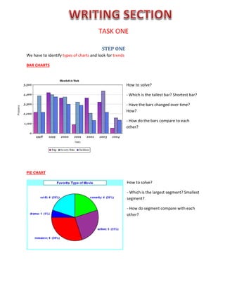
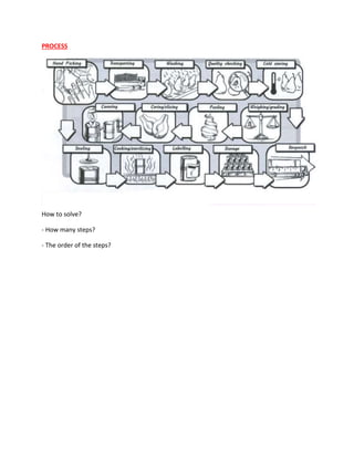
TASK ONE
STEP ONE
We have to identify types of charts and look for trends
BAR CHARTS
How to solve?
- Which is the tallest bar? Shortest bar?
- Have the bars changed over time?
How?
- How do the bars compare to each
other?
PIE CHART
How to solve?
- Which is the largest segment? Smallest
segment?
- How do segment compare with each
other?
LINE GRAPH
How to solve?
- What is the highest point? Lowest point?
- Is there a point till when the trend was increasing or decreasing?
- When did the trend change?
TABLE
How to solve?
- What is the highest figure? Lowest figure?
- What is the second highest? Etc.
PROCESS
How to solve?
- How many steps?
- The order of the steps?
STEP TWO
Using a wide range vocabulary of trend to describe and interpret the visual information
STEP 3
Write your answer according to a plan. NEVER GIVE YOUR IDEA ON WHY THE DATA GO THAT WAY. For
example, never write “The number of population went up perhaps due to the migration of the Asian”.
Just interpret the chart, do not give your idea or guessing or prediction.
ALL TYPES OF CHARTS: 3 paragraphs
 First paragraph: 2 sentences:
 First sentence will be your paraphrasing of the name of the chart.
For example:
Question: The chart shows the number of people in the UK buying new mobile phones each year from
2000 to 2010.
 Your paraphrase: The chart above illustrates the population in the UK who purchased new mobile
phones annually during the period of 10 years from 2000 to 2010
 Second sentence will be about the general view on the chart. Look at the chart and show
me what do you see when you first look at it? What stands out? (If it is the process, then
how many steps are there in the process?)
For example: In general, the population migrating to other countries had the trend of increasing each 10
years without any signal of dropping down.
 Second and third paragraphs: Each one must be used to interpret the main points of the chart
REMEMBER: There is NO conclusion of task 1. After interpreting the chart (after finishing paragraph 2
and 3), just put a full-stop (.) to end the task! Then turn to task 2.
The limit for the task is within 150 words which comprise approximately 10-15 sentences.
So, first paragraph: 2 sentences; Second and third paragraphs: each one 4 - 5 sentences.
EXERCISES:
The barchart below shows the total number of minutes (in billions) of telephone calls in Australia,
divided into three categories, from 2001- 2008.
Summarise the information by selecting and reporting the main features and make comparisons
where relevant.
Write at least 150 words
The pie chart below shows the proportion of different categories of families living in poverty in UK
in 2002.
Summarise the information by selecting and reporting the main features, and make comparisons
where relevant.
Write at least 150 words.
Proportion of people from each household type living in poverty
Summarise the information by selecting and reporting description of the correlation of the table that
follow.
Write at least 150 words.
Alcohol-Related Deaths 2005 beers consumption
per capita, 2002
(litres)
Total Male Female
Lithuania 125,000 112,000 13,000 91
Ireland 582,000 413,000 169,000 104
Czech Republic 1,369,000 900,000 469,000 132
Canada 580,000 505,000 75,000 86
Estonia 383,000 332,000 51,000 98
Germany 1,185,000 986,000 200,000 107
Austria 913,000 783,000 130,000 106
The graph below presents the employment patterns in the USA between 1930 and 2010.
Summarise the information by selecting and report in the main features, and make comparisons
where relevant.
Write at least 150 words
The diagram below shows the process by which bricks are manufactured for the building industry.
Summarise the information by selecting and reporting the main features, and make comparisons
where relevant.
Write at least 150 words.
Brick manufacturing

TASK_ONE_IELTS_Writing.docx

  • 1.
    TASK ONE STEP ONE Wehave to identify types of charts and look for trends BAR CHARTS How to solve? - Which is the tallest bar? Shortest bar? - Have the bars changed over time? How? - How do the bars compare to each other? PIE CHART How to solve? - Which is the largest segment? Smallest segment? - How do segment compare with each other?
  • 2.
    LINE GRAPH How tosolve? - What is the highest point? Lowest point? - Is there a point till when the trend was increasing or decreasing? - When did the trend change? TABLE How to solve? - What is the highest figure? Lowest figure? - What is the second highest? Etc.
  • 3.
    PROCESS How to solve? -How many steps? - The order of the steps?
  • 4.
    STEP TWO Using awide range vocabulary of trend to describe and interpret the visual information
  • 5.
    STEP 3 Write youranswer according to a plan. NEVER GIVE YOUR IDEA ON WHY THE DATA GO THAT WAY. For example, never write “The number of population went up perhaps due to the migration of the Asian”. Just interpret the chart, do not give your idea or guessing or prediction. ALL TYPES OF CHARTS: 3 paragraphs  First paragraph: 2 sentences:  First sentence will be your paraphrasing of the name of the chart. For example: Question: The chart shows the number of people in the UK buying new mobile phones each year from 2000 to 2010.  Your paraphrase: The chart above illustrates the population in the UK who purchased new mobile phones annually during the period of 10 years from 2000 to 2010  Second sentence will be about the general view on the chart. Look at the chart and show me what do you see when you first look at it? What stands out? (If it is the process, then how many steps are there in the process?) For example: In general, the population migrating to other countries had the trend of increasing each 10 years without any signal of dropping down.  Second and third paragraphs: Each one must be used to interpret the main points of the chart REMEMBER: There is NO conclusion of task 1. After interpreting the chart (after finishing paragraph 2 and 3), just put a full-stop (.) to end the task! Then turn to task 2. The limit for the task is within 150 words which comprise approximately 10-15 sentences. So, first paragraph: 2 sentences; Second and third paragraphs: each one 4 - 5 sentences.
  • 6.
    EXERCISES: The barchart belowshows the total number of minutes (in billions) of telephone calls in Australia, divided into three categories, from 2001- 2008. Summarise the information by selecting and reporting the main features and make comparisons where relevant. Write at least 150 words
  • 7.
    The pie chartbelow shows the proportion of different categories of families living in poverty in UK in 2002. Summarise the information by selecting and reporting the main features, and make comparisons where relevant. Write at least 150 words. Proportion of people from each household type living in poverty
  • 8.
    Summarise the informationby selecting and reporting description of the correlation of the table that follow. Write at least 150 words. Alcohol-Related Deaths 2005 beers consumption per capita, 2002 (litres) Total Male Female Lithuania 125,000 112,000 13,000 91 Ireland 582,000 413,000 169,000 104 Czech Republic 1,369,000 900,000 469,000 132 Canada 580,000 505,000 75,000 86 Estonia 383,000 332,000 51,000 98 Germany 1,185,000 986,000 200,000 107 Austria 913,000 783,000 130,000 106
  • 9.
    The graph belowpresents the employment patterns in the USA between 1930 and 2010. Summarise the information by selecting and report in the main features, and make comparisons where relevant. Write at least 150 words
  • 10.
    The diagram belowshows the process by which bricks are manufactured for the building industry. Summarise the information by selecting and reporting the main features, and make comparisons where relevant. Write at least 150 words. Brick manufacturing