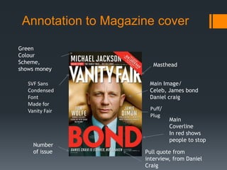
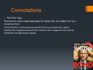
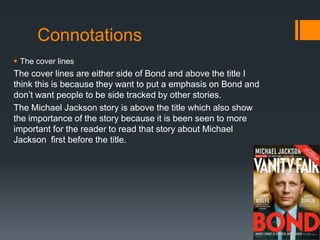
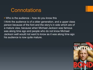
The magazine cover summarizes as:
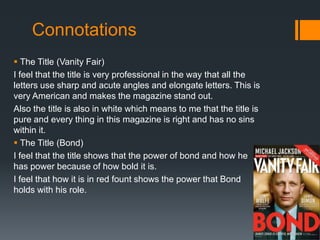
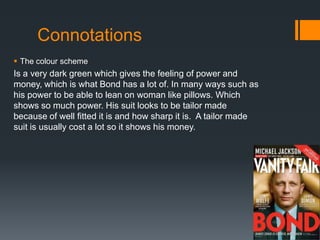
1) The dark green color scheme and image of Daniel Craig in a sharp suit conveys power and wealth befitting of James Bond and the magazine's audience.
2) The bespoke font was created for Vanity Fair to seem upmarket and match the magazine's celebrity readership.
3) Placement of cover lines and stories emphasizes Bond as the main attraction without distracting from other important pieces like one on Michael Jackson.
4) The cover aims to portray an image of power, money, and appeal to an older, upper-class audience familiar with iconic figures from the past like Michael Jackson through its visual design choices.