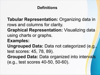
Definitions
Tabular Representation: Organizingdata in
rows and columns for clarity.
Graphical Representation: Visualizing data
using charts or graphs.
Examples:
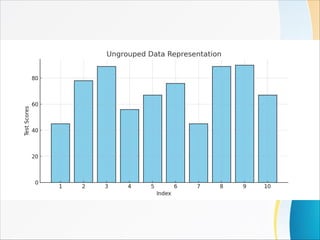
Ungrouped Data: Data not categorized (e.g.,
test scores: 45, 78, 89).
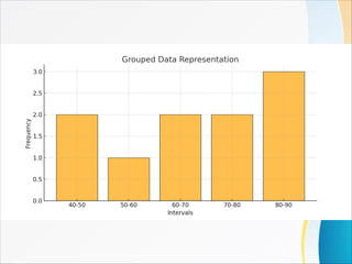
Grouped Data: Data organized into intervals
(e.g., test scores 40-50, 50-60).
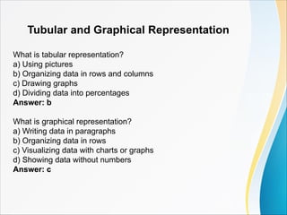
Tubular and GraphicalRepresentation
What is tabular representation?
a) Using pictures
b) Organizing data in rows and columns
c) Drawing graphs
d) Dividing data into percentages
Answer: b
What is graphical representation?
a) Writing data in paragraphs
b) Organizing data in rows
c) Visualizing data with charts or graphs
d) Showing data without numbers
Answer: c
13.
Which is anexample of ungrouped data?
a) Test scores: 40-50, 50-60
b) Monthly income ranges
c) Test scores: 45, 78, 89
d) Percentage values
Answer: c
Grouped data is:
a) Data without categorization
b) Data organized into intervals
c) Data represented visually
d) Data without any order
Answer: b
What is a benefit of graphical representation?
a) It is always accurate
b) It simplifies data visualization
c) It replaces numerical data
d) It doesn't require any calculations
Answer: b
14.
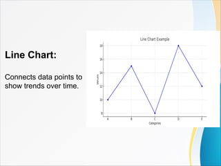
Line Chart
A linechart is used to:
a) Show proportions
b) Represent continuous trends over time
c) Display data in intervals
d) Compare percentages
Answer: b
What connects the data points in a line chart?
a) Bars
b) Dots
c) Lines
d) Circles
Answer: c
15.
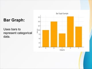
Bar Graph
A bargraph is used for:
a) Showing categorical data
b) Representing percentages
c) Tracking continuous trends
d) Dividing data into intervals
Answer: a
What is the key feature of a bar graph?
a) Bars of equal height
b) Gaps between bars
c) Bars without color
d) All bars touching each other
Answer: b
16.
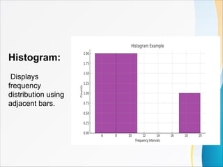
Histogram
A histogram isdifferent from a bar graph because:
a) Its bars have gaps
b) Its bars touch each other
c) It doesn't represent data
d) It is used for proportions
Answer: b
What type of data does a histogram represent?
a) Categorical data
b) Continuous frequency distribution
c) Percentages
d) Trends over time
Answer: b
17.
Pie Chart
A piechart is best for:
a) Showing trends over time
b) Displaying proportions of a whole
c) Grouping data into intervals
d) Representing numerical data
Answer: b
What shape is used in a pie chart?
a) Square
b) Circle
c) Triangle
d) Rectangle
Answer: b
18.
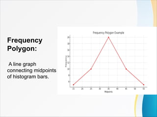
Frequency Polygon
A frequencypolygon uses:
a) Bars
b) Lines connecting midpoints
c) Circles
d) Percentages
Answer: b
The frequency polygon is similar to:
a) A pie chart
b) A line graph
c) A bar graph
d) A histogram
Answer: d
19.
General Questions
What isungrouped data?
a) Data categorized into intervals
b) Data not categorized
c) Data displayed in graphs
d) Data with percentages
Answer: b
Grouped data is usually organized into:
a) Random numbers
b) Categories without order
c) Intervals
d) Continuous trends
Answer: c
20.
Which graph showsdata as slices of a circle?
a) Bar graph
b) Histogram
c) Pie chart
d) Line chart
Answer: c
Why is a histogram useful?
a) It represents trends over time
b) It shows frequency distribution
c) It divides data into percentages
d) It represents categorical data
Answer: b
Which graph uses adjacent bars?
a) Pie chart
b) Histogram
c) Line graph
d) Bar graph
Answer: b


![Polymer [ बहुलक ] Chemistry Notes PDF - Irfanullah Mehar - JJ Sir Chemistry.pdf](https://cdn.slidesharecdn.com/ss_thumbnails/polymerchemistrynotespdf-irfanullahmehar-jjsirchemistry-260210172118-3f9b37f7-thumbnail.jpg?width=640&height=640&fit=bounds)


