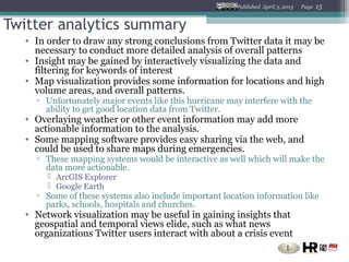
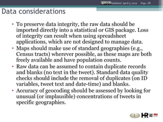
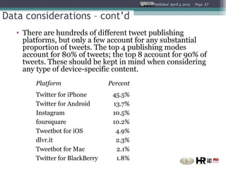
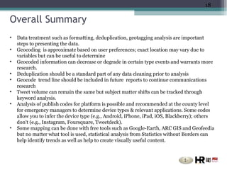
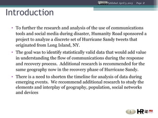
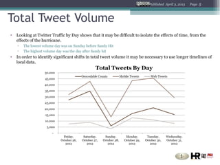
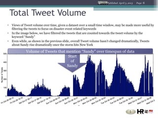
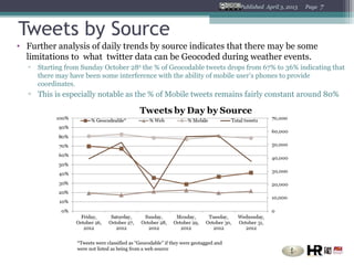
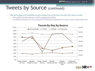
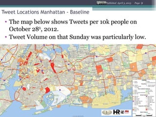
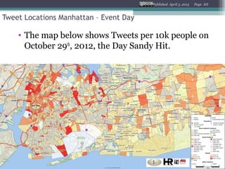
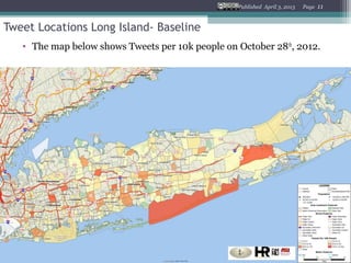
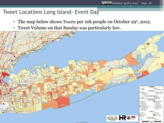
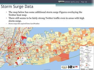
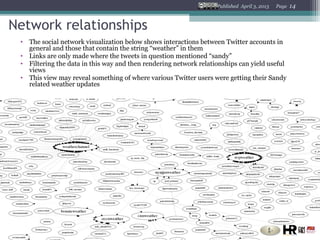
Analysis of Twitter Data during
    Hurricane Sandy
Statistics Without Borders And Humanity Road
With data aggregated by TweetTracker


1
Published April 3, 2013   Page   2


Introduction
 • To further the research and analysis of the use of communications
   tools and social media during disaster, Humanity Road sponsored a
   project to analyze a discrete set of Hurricane Sandy tweets that
   originated from Long Island, NY.
 • The goal was to identify statistically valid data that would add value
   in understanding the flow of communications during the response
   and recovery process. Additional research is recommended for the
   same geography now in the recovery phase of Hurricane Sandy.
 • There is a need to shorten the timeline for analysis of data during
   emerging events. We recommend additional research to study the
   elements and interplay of geography, population, social networks
   and devices
Published April 3, 2013   Page   3


The Team
 • This team explored what data may be available quickly that could be
   useful to disaster response organizations in response to an emerging
   event and also to identify what steps should be taken to increase
   and ensure ‘good clean data’ is used for the analysis.


 • The team included experienced members of the technology
   community. Statistics without Borders performed analysis on data
   that was aggregated by TweetTracker from Arizona State University
   Decision Machine Learning Lab (DMML). TweetTracker is a project
   sponsored by the Office of Naval Research)
Published April 3, 2013   Page   4


Parameters

 • Data set was collected for six days from October 26, 2012 through
   Oct 31, 2012 on a slow moving event, Hurricane Sandy.
 • The geoboundary set for research included all of Long Island
   Geocoding is approximate based on user preferences, exact location
   may vary due to variables in twitter, cell phone and service provider
   settings
 • The report was compiled in partnership with Statistics without
   Borders, for analysis with data aggregation by TweetTracker from
   Arizona State University DMML lab (a project sponsored by the
   Office of Naval Research)
Published April 3, 2013   Page   5


Total Tweet Volume
•   Looking at Twitter Traffic by Day shows that it may be difficult to isolate the effects of time, from the
    effects of the hurricane.
    ▫   The lowest volume day was on Sunday before Sandy Hit
    ▫   The highest volume day was the day after Sandy hit
•   In order to identify significant shifts in total tweet volume it may be necessary to use longer timelines of
    local data.
Published April 3, 2013   Page   6


    Total Tweet Volume
•   Views of Tweet volume over time, given a dataset over a small time window, may be made more useful by
    filtering the tweets to focus on disaster event related keywords
•   In the image below, we have filtered the tweets that are counted towards the tweet volume by the
    keyword “Sandy”
•   Even while, as shown in the previous slide, overall Tweet volume hasn’t changed dramatically, Tweets
    about Sandy rise dramatically once the storm hits New York

              Volume of Tweets that mention “Sandy” over timespan of data
                                     Start
                                      of
                                    Sandy
Published April 3, 2013   Page   7


Tweets by Source
• Further analysis of daily trends by source indicates that there may be some
  limitations to what twitter data can be Geocoded during weather events.
  ▫   Starting from Sunday October 28th the % of Geocodable tweets drops from 67% to 36% indicating that
      there may have been some interference with the ability of mobile user’s phones to provide
      coordinates.
  ▫ This is especially notable as the % of Mobile tweets remains fairly constant around 80%


                  *Tweets were classified as “Geocodable” if they were geotagged and
                  were not listed as being from a web source
Published April 3, 2013     Page   8


Tweets by Source                                               (continued)
▫   The percentage of Geocodable tweets remains low in the days just after the storm as well
       This could be caused by damage to mobile geotagging functionality.
       It could also represent more users turning off the GPS function of their phone in order to conserve phone battery life.
Published April 3, 2013   Page   9


Tweet Locations Manhattan - Baseline
 • The map below shows Tweets per 10k people on
   October 28th, 2012.
 • Tweet Volume on that Sunday was particularly low.
Published April 3, 2013   Page   10


Tweet Locations Manhattan – Event Day

    • The map below shows Tweets per 10k people on
      October 29th, 2012, the Day Sandy Hit.
Published April 3, 2013   Page   11


Tweet Locations Long Island- Baseline
   • The map below shows Tweets per 10k people on October 28 th, 2012.
Published April 3, 2013   Page   12


Tweet Locations Long Island- Event Day
    • The map below shows Tweets per 10k people on October 29th, 2012.
    • Tweet Volume on that Sunday was particularly low.
Published April 3, 2013   Page   13


Storm Surge Data
  • The map below has some additional storm surge Figures overlaying the
    Twitter heat map.
  • There still seems to be fairly strong Twitter traffic even in areas with high
    storm surge.
  •   Storm surge data aquired from AccuWeather
Published April 3, 2013   Page   14


Network relationships
 • The social network visualization below shows interactions between Twitter accounts in
   general and those that contain the string “weather” in them
 • Links are only made where the tweets in question mentioned “sandy”
 • Filtering the data in this way and then rendering network relationships can yield useful
   views
 • This view may reveal something of where various Twitter users were getting their Sandy
   related weather updates
Published April 3, 2013   Page   15


Twitter analytics summary
  • In order to draw any strong conclusions from Twitter data it may be
    necessary to conduct more detailed analysis of overall patterns
  • Insight may be gained by interactively visualizing the data and
    filtering for keywords of interest
  • Map visualization provides some information for locations and high
    volume areas, and overall patterns.
    ▫ Unfortunately major events like this hurricane may interfere with the
      ability to get good location data from Twitter.
  • Overlaying weather or other event information may add more
    actionable information to the analysis.
  • Some mapping software provides easy sharing via the web, and
    could be used to share maps during emergencies.
    ▫ These mapping systems would be interactive as well which will make the
      data more actionable.
        ArcGIS Explorer
        Google Earth
    ▫ Some of these systems also include important location information like
      parks, schools, hospitals and churches.
  • Network visualization may be useful in gaining insights that
    geospatial and temporal views elide, such as what news
    organizations Twitter users interact with about a crisis event
Published April 3, 2013   Page   16


Data considerations
   • To preserve data integrity, the raw data should be
     imported directly into a statistical or GIS package. Loss
     of integrity can result when using spreadsheet
     applications, which are not designed to manage data.
   • Maps should make use of standard geographies (e.g.,
     Census tracts) wherever possible, as these maps are both
     freely available and have population counts.
   • Raw data can be assumed to contain duplicate records
     and blanks (no text in the tweet). Standard data quality
     checks should include the removal of duplicates (on ID
     variables, tweet text and date-time) and blanks.
   • Accuracy of geocoding should be assessed by looking for
     unusual (or implausible) concentrations of tweets in
     specific geographies.
Published April 3, 2013   Page   17


Data considerations – cont’d
   • There are hundreds of different tweet publishing
     platforms, but only a few account for any substantial
     proportion of tweets. The top 4 publishing modes
     account for 80% of tweets; the top 8 account for 90% of
     tweets. These should be kept in mind when considering
     any type of device-specific content.
        Platform                 Percent
        Twitter for iPhone        45.5%
        Twitter for Android       13.7%
        Instagram                 10.5%
        foursquare                10.2%
        Tweetbot for iOS           4.9%
        dlvr.it                    2.3%
        Tweetbot for Mac           2.1%
        Twitter for BlackBerry     1.8%
18

Overall Summary
•   Data treatment such as formatting, deduplication, geotagging analysis are important
    steps to presenting the data.
•   Geocoding is approximate based on user preferences; exact location may vary due to
    variables but can be useful to determine
•   Geocoded information can decrease or degrade in certain type events and warrants more
    research.
•   Deduplication should be a standard part of any data cleaning prior to analysis
•   Geocode trend line should be included in future reports to continue communications
    research
•   Tweet volume can remain the same but subject matter shifts can be tracked through
    keyword analysis.
•   Analysis of publish codes for platform is possible and recommended at the county level
    for emergency managers to determine device types & relevant applications. Some codes
    allow you to infer the device type (e.g., Android, iPhone, iPad, iOS, Blackberry); others
    don't (e.g., Instagram, Foursquare, Tweetdeck).
•   Some mapping can be done with free tools such as Google-Earth, ARC GIS and Geofeedia
    but no matter what tool is used, statistical analysis from Statistics without Borders can
    help identify trends as well as help to create visually useful content.
Published April 3, 2013   Page   19


 Credits
Special thanks to the following for contributing their time and
dialogue to the preparation of this report
•Team selection Cathy Furlong, Statistics without Borders
•GIS and heat map results Paige Stover, Statistics without Borders
•Network Relationships Joshua Saxe, Statistics without Borders
•Analytics & data considerations by Tim B. Gravelle, Statistics without Borders
•Additional guidance and recommendations by Joanna Lane, NY VOST
•TweetTracker developed by Shamanth Kumar, Fred Morstatter and Dr. Huan Liu
Arizona State University DMML Lab under a grant from the Office of Naval Research
•Summary and Project Management by Cat Graham, Humanity Road
•Storm surge data acquired from AccuWeather

Analysis of Twitter Data During Hurricane Sandy

  • 1.
    Analysis of TwitterData during Hurricane Sandy Statistics Without Borders And Humanity Road With data aggregated by TweetTracker 1
  • 2.
    Published April 3,2013 Page 2 Introduction • To further the research and analysis of the use of communications tools and social media during disaster, Humanity Road sponsored a project to analyze a discrete set of Hurricane Sandy tweets that originated from Long Island, NY. • The goal was to identify statistically valid data that would add value in understanding the flow of communications during the response and recovery process. Additional research is recommended for the same geography now in the recovery phase of Hurricane Sandy. • There is a need to shorten the timeline for analysis of data during emerging events. We recommend additional research to study the elements and interplay of geography, population, social networks and devices
  • 3.
    Published April 3,2013 Page 3 The Team • This team explored what data may be available quickly that could be useful to disaster response organizations in response to an emerging event and also to identify what steps should be taken to increase and ensure ‘good clean data’ is used for the analysis. • The team included experienced members of the technology community. Statistics without Borders performed analysis on data that was aggregated by TweetTracker from Arizona State University Decision Machine Learning Lab (DMML). TweetTracker is a project sponsored by the Office of Naval Research)
  • 4.
    Published April 3,2013 Page 4 Parameters • Data set was collected for six days from October 26, 2012 through Oct 31, 2012 on a slow moving event, Hurricane Sandy. • The geoboundary set for research included all of Long Island Geocoding is approximate based on user preferences, exact location may vary due to variables in twitter, cell phone and service provider settings • The report was compiled in partnership with Statistics without Borders, for analysis with data aggregation by TweetTracker from Arizona State University DMML lab (a project sponsored by the Office of Naval Research)
  • 5.
    Published April 3,2013 Page 5 Total Tweet Volume • Looking at Twitter Traffic by Day shows that it may be difficult to isolate the effects of time, from the effects of the hurricane. ▫ The lowest volume day was on Sunday before Sandy Hit ▫ The highest volume day was the day after Sandy hit • In order to identify significant shifts in total tweet volume it may be necessary to use longer timelines of local data.
  • 6.
    Published April 3,2013 Page 6 Total Tweet Volume • Views of Tweet volume over time, given a dataset over a small time window, may be made more useful by filtering the tweets to focus on disaster event related keywords • In the image below, we have filtered the tweets that are counted towards the tweet volume by the keyword “Sandy” • Even while, as shown in the previous slide, overall Tweet volume hasn’t changed dramatically, Tweets about Sandy rise dramatically once the storm hits New York Volume of Tweets that mention “Sandy” over timespan of data Start of Sandy
  • 7.
    Published April 3,2013 Page 7 Tweets by Source • Further analysis of daily trends by source indicates that there may be some limitations to what twitter data can be Geocoded during weather events. ▫ Starting from Sunday October 28th the % of Geocodable tweets drops from 67% to 36% indicating that there may have been some interference with the ability of mobile user’s phones to provide coordinates. ▫ This is especially notable as the % of Mobile tweets remains fairly constant around 80% *Tweets were classified as “Geocodable” if they were geotagged and were not listed as being from a web source
  • 8.
    Published April 3,2013 Page 8 Tweets by Source (continued) ▫ The percentage of Geocodable tweets remains low in the days just after the storm as well  This could be caused by damage to mobile geotagging functionality.  It could also represent more users turning off the GPS function of their phone in order to conserve phone battery life.
  • 9.
    Published April 3,2013 Page 9 Tweet Locations Manhattan - Baseline • The map below shows Tweets per 10k people on October 28th, 2012. • Tweet Volume on that Sunday was particularly low.
  • 10.
    Published April 3,2013 Page 10 Tweet Locations Manhattan – Event Day • The map below shows Tweets per 10k people on October 29th, 2012, the Day Sandy Hit.
  • 11.
    Published April 3,2013 Page 11 Tweet Locations Long Island- Baseline • The map below shows Tweets per 10k people on October 28 th, 2012.
  • 12.
    Published April 3,2013 Page 12 Tweet Locations Long Island- Event Day • The map below shows Tweets per 10k people on October 29th, 2012. • Tweet Volume on that Sunday was particularly low.
  • 13.
    Published April 3,2013 Page 13 Storm Surge Data • The map below has some additional storm surge Figures overlaying the Twitter heat map. • There still seems to be fairly strong Twitter traffic even in areas with high storm surge. • Storm surge data aquired from AccuWeather
  • 14.
    Published April 3,2013 Page 14 Network relationships • The social network visualization below shows interactions between Twitter accounts in general and those that contain the string “weather” in them • Links are only made where the tweets in question mentioned “sandy” • Filtering the data in this way and then rendering network relationships can yield useful views • This view may reveal something of where various Twitter users were getting their Sandy related weather updates
  • 15.
    Published April 3,2013 Page 15 Twitter analytics summary • In order to draw any strong conclusions from Twitter data it may be necessary to conduct more detailed analysis of overall patterns • Insight may be gained by interactively visualizing the data and filtering for keywords of interest • Map visualization provides some information for locations and high volume areas, and overall patterns. ▫ Unfortunately major events like this hurricane may interfere with the ability to get good location data from Twitter. • Overlaying weather or other event information may add more actionable information to the analysis. • Some mapping software provides easy sharing via the web, and could be used to share maps during emergencies. ▫ These mapping systems would be interactive as well which will make the data more actionable.  ArcGIS Explorer  Google Earth ▫ Some of these systems also include important location information like parks, schools, hospitals and churches. • Network visualization may be useful in gaining insights that geospatial and temporal views elide, such as what news organizations Twitter users interact with about a crisis event
  • 16.
    Published April 3,2013 Page 16 Data considerations • To preserve data integrity, the raw data should be imported directly into a statistical or GIS package. Loss of integrity can result when using spreadsheet applications, which are not designed to manage data. • Maps should make use of standard geographies (e.g., Census tracts) wherever possible, as these maps are both freely available and have population counts. • Raw data can be assumed to contain duplicate records and blanks (no text in the tweet). Standard data quality checks should include the removal of duplicates (on ID variables, tweet text and date-time) and blanks. • Accuracy of geocoding should be assessed by looking for unusual (or implausible) concentrations of tweets in specific geographies.
  • 17.
    Published April 3,2013 Page 17 Data considerations – cont’d • There are hundreds of different tweet publishing platforms, but only a few account for any substantial proportion of tweets. The top 4 publishing modes account for 80% of tweets; the top 8 account for 90% of tweets. These should be kept in mind when considering any type of device-specific content. Platform Percent Twitter for iPhone 45.5% Twitter for Android 13.7% Instagram 10.5% foursquare 10.2% Tweetbot for iOS 4.9% dlvr.it 2.3% Tweetbot for Mac 2.1% Twitter for BlackBerry 1.8%
  • 18.
    18 Overall Summary • Data treatment such as formatting, deduplication, geotagging analysis are important steps to presenting the data. • Geocoding is approximate based on user preferences; exact location may vary due to variables but can be useful to determine • Geocoded information can decrease or degrade in certain type events and warrants more research. • Deduplication should be a standard part of any data cleaning prior to analysis • Geocode trend line should be included in future reports to continue communications research • Tweet volume can remain the same but subject matter shifts can be tracked through keyword analysis. • Analysis of publish codes for platform is possible and recommended at the county level for emergency managers to determine device types & relevant applications. Some codes allow you to infer the device type (e.g., Android, iPhone, iPad, iOS, Blackberry); others don't (e.g., Instagram, Foursquare, Tweetdeck). • Some mapping can be done with free tools such as Google-Earth, ARC GIS and Geofeedia but no matter what tool is used, statistical analysis from Statistics without Borders can help identify trends as well as help to create visually useful content.
  • 19.
    Published April 3,2013 Page 19 Credits Special thanks to the following for contributing their time and dialogue to the preparation of this report •Team selection Cathy Furlong, Statistics without Borders •GIS and heat map results Paige Stover, Statistics without Borders •Network Relationships Joshua Saxe, Statistics without Borders •Analytics & data considerations by Tim B. Gravelle, Statistics without Borders •Additional guidance and recommendations by Joanna Lane, NY VOST •TweetTracker developed by Shamanth Kumar, Fred Morstatter and Dr. Huan Liu Arizona State University DMML Lab under a grant from the Office of Naval Research •Summary and Project Management by Cat Graham, Humanity Road •Storm surge data acquired from AccuWeather