Download to read offline
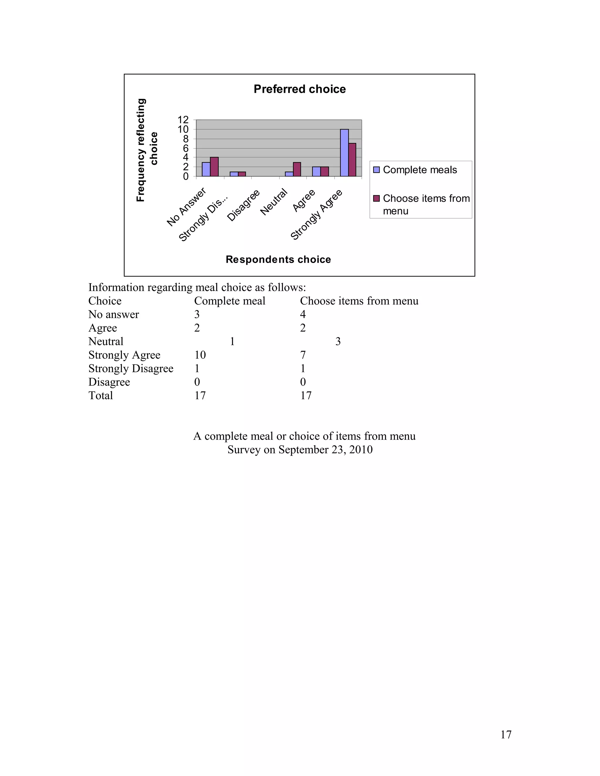
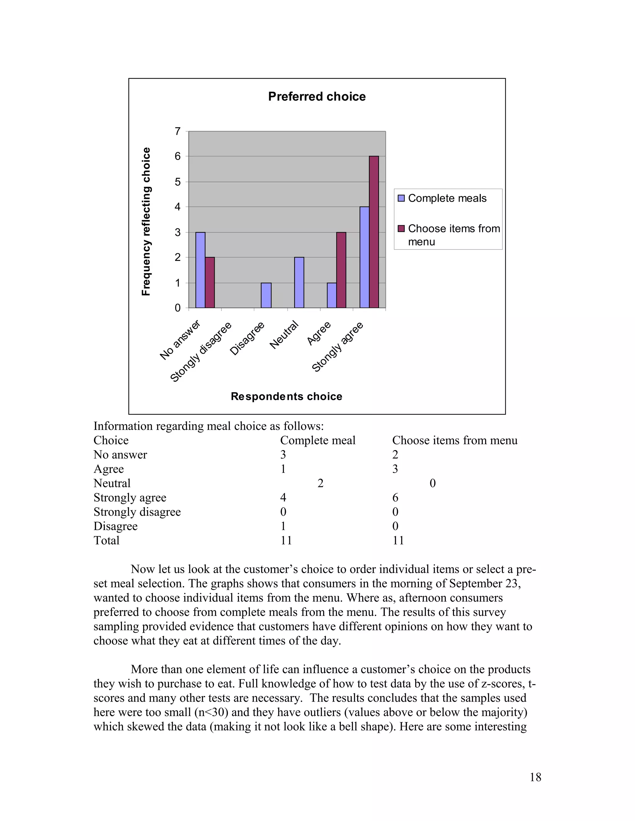

- Ellen Wells conducted a survey of customers at B&J's Café to study their preferences for complete meals or individual menu items. - She surveyed customers over two days, collecting data on age, influences on their choices, and prices paid for meals. - Ellen analyzed the data using statistical tests and found evidence that individual items are typically priced under $15, while there was no evidence that complete meals are usually priced over $15. This supports the hypothesis that customers prefer choosing individual menu items.