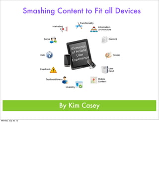
Smashing Content to Fit all Devices


                                By Kim Casey

Monday, July 30, 12
Mobile Devices Then


Monday, July 30, 12
             In	
  the	
  beginning	
  mobile	
  devices	
  were	
  created	
  	
  for	
  communication	
  purposes	
  only.	
  Slowly	
  they	
  evolved	
  into	
  what	
  is	
  termed	
  as	
  smart	
  phone	
  because	
  
             they	
  could	
  do	
  more	
  than	
  just	
  open	
  lines	
  of	
  communication.	
  
Mobile Devices Then
                                          Analog Motorola DynaTAC 8000X First Launched in 1983


Monday, July 30, 12
             In	
  the	
  beginning	
  mobile	
  devices	
  were	
  created	
  	
  for	
  communication	
  purposes	
  only.	
  Slowly	
  they	
  evolved	
  into	
  what	
  is	
  termed	
  as	
  smart	
  phone	
  because	
  
             they	
  could	
  do	
  more	
  than	
  just	
  open	
  lines	
  of	
  communication.	
  
Mobile Devices Now


Monday, July 30, 12
             With	
  the	
  ever-­‐growing	
  progress	
  of	
  smartphones,	
  users	
  can	
  access	
  just	
  as	
  much	
  information	
  in	
  the	
  palm	
  of	
  their	
  hand	
  as	
  they	
  can	
  from	
  any	
  computer.	
  
             The	
  only	
  difference	
  being	
  that	
  the	
  information	
  	
  on	
  a	
  smartphone	
  is	
  usually	
  accessed	
  for	
  instant	
  information	
  only.	
  Users	
  are	
  searching	
  but	
  they	
  are	
  not	
  
             browsing.	
  The	
  question	
  is	
  how	
  smart	
  is	
  it	
  if	
  the	
  content	
  isn’t	
  treated	
  equal?
Mobile Devices Now
                                                                                                                                                                         Communication
                                                                                                                                                                              Social Media
                                                                                                                                                                               eCommerce
                                                                                                                                                                                  Email
                                                                                                                                                                                Microsoft
                                                                                                                                                                               Compatible
                                                                                                                                                                                 Camera
                                                                                                                                                             GPS...
                                                                                                                                                   ...and So Much More!
Monday, July 30, 12
             With	
  the	
  ever-­‐growing	
  progress	
  of	
  smartphones,	
  users	
  can	
  access	
  just	
  as	
  much	
  information	
  in	
  the	
  palm	
  of	
  their	
  hand	
  as	
  they	
  can	
  from	
  any	
  computer.	
  
             The	
  only	
  difference	
  being	
  that	
  the	
  information	
  	
  on	
  a	
  smartphone	
  is	
  usually	
  accessed	
  for	
  instant	
  information	
  only.	
  Users	
  are	
  searching	
  but	
  they	
  are	
  not	
  
             browsing.	
  The	
  question	
  is	
  how	
  smart	
  is	
  it	
  if	
  the	
  content	
  isn’t	
  treated	
  equal?
Don’t Forget the Tablet


Monday, July 30, 12
             The	
  same	
  holds	
  true	
  for	
  the	
  rapid	
  expansion	
  of	
  the	
  tablet.	
  This	
  device	
  is	
  a	
  merge	
  between	
  the	
  smart	
  phone	
  and	
  the	
  laptop.	
  It	
  also	
  holds	
  a	
  unique	
  
             content	
  management	
  position.	
  	
  It	
  has	
  more	
  space	
  for	
  more	
  activities	
  and	
  is	
  incredibly	
  portable.	
  But	
  what	
  happens	
  when	
  the	
  sites	
  you	
  are	
  used	
  to	
  just	
  
             don’t	
  match	
  up	
  on	
  your	
  tablet?
Don’t Forget the Tablet


      Portable...
                    User Friendly...
                         Entertainment Based Yet ...
                                                                 Suitable for Business Functionality...
                                                                                                                                                                         and so much more!
Monday, July 30, 12
             The	
  same	
  holds	
  true	
  for	
  the	
  rapid	
  expansion	
  of	
  the	
  tablet.	
  This	
  device	
  is	
  a	
  merge	
  between	
  the	
  smart	
  phone	
  and	
  the	
  laptop.	
  It	
  also	
  holds	
  a	
  unique	
  
             content	
  management	
  position.	
  	
  It	
  has	
  more	
  space	
  for	
  more	
  activities	
  and	
  is	
  incredibly	
  portable.	
  But	
  what	
  happens	
  when	
  the	
  sites	
  you	
  are	
  used	
  to	
  just	
  
             don’t	
  match	
  up	
  on	
  your	
  tablet?
The Evolution of Mobile


Monday, July 30, 12
      So	
  with	
  the	
  explosion	
  of	
  devices	
  in	
  the	
  past	
  few	
  years	
  web	
  Designers	
  cannot	
  ignore	
  that	
  more	
  and	
  more	
  users	
  are	
  going	
  mobile.	
  They	
  are	
  searching	
  for	
  quick	
  
      Gix	
  content	
  or	
  browsing	
  in	
  a	
  more	
  laid	
  back	
  atmosphere,	
  on	
  the	
  bus,	
  in	
  a	
  hammock,	
  at	
  the	
  playground.	
  Structured	
  usability	
  was	
  once	
  thought	
  of	
  as	
  brilliant	
  in	
  
      the	
  invention	
  of	
  the	
  laptop	
  but	
  more	
  advance	
  capabilities	
  means	
  more	
  users,	
  more	
  reasons	
  for	
  using,	
  and	
  better	
  matched	
  content	
  to	
  devices	
  being	
  used.	


What Devices What Task


Monday, July 30, 12
             Simply	
  put,	
  users	
  on	
  a	
  smart	
  phone	
  are	
  looking	
  for	
  speciGic	
  information	
  like;	
  the	
  number	
  to	
  a	
  restaurant,	
  Glight	
  information,	
  directions.	
  Tablet	
  users	
  are	
  
             usually	
  going	
  a	
  little	
  deeper	
  for	
  information,	
  maybe	
  watching	
  a	
  movie,	
  searching	
  YouTube,	
  Checking	
  Facebook,	
  using	
  an	
  eReader,	
  or	
  making	
  a	
  
             purchase.	
  People	
  are	
  using	
  there	
  devices	
  to	
  Git	
  the	
  needs	
  of	
  their	
  tasks.	
  Very	
  rarely	
  are	
  users	
  typing	
  up	
  a	
  report	
  using	
  work	
  document	
  on	
  a	
  
             smartphone,	
  even	
  though	
  they	
  could.	
  Unfortunately	
  the	
  availability	
  to	
  do	
  so	
  doesn’t	
  exactly	
  make	
  it	
  an	
  advantage	
  because	
  the	
  challenge	
  of	
  doing	
  so	
  on	
  
             such	
  a	
  small	
  device	
  would	
  prove	
  to	
  be	
  monotonous.	
  Fixing	
  or	
  adjusting	
  a	
  repost	
  before	
  emailing	
  may	
  be	
  an	
  option.	
  
What Devices What Task
                                                                                                                 Communication Email
                                                                                                                    Directions Weather
                                                                                                                     Stats Gaming Scheduling

                                                                                                                     Moderate Web Browsing


                                                                                   Everything Smartphones can do...

                                        but with more content capabilities and speed!
Monday, July 30, 12
             Simply	
  put,	
  users	
  on	
  a	
  smart	
  phone	
  are	
  looking	
  for	
  speciGic	
  information	
  like;	
  the	
  number	
  to	
  a	
  restaurant,	
  Glight	
  information,	
  directions.	
  Tablet	
  users	
  are	
  
             usually	
  going	
  a	
  little	
  deeper	
  for	
  information,	
  maybe	
  watching	
  a	
  movie,	
  searching	
  YouTube,	
  Checking	
  Facebook,	
  using	
  an	
  eReader,	
  or	
  making	
  a	
  
             purchase.	
  People	
  are	
  using	
  there	
  devices	
  to	
  Git	
  the	
  needs	
  of	
  their	
  tasks.	
  Very	
  rarely	
  are	
  users	
  typing	
  up	
  a	
  report	
  using	
  work	
  document	
  on	
  a	
  
             smartphone,	
  even	
  though	
  they	
  could.	
  Unfortunately	
  the	
  availability	
  to	
  do	
  so	
  doesn’t	
  exactly	
  make	
  it	
  an	
  advantage	
  because	
  the	
  challenge	
  of	
  doing	
  so	
  on	
  
             such	
  a	
  small	
  device	
  would	
  prove	
  to	
  be	
  monotonous.	
  Fixing	
  or	
  adjusting	
  a	
  repost	
  before	
  emailing	
  may	
  be	
  an	
  option.	
  
Content Fits the Device


Monday, July 30, 12
   	
     In	
  recent	
  years	
  we	
  as	
  designers	
  ignored	
  the	
  potential	
  in	
  our	
  smaller	
  traveling	
  companions	
  that	
  were	
  mobile	
  devices.	
  We	
  ignored	
  just	
  how	
  much	
  of	
  an	
  impact	
  
          that	
  their	
  growing	
  numbers	
  would	
  have	
  on	
  eCommerce,	
  and	
  Internet	
  browsing.	
  As	
  developers	
  we	
  accepted	
  shortening	
  content	
  to	
  Git	
  the	
  device,	
  when	
  in	
  
          actuality	
  we	
  have	
  to	
  enhance	
  the	
  content	
  to	
  Git	
  the	
  devise.	
  
   	
     Smartphone	
  content	
  Is	
  much	
  like	
  a	
  presentation:	
  content	
  is	
  short	
  and	
  understandable,	
  and	
  the	
  premise	
  is	
  easily	
  accessible	
  and	
  understood.	
  Tablets	
  are	
  
          smaller	
  versions	
  of	
  a	
  computers	
  and	
  are	
  easily	
  transported	
  for	
  content	
  rich	
  experiences.	
  
Content Fits the Device


                                                                                                                   In short;
                                                                                                          “when the shoe fits wear it...
                                                                                                                  or buy it.”


Monday, July 30, 12
   	
     In	
  recent	
  years	
  we	
  as	
  designers	
  ignored	
  the	
  potential	
  in	
  our	
  smaller	
  traveling	
  companions	
  that	
  were	
  mobile	
  devices.	
  We	
  ignored	
  just	
  how	
  much	
  of	
  an	
  impact	
  
          that	
  their	
  growing	
  numbers	
  would	
  have	
  on	
  eCommerce,	
  and	
  Internet	
  browsing.	
  As	
  developers	
  we	
  accepted	
  shortening	
  content	
  to	
  Git	
  the	
  device,	
  when	
  in	
  
          actuality	
  we	
  have	
  to	
  enhance	
  the	
  content	
  to	
  Git	
  the	
  devise.	
  
   	
     Smartphone	
  content	
  Is	
  much	
  like	
  a	
  presentation:	
  content	
  is	
  short	
  and	
  understandable,	
  and	
  the	
  premise	
  is	
  easily	
  accessible	
  and	
  understood.	
  Tablets	
  are	
  
          smaller	
  versions	
  of	
  a	
  computers	
  and	
  are	
  easily	
  transported	
  for	
  content	
  rich	
  experiences.	
  
The Good..... the Bad.... and the Ugly

                    eBay                                                                               FaceBook                                                                                   Craig’s List


Monday, July 30, 12
      Good	
  =	
  eBay

      A	
  	
  good	
  example	
  of	
  smashing	
  content	
  to	
  Git	
  mobile	
  devices	
  would	
  be	
  eBay.	
  Ebay	
  has	
  created	
  a	
  great	
  app	
  for	
  smartphones	
  that	
  enhance	
  users	
  capabilities	
  all	
  
      in	
  the	
  palm	
  of	
  your	
  hand.	
  Images	
  are	
  easy	
  to	
  view	
  and	
  access	
  and	
  the	
  application	
  send	
  out	
  messages	
  for	
  instant	
  bidding.	
  

      Bad	
  =	
  Facebook

      While	
  I	
  have	
  to	
  admit	
  I	
  am	
  addicted	
  to	
  my	
  Facebook	
  on	
  the	
  go,	
  the	
  app	
  is	
  slow	
  to	
  upload	
  pictures	
  and	
  the	
  front	
  page	
  of	
  the	
  content	
  on	
  any	
  mobile	
  device	
  is	
  
      small	
  and	
  not	
  very	
  user	
  friendly.	
  This	
  is	
  a	
  site	
  that	
  needs	
  some	
  more	
  tweaking,	
  so	
  I	
  labeled	
  it	
  bad.	
  

      Ugly	
  =	
  Craig’s	
  list

      When	
  I	
  pulled	
  up	
  Craig’s	
  list	
  using	
  my	
  iPhone	
  the	
  content	
  looked	
  much	
  like	
  the	
  web	
  sites	
  from	
  the	
  past.	
  The	
  look	
  was	
  mostly	
  blue	
  linked	
  content,	
  no	
  images	
  
      and	
  not	
  very	
  user	
  friendly.	
  
Jeff’s Examples?


Monday, July 30, 12
In Jeff Starr’s article, “The Five Minute CSS Mobile make over.” he gives multiple examples of what bad sites on mobile devises looks like. The
premise of his article is an easy code to style sheets that help solve this problem.
Jeff’s Examples?


           Enter Mobile Style Sheets (Starr, 2009).


Monday, July 30, 12
In Jeff Starr’s article, “The Five Minute CSS Mobile make over.” he gives multiple examples of what bad sites on mobile devises looks like. The
premise of his article is an easy code to style sheets that help solve this problem.
Mobile Expansion and Web Design


Monday, July 30, 12
Mobile Expansion and Web Design


                                   So much better!


Monday, July 30, 12
Collins Catering


Monday, July 30, 12
      To	
  create	
  a	
  mobile	
  friendly	
  experience	
  for	
  Collin’s	
  Catering	
  mobile	
  and	
  handheld	
  coding	
  should	
  be	
  added	
  to	
  the	
  CSS	
  style	
  sheets.	
  This	
  will	
  create	
  a	
  dramatic	
  
      look	
  and	
  feel	
  for	
  the	
  mobile	
  users	
  and	
  high	
  light	
  the	
  features	
  that	
  mobile	
  users	
  will	
  be	
  looking	
  for,	
  such	
  as	
  directions,	
  contact	
  information,	
  and	
  a	
  quick	
  scan	
  of	
  
      a	
  menu.	
  
References
           Starr, J. (2009) The Five Minute CSS Mobile Make over. .

                 Retrieved July 30, 2012. From. http://perishablepress.com/the-5-minute-css-mobile-makeover/


        http://collinscateringfla.com/index.htm


Monday, July 30, 12

Smashing

  • 1.
    Smashing Content toFit all Devices By Kim Casey Monday, July 30, 12
  • 2.
    Mobile Devices Then Monday,July 30, 12 In  the  beginning  mobile  devices  were  created    for  communication  purposes  only.  Slowly  they  evolved  into  what  is  termed  as  smart  phone  because   they  could  do  more  than  just  open  lines  of  communication.  
  • 3.
    Mobile Devices Then Analog Motorola DynaTAC 8000X First Launched in 1983 Monday, July 30, 12 In  the  beginning  mobile  devices  were  created    for  communication  purposes  only.  Slowly  they  evolved  into  what  is  termed  as  smart  phone  because   they  could  do  more  than  just  open  lines  of  communication.  
  • 4.
    Mobile Devices Now Monday,July 30, 12 With  the  ever-­‐growing  progress  of  smartphones,  users  can  access  just  as  much  information  in  the  palm  of  their  hand  as  they  can  from  any  computer.   The  only  difference  being  that  the  information    on  a  smartphone  is  usually  accessed  for  instant  information  only.  Users  are  searching  but  they  are  not   browsing.  The  question  is  how  smart  is  it  if  the  content  isn’t  treated  equal?
  • 5.
    Mobile Devices Now Communication Social Media eCommerce Email Microsoft Compatible Camera GPS... ...and So Much More! Monday, July 30, 12 With  the  ever-­‐growing  progress  of  smartphones,  users  can  access  just  as  much  information  in  the  palm  of  their  hand  as  they  can  from  any  computer.   The  only  difference  being  that  the  information    on  a  smartphone  is  usually  accessed  for  instant  information  only.  Users  are  searching  but  they  are  not   browsing.  The  question  is  how  smart  is  it  if  the  content  isn’t  treated  equal?
  • 6.
    Don’t Forget theTablet Monday, July 30, 12 The  same  holds  true  for  the  rapid  expansion  of  the  tablet.  This  device  is  a  merge  between  the  smart  phone  and  the  laptop.  It  also  holds  a  unique   content  management  position.    It  has  more  space  for  more  activities  and  is  incredibly  portable.  But  what  happens  when  the  sites  you  are  used  to  just   don’t  match  up  on  your  tablet?
  • 7.
    Don’t Forget theTablet Portable... User Friendly... Entertainment Based Yet ... Suitable for Business Functionality... and so much more! Monday, July 30, 12 The  same  holds  true  for  the  rapid  expansion  of  the  tablet.  This  device  is  a  merge  between  the  smart  phone  and  the  laptop.  It  also  holds  a  unique   content  management  position.    It  has  more  space  for  more  activities  and  is  incredibly  portable.  But  what  happens  when  the  sites  you  are  used  to  just   don’t  match  up  on  your  tablet?
  • 8.
    The Evolution ofMobile Monday, July 30, 12 So  with  the  explosion  of  devices  in  the  past  few  years  web  Designers  cannot  ignore  that  more  and  more  users  are  going  mobile.  They  are  searching  for  quick   Gix  content  or  browsing  in  a  more  laid  back  atmosphere,  on  the  bus,  in  a  hammock,  at  the  playground.  Structured  usability  was  once  thought  of  as  brilliant  in   the  invention  of  the  laptop  but  more  advance  capabilities  means  more  users,  more  reasons  for  using,  and  better  matched  content  to  devices  being  used.    
  • 9.
    What Devices WhatTask Monday, July 30, 12 Simply  put,  users  on  a  smart  phone  are  looking  for  speciGic  information  like;  the  number  to  a  restaurant,  Glight  information,  directions.  Tablet  users  are   usually  going  a  little  deeper  for  information,  maybe  watching  a  movie,  searching  YouTube,  Checking  Facebook,  using  an  eReader,  or  making  a   purchase.  People  are  using  there  devices  to  Git  the  needs  of  their  tasks.  Very  rarely  are  users  typing  up  a  report  using  work  document  on  a   smartphone,  even  though  they  could.  Unfortunately  the  availability  to  do  so  doesn’t  exactly  make  it  an  advantage  because  the  challenge  of  doing  so  on   such  a  small  device  would  prove  to  be  monotonous.  Fixing  or  adjusting  a  repost  before  emailing  may  be  an  option.  
  • 10.
    What Devices WhatTask Communication Email Directions Weather Stats Gaming Scheduling Moderate Web Browsing Everything Smartphones can do... but with more content capabilities and speed! Monday, July 30, 12 Simply  put,  users  on  a  smart  phone  are  looking  for  speciGic  information  like;  the  number  to  a  restaurant,  Glight  information,  directions.  Tablet  users  are   usually  going  a  little  deeper  for  information,  maybe  watching  a  movie,  searching  YouTube,  Checking  Facebook,  using  an  eReader,  or  making  a   purchase.  People  are  using  there  devices  to  Git  the  needs  of  their  tasks.  Very  rarely  are  users  typing  up  a  report  using  work  document  on  a   smartphone,  even  though  they  could.  Unfortunately  the  availability  to  do  so  doesn’t  exactly  make  it  an  advantage  because  the  challenge  of  doing  so  on   such  a  small  device  would  prove  to  be  monotonous.  Fixing  or  adjusting  a  repost  before  emailing  may  be  an  option.  
  • 11.
    Content Fits theDevice Monday, July 30, 12   In  recent  years  we  as  designers  ignored  the  potential  in  our  smaller  traveling  companions  that  were  mobile  devices.  We  ignored  just  how  much  of  an  impact   that  their  growing  numbers  would  have  on  eCommerce,  and  Internet  browsing.  As  developers  we  accepted  shortening  content  to  Git  the  device,  when  in   actuality  we  have  to  enhance  the  content  to  Git  the  devise.     Smartphone  content  Is  much  like  a  presentation:  content  is  short  and  understandable,  and  the  premise  is  easily  accessible  and  understood.  Tablets  are   smaller  versions  of  a  computers  and  are  easily  transported  for  content  rich  experiences.  
  • 12.
    Content Fits theDevice In short; “when the shoe fits wear it... or buy it.” Monday, July 30, 12   In  recent  years  we  as  designers  ignored  the  potential  in  our  smaller  traveling  companions  that  were  mobile  devices.  We  ignored  just  how  much  of  an  impact   that  their  growing  numbers  would  have  on  eCommerce,  and  Internet  browsing.  As  developers  we  accepted  shortening  content  to  Git  the  device,  when  in   actuality  we  have  to  enhance  the  content  to  Git  the  devise.     Smartphone  content  Is  much  like  a  presentation:  content  is  short  and  understandable,  and  the  premise  is  easily  accessible  and  understood.  Tablets  are   smaller  versions  of  a  computers  and  are  easily  transported  for  content  rich  experiences.  
  • 13.
    The Good..... theBad.... and the Ugly eBay FaceBook Craig’s List Monday, July 30, 12 Good  =  eBay A    good  example  of  smashing  content  to  Git  mobile  devices  would  be  eBay.  Ebay  has  created  a  great  app  for  smartphones  that  enhance  users  capabilities  all   in  the  palm  of  your  hand.  Images  are  easy  to  view  and  access  and  the  application  send  out  messages  for  instant  bidding.   Bad  =  Facebook While  I  have  to  admit  I  am  addicted  to  my  Facebook  on  the  go,  the  app  is  slow  to  upload  pictures  and  the  front  page  of  the  content  on  any  mobile  device  is   small  and  not  very  user  friendly.  This  is  a  site  that  needs  some  more  tweaking,  so  I  labeled  it  bad.   Ugly  =  Craig’s  list When  I  pulled  up  Craig’s  list  using  my  iPhone  the  content  looked  much  like  the  web  sites  from  the  past.  The  look  was  mostly  blue  linked  content,  no  images   and  not  very  user  friendly.  
  • 14.
    Jeff’s Examples? Monday, July30, 12 In Jeff Starr’s article, “The Five Minute CSS Mobile make over.” he gives multiple examples of what bad sites on mobile devises looks like. The premise of his article is an easy code to style sheets that help solve this problem.
  • 15.
    Jeff’s Examples? Enter Mobile Style Sheets (Starr, 2009). Monday, July 30, 12 In Jeff Starr’s article, “The Five Minute CSS Mobile make over.” he gives multiple examples of what bad sites on mobile devises looks like. The premise of his article is an easy code to style sheets that help solve this problem.
  • 16.
    Mobile Expansion andWeb Design Monday, July 30, 12
  • 17.
    Mobile Expansion andWeb Design So much better! Monday, July 30, 12
  • 18.
    Collins Catering Monday, July30, 12 To  create  a  mobile  friendly  experience  for  Collin’s  Catering  mobile  and  handheld  coding  should  be  added  to  the  CSS  style  sheets.  This  will  create  a  dramatic   look  and  feel  for  the  mobile  users  and  high  light  the  features  that  mobile  users  will  be  looking  for,  such  as  directions,  contact  information,  and  a  quick  scan  of   a  menu.  
  • 19.
    Collins Catering Monday, July30, 12 To  create  a  mobile  friendly  experience  for  Collin’s  Catering  mobile  and  handheld  coding  should  be  added  to  the  CSS  style  sheets.  This  will  create  a  dramatic   look  and  feel  for  the  mobile  users  and  high  light  the  features  that  mobile  users  will  be  looking  for,  such  as  directions,  contact  information,  and  a  quick  scan  of   a  menu.  
  • 20.
    References Starr, J. (2009) The Five Minute CSS Mobile Make over. . Retrieved July 30, 2012. From. http://perishablepress.com/the-5-minute-css-mobile-makeover/ http://collinscateringfla.com/index.htm Monday, July 30, 12