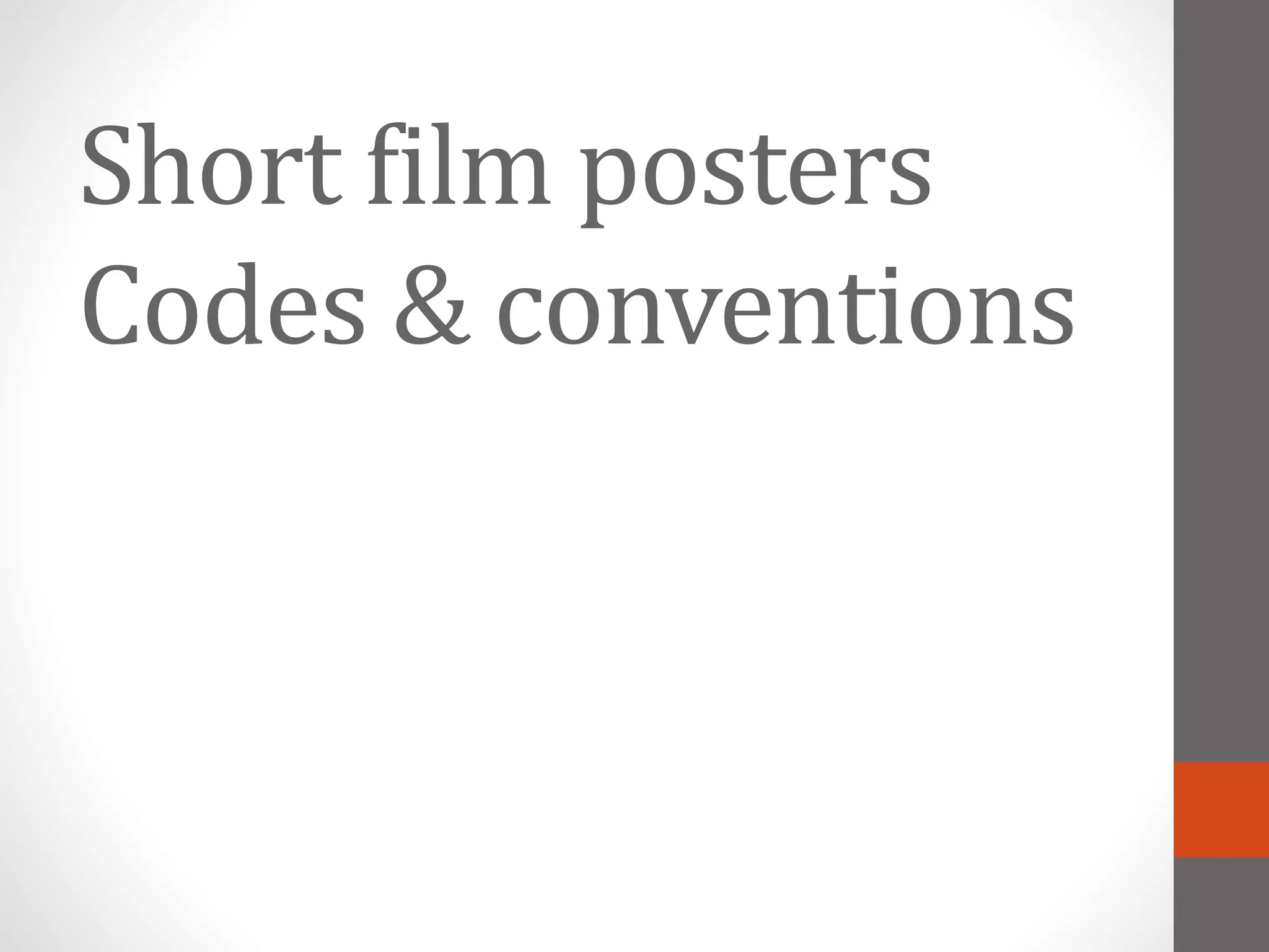
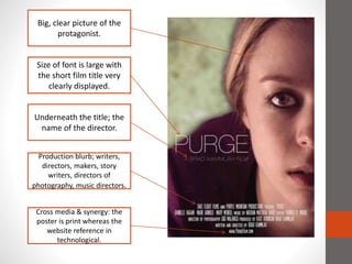
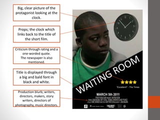
Short film posters
Codes & conventions
Big, clear picture of the
protagonist.
Size of font is large with
the short film title very
clearly displayed.
Underneath the title; the
name of the director.
Cross media & synergy: the
poster is print whereas the
website reference in
technological.
Production blurb; writers,
directors, makers, story
writers, directors of
photography, music directors.
Big, clear picture of the
protagonist looking at the
clock.
Props; the clock which
links back to the title of
the short film.
Criticism through rating and a
one-worded quote.
The newspaper is also
mentioned.
Title is displayed through
a big and bald font in
black and white.
Production blurb; writers,
directors, makers, story
writers, directors of
photography, music directors.
Production blurb; writers,
directors, music directors,
producers.
Extra large font which
brings more emphasise on
the title.
A bigger emphasise on the
house and smaller emphasise
on the protagonist.
Cross media and synergy:
the poster is print and the
website is technological.
Small and hidden credits
informing the audience about
the writer & producer.
All in all
• Big and bold font and therefore clear title.
• The vast majority of the short film posters consists of the
protagonist, this seems to be an important convention of short film
posters.
• Conventionally the lighting and positioning of the actors will reflect
on their role of the actors. For example, if an actor is placed in the
middle of the frame it would mean that he/she is the main
character.
Other conventions
• Portrait
• Simple
• Bald fonts
• Unique & Original
• Minimal text
• Cross media

Short film posters - Codes and conventions

  • 1.
  • 2.
    Big, clear pictureof the protagonist. Size of font is large with the short film title very clearly displayed. Underneath the title; the name of the director. Cross media & synergy: the poster is print whereas the website reference in technological. Production blurb; writers, directors, makers, story writers, directors of photography, music directors.
  • 3.
    Big, clear pictureof the protagonist looking at the clock. Props; the clock which links back to the title of the short film. Criticism through rating and a one-worded quote. The newspaper is also mentioned. Title is displayed through a big and bald font in black and white. Production blurb; writers, directors, makers, story writers, directors of photography, music directors.
  • 4.
    Production blurb; writers, directors,music directors, producers. Extra large font which brings more emphasise on the title. A bigger emphasise on the house and smaller emphasise on the protagonist. Cross media and synergy: the poster is print and the website is technological. Small and hidden credits informing the audience about the writer & producer.
  • 5.
    All in all •Big and bold font and therefore clear title. • The vast majority of the short film posters consists of the protagonist, this seems to be an important convention of short film posters. • Conventionally the lighting and positioning of the actors will reflect on their role of the actors. For example, if an actor is placed in the middle of the frame it would mean that he/she is the main character. Other conventions • Portrait • Simple • Bald fonts • Unique & Original • Minimal text • Cross media