Download to read offline
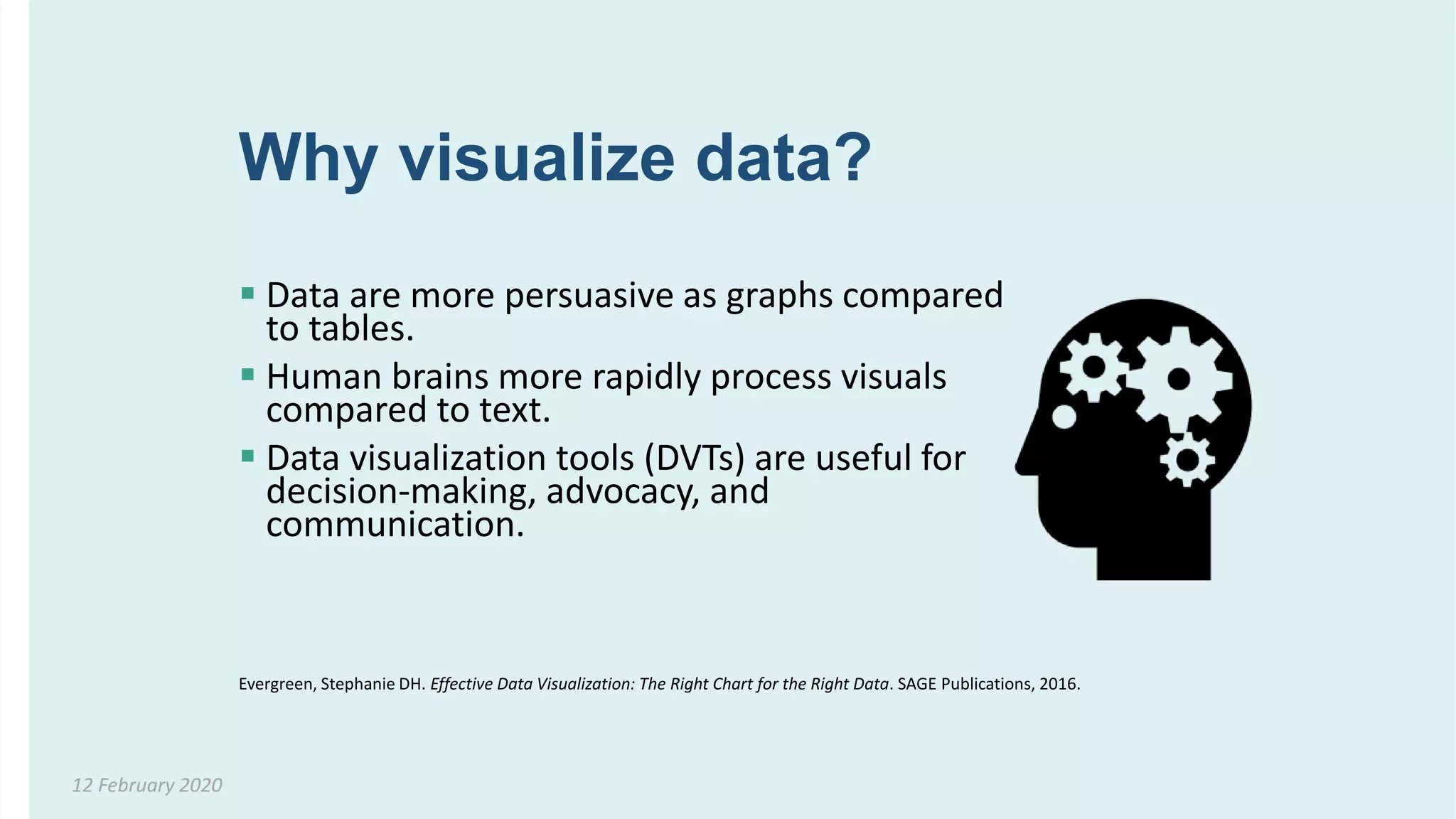
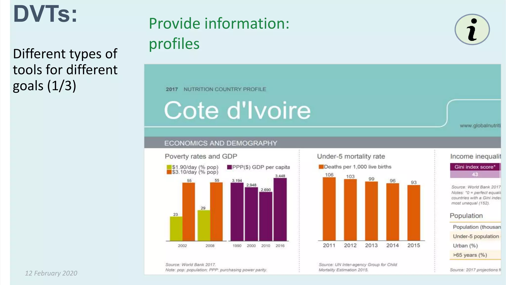
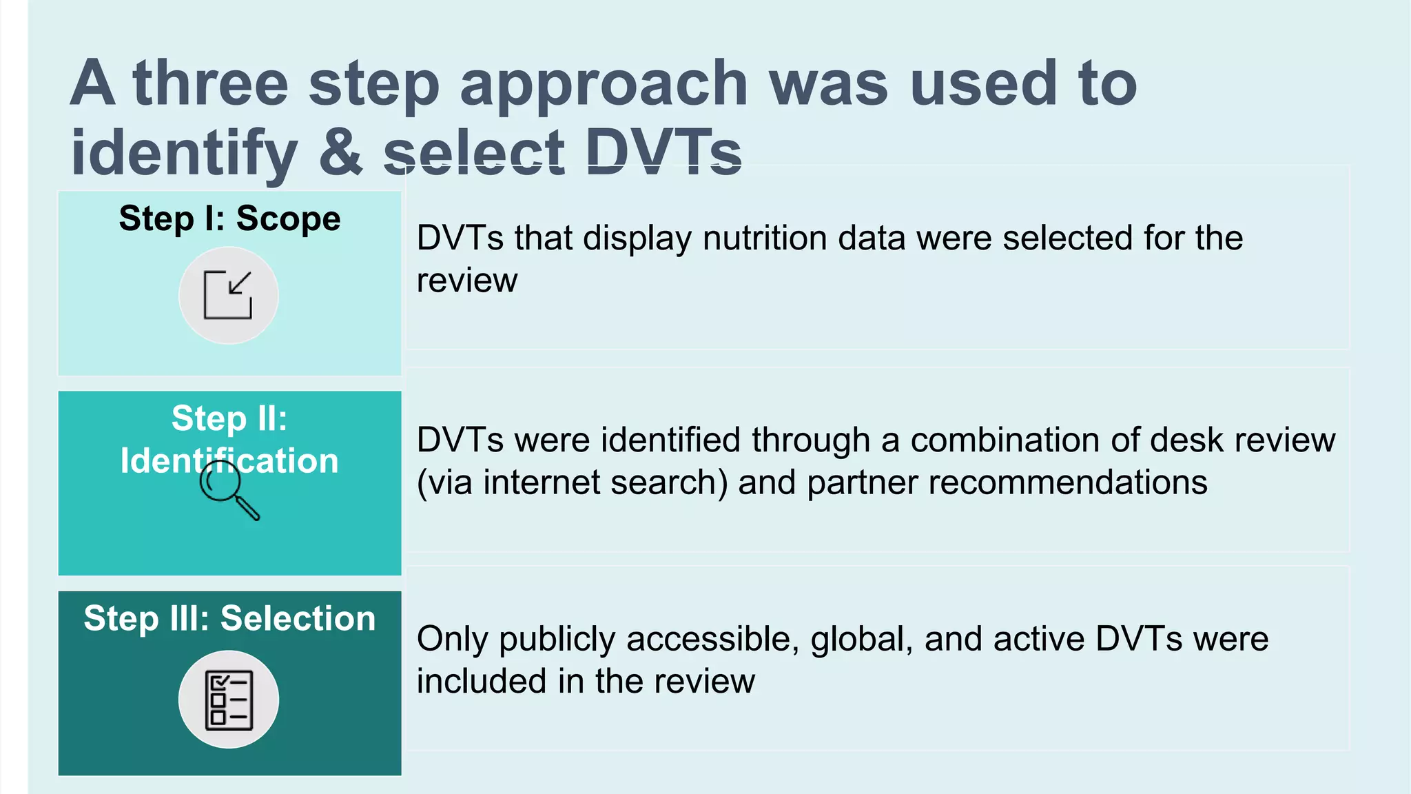
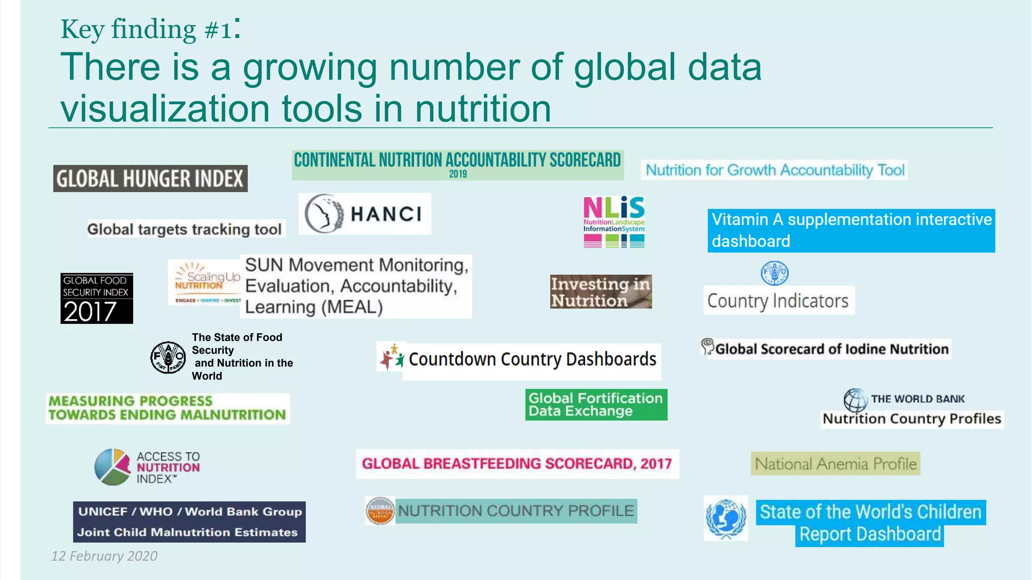
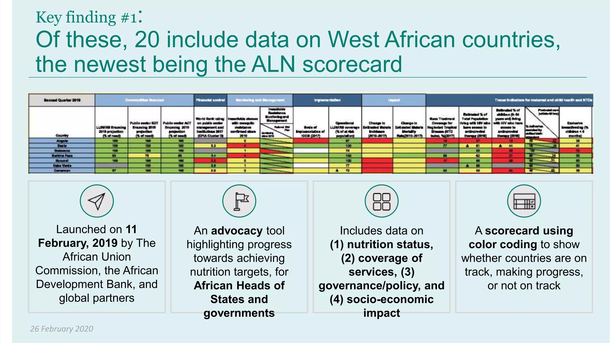
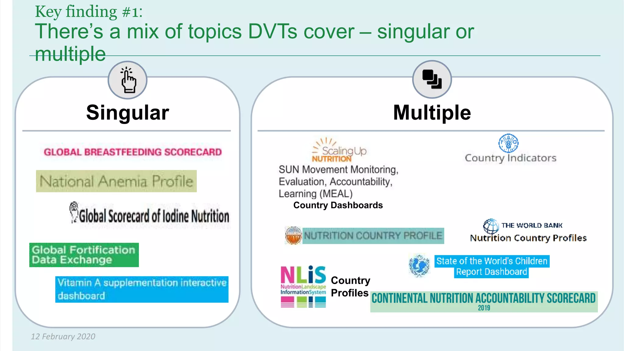
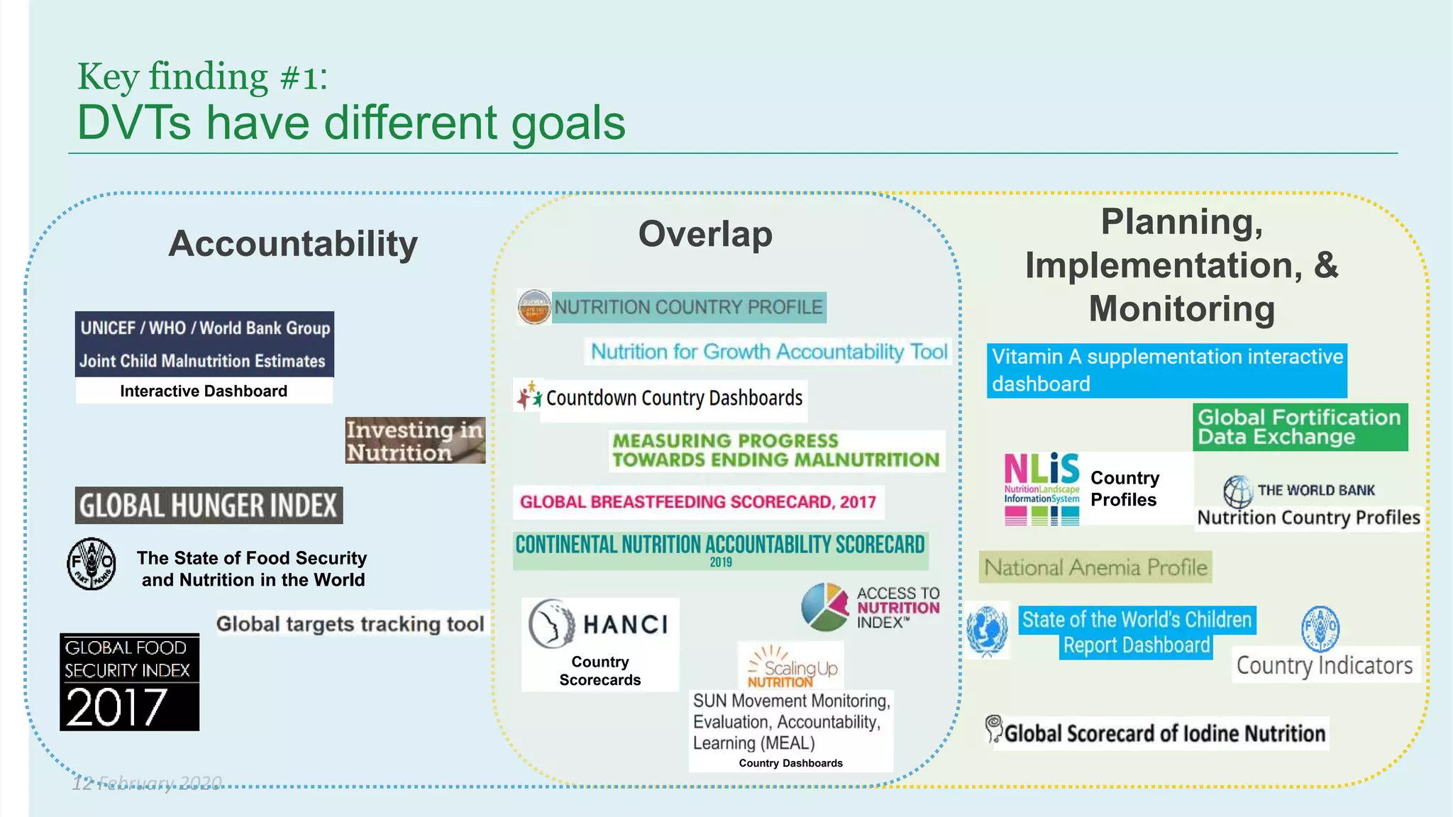
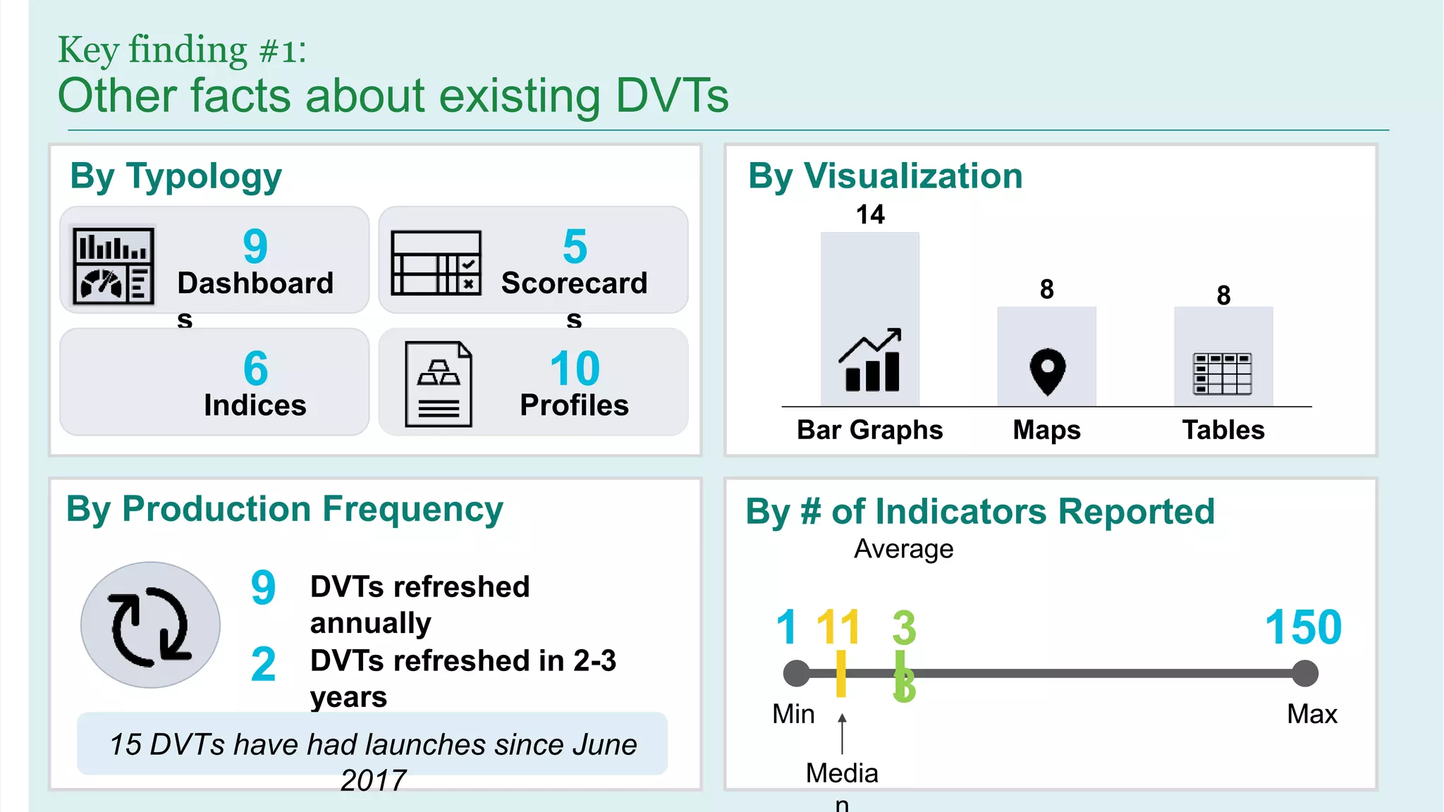
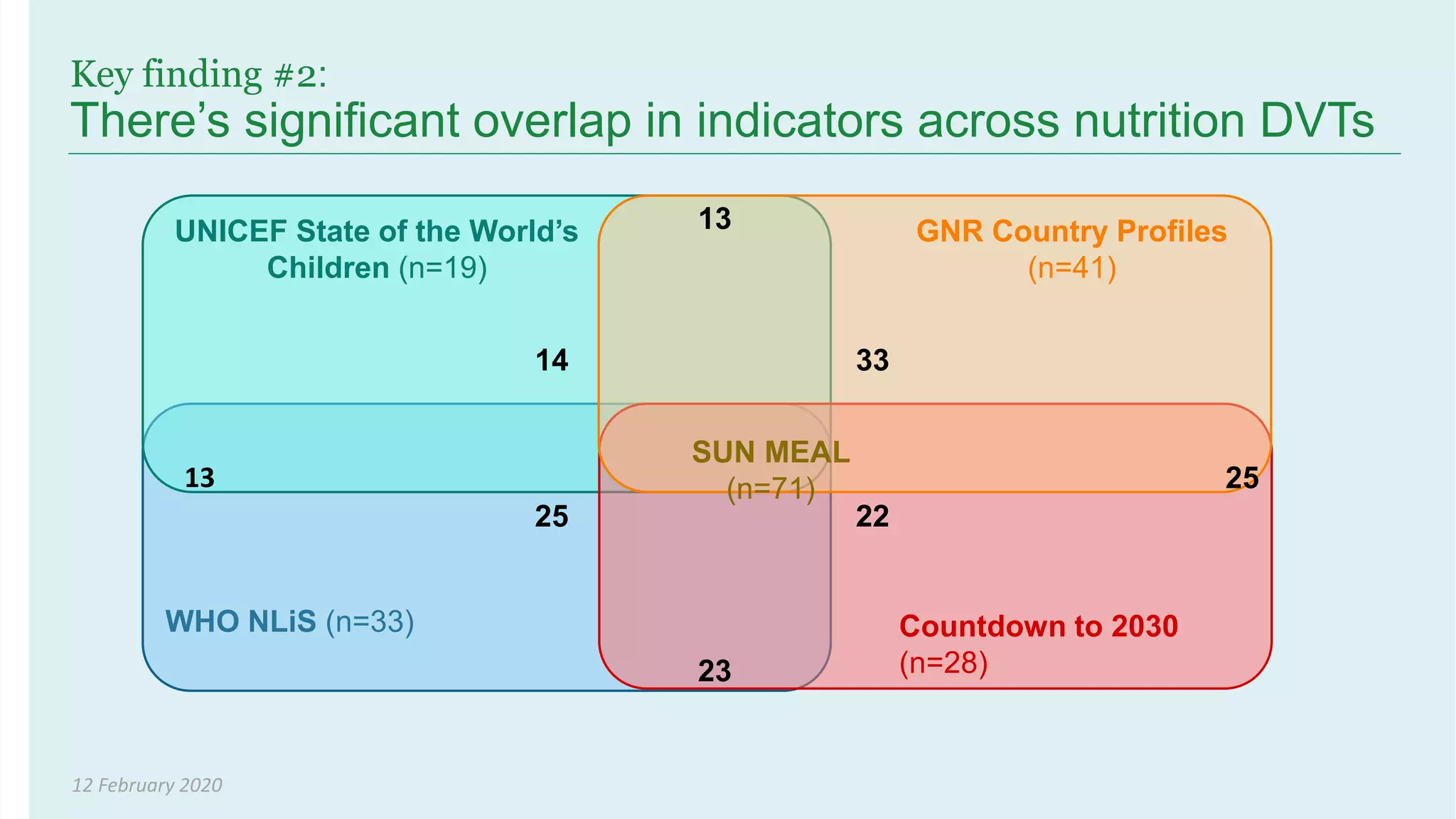
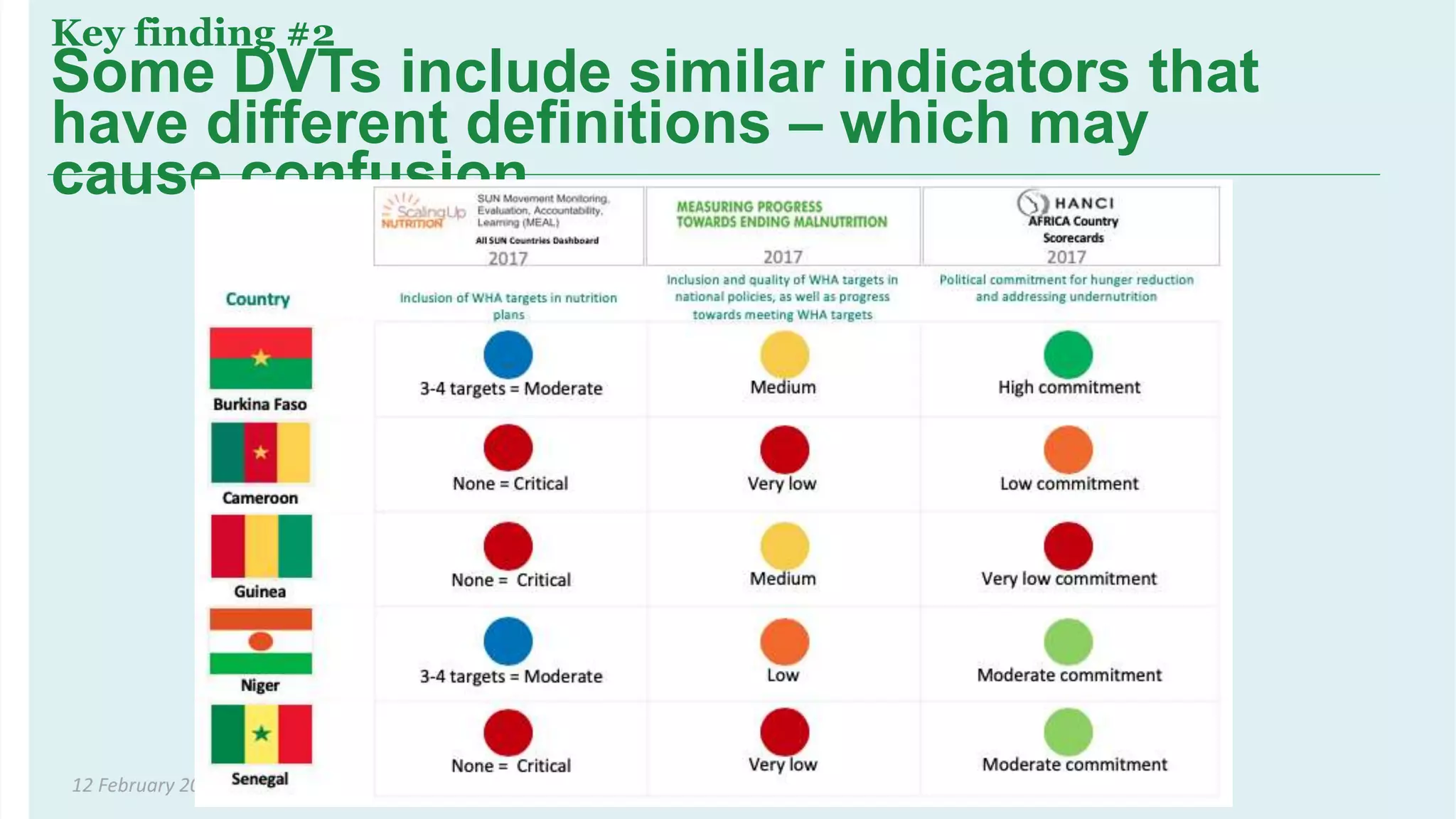
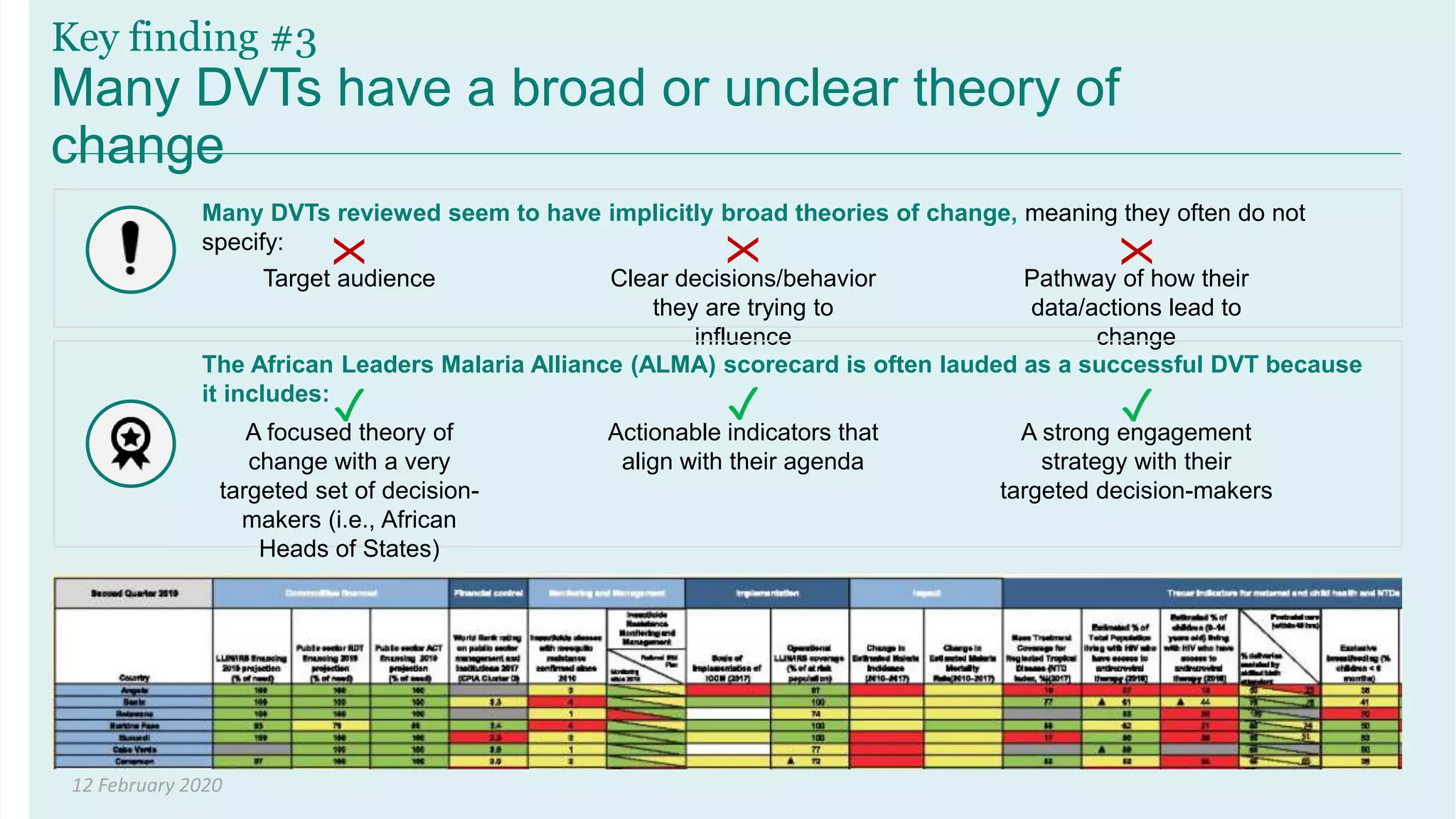
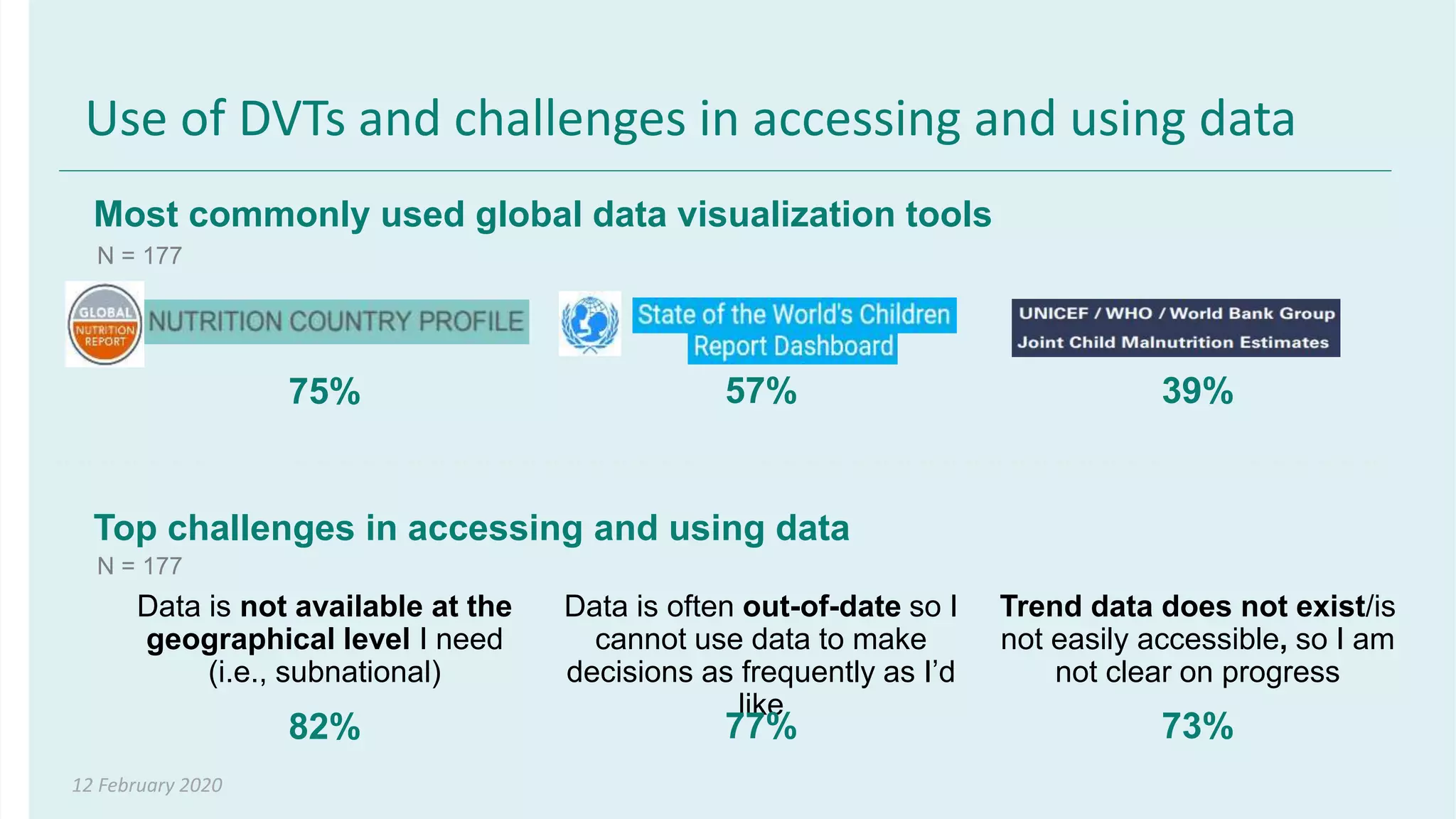

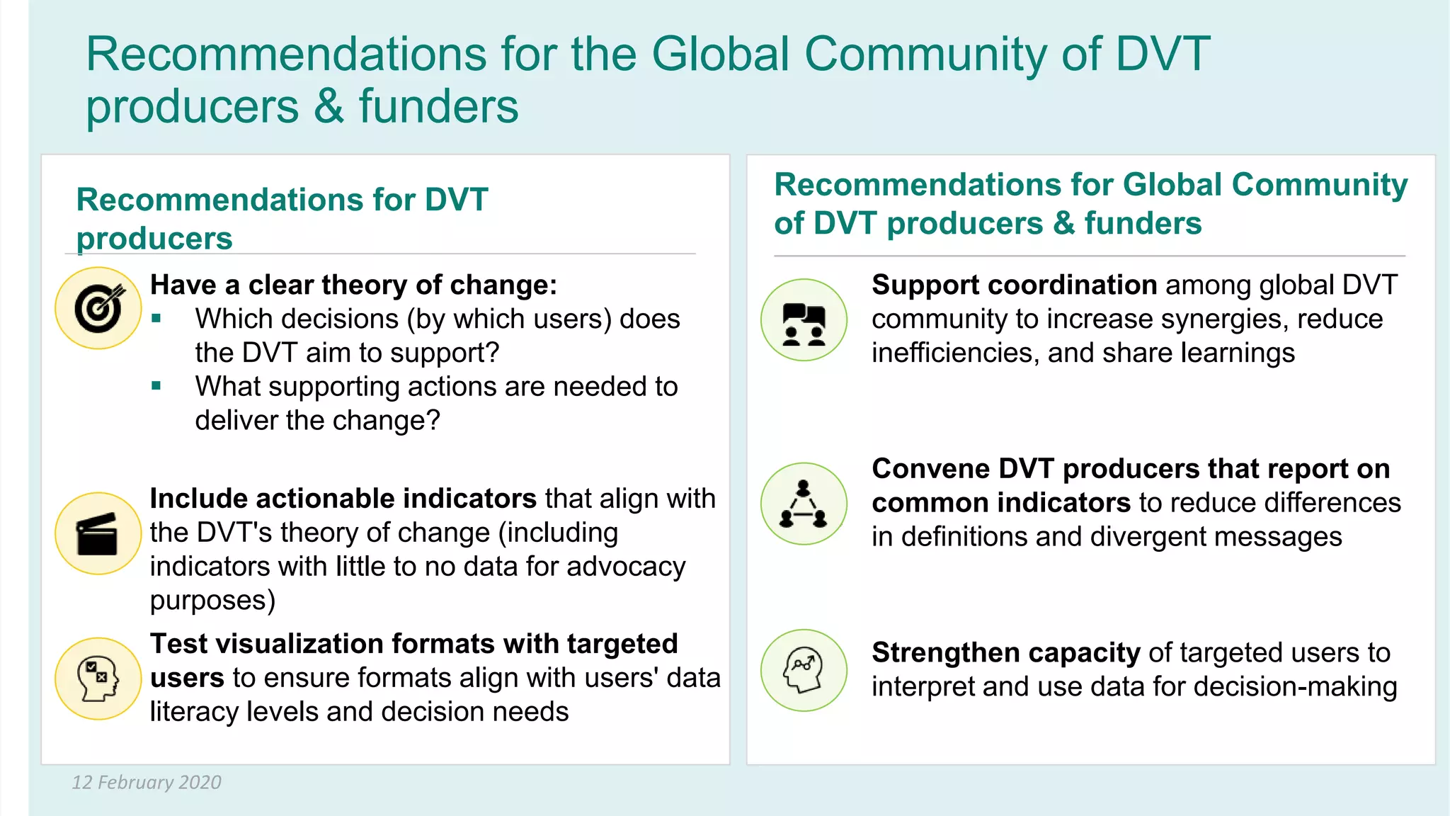

This document summarizes a presentation on data visualization tools for nutrition monitoring and advocacy. It finds that there are now 23 global data visualization tools (DVTs) in nutrition, with most including data on West African countries. There is significant overlap in the indicators across DVTs, which can cause confusion if definitions differ. Few DVTs have a clear theory of change specifying the target audience and decisions aimed to influence. Most DVTs also lack sufficiently actionable indicators to truly support decision-making. The document recommends DVT producers have a well-defined theory of change and include more actionable indicators aligned with user needs, while the global community coordinates efforts to reduce inefficiencies across tools.


